本文主要是介绍数据可视化(十二):Pandas太阳黑子数据、图像处理——离散极值、核密度、拟合曲线、奇异值分解等高级操作,希望对大家解决编程问题提供一定的参考价值,需要的开发者们随着小编来一起学习吧!
Tips:"分享是快乐的源泉💧,在我的博客里,不仅有知识的海洋🌊,还有满满的正能量加持💪,快来和我一起分享这份快乐吧😊!
喜欢我的博客的话,记得点个红心❤️和小关小注哦!您的支持是我创作的动力!数据源存放在我的资源下载区啦!
数据可视化(十二):Pandas太阳黑子数据、图像处理——离散极值、核密度、拟合曲线、奇异值分解等高级操作
目录
- 数据可视化(十二):Pandas太阳黑子数据、图像处理——离散极值、核密度、拟合曲线、奇异值分解等高级操作
- 编程题
- 1. 给定一组离散数据点,使用 scipy.interpolate 中的插值方法(如线性插值、样条插值等)对其进行插值,并绘制插值结果。
- 2. 使用 scipy.optimize 中的优化算法,找到函数的最小值点,并在图中标出最小值点。
- 3. 绘制正态分布数据的直方图和概率密度函数曲线
- 4. 对一组实验数据进行曲线拟合,使用 scipy.optimize.curve_fit 函数拟合一个非线性函数,并绘制原始数据和拟合曲线。
- 5. 对以下函数进行数值积分,并绘制函数曲线以及积分结果的区域。
- 6. 使用 scipy.ndimage 中的函数对“gdufe_logo.jpg”进行平滑处理(模糊处理、高斯滤波)和边缘处理(Sobel滤波),并展示原始图片和处理后的效果。
- 7. 对 "gdufe.jpeg" 图像进行奇异值分解,并使用20、100、200个奇异值重建图像,并将原始图像与重建图像进行可视化。
- 8. 对太阳黑子数据集,采用scipy.signal.convolve 对其进行移动平均卷积。原始信号和卷积后的信号被绘制在同一图表上进行比较。
- 9. 给定一段时间的销售额,使用 scipy.stats.linregress 进行线性回归,预测未来的销售额。
- 10. 对 "形态学.jpg" 图像,应用膨胀、腐蚀、开运算和闭运算,并可视化处理后的图像。
编程题
import matplotlib.pyplot as plt
import numpy as np
import pandas as pd# 支持中文
plt.rcParams['font.sans-serif'] = ['Arial Unicode MS']  # SimHei 用来正常显示中文标签
plt.rcParams['axes.unicode_minus'] = False  # 用来正常显示负号
1. 给定一组离散数据点,使用 scipy.interpolate 中的插值方法(如线性插值、样条插值等)对其进行插值,并绘制插值结果。
from scipy.interpolate import interp1d# 给定离散数据点
x = np.linspace(0, 30, 10)
y = np.sin(x)# 添加噪声
np.random.seed(20240501)
noise = np.random.normal(0, 0.1, len(y))
y_noisy = y + noise# 线性插值
linear_interp = interp1d(x, y_noisy, kind='linear')# 样条插值
cubic_interp = interp1d(x, y_noisy, kind='cubic')# 在新的 x 值上进行插值
x_new = np.linspace(0, 30, 1000)
y_linear = linear_interp(x_new)
y_cubic = cubic_interp(x_new)# 绘制结果
plt.figure(figsize=(10, 6))
plt.plot(x, y_noisy, 'o', label='Noisy Data')
plt.plot(x_new, y_linear, label='Linear Interpolation')
plt.plot(x_new, y_cubic, label='Cubic Spline Interpolation')
plt.xlabel('x')
plt.ylabel('y')
plt.title('Interpolation of Noisy Data')
plt.legend()
plt.grid(True)
plt.show()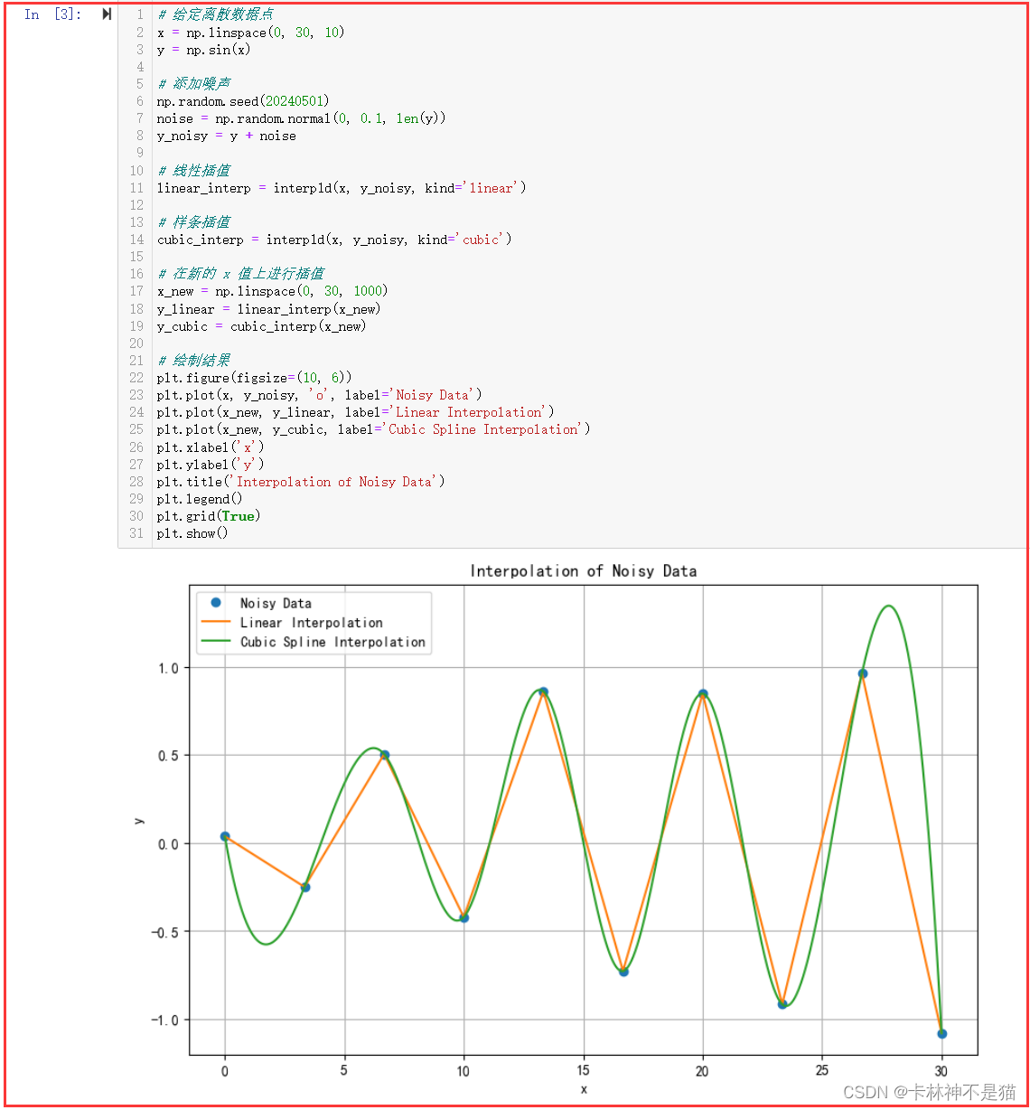
2. 使用 scipy.optimize 中的优化算法,找到函数的最小值点,并在图中标出最小值点。
目标函数为:
f ( x ) = sin ( 3 x ) + 1.5 x 2 − 2 x f(x) = \sin(3x) + 1.5x^2 - 2x f(x)=sin(3x)+1.5x2−2x
from scipy.optimize import minimize# 定义目标函数
def objective_function(x):return np.sin(3 * x) + 1.5 * x**2 - 2 * x# 定义搜索空间
bounds = [(-5, 5)]# 使用全局优化算法(差分进化算法)寻找最小值
result = differential_evolution(objective_function, bounds)# 打印最小值点
min_x = result.x
min_y = result.fun
print("Minimum point:", min_x)
print("Minimum value:", min_y)# 绘制目标函数
x_vals = np.linspace(-5, 5, 400)
y_vals = objective_function(x_vals)plt.figure(figsize=(10, 6))
plt.plot(x_vals, y_vals, label='Objective Function')
plt.scatter(min_x, min_y, color='red', label='Minimum Point')
plt.xlabel('x')
plt.ylabel('f(x)')
plt.title('Global Minimization of Objective Function')
plt.legend()
plt.grid(True)
plt.show()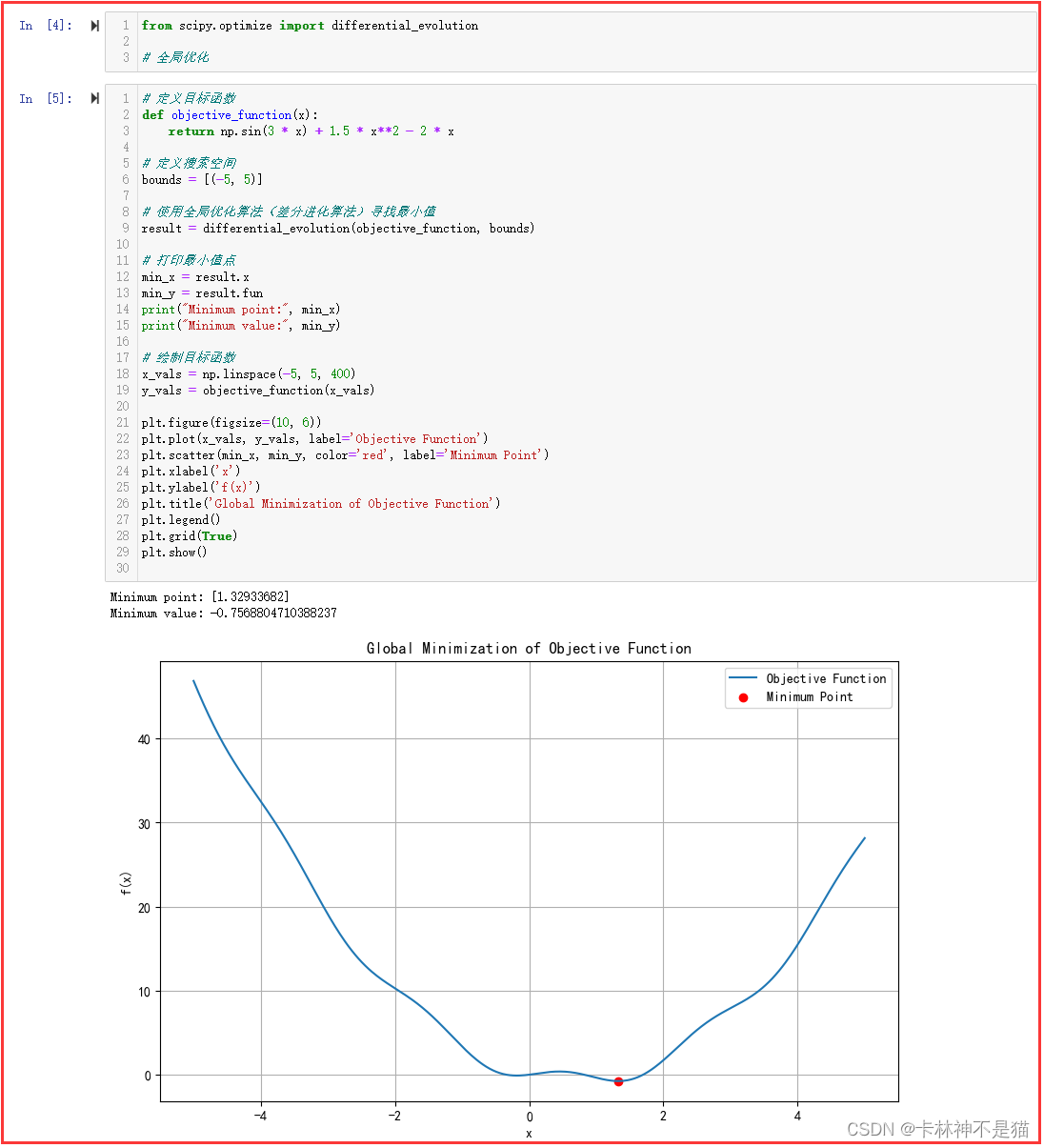
3. 绘制正态分布数据的直方图和概率密度函数曲线
from scipy.stats import norm# 生成正态分布的随机样本
np.random.seed(20240501)
sample_size = 1000
mean = 0
std_dev = 1
data = np.random.normal(mean, std_dev, sample_size)# 添加噪声
noise_mean = 0
noise_std_dev = 0.2
noise = np.random.normal(noise_mean, noise_std_dev, sample_size)
noisy_data = data + noise# 绘制直方图
plt.figure(figsize=(10, 6))
plt.hist(noisy_data, bins=30, density=True, alpha=0.6, color='b', label='Histogram')# 绘制概率密度函数曲线
xmin, xmax = plt.xlim()
x = np.linspace(xmin, xmax, 100)
p = norm.pdf(x, mean, std_dev)
plt.plot(x, p, 'k', linewidth=2, label='PDF')plt.title('Histogram and PDF of Noisy Normal Distribution')
plt.xlabel('Value')
plt.ylabel('Density')
plt.legend()
plt.grid(True)
plt.show()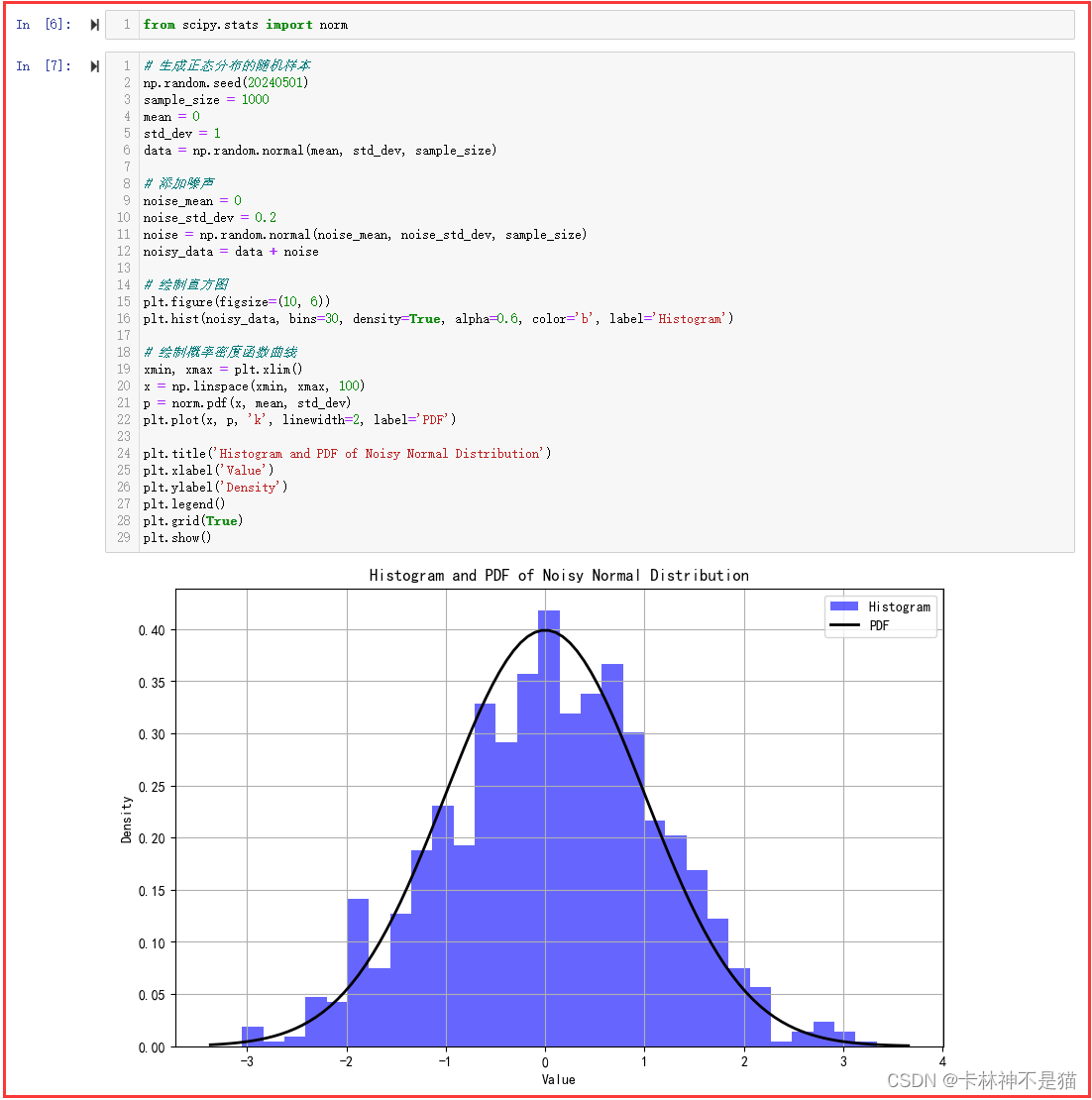
4. 对一组实验数据进行曲线拟合,使用 scipy.optimize.curve_fit 函数拟合一个非线性函数,并绘制原始数据和拟合曲线。
from scipy.optimize import curve_fit# 定义非线性函数
def nonlinear_function(x, a, b, c):return a * np.sin(b * x) + c# 生成实验数据
np.random.seed(20240501)
x_data = np.linspace(0, 10, 100)
y_data = 2 * np.sin(1.5 * x_data) + 1 + np.random.normal(0, 0.5, len(x_data))# 使用 curve_fit 函数拟合非线性函数
popt, pcov = curve_fit(nonlinear_function, x_data, y_data)# 获取拟合参数
a_fit, b_fit, c_fit = popt# 绘制原始数据和拟合曲线
plt.figure(figsize=(10, 6))
plt.scatter(x_data, y_data, label='Original Data')
plt.plot(x_data, nonlinear_function(x_data, a_fit, b_fit, c_fit), 'r-', label='Fitted Curve')
plt.title('Curve Fitting with Nonlinear Function')
plt.xlabel('X')
plt.ylabel('Y')
plt.legend()
plt.grid(True)
plt.show()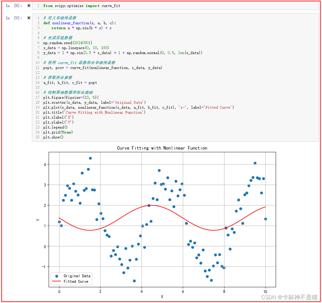
5. 对以下函数进行数值积分,并绘制函数曲线以及积分结果的区域。
要积分的函数为:
f ( x ) = sin ( x ) + 1 2 cos ( 2 x ) f(x) = \sin(x) + \frac{1}{2} \cos(2x) f(x)=sin(x)+21cos(2x)
对该函数从 x = 0 x=0 x=0 到 x = 2 π x=2\pi x=2π 进行数值积分。
from scipy.integrate import quad# 以下编码
# 定义函数
def f(x):return np.sin(x) + 0.5 * np.cos(2 * x)# 定义积分区间
a = 0
b = 2 * np.pi# 数值积分
integral_result, error = quad(f, a, b)# 生成 x 值
x_values = np.linspace(a, b, 100)# 计算函数值
y_values = f(x_values)# 绘制函数曲线和积分区域
plt.figure(figsize=(10, 6))
plt.plot(x_values, y_values, label='Function Curve')
plt.fill_between(x_values, y_values, alpha=0.3, label='Integral Area')
plt.title('Function Curve and Integral Area')
plt.xlabel('x')
plt.ylabel('f(x)')
plt.axhline(0, color='black', linewidth=0.5)  # 绘制 x 轴
plt.axvline(0, color='black', linewidth=0.5)  # 绘制 y 轴
plt.legend()
plt.grid(True)
plt.show()print("Integral result:", integral_result)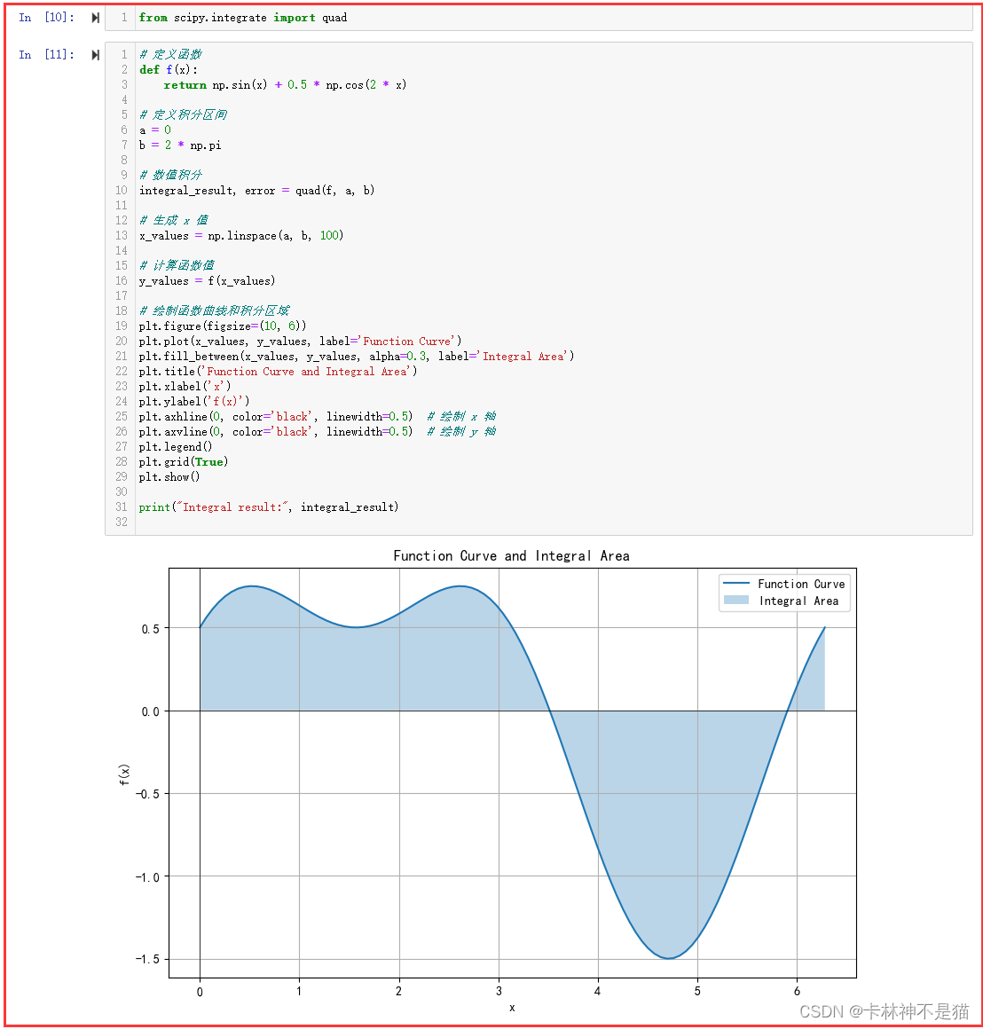
6. 使用 scipy.ndimage 中的函数对“gdufe_logo.jpg”进行平滑处理(模糊处理、高斯滤波)和边缘处理(Sobel滤波),并展示原始图片和处理后的效果。
from scipy import ndimage
from PIL import Image# 读取图像
image = Image.open("../data/gdufe_logo.jpg")
image = image.convert("L")  # 将图像转换为灰度图像# 平滑处理(高斯滤波)
smoothed_image = ndimage.gaussian_filter(image, sigma=3)# 边缘处理(Sobel滤波)
sobel_image = ndimage.sobel(image)# 展示原始图片和处理后的效果
plt.figure(figsize=(12, 6))plt.subplot(1, 3, 1)
plt.imshow(image, cmap='gray')
plt.title('Original Image')
plt.axis('off')plt.subplot(1, 3, 2)
plt.imshow(smoothed_image, cmap='gray')
plt.title('Smoothed Image (Gaussian Filter)')
plt.axis('off')plt.subplot(1, 3, 3)
plt.imshow(sobel_image, cmap='gray')
plt.title('Edges (Sobel Filter)')
plt.axis('off')plt.show()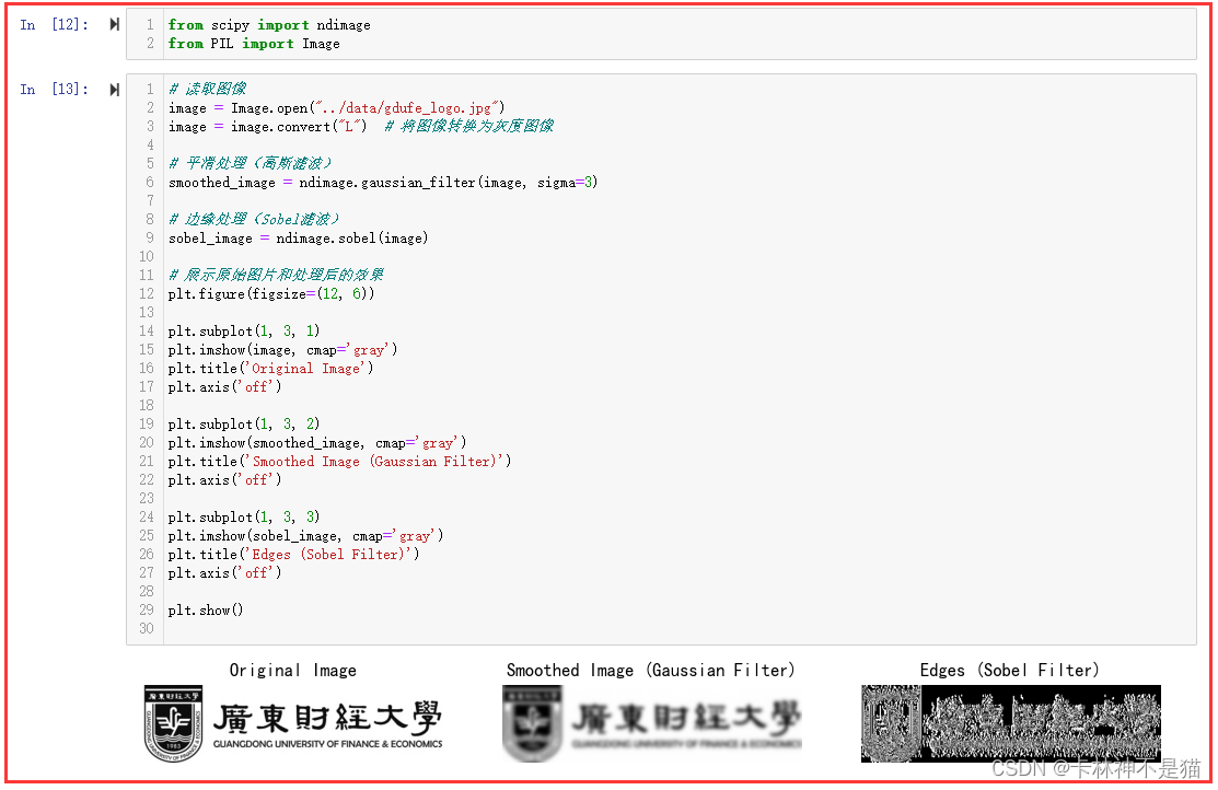
7. 对 “gdufe.jpeg” 图像进行奇异值分解,并使用20、100、200个奇异值重建图像,并将原始图像与重建图像进行可视化。
注意:用摊平后的图像进行 SVD 操作,然后再重塑展现,从而可以处理彩色RGB图像。
from PIL import Image
from scipy.linalg import svd# 读取彩色图像
image = Image.open("../data/gdufe.jpeg")# 将图像转换为 numpy 数组
image_array = np.array(image)# 获取图像的尺寸
m, n, c = image_array.shape# 摊平图像数组
flat_image_array = image_array.reshape(-1, c)# 进行奇异值分解
U, s, Vt = np.linalg.svd(flat_image_array, full_matrices=False)# 重建图像函数
def reconstruct_image(U, s, Vt, num_singular_values):# 使用指定数量的奇异值重建图像reconstructed_image_array = np.dot(U[:, :num_singular_values], np.dot(np.diag(s[:num_singular_values]), Vt[:num_singular_values, :]))# 重塑图像数组形状reconstructed_image_array = np.clip(reconstructed_image_array, 0, 255).astype(np.uint8)reconstructed_image = reconstructed_image_array.reshape(m, n, c)return Image.fromarray(reconstructed_image)# 使用不同数量的奇异值重建图像并可视化
num_singular_values_list = [20, 100, 200]plt.figure(figsize=(15, 5))for i, num_singular_values in enumerate(num_singular_values_list):plt.subplot(1, len(num_singular_values_list), i + 1)reconstructed_image = reconstruct_image(U, s, Vt, num_singular_values)plt.imshow(reconstructed_image)plt.title(f'{num_singular_values} Singular Values')plt.axis('off')plt.show()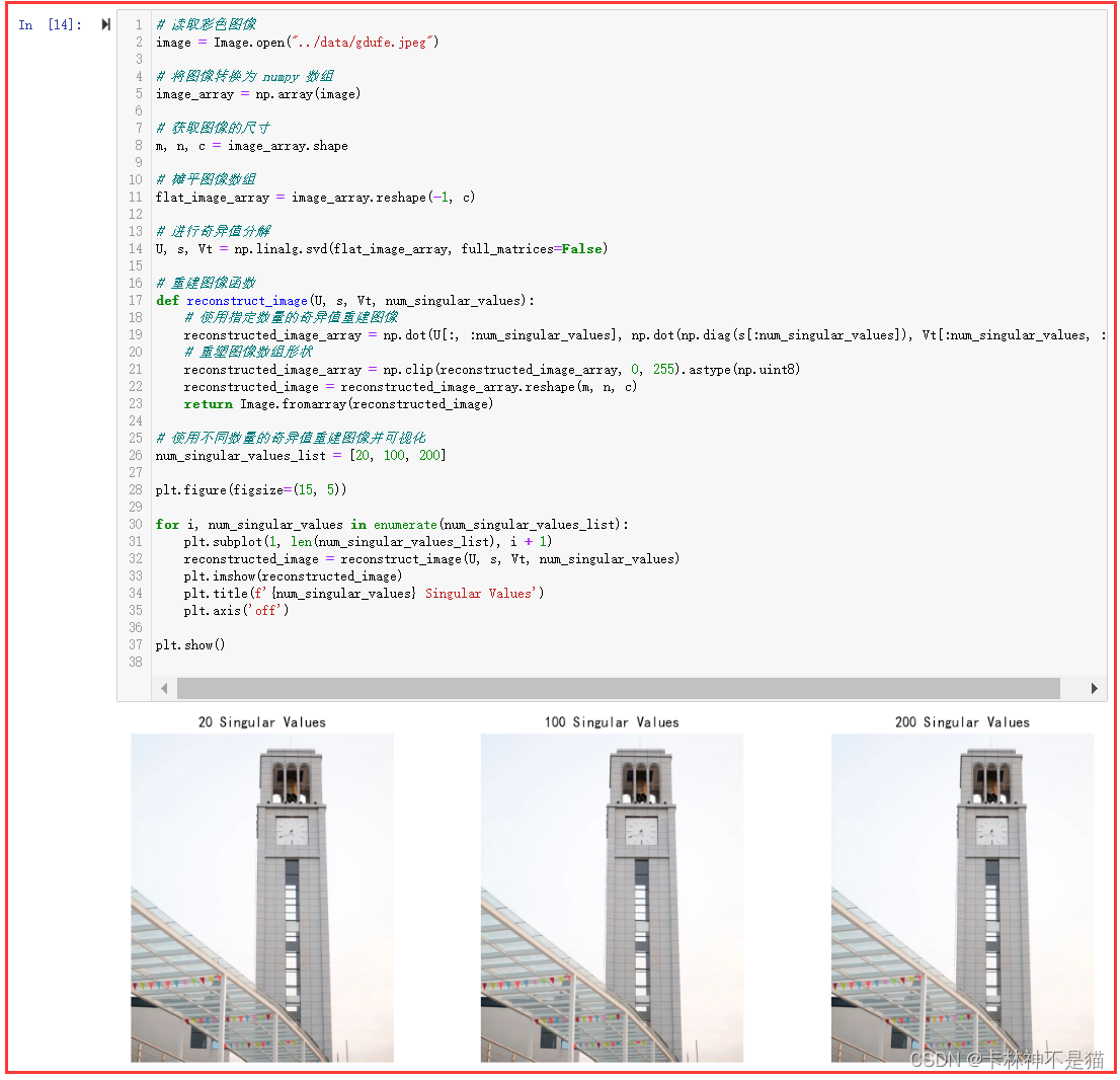
8. 对太阳黑子数据集,采用scipy.signal.convolve 对其进行移动平均卷积。原始信号和卷积后的信号被绘制在同一图表上进行比较。
from scipy import signal
from statsmodels import datasets# 加载太阳黑子数据集
sp = datasets.sunspots.load_pandas().data['SUNACTIVITY']# 定义移动平均窗口大小
window_size = 11# 计算移动平均
moving_avg = np.convolve(sp, np.ones(window_size)/window_size, mode='valid')# 创建时间轴
time = np.arange(len(sp))# 绘制原始信号和移动平均后的信号
plt.figure(figsize=(10, 6))
plt.plot(time, sp, label='Original Signal')
plt.plot(time[window_size-1:], moving_avg, label=f'Moving Average (Window Size {window_size})')
plt.title('Sunspot Activity with Moving Average Convolution')
plt.xlabel('Time')
plt.ylabel('Sunspot Activity')
plt.legend()
plt.grid(True)
plt.show()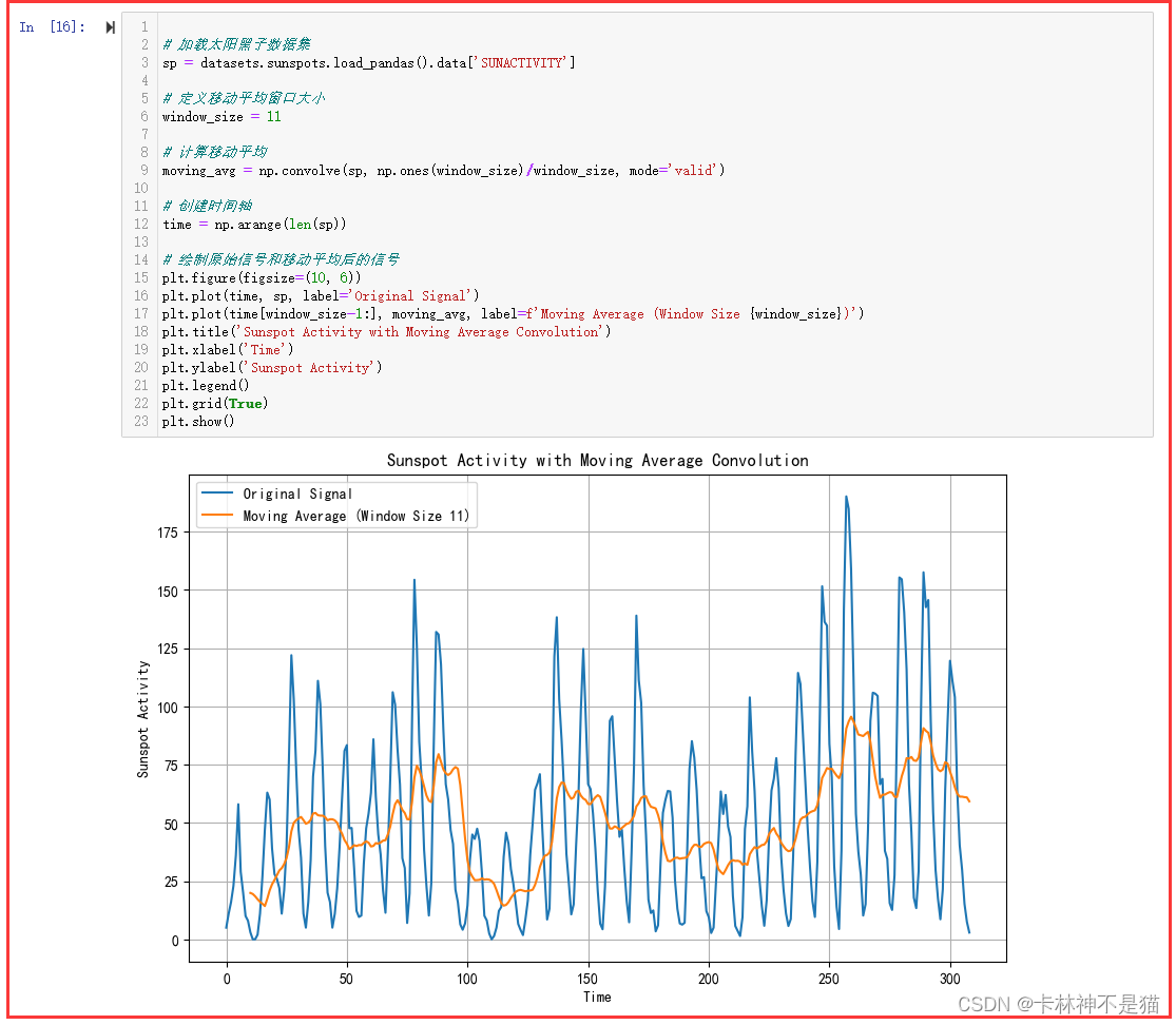
9. 给定一段时间的销售额,使用 scipy.stats.linregress 进行线性回归,预测未来的销售额。
from scipy.stats import linregress# 给定时间段的销售额数据
sales = np.array([100, 120, 130, 140, 150, 160, 170, 180, 190, 200])
time = np.arange(len(sales))# 进行线性回归
slope, intercept, r_value, p_value, std_err = linregress(time, sales)# 使用线性回归方程预测未来销售额
future_time = np.arange(len(sales), len(sales) + 5)  # 假设预测未来5个时间点
future_sales = slope * future_time + intercept# 绘制原始销售额和线性回归线
plt.figure(figsize=(10, 6))
plt.scatter(time, sales, label='Actual Sales')
plt.plot(time, slope * time + intercept, color='red', label='Linear Regression')
plt.scatter(future_time, future_sales, color='green', label='Predicted Sales')
plt.title('Sales Linear Regression and Prediction')
plt.xlabel('Time')
plt.ylabel('Sales')
plt.legend()
plt.grid(True)
plt.show()# 输出预测未来销售额
print("预测未来销售额:")
for t, s in zip(future_time, future_sales):print(f"时间 {t}: 销售额 {s}")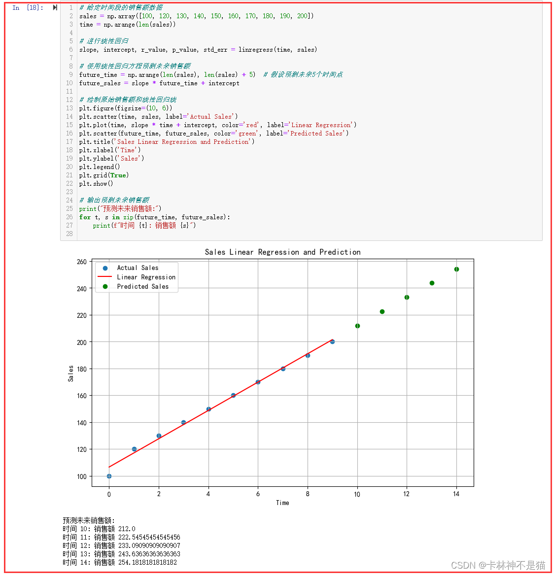
10. 对 “形态学.jpg” 图像,应用膨胀、腐蚀、开运算和闭运算,并可视化处理后的图像。
运算参数:size = (10, 10)
from PIL import Image
from scipy import ndimage# 打开图像
image = Image.open("../data/形态学.jpg")# 将图像转换为灰度图像
image_gray = image.convert("L")# 转换为数组
image_array = np.array(image_gray)# 定义运算参数
size = (10, 10)# 应用膨胀
dilated_image = ndimage.grey_dilation(image_array, size=size)# 应用腐蚀
eroded_image = ndimage.grey_erosion(image_array, size=size)# 应用开运算
opened_image = ndimage.grey_opening(image_array, size=size)# 应用闭运算
closed_image = ndimage.grey_closing(image_array, size=size)# 可视化处理后的图像
plt.figure(figsize=(12, 8))plt.subplot(2, 3, 1)
plt.imshow(image_array, cmap='gray')
plt.title('Original Image')plt.subplot(2, 3, 2)
plt.imshow(dilated_image, cmap='gray')
plt.title('Dilated Image')plt.subplot(2, 3, 3)
plt.imshow(eroded_image, cmap='gray')
plt.title('Eroded Image')plt.subplot(2, 3, 4)
plt.imshow(opened_image, cmap='gray')
plt.title('Opened Image')plt.subplot(2, 3, 5)
plt.imshow(closed_image, cmap='gray')
plt.title('Closed Image')plt.tight_layout()
plt.show()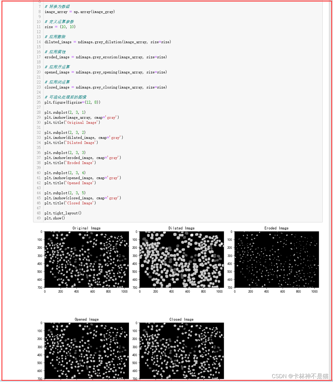
这篇关于数据可视化(十二):Pandas太阳黑子数据、图像处理——离散极值、核密度、拟合曲线、奇异值分解等高级操作的文章就介绍到这儿,希望我们推荐的文章对编程师们有所帮助!