本文主要是介绍使用 CSS : 伪元素:after、过渡动画transition实现过渡效果(鼠标悬浮或点击 标签时,底部边框从左到右过渡),希望对大家解决编程问题提供一定的参考价值,需要的开发者们随着小编来一起学习吧!
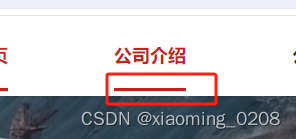
首先,给 <span> 标签添加一个父元素,定义属性类名:nav-wrapper ,父级设置相对定位。然后,使用 ::after 伪元素来创建一个与底部边框相同宽度的元素,初始时宽度为 0,通过过渡动画transition逐渐增加宽度,从而实现从左到右的过渡效果。
<div class="nav-wrapper"><span class="nav" :class="$route.fullPath === '/companyProducts' ? 'active' : ''">公司产品</span></div>
.nav-wrapper {position: relative;
}.nav::after {content: "";position: absolute;left: 0;bottom: 0;width: 0;height: 2px;background-color: red;transition: width 0.3s ease;
}.nav:hover::after,
.nav:focus::after {width: 100%;
}//当前路由样式
.active {color: #cd1e19;font-weight: 700;}
这篇关于使用 CSS : 伪元素:after、过渡动画transition实现过渡效果(鼠标悬浮或点击 标签时,底部边框从左到右过渡)的文章就介绍到这儿,希望我们推荐的文章对编程师们有所帮助!


