本文主要是介绍【Qt之Quick模块】7. Quick基础、常用组件Item、Rectangle、Text、TextInput、TextEdit等,希望对大家解决编程问题提供一定的参考价值,需要的开发者们随着小编来一起学习吧!
1. 概述
Qt Quick模块是编写QML应用程序的标准库。Qt QML模块提供QML引擎和语言基础结构,Qt Quick模块提供用QML创建用户界面所需的所有基本类型。它提供了一个可视化画布,包括用于创建和动画化可视化组件、接收用户输入、创建数据模型和视图以及延迟对象实例化的类型。
Qt Quick模块提供了一个QML API(为用QML语言创建用户界面提供QML类型)和一个c++ API(用c++代码扩展QML应用程序)。
注意:一组基于Qt quick的UI控件也可用于创建用户界面。
1.1 使用Qcuick模块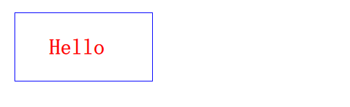
需在.pro文件中添加:
QT += quick
在所用的文件中导入以下代码:
import QtQuick
1.2 Quick 模块类关系图
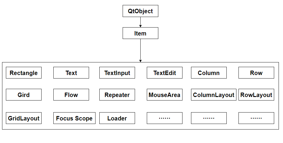
2. 可视组件
2.1 Item
Item类型是Qt Quick中所有可视项目的基本类型。
Qt Quick中的所有可视项都继承自Item。尽管Item对象没有可视外观,但它定义了可视项目中常见的所有属性,例如x和y位置、宽度和高度、锚定和键处理支持。
2.1.1 Item作为容器
Item类型可用于将多个项分组到单个根下。例如:
import QtQuick 2.0Item {Image {source: "tile.png"}Image {x: 80width: 100height: 100source: "tile.png"}Image {x: 190width: 100height: 100fillMode: Image.Tilesource: "tile.png"}}
2.1.2 Item不透明度
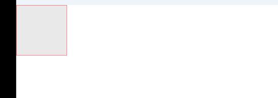
Item{Rectangle{// 设置透明度opacity: 0.5color: "lightgrey"width: 100height: 100border.color: "red"anchors.centerIn: rootRectangle{color: "blue"width: 100height: 100border.color: "blue"}}}
2.1.3 Item是否可见和启用
Item{Rectangle{// 设置透明度opacity: 0.5color: "lightgrey"width: 100height: 100border.color: "red"Rectangle{color: "blue"width: 100height: 100border.color: "blue"// 是否可见visible: false// 是否启用enabled: false}}}
2.1.4 Item z轴堆叠顺序
Item有一个z属性,可以用来设置项的堆叠顺序
z相同,后面的在前面的上面
z大,在z小的上面
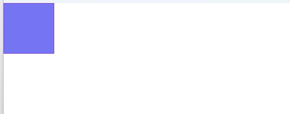
Item{Rectangle{// 设置透明度z : 1opacity: 0.5color: "lightgrey"width: 100height: 100border.color: "red"}Rectangle{z : 0x: 50y: 50color: "blue"width: 100height: 100border.color: "blue"}}

2.1.5 Item 定位子项 和 坐标映射
Item有以下几个函数用于定位子项和坐标映射
- childAt(real x, real y):定位第一个在(x, y)位置的可视子项
- mapFromItem(Item item, real x, real y):将item的坐标转换为项目坐标
- mapToItem(Item item, real x, real y):将item的项目坐标转换为item的坐标系统
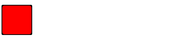
2.2 Rectangle
矩形项用于用纯色或渐变填充区域,或提供矩形边框。颜色设置可以使用名称和"#000000"格式。
属性设置可以用属性组设置。
import QtQuick 2.0Rectangle {width: 100height: 100color: "red"border.color: "black"border.width: 5radius: 10}
Rectangle {color: "#00B000"width: 80; height: 80}Rectangle {color: "steelblue"y: 100; width: 80; height: 80}

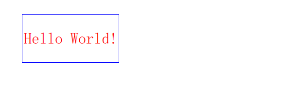
2.3 Text
文本项可以显示纯文本和富文本。例如,具有特定字体和大小的红色文本可以这样定义:
Text {text: "Hello World!"font.family: "Helvetica"font.pointSize: 24color: "red"}
或者
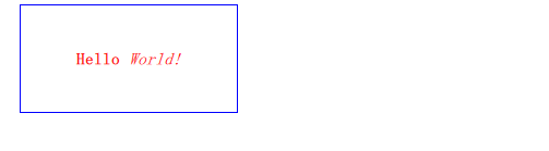
Text {text: "<b>Hello</b> <i>World!</i>"}
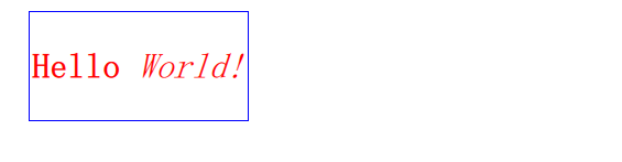
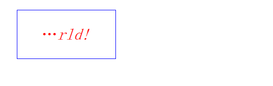
2.3.1 隐藏超过长度的文本
如下,文本长度100,超过就隐藏左边
Text {width: 100anchors.centerIn: parenttext: "<b>Hello</b> <i>World!</i>"font.family: "Helvetica"font.pointSize: 24color: "red"elide: Text.ElideLeft}
2.3.2 换行
Text {width: 100anchors.centerIn: parenttext: "<b>Hello</b> <i>World!</i>"font.family: "Helvetica"font.pointSize: 24color: "red"// elide: Text.ElideLeftwrapMode: Text.WrapAnywhere}
2.3.3 裁剪
clip属性用于设置文本是否被裁剪
Text {width: 100anchors.centerIn: parenttext: "<b>Hello</b> <i>World!</i>"font.family: "Helvetica"font.pointSize: 24color: "red"// elide: Text.ElideLeft// wrapMode: Text.WrapAnywhereclip: true}
2.3.4 字体
使用font属性可对文本进行设置,用法:
font.xxx
如:
font.family: "Helvetica"
font.pointSize: 24
font可以设置bold、family、italic、pixelSize、pointSize、underline等属性。
2.3.5 对齐方式
属性horizontalAlignment 和属性verticalAlignment设置对齐方式
Text {width: parent.widthheight: parent.heighttext: "<b>Hello</b> <i>World!</i>"font.family: "Helvetica"font.pointSize: 11color: "red"// elide: Text.ElideLeft// wrapMode: Text.WrapAnywhere// clip: truehorizontalAlignment : Text.AlignHCenterverticalAlignment: Text.AlignVCenter}
2.3.6 文本样式
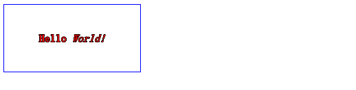
使用style属性设置文本样式
Text {width: parent.widthheight: parent.heighttext: "<b>Hello</b> <i>World!</i>"font.family: "Helvetica"font.pointSize: 11color: "red"// elide: Text.ElideLeft// wrapMode: Text.WrapAnywhere// clip: truehorizontalAlignment : Text.AlignHCenterverticalAlignment: Text.AlignVCenterstyle: Text.Outline}
2.4 TextInput
TextInput显示一行可编辑的纯文本。
TextInput用于接受一行文本输入。输入约束可以放在TextInput项上(例如,通过验证器或inputMask),并且将echoMode设置为适当的值可以将TextInput用于密码输入字段。
2.4.1 使用验证器
TextInput{width: parent.widthheight: parent.heighthorizontalAlignment: Text.AlignHCenterverticalAlignment: Text.AlignVCentervalidator: IntValidator{bottom: 1; top: 99;}//text: "只能输入1-99的数字."}
2.4.2 使用掩码
TextInput{width: parent.widthheight: parent.heighthorizontalAlignment: Text.AlignHCenterverticalAlignment: Text.AlignVCenter// validator: IntValidator{bottom: 1; top: 99;}inputMask: ">AA_999_a"//text: "只能输入1-99的数字."}
2.4.3 回显方式
echoMode属性指定了TextInput文本显示方式:
| 枚举 | 值 | 描述 |
|---|---|---|
| QLineEdit::Normal | 0 | 默认方式,直接显示文本 |
| QLineEdit::NoEcho | 1 | 不显示输入内容 |
| QLineEdit::Password | 2 | 以密码掩码字符替换文本 |
| QLineEdit::PasswordEchoOnEdit | 3 | 输入时显示文本,但输入完显示密码掩码字符 |
TextInput{width: parent.widthheight: parent.heighthorizontalAlignment: Text.AlignHCenterverticalAlignment: Text.AlignVCentervalidator: IntValidator{bottom: 1; top: 99;}echoMode: TextInput.Password// inputMask: ">AA_999_a"//text: "只能输入1-99的数字."onEditingFinished: console.log(text)}
2.4.4 信号处理器
TextInput提供了两个输入完成的信号处理器,onAccepted()和onEditingFinished()。他们都会在按下回车时触发,区别是后者失去焦点也会触发。
TextInput也提供了一个onTextEdited()的信号处理器,当内容编辑时触发。
2.4.5 文本选取
selectByMouse属性设置使用鼠标选择TextInput中的文本。
- selectByMouse: bool
默认为false。
如果为true,则用户可以使用鼠标以某种特定于平台的方式选择文本。 - selectedText: string
此只读属性提供当前在文本输入中选择的文本。 - selectedTextColor: color
突出显示文本的颜色,用于选择。 - selectionColor: color
用于选择的文本突出显示背景颜色。 - selectionEnd: int
当前选择中最后一个字符后的光标位置。
此属性是只读的。要更改选择,请使用select(start,end),selectAll()或selectWord()。 - selectionStart: int
当前选择中第一个字符之前的光标位置。
此属性是只读的。要更改选择,请使用select(start,end),selectAll()或selectWord()。
TextInput{width: parent.widthheight: parent.heighthorizontalAlignment: Text.AlignHCenterverticalAlignment: Text.AlignVCentervalidator: IntValidator{bottom: 1; top: 99999999;}//echoMode: TextInput.Password// inputMask: ">AA_999_a"//text: "只能输入1-99的数字."onEditingFinished: console.log(text)selectByMouse: truemouseSelectionMode: TextInput.SelectWordsselectionColor: "lightgrey"selectedTextColor: "red"}
2.4.6 外观
TextInput默认没有外观,都不知道光标在哪儿,所以需要自己实现自定义组件,比如,在一个Rectangle内添加一个TextInput组件。或者实现别的已经实现的组件库,如TextField组件
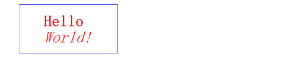
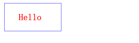
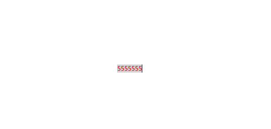
Rectangle{width: 300height: 50border.color: "blue"anchors.centerIn: parentTextInput{anchors.fill: parenthorizontalAlignment: Text.AlignHCenterverticalAlignment: Text.AlignVCentervalidator: IntValidator{bottom: 1; top: 99999999;}//echoMode: TextInput.Password// inputMask: ">AA_999_a"//text: "只能输入1-99的数字."onEditingFinished: console.log(text)selectByMouse: truemouseSelectionMode: TextInput.SelectWordsselectionColor: "lightgrey"selectedTextColor: "red"}}

2.5 TextEdit
TextEdit组件显示一个可编辑的格式化文本块,和TextInput相比,那个是单行的,这个是多行的。属性用法基本一样
它可以显示纯文本和富文本。例如:
TextEdit {width: 240text: "<b>Hello</b> <i>World!</i>"font.family: "Helvetica"font.pointSize: 20color: "blue"focus: true}

将focus属性设置为true使TextEdit组件能够接收键盘焦点。
请注意,TextEdit不实现滚动、跟随光标或特定于外观的其他行为。一般会使用Flickable元素提供移动、实现光标跟随:
Flickable {id: flickwidth: 300; height: 200;contentWidth: edit.contentWidthcontentHeight: edit.contentHeightclip: truefunction ensureVisible(r){if (contentX >= r.x)contentX = r.x;else if (contentX+width <= r.x+r.width)contentX = r.x+r.width-width;if (contentY >= r.y)contentY = r.y;else if (contentY+height <= r.y+r.height)contentY = r.y+r.height-height;}TextEdit {id: editwidth: flick.widthfocus: truewrapMode: TextEdit.WraponCursorRectangleChanged: flick.ensureVisible(cursorRectangle)}}
3. 结论
且听且忘且随风,且行且看且从容。
这篇关于【Qt之Quick模块】7. Quick基础、常用组件Item、Rectangle、Text、TextInput、TextEdit等的文章就介绍到这儿,希望我们推荐的文章对编程师们有所帮助!


