本文主要是介绍(助力国赛)数学建模可视化!!!含代码1(折线图、地图(点)、地图(线)、地图(多边形)、地图(密度)、环形图、环形柱状图、局部放大图),希望对大家解决编程问题提供一定的参考价值,需要的开发者们随着小编来一起学习吧!
众所周知,数学建模的过程中,将复杂的数据和模型结果通过可视化图形呈现出来,不仅能够帮助我们更深入地理解问题,还能够有效地向评委展示我们的研究成果。
今天,作者将与大家分享8种强大的数学建模可视化图形及其在实际问题中的应用,包含如下图形:折线图、地图(点)、地图(线)、地图(多边形)、地图(密度)、环形图、环形柱状图、局部放大图。
如果阅者觉得此篇分享有效的的话,请点赞收藏再走!!!(还有第二部分后续更新)
1. 折线图:一种趋势分析的利器
折线图是最基本的可视化工具之一,适用于展示数据随时间或其他连续变量的变化趋势。
#绘制折线图代码如下:
import matplotlib.pyplot as plt
from matplotlib.lines import Line2D
import numpy as npdef plot(ax, colors, legends, legend_anchors, x, y, xlabel, ylabel, n_lengend_col=6):""":param ax: 使用 fig, ax = plt.subplots 返回的 ax:param colors: 折线对应的颜色,必须与折线个数相同:param legends: 图例名称,必须与折线个数相同:param legend_anchors: 图例显示的位置,(x, y) 其中x和y均为图例中心点在图中的相对位置,例如:[0.5, 0.5] 表示图例中心点位于图的正中间,[0.5, 1]表示图例的中心点位于图的正上方,[0.5, 1.1]表示图例的中心点位于图的正上方偏上位置:param x: x轴数据,一维列表:param y: y轴数据,多维列表,必须与颜色和图例数量相同,例如:[y1, y2]:param xlabel: x轴标签:param ylabel: y轴标签:param n_lengend_col: 每行图例显示的个数,如果此值大于折线个数,则一行显示所有图例,如果设置为1,则按列显示图例:return: 画布实例"""ax.yaxis.set_tick_params(length=0)ax.xaxis.set_tick_params(length=0)# 去除边框ax.spines["left"].set_color("none")ax.spines["right"].set_color("none")ax.spines["top"].set_color("none")# 显示y轴栅格ax.grid(axis='y', alpha=0.4)# 创建图例handles = [Line2D([], [], label=label,lw=0,  # there's no line added, just the markermarker="o",  # circle markermarkersize=10,  # marker sizemarkerfacecolor=colors[idx],  # marker fill color)for idx, label in enumerate(legends)]legend = ax.legend(handles=handles,bbox_to_anchor=legend_anchors,  # Located in the top-mid of the figure.fontsize=12,handletextpad=0.6,  # Space between text and marker/linehandlelength=1.4,columnspacing=1.4,loc="center",ncol=n_lengend_col,  # 每行图例显示的个数,如果设置为1,表示按列显示图例frameon=False)for i in range(len(legends)):handle = legend.legendHandles[i]handle.set_alpha(0.7)for i in range(len(colors)):ax.plot(x, y[i], color=colors[i])# 设置x轴 y轴标签ax.set_xlabel(xlabel, fontdict={'size': 12})ax.set_ylabel(ylabel, fontdict={'size': 12})return axif __name__ == '__main__':# 随机生成一些数据x = list(range(100))y1 = np.log(x) + np.random.rand(100)y2 = np.log(x)y3 = np.log(x) - np.random.rand(100)colors = ["#009966", "#3399CC", "#FF6600"]legends = ["hair dryer", "microwave", "pacifier"]fig, ax = plt.subplots(figsize=(8, 6), ncols=1, nrows=1)ax = plot(ax, colors, legends, [0.5, 1.03], x, [y1, y2, y3], 'step', 'value')plt.show()
绘制折线图如下图1所示:

2 地图:地理空间数据的直观展示
地图可视化可以帮助我们理解地理空间数据的分布和模式。
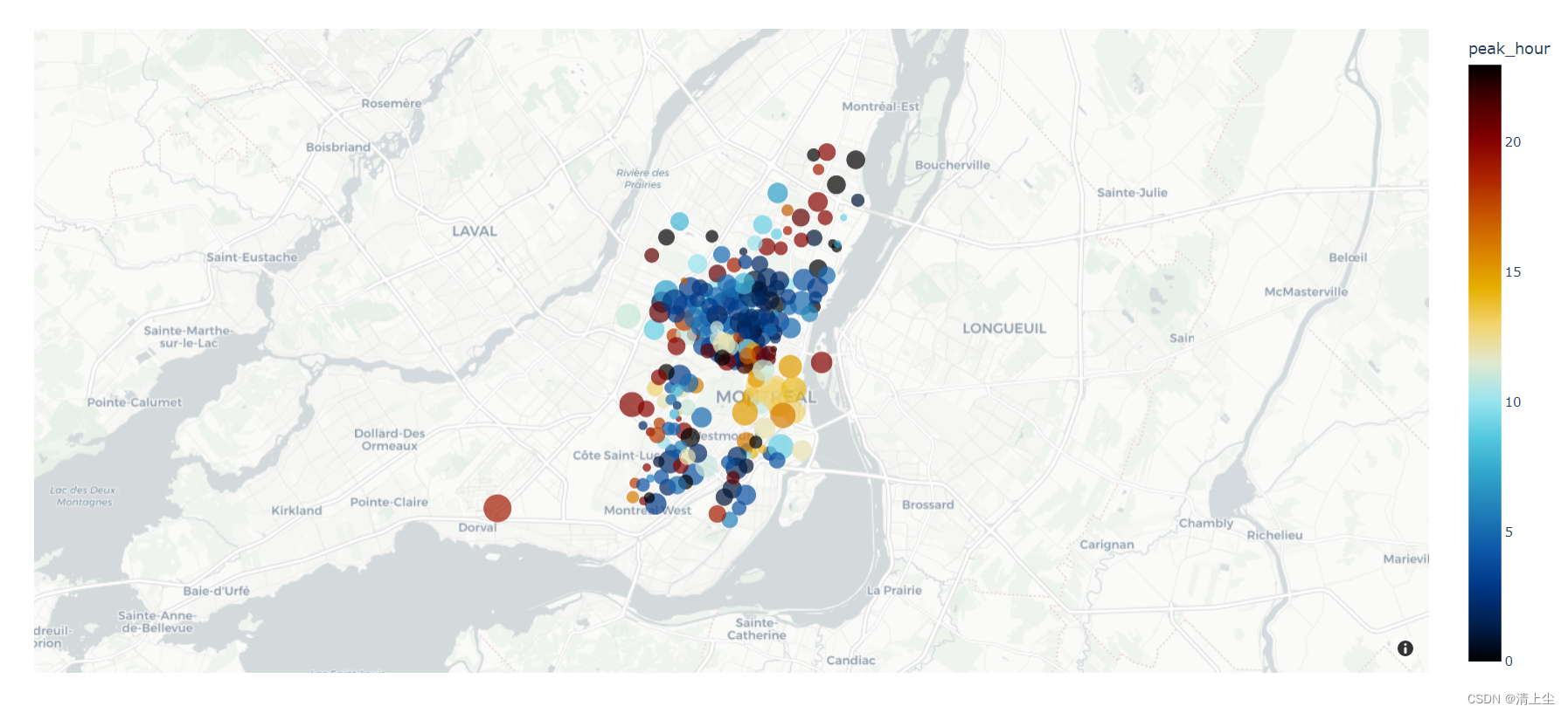
2.1 地图上绘制点
#地图上绘制点的代码
import plotly.io as pio
import plotly.graph_objs as go
import plotly.express as px
from plotly.subplots import make_subplots
import pandas as pd
import numpy as np# can be `plotly`, `plotly_white`, `plotly_dark`, `ggplot2`, `seaborn`, `simple_white`, `none`
pio.templates.default = 'plotly_white'# 加载数据
df = px.data.carshare()
print(df.head())fig = px.scatter_mapbox(df,lat="centroid_lat", lon="centroid_lon",color="peak_hour",size="car_hours",color_continuous_scale=px.colors.cyclical.IceFire,zoom=10)# mapbox_style 可以为 `open-street-map`, `carto-positron`, `carto-darkmatter`,
# `stamen-terrain`, `stamen-toner`, `stamen-watercolor`
fig.update_layout(mapbox_style="carto-positron")fig.write_html('test.html')
绘制地图(点)如下图2所示:
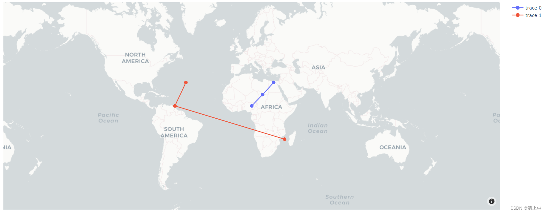
2.2 地图上绘制线
#地图上绘制线的代码
import plotly.io as pio
import plotly.graph_objs as go
import plotly.express as px
from plotly.subplots import make_subplots
import pandas as pd
import numpy as np# pandas打印时显示所有列
pd.set_option('display.max_columns', None)# can be `plotly`, `plotly_white`, `plotly_dark`, `ggplot2`, `seaborn`, `simple_white`, `none`
pio.templates.default = 'plotly_white'fig = go.Figure()
fig.add_trace(go.Scattermapbox(mode='markers+lines',lon=[10, 20, 30],lat=[10, 20, 30],marker={'size': 10}
))
fig.add_trace(go.Scattermapbox(mode="markers+lines",lon=[-50, -60, 40],lat=[30, 10, -20],marker={'size': 10}
))
fig.update_layout(mapbox={'center': {'lon': 10, 'lat': 10},'style': "carto-positron",'zoom': 1}
)fig.write_html('test.html')
绘制地图(线)如下图3所示:
2.3 地图上绘制多边形
#地图上绘制多边形的代码1:多边形数据格式遵循GeoJson标准
import plotly.io as pio
import plotly.graph_objs as go
import plotly.express as px
from plotly.subplots import make_subplots
import pandas as pd
import numpy as np# pandas打印时显示所有列
pd.set_option('display.max_columns', None)# can be `plotly`, `plotly_white`, `plotly_dark`, `ggplot2`, `seaborn`, `simple_white`, `none`
pio.templates.default = 'plotly_white'# 设置数据
df = pd.DataFrame({'id': [1, 2], 'value': [10, 7]})
# 遵循geojson标准
geojson = {"type": "FeatureCollection","features": [{"type": "Feature","properties": {"id": 1},"geometry": {"type": "Polygon","coordinates": [[[247.19238281250003, 45.30580259943578],[241.34765625, 43.389081939117496],[243.80859375, 39.50404070558415],[250.62011718749997, 40.97989806962013],[245.302734375, 42.261049162113856],[247.19238281250003, 45.30580259943578]]]}},{"type": "Feature","properties": {"id": 2},"geometry": {"type": "Polygon","coordinates": [[[257.783203125, 41.409775832009565],[266.7919921875, 41.409775832009565],[266.7919921875, 46.6795944656402],[257.783203125, 46.6795944656402],[257.783203125, 41.409775832009565]]]}}]
}"""
geojson标准格式中的 properties 属性中需要设置一个标识该多边形的标识符,dataframe中需要有一列与标识符相对应,
这样才可以将dataframe中的其他值与geojson中的多边形相对应。此处我们设置geojson中的properties属性包含标识符id,并在dataframe中设置一列id,与其相对应。choropleth_mapbox函数中的参数:locations表示dataframe中的标识列名,本例我们设置为 idfeatureidkey表示geojson中的标识符属性名,本例我们设置为 properties.id
"""
fig = px.choropleth_mapbox(df, geojson=geojson, color=['#8ff06d', '#f65a5d'],locations="id", featureidkey="properties.id",opacity=0.5,center={"lat": 45.5517, "lon": -73.7073},zoom=2)# mapbox_style 可以为 `open-street-map`, `carto-positron`, `carto-darkmatter`,
# `stamen-terrain`, `stamen-toner`, `stamen-watercolor`
fig.update_layout(mapbox_style="carto-positron")fig.write_html('test.html')
绘制地图(多边形)如下图4所示:

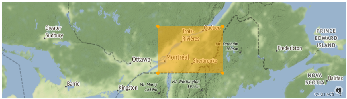
#地图上绘制多边形的代码2:多边形数据格式遵循GeoJson标准
import plotly.io as pio
import plotly.express as px
import plotly.graph_objects as go
from plotly.subplots import make_subplots
import pandas as pd
import numpy as np# 显示所有列
pd.set_option('display.max_columns', None)# can be `plotly`, `plotly_white`, `plotly_dark`, `ggplot2`, `seaborn`, `simple_white`, `none`
pio.templates.default = 'plotly_white'fig = go.Figure(go.Scattermapbox(fill = "toself",lon = [-74, -70, -70, -74], lat = [47, 47, 45, 45],marker = { 'size': 10, 'color': "orange" }
))fig.update_layout(mapbox = {'style': "stamen-terrain",'center': {'lon': -73, 'lat': 46 },'zoom': 5},showlegend = False
)fig.show()
绘制地图(多边形2)如下图5所示:
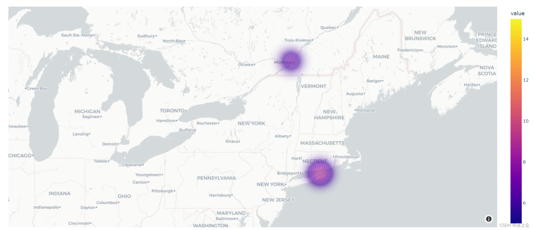
2.4 地图上绘制密度的代码
# 地图上绘制密度的代码
import plotly.io as pio
import plotly.graph_objs as go
import plotly.express as px
from plotly.subplots import make_subplots
import pandas as pd
import numpy as np# pandas打印时显示所有列
pd.set_option('display.max_columns', None)# can be `plotly`, `plotly_white`, `plotly_dark`, `ggplot2`, `seaborn`, `simple_white`, `none`
pio.templates.default = 'plotly_white'df = pd.DataFrame({'lat': [45.5517, 49.1473, 41.1558],'lon': [-73.7073, -79.2188, -72.1445],'value': [10, 5, 15]})fig = px.density_mapbox(df, lat='lat', lon='lon', z='value',radius=60, opacity=0.6)# mapbox_style 可以为 `open-street-map`, `carto-positron`, `carto-darkmatter`,
# `stamen-terrain`, `stamen-toner`, `stamen-watercolor`
fig.update_layout(mapbox_style="carto-positron")fig.write_html('test.html')
绘制地图(密度)如下图6所示:
环形图是一种特殊的饼图,它可以用来展示各部分占总体的比例关系。
#环形图的代码
import plotly.io as pio
import plotly.graph_objs as go
import plotly.express as px
from plotly.subplots import make_subplots
import pandas as pdpio.templates.default = 'plotly_white'labels = ["US", "China", "European Union", "Russian Federation", "Brazil", "India", "Rest of World"]# 创建子图
fig = make_subplots(rows=1, cols=2, specs=[[{'type': 'domain'}, {'type': 'domain'}]])fig.add_trace(go.Pie(labels=labels, values=[16, 15, 12, 6, 5, 4, 42], name='GHG Emissions'), 1, 1)
fig.add_trace(go.Pie(labels=labels, values=[27, 11, 25, 8, 1, 3, 25], name="CO2 Emissions"), 1, 2)
# 使用hole参数设置圆环中心空缺大小
fig.update_traces(hole=.4)fig.update_layout(title_text='Global Emissions',annotations=[dict(text='GHG', x=0.20, y=0.5, font_size=20, showarrow=False),dict(text='CO2', x=0.80, y=0.5, font_size=20, showarrow=False)]
)fig.write_html('test.html')
绘制环形图如下图7所示:
4.环形柱状图:适合单维、离散数据,普通柱状图的美化
环形柱状图(Circular Barplot):适合单维、离散数据,普通柱状图的美化。
import matplotlib as mpl
import matplotlib.pyplot as plt
import numpy as np
import pandas as pd
from matplotlib.cm import ScalarMappable
from mpl_toolkits.axes_grid1.inset_locator import inset_axes
from textwrap import wrapGREY12 = "#1f1f1f"
# plt.rcParams.update({"font.family": "Bell MT"})  # 设置默认字体为 Bell MT
plt.rcParams["text.color"] = GREY12  # 设置默认字体颜色class CircularBarplot:def __init__(self, x, y, points=None, count=None, colors=None):""":param x: x坐标刻度:param y: y坐标值:param points: 是否标记点,例如标记平均值、最大值等,None为不标记:param count: 颜色维度,颜色可以显示一个维度的数值信息,若为None,则默认为y:param colors: 离散的颜色值,将对其进行线性插值"""self.x = xself.y = yself.points = pointsself.length = len(x)self.count = count if count is not None else yself.angles = np.linspace(0.05, 2 * np.pi - 0.05, len(x), endpoint=False)self.colors, self.cmap, self.norm = self.create_colormap(colors)def create_colormap(self, colors=None):# 根据输入值的个数返回颜色映射step_colors = ["#6C5B7B", "#C06C84", "#F67280", "#F8B195"]if colors is not None:step_colors = colorscmap = mpl.colors.LinearSegmentedColormap.from_list("my color", step_colors, N=256)norm = mpl.colors.Normalize(vmin=self.count.min(), vmax=self.count.max())return cmap(norm(self.count)), cmap, normdef show_yticks(self, ax, yticks_label):# 设置显示的y轴刻度标签PAD = 10for i in yticks_label:ax.text(-0.2 * np.pi / 2, i + PAD, str(i), ha="center", size=12)def pad_xticks(self, ax, pad):# 将x轴刻度的标签进行空白填充,使其远离x轴xticks = ax.xaxis.get_major_ticks()for tick in xticks:tick.set_pad(pad)def create_colorbar(self, fig, ax, anchor=(0.35, 0.1, 0.35, 0.01), ticks=None,label=None, label_size=12, label_pad=-30, bottom=0.175):"""创建色柱:param fig::param ax::param anchor: 色柱位置,[x_min, y_min, width, height]:param ticks: 色柱上显示的刻度标签:param label: 色柱名称:param label_size: 色柱名称的字体大小:param label_pad: 色柱名称的空白填充:param bottom: 底部空白程度:return:"""fig.subplots_adjust(bottom=bottom)cbaxes = inset_axes(ax,width="100%",height="100%",loc="lower center",bbox_to_anchor=anchor,bbox_transform=fig.transFigure  # Note it uses the figure.)cb = fig.colorbar(ScalarMappable(norm=self.norm, cmap=self.cmap),cax=cbaxes,  # Use the inset_axes created aboveorientation="horizontal",ticks=ticks)cb.outline.set_visible(False)cb.ax.xaxis.set_tick_params(size=0)if label is not None:cb.set_label(label, size=label_size, labelpad=label_pad)def plot(self, figsize, ylim, vlines=None, bar_width=0.52, yticks=None,xticks_pad=10, yticks_label=None, colorbar=None, title=None):"""绘图:param figsize: 画布大小:param ylim: y值限制,[ymin, ymax]:param vlines: x轴凸显直线的长度, [min, max],如果为None,则根据ylim进行推断:param bar_width: 柱子的宽度,柱子越少,值应越大:param yticks: 显示圆圈的y轴刻度, 列表:param xticks_pad: x刻度标签的偏离程度:param yticks_label: y轴显示的标签:param colorbar: 色柱相关参数,详见 create_colorbar,若为None则不绘制色柱:param title: 标题相关参数,详见 add_title,若为None则不添加标题"""if vlines is None:vlines = [max(ylim[0], 0), ylim[1] * 0.8]fig, ax = plt.subplots(figsize=figsize, subplot_kw={'projection': 'polar'})fig.patch.set_facecolor("white")ax.set_facecolor("white")ax.set_theta_offset(1.2 * np.pi / 2)ax.set_ylim(*ylim)ax.bar(self.angles, self.y, color=self.colors, alpha=0.9, width=bar_width, zorder=10)ax.vlines(self.angles, vlines[0], vlines[1], color=GREY12, ls=(0, (4, 4)), zorder=11)if self.points is not None:ax.scatter(self.angles, self.points, s=60, color=GREY12, zorder=11)# 每隔5个字符,将x轴刻度标签进行换行region = ["\n".join(wrap(r, 5, break_long_words=False)) for r in self.x]ax.set_xticks(self.angles)ax.set_xticklabels(region, size=12)ax.xaxis.grid(False)ax.set_yticklabels([])ax.set_yticks(yticks)ax.spines["start"].set_color("none")ax.spines["polar"].set_color("none")self.pad_xticks(ax, xticks_pad)self.show_yticks(ax, yticks_label)if colorbar is not None:self.create_colorbar(fig, ax, **colorbar)if title is not None:self.add_title(fig, **title)def add_title(self, fig, top, title, subtitle):"""添加标题:param fig::param top: 上方空白程度:param title: 主标题:param subtitle: 解释说明"""fig.subplots_adjust(top=top)fig.text(0.2, 0.93, title, fontsize=20, weight="bold", ha="left", va="baseline")fig.text(0.2, 0.9, subtitle, fontsize=12, ha="left", va="top")if __name__ == '__main__':data = pd.DataFrame({'x': ['A', 'B', 'C', 'D', 'E', 'F', 'G', 'H'],'y': [2130, 453, 1333.5, 383, 1601, 671, 210, 106]})data = data.sort_values('y', ascending=False)title = "\nHiking Locations in Washington"subtitle = "\n".join(["This Visualisation shows the cummulative length of tracks,","the amount of tracks and the mean gain in elevation per location.\n","If you are an experienced hiker, you might want to go","to the North Cascades since there are a lot of tracks,","higher elevations and total length to overcome."])cb = CircularBarplot(data['x'], data['y'], data['y'])cb.plot(figsize=(9, 18), ylim=(-1000, 2500), vlines=None,bar_width=0.7, xticks_pad=3,yticks=[0, 500, 1000, 1500, 2000, 2500],yticks_label=[500, 1500, 2500],colorbar=dict(anchor=(0.33, 0.1, 0.35, 0.01),ticks=[500, 1000, 1500, 2000],label="value",label_size=12,label_pad=-30,bottom=0.175),title=dict(top=0.74,title=title,subtitle=subtitle))plt.show()
绘制环形柱状图如下8所示:

5. 局部放大图:细节观察
局部放大图可以帮助我们放大观察图表中的特定区域,以便更清晰地查看细节。在这里作者分享两种局部放大图。
#第一种局部放大图的代码
import plotly.io as pio
import plotly.express as px
import plotly.graph_objects as go
from plotly.subplots import make_subplots
import pandas as pd
import numpy as np# 设置plotly默认主题
pio.templates.default = 'plotly_white'# 设置pandas打印时显示所有列
pd.set_option('display.max_columns', None)class LocalZoomPlot:def __init__(self, x, y, colors, x_range, scale=0.):self.x = xself.y = yself.colors = colorsself.x_range = x_rangeself.y_range = self.getRangeMinMaxValue(x_range, scale)def getRangeMinMaxValue(self, x_range, scale=0.):"""获取指定x轴范围内,所有y数据的最大值和最小值:param x_range: 期望局部放大的x轴范围:param scale: 将最大值和最小值向两侧延伸一定距离"""min_value = np.min([np.min(arr[x_range[0]:x_range[1]]) for arr in self.y])max_value = np.max([np.max(arr[x_range[0]:x_range[1]]) for arr in self.y])# 按一定比例缩放min_value = min_value - (max_value - min_value) * scalemax_value = max_value + (max_value - min_value) * scale# 返回缩放后的结果return min_value, max_valuedef originPlot(self, fig, **kwargs):"""根据 y 数据绘制初始折线图:param fig: go.Figure实例"""fig.add_traces([go.Scatter(x=self.x, y=arr, opacity=0.7, marker_color=self.colors[i], **kwargs)for i, arr in enumerate(self.y)]) return figdef insetPlot(self, fig, inset_axes):"""在原始图像上插入嵌入图:param fig: go.Figure对象实例:param inset_axes: 嵌入图的位置和大小 [左下角的x轴位置, 左下角的y轴位置, 宽度, 高度]所有坐标都是绝对坐标(0~1之间)"""fig = fig.set_subplots(insets=[dict(type='xy',l=inset_axes[0], b=inset_axes[1],w=inset_axes[2], h=inset_axes[3],)])fig = self.originPlot(fig, xaxis='x2', yaxis='y2', showlegend=False)fig.update_layout(xaxis2=dict(range=self.x_range),yaxis2=dict(range=self.y_range))return figdef rectOriginArea(self, fig):"""将放大的区域框起来:param fig: go.Figure实例"""fig.add_trace(go.Scatter(x=np.array(self.x_range)[[0, 1, 1, 0, 0]],y=np.array(self.y_range)[[1, 1, 0, 0, 1]],mode='lines', line={'color': '#737473', 'dash': 'dash', 'width': 3},showlegend=False))return figdef addConnectLine(self, fig, area_point_num, point):"""从放大区域指定点连线:param fig: go.Figure实例:param area_point_num: 放大区域的锚点,例如:(0, 0)表示放大区域的左下角坐标,(0, 1)表示左上角坐标,(1, 0)表示右下角坐标,(1, 1)表示右上角坐标,只能取这四种情况:param point: 要进行连线的另一个点,通常位于嵌入图附近,根据美观程度自行指定"""fig.add_shape(type='line', x0=self.x_range[area_point_num[0]], y0=self.y_range[area_point_num[1]],x1=point[0], y1=point[1],line={'color': '#737473', 'dash': 'dash', 'width': 1},)return fig# 随机生成一些数据
# x坐标
x = np.arange(1, 1001)# 生成y轴数据,并添加随机波动
y1 = np.log(x)
indexs = np.random.randint(0, 1000, 800)
for index in indexs:y1[index] += np.random.rand() - 0.5
y1 = y1 + 0.2y2 = np.log(x)
indexs = np.random.randint(0, 1000, 800)
for index in indexs:y2[index] += np.random.rand() - 0.5y3 = np.log(x)
indexs = np.random.randint(0, 1000, 800)
for index in indexs:y3[index] += np.random.rand() - 0.5
y3 = y3 - 0.2# 开始绘制
plot = LocalZoomPlot(x, [y1, y2, y3], ['#f0bc94', '#7fe2b3', '#cba0e6'], (100, 150), 0.)
fig = go.Figure()fig = plot.originPlot(fig)
fig = plot.insetPlot(fig, (0.4, 0.2, 0.4, 0.3))
fig = plot.rectOriginArea(fig)
fig = plot.addConnectLine(fig, (0, 0), (420, -0.7))
fig = plot.addConnectLine(fig, (1, 1), (900, 2.7))fig.update_layout(width=800, height=600,xaxis=dict(rangemode='tozero',showgrid=False,zeroline=False,),xaxis2=dict(showgrid=False,zeroline=False),
)fig.show()
绘制第1种局部放大图如下图9所示:

(关于第二种局部放大图的介绍请见《数学建模可视化!!!含代码2》)
结语
通过上述9种可视化图形,我们可以更加生动地展示数学建模的结果。你最喜欢哪一种图形?或者你有其他独特的可视化技巧吗?欢迎在评论区分享你的想法和代码,让我们一起探索数学建模的无限魅力! 喜欢请多多关注!!!
这篇关于(助力国赛)数学建模可视化!!!含代码1(折线图、地图(点)、地图(线)、地图(多边形)、地图(密度)、环形图、环形柱状图、局部放大图)的文章就介绍到这儿,希望我们推荐的文章对编程师们有所帮助!