本文主要是介绍机器学习专项课程03:Unsupervised Learning, Recommenders, Reinforcement Learning笔记 Week01,希望对大家解决编程问题提供一定的参考价值,需要的开发者们随着小编来一起学习吧!
Week 01 of Unsupervised Learning, Recommenders, Reinforcement Learning
本笔记包含字幕,quiz的答案以及作业的代码,仅供个人学习使用,如有侵权,请联系删除。

课程地址: https://www.coursera.org/learn/unsupervised-learning-recommenders-reinforcement-learning
文章目录
- Week 01 of Unsupervised Learning, Recommenders, Reinforcement Learning
- What you'll learn
- Learning Objectives
- Welcome
- [1] Clustering
- What is clustering?
- K-means Intuition
- K-means Algorithm
- Optimization objective
- Initializing K-means
- Choosing the number of clusters
- [2] Practice Quiz: Clustering
- [3] Practice Lab 1
- 1 - Implementing K-means
- 1.1 Finding closest centroids
- Exercise 1
- 1.2 Computing centroid means
- Exercise 2
- 2 - K-means on a sample dataset
- 3 - Random initialization
- 4 - Image compression with K-means
- 4.1 Dataset
- Processing data
- 4.2 K-Means on image pixels
- 4.3 Compress the image
- [4] Anomaly Detection
- Finding unusual events
- Gaussian (normal) distribution
- Anomaly detection algorithm
- Developing and evaluating an anomaly detection system
- Anomaly detection vs. supervised learning
- Choosing what features to use
- [5] Practice quiz: Anomaly detection
- [6] Practice Lab 2
- 1 - Packages
- 2 - Anomaly detection
- 2.1 Problem Statement
- 2.2 Dataset
- View the variables
- Check the dimensions of your variables
- Visualize your data
- 2.3 Gaussian distribution
- 2.3.1 Estimating parameters for a Gaussian distribution
- Exercise 1
- 2.3.2 Selecting the threshold ϵ \epsilon ϵ
- Exercise 2
- 2.4 High dimensional dataset
- Check the dimensions of your variables
- Anomaly detection
- 其他
本笔记包含字幕,quiz的答案以及作业的代码,仅供个人学习使用,如有侵权,请联系删除。
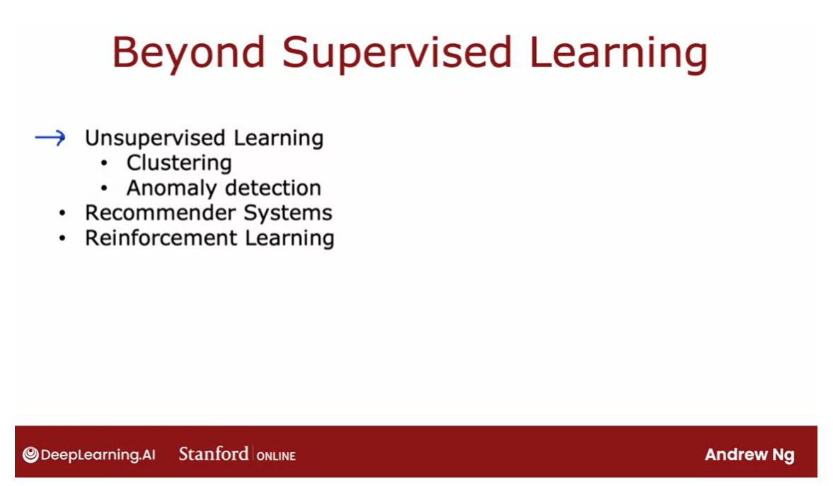
What you’ll learn
- Use unsupervised learning techniques for unsupervised learning: including clustering and anomaly detection
- Build recommender systems with a collaborative filtering approach and a content-based deep learning method
- Build a deep reinforcement learning model
This week, you will learn two key unsupervised learning algorithms: clustering and anomaly detection
Learning Objectives
- Implement the k-means clustering algorithm
- Implement the k-means optimization objective
- Initialize the k-means algorithm
- Choose the number of clusters for the k-means algorithm
- Implement an anomaly detection system
- Decide when to use supervised learning vs. anomaly detection
- Implement the centroid update function in k-means
- Implement the function that finds the closest centroids to each point in k-means
Welcome
Welcome to this third
and final course of this specialization on
unsupervised learning, recommender systems, and
reinforcement learning.
Give an extra set of tools
Whereas in the first two courses, we spent a lot of time
on supervised learning, in this third and final course, we’ll talk about a new
set of techniques that goes beyond supervised
learning and we’ll give you an extra set of powerful tools that I
hope you enjoy adding to your tool sets and
by the time you finish this course and
finish this specialization,
I think you’ll be
well on your way to being an expert in
machine learning.
Let’s take a look.
This week we’ll start with supervised learning.
In particular, you’ll learn
about clustering algorithms, which is a way of grouping
data into clusters, as well as anomaly detection.
Both of these are
techniques used by many companies today, in important commercial
applications.
By the end of this week, you know how these
algorithms work and be able to get them to
work with yourself as well.
In the second week, you will learn about
recommender systems.When you go to a online shopping websites or
a video streaming website, how does it recommend
products or movies to you?
Recommender systems is one of the most commercially important machine learning technologies, is moving many
billions of dollars worth of value or products
or other things around, is one of the technologies
that receives surprisingly little
attention from academia, despite how important it is.
But in the second week, I hope you learn
how these systems work and be able to
implement one for yourself.If you are curious about how
online ads systems work, the description of
recommender systems will also give you
a sense for how those large online
ad tech companies decide what ads to show you.
In the third and final
week of this course, you’ll learn about
reinforcement learning.You may have read in the news about reinforcement
learning being great at playing a variety of video games, even
outperforming humans.
I’ve also used reinforcement
learning many times myself to control a variety
of different robots.
Even though reinforcement
learning is a new and emerging
technology, that is, the number of commercial
applications of reinforcement learning
is not nearly as large as the other techniques covered in this week
or in previous weeks, is a technology that
is exciting and is opening up a new frontier to what you can get learning
algorithms to do.
In the final week, you implement a reinforcement
learning yourself and use it to land a
simulated moon lander.When you see that working for yourself with your own code, later in this course, I think you’ll be
impressed by what you can get reinforcement
learning to do.
I’m really excited
to be here with you to talk about
unsupervised learning, recommender systems, and
reinforcement learning.
Let’s go on to the next
video where you learn about an important unsupervised
learning algorithm called a clustering algorithm.
[1] Clustering
What is clustering?
聚类是一种无监督学习技术,旨在将数据集中的对象分成具有相似特征的组。这些组,也称为簇,内部的成员之间相似度较高,而不同组之间的成员则相似度较低。聚类算法旨在通过最大化簇内相似度和最小化簇间相似度来实现这一目标。常见的聚类算法包括K均值聚类、层次聚类和DBSCAN等。聚类在数据挖掘、模式识别、图像分割等领域中得到广泛应用。
What is clustering?
A clustering algorithm looks at a number of data points and automatically finds
data points that are related or similar to each other.
Let’s take a look
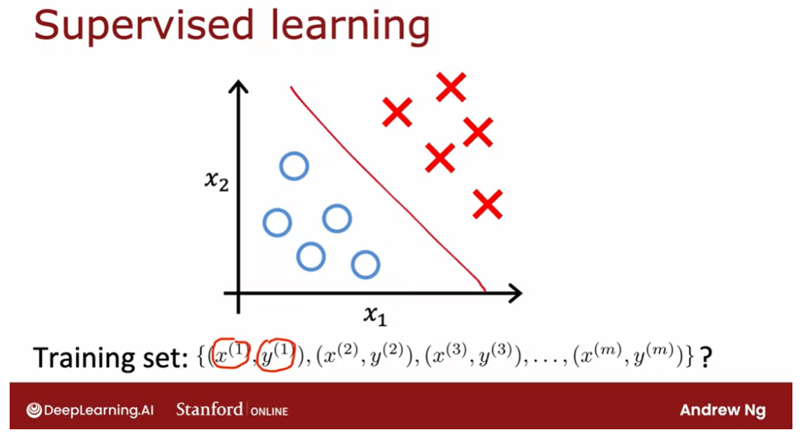
at what that means. Let me contrast clustering, which is an unsupervised
learning algorithm, with what you had
previously seen with supervised learning for
binary classification.
Given a dataset like this
with features x_1 and x_2. With supervised learning, we
had a training set with both the input features x as
well as the labels y. We could plot a dataset
like this and fit, say, a logistic regression
algorithm or a neural network to learn a
decision boundary like that.
In supervised learning,
the dataset included both the inputs x as well
as the target outputs y. In contrast, in
unsupervised learning, you are given a dataset
like this with just x, but not the labels or
the target labels y.
That’s why when I
plot a dataset, it looks like this, with just dots rather
than two classes denoted by the x’s and the o’s. Because we don’t have
target labels y, we’re not able to tell the algorithm what is
the “right answer, y” that we wanted to predict.
Instead, we’re going to
ask the algorithm to find something interesting
about the data, that is to find some interesting structure about this data.
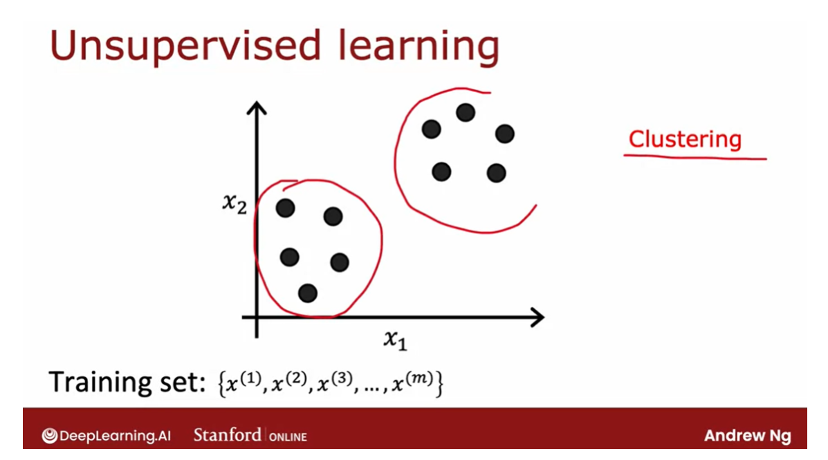
Unsupervised learning
But the first unsupervised
learning algorithm that you learn about is called
a clustering algorithm, which looks for one
particular type of structure in the data.
Namely, look at the dataset
like this and try to see if it can be
grouped into clusters, meaning groups of points that
are similar to each other.A clustering algorithm,
in this case, might find that this dataset comprises of data from
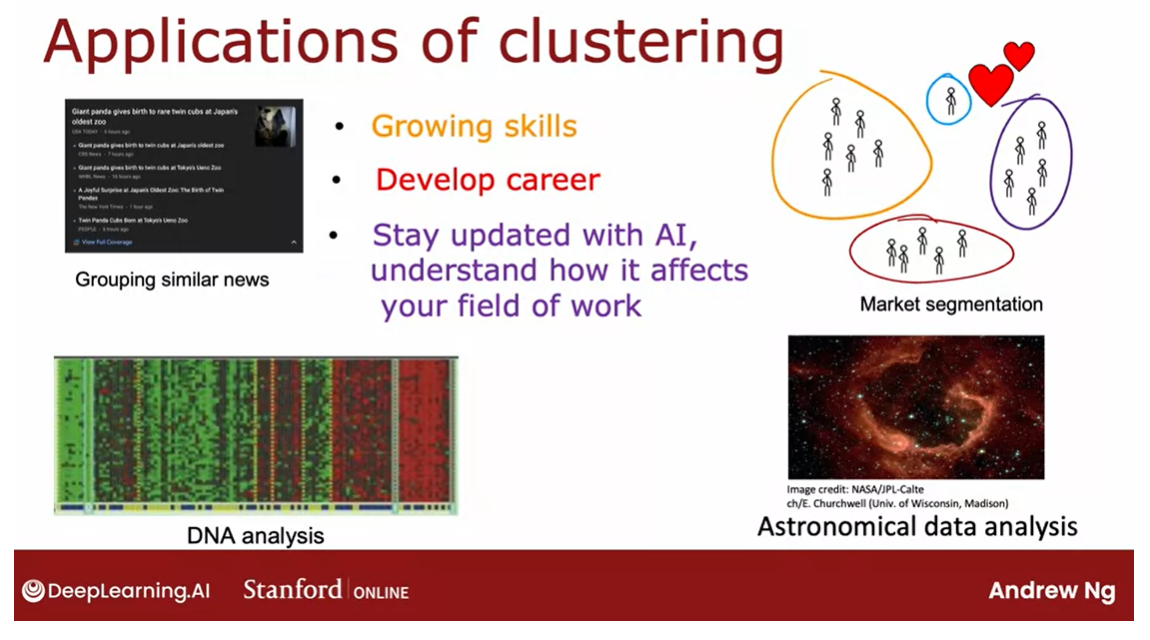
two clusters shown here. Here are some applications
of clustering.
Application
In the first week of
the first course, you heard me talk about grouping similar news
articles together, like the story about Pandas
or market segmentation, where at deeplearning.ai, we discovered that there
are many learners that come here because you may want
to grow your skills, or develop your careers, or stay updated with AI and understand how it
affects your field of work. We want to help
everyone with any of these skills to learn
about machine learning, or if you don’t fall into
one of these clusters, that’s totally fine too. I hope deeplearning.ai and Stanford Online’s materials will be useful to you as well.
Clustering has also been
used to analyze DNA data, where you will look at the
genetic expression data from different individuals
and try to group them into people that
exhibit similar traits.
I find astronomy and space
exploration fascinating. One application that
I thought was very exciting was astronomers using clustering for astronomical
data analysis to group bodies in
space together for their own analysis of
what’s going on in space.
One of the applications I found fascinating was
astronomers using clustering to group bodies
together to figure out which ones form one galaxy or which one form coherent
structures in space.
Clustering today
is used for all of these applications
and many more. In the next video, let’s take a look at the most commonly used
clustering algorithm called the k-means algorithm, and let’s take a look
at how it works.
K-means Intuition
K均值算法的直观理解是一种基于距离的聚类方法。该算法首先随机选择k个中心点作为初始簇中心,然后将数据点分配到最近的中心点所代表的簇中。接着,计算每个簇的新中心点,即取簇中所有点的平均值。然后,将新计算出的中心点作为簇的新中心,重复这个过程直到簇的中心点不再改变或者达到指定的迭代次数。这样,最终得到的簇会尽可能地将数据点分为K个具有相似特征的组。
Let’s take a look at what the K-means
clustering algorithm does. Let me start with an example. Here I’ve plotted a data set with
30 unlabeled training examples. So there are 30 points. And what we like to do is run
K-means on this data set.
The first thing that the K-means algorithm
does is it will take a random guess at where might be the centers of the two
clusters that you might ask it to find.In this example I’m going to ask
it to try to find two clusters. Later in this week we’ll talk about how you might decide how
many clusters to find.
But the very first step is it
will randomly pick two points, which I’ve shown here as a red cross and
the blue cross, at where might be the centers
of two different clusters. This is just a random initial guess and
they’re not particularly good guesses. But it’s a start.
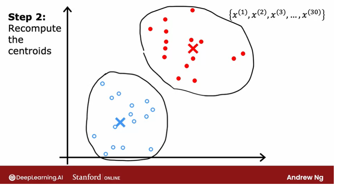
第一步:每个点的颜色赋值成最近的质心的颜色。
第二步:重新计算质心。
不停重复上述两步。
Assign each point to its closest centroid
One thing I hope you take away from
this video is that K-means will repeatedly do two different things.The first is assign points
to cluster centroids and the second is move cluster centroids.
Let’s take a look at what this means. The first of the two steps is it will
go through each of these points and look at whether it is closer to
the red cross or to the blue cross.The very first thing that K-means
does is it will take a random guess at where are the centers of the cluster? And the centers of the cluster
are called cluster centroids. After it’s made an initial guess
at where the cluster centroid is, it will go through all of these examples,
x(1) through x(30), my 30 data points.
And for each of them it will check if it
is closer to the red cluster centroid, shown by the red cross, or if it’s
closer to the blue cluster centroid, shown by the blue cross. And it will assign each of these
points to whichever of the cluster centroids It is closer to.
I’m going to illustrate that by
painting each of these examples, each of these little round dots,
either red or blue, depending on whether that example is closer to
the red or to the blue cluster centroid.
So this point up here is closer to the red
centroid, which is why it’s painted red. Whereas this point down there is
closer to the blue cluster centroid, which is why I’ve now painted it blue.
So that was the first of the two things
that K-means does over and over. Which is a sign points
to clusters centroids. And all that means is it will associate
which I’m illustrating with the color, every point of one of
the cluster centroids.
The second of the two steps
that K-means does is, it’ll look at all of the red points and
take an average of them. And it will move the red cross
to whatever is the average location of the red dots,
which turns out to be here.
And so the red cross, that is the red
cluster centroid will move here. And then we do the same thing for
all the blue dots. Look at all the blue dots, and
take an average of them, and move the blue cross over there. So you now have a new location for
the blue cluster centroid as well.
Recompute the centroids
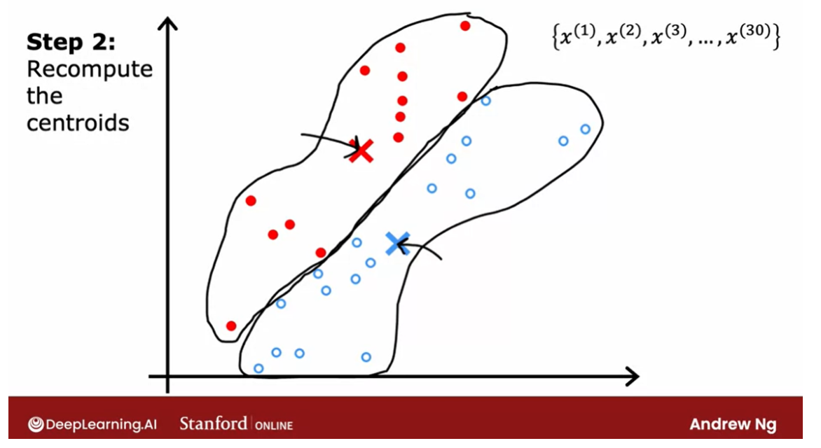
repeat these 2 steps
In the next video we’ll look at
the mathematical formulas for how to do both of these steps. But now that you have these new and
hopefully slightly improved guesses for the locations of the two cluster centroids, we’ll look through all of
the 30 training examples again. And check for every one of them,
whether it’s closer to the red or the blue cluster centroid for
the new locations.
And then we will associate them which
are indicated by the color again, every point to the closer
cluster centroid. And if you do that, you see that
the field points change color.
So for example, this point is colored red, because it was closer to the red
cluster centroid previously. But if we now look again,
it’s now actually closer to the blue cluster centroid, because the
blue and red cluster centroids have moved.So if we go through and
associate each point with the closer cluster centroids, you end up with this.
And then we just repeat
the second part of K-means again. Which is look at all of the red dots and
compute the average. And also look at all of the blue dots and compute the average location
of all of the blue dots. And it turns out that you end up
moving the red cross over there and the blue cross over here. And we repeat.
Let’s look at all of the points again and
we color them, either red or blue, depending on which
cluster centroid that is closer to. So you end up with this. And then again, look at all of the red
dots and take their average location, and look at all the blue dots and
take the average location, and move the clusters to the new locations. And it turns out that if you were to keep
on repeating these two steps, that is look at each point and assign it to
the nearest cluster centroid and then also move each cluster centroid to the mean
of all the points with the same color.
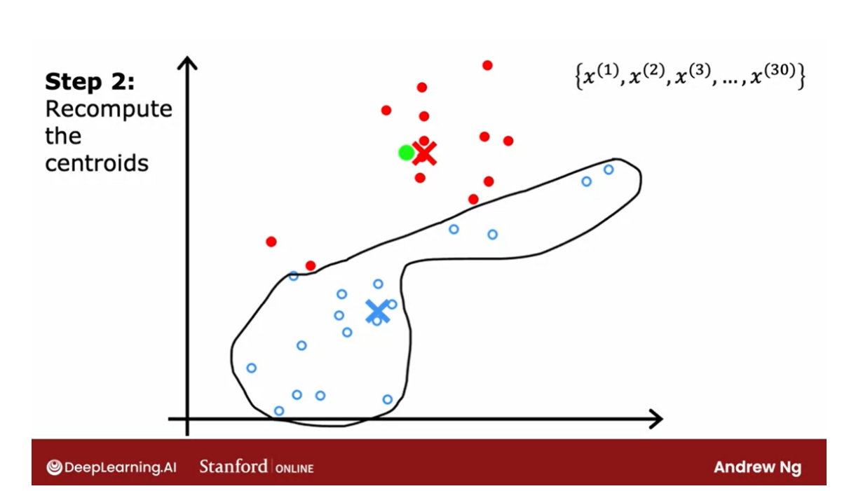
The last: the point’s color doesn’t change
If you keep on doing those two steps,
you find that there are no more changes to the colors of the points or to
the locations of the clusters centroids.
And so this means that at this point
the K-means clustering algorithm has converged. Because applying those two steps over and
over, results in no further changes to either the assignment
to point to the centroids or the location of the cluster centroids. In this example, it looks like
K-means has done a pretty good job. It has found that these points up
here correspond to one cluster, and these points down here
correspond to a second cluster.
So now you’ve seen an illustration
of how K-means works. The two key steps are, assign every
point to the cluster centroid, depending on what cluster
centroid is nearest to. And second move each cluster
centroid to the average or the mean of all the points
that were assigned to it. In the next video,
we’ll look at how to formalize this and write out the algorithm that does
what you just saw in this video. Let’s go on to the next video.
K-means Algorithm
In the last video, you saw an illustration of the
k-means algorithm running. Now let’s write out the
K-means algorithm in detail so that you’d be able to implement
it for yourself.
assign points to cluster centroids.
Here’s the K-means algorithm. The first step is to randomly initialize
K cluster centroids, Mu 1 Mu 2, through Mu k. In the
example that we had, this corresponded
to when we randomly chose a location for the red cross and for the blue cross corresponding to the two cluster centroids. In our example, K
was equal to two. If the red cross was cluster centroid one and the blue cross
was cluster centroid two. These are just two indices to denote the first and
the second cluster.
Then the red cross would
be the location of Mu 1 and the blue cross would
be the location of Mu 2. Just to be clear, Mu 1 and Mu 2 are vectors which have the same dimension as
your training examples, X1 through say X30,
in our example.
All of these are lists of
two numbers or they’re two-dimensional
vectors or whatever dimension the training data had. We had n equals two
features for each of the training examples
then Mu 1 and Mu 2 will also be
two-dimensional vectors, meaning vectors with
two numbers in them.
Having randomly initialized
the K cluster centroids, K-means will then
repeatedly carry out the two steps that you
saw in the last video.
The first step is to
assign points to clusters, centroids, meaning color,
each of the points, either red or blue, corresponding to assigning
them to cluster centroids one or two when K is equal to two. Rinse it out enough. That means that we’re going to, for I equals one through m
for all m training examples, we’re going to set c^i to
be equal to the index, which can be anything
from one to K of the cluster centroid closest
to the training example x^i.Mathematically you
can write this out as computing the distance between x^i and Mu k. In math, the distance between two points is often written like this. It is also called the L2 norm.
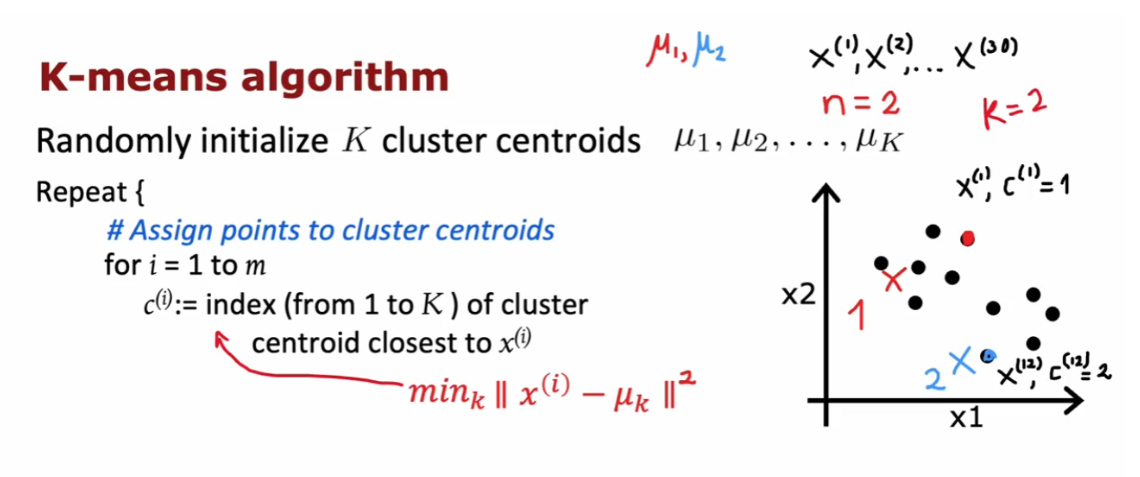
What you want to
find is the value of k that minimizes this, because that corresponds to
the cluster centroid Mu k that is closest to the
training example x^i. Then the value of k
that minimizes this is what gets set to c^i. When you implement
this algorithm, you find that it’s
actually a little bit more convenient to minimize the squared distance because
the cluster centroid with the smallest square
distance should be the same as the cluster centroid
with the smallest distance.
When you look at this week’s optional
labs and practice labs, you see how to implement
this in code for yourself. As a concrete example, this point up here is closer to the red or two
cluster centroids 1. If this was training
example x^1, we will set c^1
to be equal to 1. Whereas this point over here, if this was the 12th
training example, this is closer to the second cluster
centroids the blue one. We will set this, the corresponding
cluster assignment variable to two because it’s closer to cluster centroid 2.
move the cluster centroids.
That’s the first step of
the K-means algorithm, assign points to
cluster centroids.The second step is to move
the cluster centroids. What that means is for lowercase
k equals 1 to capital K, the number of clusters. We’re going to set the cluster centroid
location to be updated to be the average or the
mean of the points assigned to that
cluster k.
Concretely, what that means is,
we’ll look at all of these red points, say, and look at their position on the horizontal axis and look at the value of the
first feature x^1, and average that out. Compute the average value on
the vertical axis as well.After computing
those two averages, you find that the mean is here, which is why Mu 1, that is the location that
the red cluster centroid gets updated as follows. Similarly, we will
look at all of the points that were
colored blue, that is, with c^i equals 2 and computes the average of the
value on the horizontal axis, the average of their feature x1. Compute the average
of the feature x2.
Those two averages give you the new location of the
blue cluster centroid, which therefore moves over here. Just to write those out in math. If the first cluster
has assigned to it training examples 1,5,6,10. Just as an example.Then what that means is you will compute the average this way. Notice that x^1, x^5, x^6, and x^10 are training examples. Four training examples, so we divide by 4 and this gives you the new location of Mu1, the new cluster
centroid for cluster 1.
To be clear, each
of these x values are vectors with two
numbers in them, or n numbers in them if
you have n features, and so Mu will also have
two numbers in it or n numbers in it if you have
n features instead of two.
Now, there is one corner
case of this algorithm, which is what happens if a cluster has zero training
examples assigned to it.In that case, the
second step, Mu k, would be trying to compute
the average of zero points. That’s not well-defined. If that ever happens, the most common
thing to do is to just eliminate that cluster. You end up with K
minus 1 clusters. Or if you really, really need K clusters an alternative
would be to just randomly reinitialize
that cluster centroid and hope that it
gets assigned at least some points
next time round.
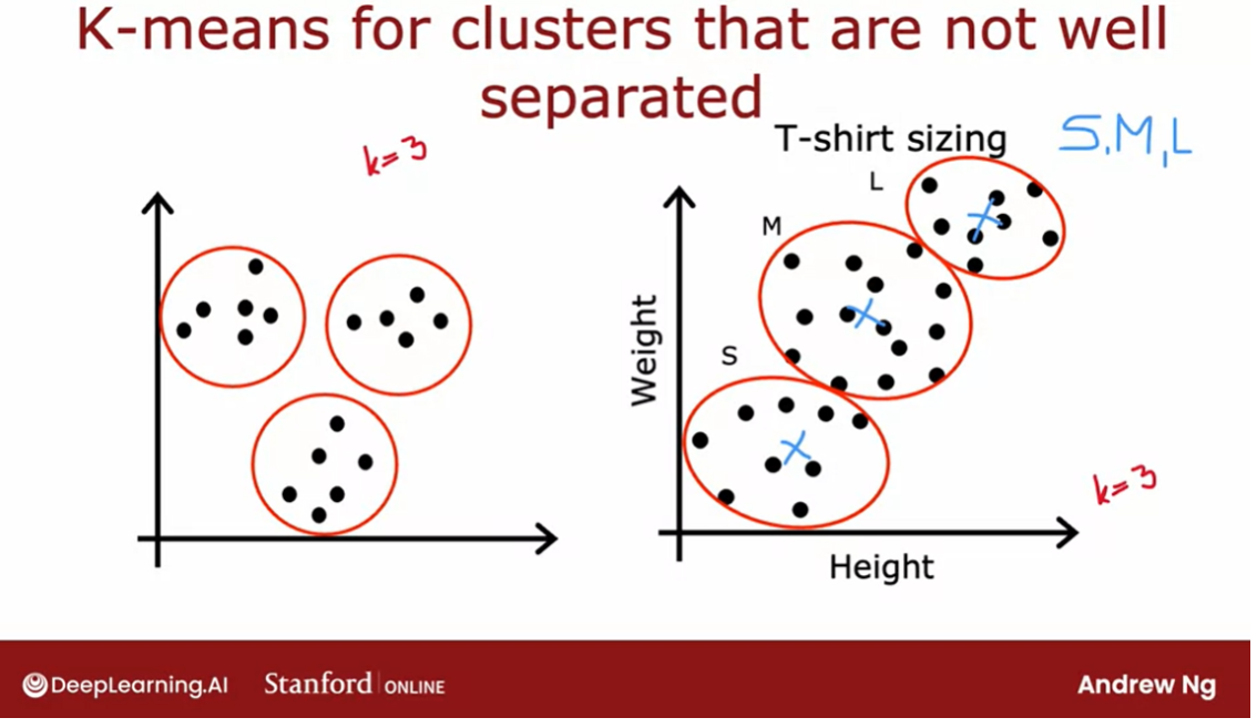
K-means for clusters that are not well separated
But it’s actually more common when running
K-means to just eliminate a cluster if no
points are assigned to it. Even though I’ve
mainly been describing K-means for clusters
that are well separated. Clusters that may
look like this. Where if you asked her
to find three clusters, hopefully they will find these
three distinct clusters. It turns out that K-means is
also frequently applied to data sets where the clusters
are not that well separated.
For example, if you are a designer and manufacturer
of cool t-shirts, and you want to decide, how do I size my small, medium, and large t-shirts. How small should a small be, how large should a large be, and what should a medium-size
t-shirt really be?
One thing you might
do is collect data of people likely to buy your t-shirts based on
their heights and weights. You find that the height and
weight of people tend to vary continuously
on the spectrum without some very
clear clusters.
Nonetheless, if you
were to run K-means with say, three
clusters centroids, you might find
that K-means would group these points
into one cluster, these points into
a second cluster, and these points into
a third cluster.
If you’re trying to decide exactly how to size your small, medium, and large t-shirts, you might then choose
the dimensions of your small t-shirt
to try to make it fit these individuals well. The medium-size t-shirt to try to fit these
individuals well, and the large t-shirt to try to fit these individuals well with potentially the
cluster centroids giving you a sense of what is the most representative
height and weight that you will want your three
t-shirt sizes to fit.
This is an example of K-means working just fine and giving a useful results even
if the data does not lie in well-separated
groups or clusters.
That was the K-means
clustering algorithm. Assign cluster centroids
randomly and then repeatedly assign points to
cluster centroids and move the cluster centroids.
But what this algorithm
really doing and do we think this algorithm will
converge or they just keep on running forever
and never converge. To gain deeper intuition about
the K-means algorithm and also see why we might hope
this algorithm does converge, let’s go on to the next
video where you see that K-means is actually trying to optimize a specific
cost function. Let’s take a look at
that in the next video.
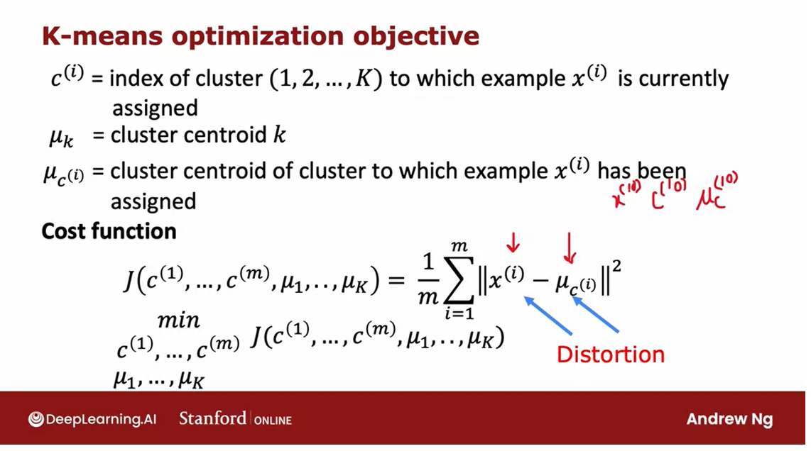
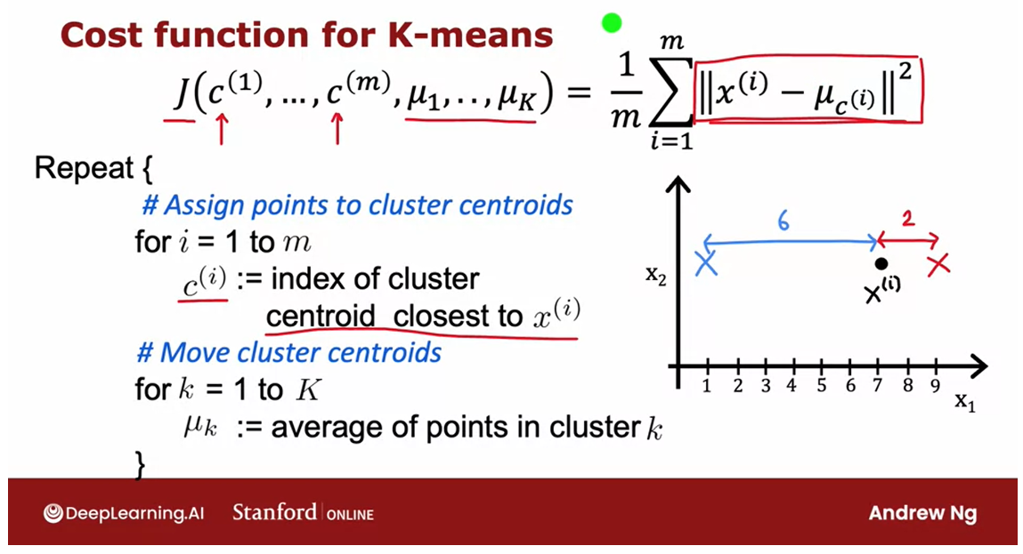
Optimization objective
In the earlier courses, courses one and two
of the specialization, you saw a lot of supervised learning algorithms as taking
training set posing a cost function. And then using grading descent or some other algorithms to
optimize that cost function. It turns out that the
K-means algorithm that you saw in the last video is also
optimizing a specific cost function.
Although the optimization algorithm that
it uses to optimize that is not gradient descent is actually the algorithm that
you already saw in the last video. Let’s take a look at what all this means.Let’s take a look at what is
the cost function for K-means, to get started as a reminder
this is a notation we’ve been using whereas CI is
the index of the cluster. So CI is some number from one
Su K of the index of the cluster to which training example XI
is currently assigned and new K is the location
of cluster centroid k.
Let me introduce one
more piece of notation, which is when lower case K equals CI. So mu subscript CI is
the cluster centroid of the cluster to which example
XI has been assigned.
So for example, if I were to look at some
training example C train example 10 and I were to ask What’s the location
of the clustering centroids to which the 10th training example
has been assigned?Well, I would then look up C10. This will give me a number from one to K. That tells me was example 10
assigned to the red or the blue or some other cluster centroid,
and then mu subscript C- 10 is the location of the cluster centroid
to which extent has been assigned.
So armed with this notation,
let me now write out the cost function that K means
turns out to be minimizing. The cost function J,
which is a function of C1 through CM. These are all the assignments of
points to clusters Androids as well as new one through mu capsule K.These are the locations of all
the clusters centroid is defined as this expression on the right.
It is the average, so
one over M some from i equals to m of the squared distance
between every training example XI as I goes from one through M it
is a square distance between X I. And Nu subscript C high.So this quantity up here, in other words,
the cost function good for K is the average squared distance
between every training example XI. And the location of the cluster centroid
to which the training example exile has been assigned.
So for this example up here we’ve
been measuring the distance between X10 and mu subscript C10. The cluster centroid to which extent has
been assigned and taking the square of that distance and that would be one of the
terms over here that we’re averaging over. And it turns out that what the K means
algorithm is doing is trying to find assignments of points of clusters
centroid as well as find locations of clusters centroid that
minimizes the squared distance.
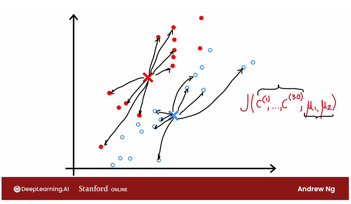
Visually, here’s what you
saw part way into the run of K means in the earlier video. And at this step the cost function. If you were to computer it would be to
look at everyone at the blue points and measure these distances and
computer square. And then also similarly look at
every one of the red points and compute these distances and
compute the square. And then the average of the squares
of all of these differences for the red and the blue points is
the value of the cost function J, at this particular configuration
of the parameters for K-means.
And what they will do on every
step is try to update the cluster assignments C1 through
C30 in this example. Or update the positions of
the cluster centralism, U1 and U2. In order to keep on reducing
this cost function J.
Distortion function
By the way,
this cost function J also has a name in the literature is called
the distortion function. I don’t know that this is a great name. But if you hear someone talk about the key
news algorithm and the distortion or the distortion cost function, that’s
just what this formula J is computing.
See the algorithm
Let’s now take a deeper
look at the algorithm and why the algorithm is trying to
minimize this cost function J. Or why is trying to minimize
the distortion here on top of copied over the cost function from the previous slide.
It turns out that the first part of K
means where you assign points to cluster centroid. That turns out to be trying
to update C1 through CM. To try to minimize the cost
function J as much as possible while holding mu one through mu K fix.
And the second step, in contrast
where you move the custom centroid, it turns out that is trying
to leave C1 through CM fix. But to update new one through mu K to
try to minimize the cost function or the distortion as much as possible.
Let’s take a look at why this is the case. During the first step, if you want to
choose the values of C1 through CM or save a particular value of
Ci to try to minimize this. Well, what would make Xi minus mu CI as small as possible?
This is the distance or the square
distance between a training example XI. And the location of the class is
central to which has been assigned. So if you want to minimize this
distance or the square distance, what you should do is assign
XI to the closest cluster centroid.
So to take a simplified example,
if you have two clusters centroid say close to central is one and two and
just a single training example, XI. If you were to sign it
to cluster centroid one, this square distance here would be
this large distance, well squared.
And if you were to assign it to cluster
centroid 2 then this square distance would be the square of this
much smaller distance. So if you want to minimize this term,
you will take X I and assign it to the closer centroid, which is
exactly what the algorithm is doing up here.
So that’s why the step where you assign
points to a cluster centroid is choosing the values for CI to try to minimize J. Without changing, we went through
the mu K for now, but just choosing the values of C1 through CM to try to
make these terms as small as possible.
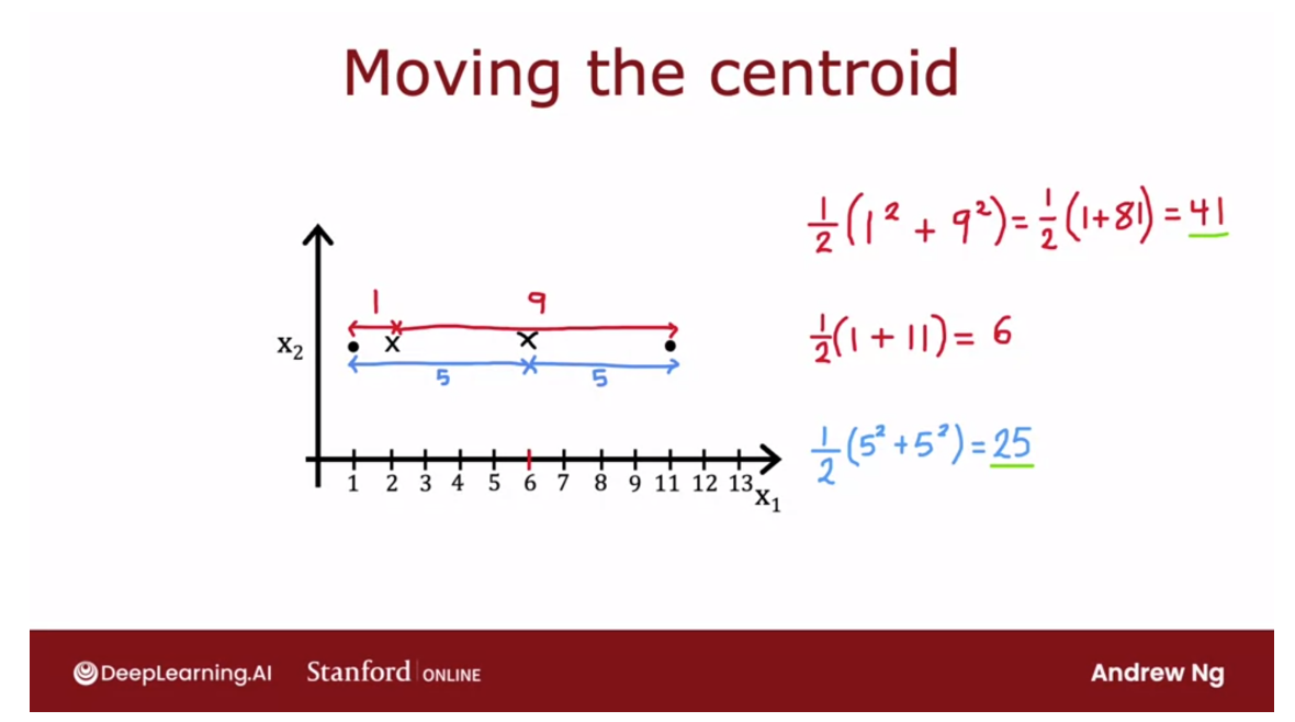
Moving the centroid
用一个图示例子来看移动质心之后cost function的计算过程
How about the second step of
the K-means algorithm that is to move to clusters centroids? It turns out that choosing mu K to be
average and the mean of the points assigned is the choice of these terms
mu that will minimize this expression.
To take a simplified example, say you have a cluster with just two
points assigned to it shown as follows. And so with the cluster centroid here, the average of the square
distances would be a distance of one here squared plus this distance here,
which is 9 squared. And then you take the average
of these two numbers. And so that turns out to
be one half of 1 plus 81, which turns out to be 41.
But if you were to take the average
of these two points, so (1+ 11)/2, that’s equal to 6. And if you were to move
the cluster centroid over here to middle than the average of
these two square distances, turns out to be a distance of five and
five here. So you end up with one half of 5 squared
plus 5 squared, which is equal to 25. And this is a much smaller
average squared distance than 41.
And in fact, you can play around with
the location of this cluster centroid and maybe convince yourself that
taking this mean location. This average location in the middle
of these two training examples, that is really the value that
minimizes the square distance.
So the fact that the K-means algorithm
is optimizing a cost function J means that it is guaranteed to converge,
that is on every single iteration. The distortion cost function should go
down or stay the same, but if it ever fails to go down or stay the same,
in the worst case, if it ever goes up.
That means there’s a bug in the code,
it should never go up because every single step of K means
is setting the value CI and mu K to try to reduce the cost function. Also, if the cost function
ever stops going down, that also gives you one way to
test if K means has converged.
Once there’s a single iteration
where it stays the same. That usually means K means has converged
and you should just stop running the algorithm even further or in some rare cases
you will run K means for a long time. And the cost function of the distortion
is just going down very, very slowly, and that’s a bit like gradient descent
where maybe running even longer might help a bit.
But if the rate at which the cost function
is going down has become very, very slow. You might also just say
this is good enough. I’m just going to say it’s
close enough to convergence and not spend even more compute cycles
running the algorithm for even longer.
So these are some of the ways that
computing the cost function is helpful helps you figure out if
the algorithm has converged. It turns out that there’s
one other very useful way to take advantage of the cost function, which is to use multiple different random
initialization of the cluster centroid. It turns out if you do this, you can often
find much better clusters using K means, let’s take a look at the next
video of how to do that.
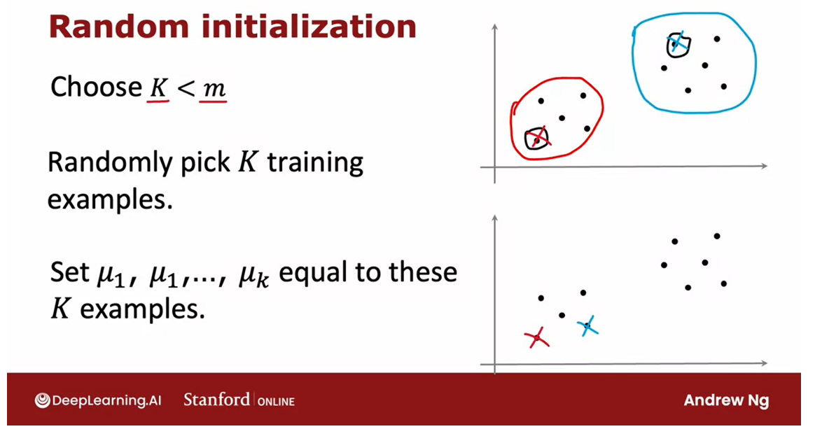
Initializing K-means
choose random locations as the initial guesses for the cluster centroids
The very first step of the K means
clustering algorithm, was to choose random locations as the initial guesses for
the cluster centroids mu one through mu K.
But how do you actually
take that random guess. Let’s take a look at that in this video,
as well as how you can take multiple attempts at the initial guesses
with mu one through mu K.That will result in your finding
a better set of clusters.
See how to take the random guesses.
Let’s take a look,here again is the K means algorithm and in this video let’s take a look at how
you can implement this first step.
The number of cluster centroids K is less the the training examples m
When running K means you should pretty
much always choose the number of cluster central’s K to be
lessened to training examples m.
It doesn’t really make sense to have
K greater than m because then there won’t even be enough training examples
to have at least one training example per cluster centroids.So in our earlier example we had
K equals two and m equals 30.
Choose the cluster centroids: randomly pick K training examples
In order to choose the cluster centroids, the most common way is to randomly
pick K training examples.
So here is a training set where if I were
to randomly pick two training examples, maybe I end up picking this one and
this one.
Set mu1 to mu k equal to these K training examples
And then we would set mu one through mu
K equal to these K training examples.So I might initialize my
red cluster centroid here, and initialize my blue
cluster sent troy over here, in the example where K was equal to two.
And it turns out that if this was
your random initialization and you were to run K means you
pray end up with K means deciding that these are the two
classes in the data set.
Notes that this method of initializing the
cost of centroids is a little bit different than what I had used in
the illustration in the earlier videos.Where I was initializing the cluster
centroids mu one and mu two to be just random points rather than sitting on
top of specific training examples.I’ve done that to make the illustrations
clearer in the earlier videos.
Much more common way to initialize the cluster centroids: in this slide
But what I’m showing in this slide is
actually a much more commonly used way of initializing the clusters centroids.
Now with this method there is a chance
that you end up with an initialization of the cluster centroids where the red cross
is here and maybe the blue cross is here.
And depending on how you choose
the random initial central centroids kineys\g raw end up picking a difference
set of causes for your data set.
A slightly more complex example
Let’s look at a slightly more complex
example, where we’re going to look at this data set and try to find three
clusters so k equals three in this data.
If you were to run K means with one random
initialization of the cluster centroid, you may get this result up here and
this looks like a pretty good choice.Pretty good clustering of the data
into three different clusters.
turn out to be a local optima
But with a different initialization,
say you had happened to initialize two of the cluster centroids
within this group of points.And one within this group of points,
after running k means you might end up with this clustering,
which doesn’t look as good.
And this turns out to be a local optima,
in which K-means is trying to minimize the distortion cost function,
that cost function J of C1 through CM and mu one through
mu K that you saw in the last video.
get stuck in a local minimum
But with this less fortunate
choice of random initialization, it had just happened to get
stuck in a local minimum.
Another example of a local minimum.
And here’s another example
of a local minimum, where a different random initialization
course came in to find this clustering of the data
into three clusters, which again doesn’t seem as good as
the one that you saw up here on top.
Try multiple random intitialization
So if you want to give k means multiple
shots at finding the best local optimum.If you want to try multiple
random initialization, so give it a better chance of finding
this good clustering up on top.
Run the k means algorithm multiple times and try to find the best local optima.
One other thing you could
do with the k means algorithm is to run it multiple times and
then to try to find the best local optima.
Choose between different solutions: calculate the cost functions, choose the lowest value.
And it turns out that if you were
to run k means three times say, and end up with these three
distinct clusterings.Then one way to choose between
these three solutions, is to compute the cost function J for
all three of these solutions, all three of these choices of
clusters found by k means.
And then to pick one of these
three according to which one of them gives you the lowest value for
the cost function J.
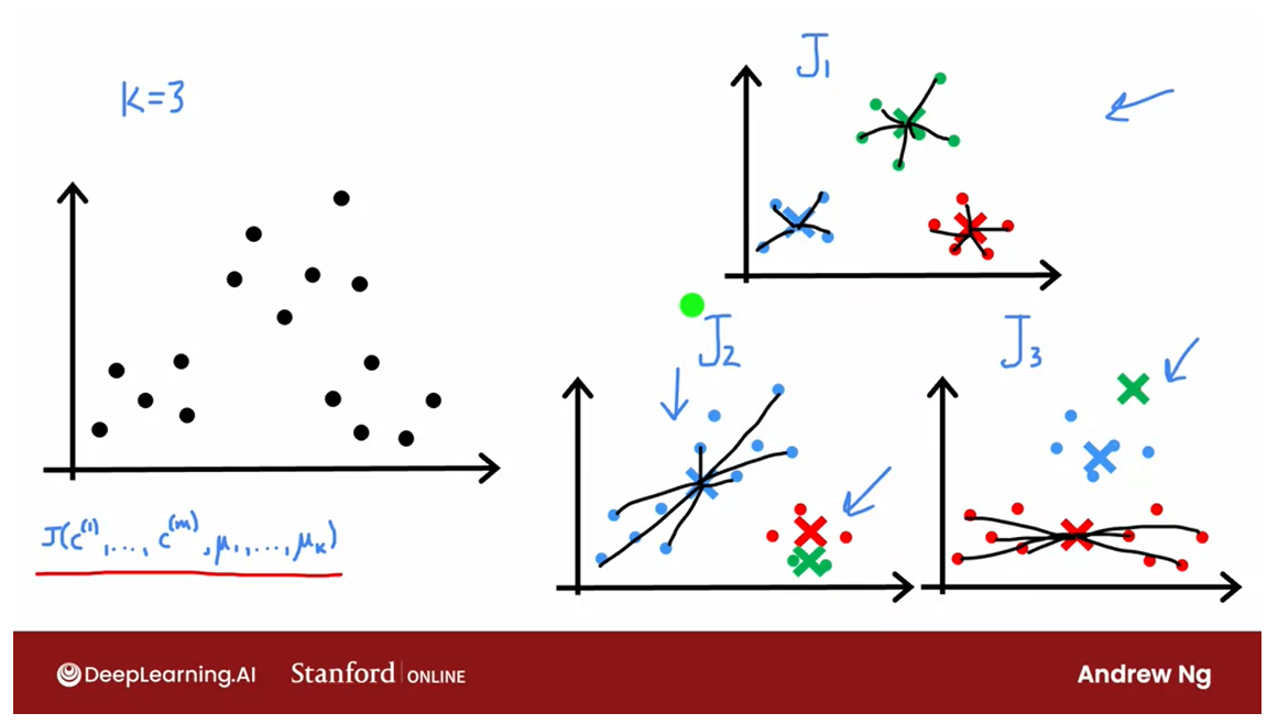
Cost function J of three grouping of clusters
Selecting a choice of the cluster centroids
And in fact, if you look at this
grouping of clusters up here, this green cross has relatively small
square distances, all the green dots. The red cross is relatively small distance
and red dots and similarly the blue cross.
And so the cost function J will be
relatively small for this example on top.
But here, the blue cross has larger
distances to all of the blue dots. And here the red cross has larger
distances to all of the red dots, which is why the cost function J, for
these examples down below would be larger.Which is why if you pick
from these three options, the one with the smallest distortion
of the smallest cost function J.You end up selecting this choice
of the cluster centroids.
So let me write this out more formally
into an algorithm, and wish you would ranking means multiple times using
different random initialization.
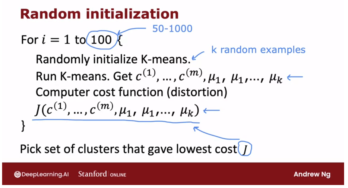
100 random initialization for K means
Here’s the algorithm, if you want to
use 100 random initialization for K-means, then you would run
100 times randomly initialized K-means using the method that
you saw earlier in this video.
Pick K training examples and let the cluster centroids initially be the location of these K training examples.
Pick K training examples and
let the cluster centuries initially be the locations of
those K training examples.
Using that random initialization,
run the K-means algorithm to convergence.And that will give you a choice of cluster
assignments and cluster centroids.And then finally, you would compute the distortion
compute the cost function as follows.
After doing this, say 100 times, you would finally pick the set of
clusters, that gave the lowest cost.And it turns out that if you do
this will often give you a much better set of clusters,
with a much lower distortion function than if you were to
run K means only a single time.
50 ~ 1000 is pretty common: random initializations
I plugged in the number up here as 100. When I’m using this method, doing this somewhere between say 50
to 1000 times would be pretty common.Where, if you run this procedure
a lot more than 1000 times, it tends to get computational expensive.And you tend to have diminishing
returns when you run it a lot of times.
Whereas trying at least maybe 50 or 100 random initializations,
will often give you a much better result than if you only had one shot at
picking a good random initialization.
But with this technique you are much more
likely to end up with this good choice of clusters on top. And these less superior local
minima down at the bottom.
So that’s it, when I’m using
the K means algorithm myself, I will almost always use more
than one random initialization.Because it just causes K means to do a
much better job minimizing the distortion cost function and finding a much better
choice for the cost of centroids.
One more video
Before we wrap up our
discussion of K means, there’s just one more video in
which I hope to discuss with you. The question of how do you choose
the number of clusters centroids? How do you choose the value of K? Let’s go on to the next video
to take a look at that.
Choosing the number of clusters
The k-means algorithm requires
as one of its inputs, k, the number of clusters
you want it to find, but how do you decide how
many clusters to used.Do you want two clusters
or three clusters of five clusters or 10
clusters? Let’s take a look.
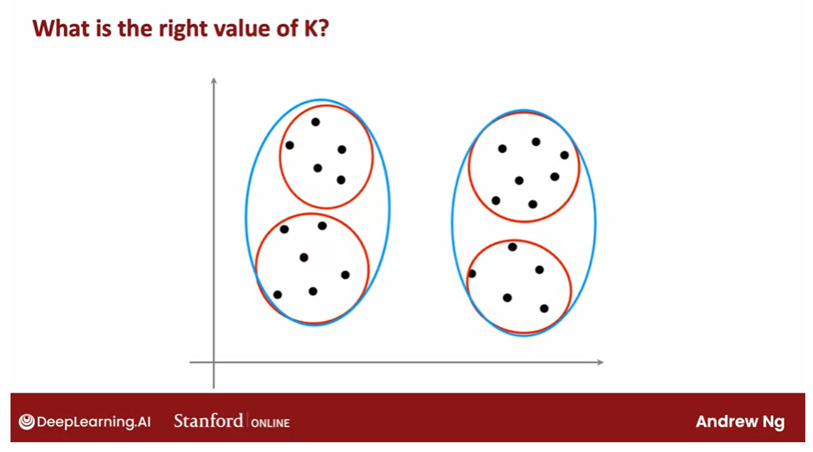
For a lot of
clustering problems, the right value of K
is truly ambiguous. If I were to show different people the
same data set and ask, how many clusters do you see?There will definitely be
people that will say, it looks like there are
two distinct clusters and they will be right. There would also be
others that will see actually four distinct clusters. They would also be right.
Clustering is unsupervised learning algorithm
Because clustering is unsupervised learning
algorithm you’re not given the quote right
answers in the form of specific labels
to try to replicate.
选择适当的 K(簇的数量)是 K 均值聚类中的一个关键问题。虽然没有一种确定性的方法来选择最佳的 K,但有几种启发式方法可以帮助您做出决策:
-
肘部法则(Elbow Method):这是最常用的方法之一。它涉及在不同的 K 值下运行 K 均值算法,并绘制每个 K 值对应的簇内平方和(SSE)的曲线图。随着 K 值的增加,SSE通常会逐渐减小。但是,当 K 值增加到某个值时,SSE的下降速度会明显变缓,形成一个“肘部”。这个肘部对应的 K 值通常被认为是最佳的选择。
-
轮廓系数(Silhouette Score):轮廓系数是一种衡量聚类结果的质量的指标。对于每个样本,它衡量了它与同一簇中其他点的相似度与与最近的其他簇中的点的相似度之间的差异。轮廓系数的取值范围在 -1 到 1 之间,值越接近 1 表示聚类效果越好。您可以尝试不同的 K 值,选择具有最高轮廓系数的那个作为最佳的 K。
-
专家知识:有时候,根据您对数据的领域知识或者对问题的理解,您可能已经有了一些关于簇的数量的估计。这种先验知识可以作为选择 K 的重要依据。
-
交叉验证:如果您的数据集足够大,您可以考虑使用交叉验证来评估不同 K 值下的聚类效果。将数据集分成训练集和验证集,然后使用训练集来训练 K 均值模型,并使用验证集来评估不同 K 值的性能。选择在验证集上表现最佳的 K 值。
-
尝试不同的 K 值:最后,如果可能的话,您也可以尝试不同的 K 值,观察聚类结果并根据您的目标和需求进行选择。
综合考虑这些方法,可以帮助您选择合适的 K 值来进行 K 均值聚类。
There are lots of applications
where the data itself does not give a clear indicator for how many clusters
there are in it.
I think it truly is ambiguous if this data has two or four, or maybe three clusters. If you take say, the red one here and the two
blue ones here say.
If you look at the academic
literature on K-means, there are a few techniques
to try to automatically choose the number of clusters to use for a
certain application.I’ll briefly mention one here that you may see
others refer to, although I had to say, I personally do not use
this method myself.
Elbow method: choose the value of K
Run K-means with a variety of values of K and plot the cost function J as a function of the number of clusters.
But one way to try to
choose the value of K is called the elbow method and what that does is you would run K-means with a
variety of values of K and plot the cost function or the distortion function J as a function of the
number of clusters.
What you find is
that when you have very few clusters,
say one cluster, the distortion function or
the cost function J will be high and as you increase
the number of clusters, it will go down,
maybe as follows. and if the curve looks like this, you say, well, it looks like the cost function
is decreasing rapidly until we get
to three clusters but the decrease is
more slowly after that.
Elbow
Let’s choose K equals 3 and this is called
an elbow, by the way, because think of it as analogous to that’s your hand and
that’s your elbow over here.
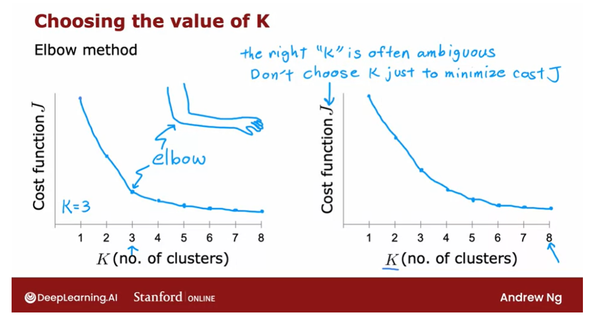
The right K is often ambiguous and the cost function doesn’t have a clear elbow.
Plotting the cost function as a function of K could help, it could help you
gain some insight. I personally hardly ever use the the elbow
method myself to choose the right
number of clusters because I think for a
lot of applications, the right number of
clusters is truly ambiguous and you
find that a lot of cost functions look
like this with just decreases smoothly and it doesn’t have a clear
elbow by wish you could use to pick the
value of K.
By the way, one technique that does
not work is to choose K so as to minimize
the cost function J because doing so would cause you to almost
always just choose the largest possible
value of K because having more clusters will pretty much always reduce the
cost function J.
Choosing K to minimize the cost function J is
not a good technique.
How to choose the value of K and practice?
How do you choose the
value of K and practice?Often you’re running K-means
in order to get clusters to use for some later or
some downstream purpose.
That is, you’re going to
take the clusters and do something with those clusters.
Evaluate K-means based on how well it performs for the downstream purpose.
What I usually do and
what I recommend you do is to evaluate K-means based on how well it performs for that later
downstream purpose.
Example: T-shirt sizing.
Let me illustrate to the
example of t-shirt sizing.One thing you could
do is run K-means on this data set to
find the clusters, in which case you
may find clusters like that and this would be
how you size your small, medium, and large t-shirts, but how many t-shirt
sizes should there be?Well, it’s ambiguous.
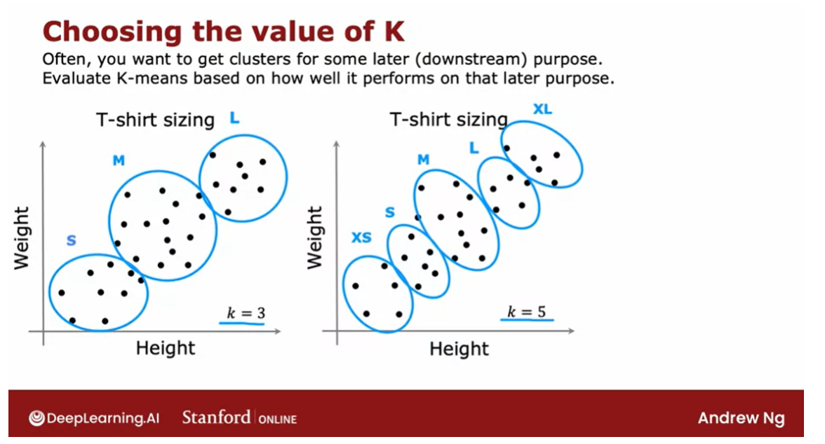
If you were to also run
K-means with five clusters, you might get clusters
that look like this.
This will let shoe size t-shirts according
to extra small, small, medium, large,
and extra large.
Both of these are
completely valid and completely fine groupings of the data into clusters, but whether you want to use three clusters or
five clusters can now be decided
based on what makes sense for your t-shirt business.
Does a trade-off between how
well the t-shirts will fit, depending on whether you have
three sizes or five sizes, but there will be extra costs
as well associated with manufacturing and
shipping five types of t-shirts instead of three
different types of t-shirts.
To see based on the trade-off: better fit vs. extra cost of making more t-shirts
What I would do in
this case is to run K-means with K equals
3 and K equals 5 and then look at these
two solutions to see based on the trade-off between fits of t-shirts
with more sizes, results in better fit versus the extra cost of making
more t-shirts where making fewer t-shirts is simpler
and less expensive to try to decide what makes sense
for the t-shirt business.
Programming exercise: image compression
When you get to the
programming exercise, you also see there
an application of K-means to image compression.
One of the most fun visual examples of K-means
This is actually one of the
most fun visual examples of K-means and there you see that there’ll
be a trade-off between the quality of
the compressed image, that is, how good
the image looks versus how much you can
compress the image to save the space.
In that program exercise, you see that you can use that trade-off to maybe
manually decide what’s the best value of K based on how good do
you want the image to look versus how large you want the compress
image size to be.
That’s it for the K-means
clustering algorithm. Congrats on learning your first unsupervised
learning algorithm.
You now know not just how
to do supervised learning, but also unsupervised learning. I hope you also have fun
with the practice lab, is actually one of the
most fun exercises I know of the K-means.
Move forward to non-linear detection: anomaly detection
With that, we’re
ready to move on to our second unsupervised
learning algorithm, which is a non-linear detection.
How do you look at
the data set and find unusual or anomalous
things in it.
This turns out to be another, one of the most commercially
important applications of unsupervised learning. I’ve used this myself many times in many different
applications.Let’s go on to the next video to talk about anomaly detection.
[2] Practice Quiz: Clustering
Unsupervised learning uses unlabeled data. The training examples do not have targets or labels “y”. Recall the T-shirt example. The data was height and weight but no target size.
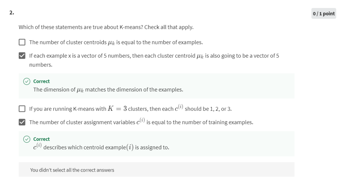
第二次做还是做错,Actually, you choose the number of centroids. The number is typically less than the number of examples.
第三次做对
[3] Practice Lab 1
1 - Implementing K-means
The K-means algorithm is a method to automatically cluster similar
data points together.
-
Concretely, you are given a training set { x ( 1 ) , . . . , x ( m ) } \{x^{(1)}, ..., x^{(m)}\} {x(1),...,x(m)}, and you want
to group the data into a few cohesive “clusters”. -
K-means is an iterative procedure that
- Starts by guessing the initial centroids, and then
- Refines this guess by
- Repeatedly assigning examples to their closest centroids, and then
- Recomputing the centroids based on the assignments.
-
In pseudocode, the K-means algorithm is as follows:
# Initialize centroids # K is the number of clusters centroids = kMeans_init_centroids(X, K)for iter in range(iterations):# Cluster assignment step: # Assign each data point to the closest centroid. # idx[i] corresponds to the index of the centroid # assigned to example iidx = find_closest_centroids(X, centroids)# Move centroid step: # Compute means based on centroid assignmentscentroids = compute_centroids(X, idx, K) -
The inner-loop of the algorithm repeatedly carries out two steps:
- Assigning each training example x ( i ) x^{(i)} x(i) to its closest centroid, and
- Recomputing the mean of each centroid using the points assigned to it.
-
The K K K-means algorithm will always converge to some final set of means for the centroids.
-
However, the converged solution may not always be ideal and depends on the initial setting of the centroids.
- Therefore, in practice the K-means algorithm is usually run a few times with different random initializations.
- One way to choose between these different solutions from different random initializations is to choose the one with the lowest cost function value (distortion).
You will implement the two phases of the K-means algorithm separately
in the next sections.
- You will start by completing
find_closest_centroidand then proceed to completecompute_centroids.
1.1 Finding closest centroids
In the “cluster assignment” phase of the K-means algorithm, the
algorithm assigns every training example x ( i ) x^{(i)} x(i) to its closest
centroid, given the current positions of centroids.
Exercise 1
Your task is to complete the code in find_closest_centroids.
- This function takes the data matrix
Xand the locations of all
centroids insidecentroids - It should output a one-dimensional array
idx(which has the same number of elements asX) that holds the index of the closest centroid (a value in { 1 , . . . , K } \{1,...,K\} {1,...,K}, where K K K is total number of centroids) to every training example . - Specifically, for every example x ( i ) x^{(i)} x(i) we set
c ( i ) : = j t h a t m i n i m i z e s ∣ ∣ x ( i ) − μ j ∣ ∣ 2 , c^{(i)} := j \quad \mathrm{that \; minimizes} \quad ||x^{(i)} - \mu_j||^2, c(i):=jthatminimizes∣∣x(i)−μj∣∣2,
where- c ( i ) c^{(i)} c(i) is the index of the centroid that is closest to x ( i ) x^{(i)} x(i) (corresponds to
idx[i]in the starter code), and - μ j \mu_j μj is the position (value) of the j j j’th centroid. (stored in
centroidsin the starter code)
- c ( i ) c^{(i)} c(i) is the index of the centroid that is closest to x ( i ) x^{(i)} x(i) (corresponds to
If you get stuck, you can check out the hints presented after the cell below to help you with the implementation.
numpy.linalg.norm — NumPy v1.23 Manual
# UNQ_C1
# GRADED FUNCTION: find_closest_centroidsdef find_closest_centroids(X, centroids):"""Computes the centroid memberships for every exampleArgs:X (ndarray): (m, n) Input values      centroids (ndarray): k centroidsReturns:idx (array_like): (m,) closest centroids"""# Set KK = centroids.shape[0]print(K)# You need to return the following variables correctlyidx = np.zeros(X.shape[0], dtype=int)### START CODE HERE ###for i in range(X.shape[0]):# each line contains a distance vectordistance = []for j in range(centroids.shape[0]):# X的第i行,和centroids的第j行计算欧几里得距离norm_ij = np.linalg.norm(X[i] - centroids[j]) # 得到的是一个距离distance.append(norm_ij)# each line holds an indexidx[i] = np.argmin(distance) # idx每一个值代表X中的每个样本到最近的centroids的索引### END CODE HERE ###return idx
解释np.linalg.norm
np.linalg.norm 是 NumPy 库中的函数,用于计算向量的范数(即长度)。在这段代码中,np.linalg.norm(X[i] - centroids[j]) 用于计算数据点 X[i] 与聚类中心 centroids[j] 之间的欧几里得距离。
具体来说,np.linalg.norm 函数将输入的向量作为参数,计算其范数。在默认情况下,np.linalg.norm 计算的是向量的二范数,即欧几里得距离。欧几里得距离是指在 n 维空间中,两个点之间的直线距离。因此,np.linalg.norm(X[i] - centroids[j]) 就是计算数据点 X[i] 与聚类中心 centroids[j] 之间的欧几里得距离。
在 K 均值聚类算法中,这个距离用来衡量数据点与每个聚类中心的相似程度,进而决定将数据点分配到哪个簇中。
print("First five elements of X are:\n", X[:5])
print('The shape of X is:', X.shape)
Output
First five elements of X are:[[1.84207953 4.6075716 ][5.65858312 4.79996405][6.35257892 3.2908545 ][2.90401653 4.61220411][3.23197916 4.93989405]]
The shape of X is: (300, 2)
# Select an initial set of centroids (3 Centroids)
initial_centroids = np.array([[3,3], [6,2], [8,5]])
print(initial_centroids.shape)# Find closest centroids using initial_centroids
idx = find_closest_centroids(X, initial_centroids)
# X.shape: 300 * 2, initial_centroids,shape: 3 * 2# Print closest centroids for the first three elements
print("First three elements in idx are:", idx[:3])# UNIT TEST
from public_tests import *find_closest_centroids_test(find_closest_centroids)
Output
(3, 2)
3
First three elements in idx are: [0 2 1]
2
3
3
All tests passed!
1.2 Computing centroid means
Given assignments of every point to a centroid, the second phase of the
algorithm recomputes, for each centroid, the mean of the points that
were assigned to it.
Exercise 2
Please complete the compute_centroids below to recompute the value for each centroid
-
Specifically, for every centroid μ k \mu_k μk we set
μ k = 1 ∣ C k ∣ ∑ i ∈ C k x ( i ) \mu_k = \frac{1}{|C_k|} \sum_{i \in C_k} x^{(i)} μk=∣Ck∣1i∈Ck∑x(i)where
- C k C_k Ck is the set of examples that are assigned to centroid k k k
- ∣ C k ∣ |C_k| ∣Ck∣ is the number of examples in the set C k C_k Ck
-
Concretely, if two examples say x ( 3 ) x^{(3)} x(3) and x ( 5 ) x^{(5)} x(5) are assigned to centroid k = 2 k=2 k=2,
then you should update μ 2 = 1 2 ( x ( 3 ) + x ( 5 ) ) \mu_2 = \frac{1}{2}(x^{(3)}+x^{(5)}) μ2=21(x(3)+x(5)).
If you get stuck, you can check out the hints presented after the cell below to help you with the implementation.
# UNQ_C2
# GRADED FUNCTION: compute_centpodsdef compute_centroids(X, idx, K):"""Returns the new centroids by computing the means of the data points assigned to each centroid.Args:X (ndarray):   (m, n) Data pointsidx (ndarray): (m,) Array containing index of closest centroid for each example in X. Concretely, idx[i] contains the index of the centroid closest to example iK (int):       number of centroidsReturns:centroids (ndarray): (K, n) New centroids computed"""# Useful variablesm, n = X.shape# You need to return the following variables correctlycentroids = np.zeros((K, n))### START CODE HERE ###for k in range(K):points = X[idx == k] # idx是向量,k是整型,得到一个bool数组,然后从X检索出来对应的行,所以point是X的行的子集centroids[k] = np.mean(points, axis = 0) # 按列求均值### END CODE HERE ## return centroids
解释代码:
当我们执行 points = X[idx == k] 时,我们实际上是在选择数据集 X 中与聚类中心 k 关联的所有数据点,并将它们存储在 points 变量中。
使用示例 idx 向量:
idx = [0, 1, 0, 2, 1]
假设我们仍然正在处理聚类中心 1,即 k = 1。那么 idx == k 的运算结果是一个布尔型向量:
idx == k = [False, True, False, False, True]
这表示数据点 2 和 5 被分配到了聚类中心 1。
接着,我们使用布尔索引来选择 X 中与聚类中心 1 关联的所有数据点。在 Python 中,我们可以直接使用布尔型向量作为索引,从而选择与 True 对应的数据点。因此,X[idx == k] 将返回一个包含了所有属于聚类中心 1 的数据点的子集。
以示例数据集 X 为例,假设 X 是一个包含了数据点坐标的二维数组:
X = [[x1, y1],[x2, y2],[x3, y3],[x4, y4],[x5, y5]]
那么 X[idx == k] 将选择与聚类中心 1 关联的所有数据点,即数据点 2 和 5:
points = X[idx == k] = [[x2, y2],[x5, y5]]
这样,points 变量中存储的就是所有属于聚类中心 1 的数据点的子集。在 K 均值聚类算法中,这些数据点将被用来计算新的聚类中心。
Test
K = 3
centroids = compute_centroids(X, idx, K)print("The centroids are:", centroids)# UNIT TEST
compute_centroids_test(compute_centroids)
The centroids are: [[2.42830111 3.15792418][5.81350331 2.63365645][7.11938687 3.6166844 ]]
All tests passed!
2 - K-means on a sample dataset
After you have completed the two functions (find_closest_centroids
and compute_centroids) above, the next step is to run the
K-means algorithm on a toy 2D dataset to help you understand how
K-means works.
- We encourage you to take a look at the function (
run_kMeans) below to understand how it works. - Notice that the code calls the two functions you implemented in a loop.
When you run the code below, it will produce a
visualization that steps through the progress of the algorithm at
each iteration.
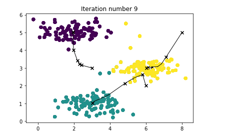
- At the end, your figure should look like the one displayed in Figure 1.
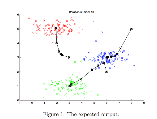
Note: You do not need to implement anything for this part. Simply run the code provided below
# You do not need to implement anything for this partdef run_kMeans(X, initial_centroids, max_iters=10, plot_progress=False):"""Runs the K-Means algorithm on data matrix X, where each row of Xis a single example"""# Initialize valuesm, n = X.shapeK = initial_centroids.shape[0]centroids = initial_centroidsprevious_centroids = centroids idx = np.zeros(m)# Run K-Meansfor i in range(max_iters):#Output progressprint("K-Means iteration %d/%d" % (i, max_iters-1))# For each example in X, assign it to the closest centroididx = find_closest_centroids(X, centroids)# Optionally plot progressif plot_progress:plot_progress_kMeans(X, centroids, previous_centroids, idx, K, i)previous_centroids = centroids# Given the memberships, compute new centroidscentroids = compute_centroids(X, idx, K)plt.show() return centroids, idx
# Load an example dataset
X = load_data()# Set initial centroids
initial_centroids = np.array([[3,3],[6,2],[8,5]])
K = 3# Number of iterations
max_iters = 10centroids, idx = run_kMeans(X, initial_centroids, max_iters, plot_progress=True)
Result
K-Means iteration 0/9
3
K-Means iteration 1/9
3
K-Means iteration 2/9
3
K-Means iteration 3/9
3
K-Means iteration 4/9
3
K-Means iteration 5/9
3
K-Means iteration 6/9
3
K-Means iteration 7/9
3
K-Means iteration 8/9
3
K-Means iteration 9/9
3
3 - Random initialization
The initial assignments of centroids for the example dataset was designed so that you will see the same figure as in Figure 1. In practice, a good strategy for initializing the centroids is to select random examples from the
training set.
In this part of the exercise, you should understand how the function kMeans_init_centroids is implemented.
- The code first randomly shuffles the indices of the examples (using
np.random.permutation()). - Then, it selects the first K K K examples based on the random permutation of the indices.
- This allows the examples to be selected at random without the risk of selecting the same example twice.
Note: You do not need to implement anything for this part of the exercise.
You do not need to modify this part
def kMeans_init_centroids(X, K):"""This function initializes K centroids that are to be used in K-Means on the dataset X
Args:X (ndarray): Data points K (int):     number of centroids/clustersReturns:centroids (ndarray): Initialized centroids
"""# Randomly reorder the indices of examples
randidx = np.random.permutation(X.shape[0])# Take the first K examples as centroids
centroids = X[randidx[:K]]return centroids
4 - Image compression with K-means
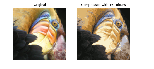
In this exercise, you will apply K-means to image compression.
- In a straightforward 24-bit color representation of an image 2 ^{2} 2, each pixel is represented as three 8-bit unsigned integers (ranging from 0 to 255) that specify the red, green and blue intensity values. This encoding is often refered to as the RGB encoding.
- Our image contains thousands of colors, and in this part of the exercise, you will reduce the number of
colors to 16 colors. - By making this reduction, it is possible to represent (compress) the photo in an efficient way.
- Specifically, you only need to store the RGB values of the 16 selected colors, and for each pixel in the image you now need to only store the index of the color at that location (where only 4 bits are necessary to represent 16 possibilities).
In this part, you will use the K-means algorithm to select the 16 colors that will be used to represent the compressed image.
- Concretely, you will treat every pixel in the original image as a data example and use the K-means algorithm to find the 16 colors that best group (cluster) the pixels in the 3- dimensional RGB space.
- Once you have computed the cluster centroids on the image, you will then use the 16 colors to replace the pixels in the original image.
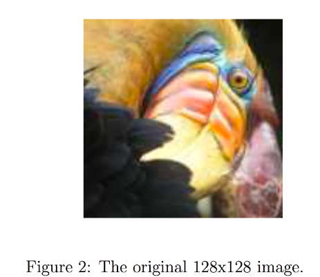
The provided photo used in this exercise belongs to Frank Wouters and is used with his permission.
4.1 Dataset
Load image
First, you will use matplotlib to read in the original image, as shown below.
# Load an image of a bird
original_img = plt.imread('bird_small.png')
Visualize image
You can visualize the image that was just loaded using the code below.
# Visualizing the image
plt.imshow(original_img)
Check the dimension of the variable
As always, you will print out the shape of your variable to get more familiar with the data.
print("Shape of original_img is:", original_img.shape)
Shape of original_img is: (128, 128, 3)
As you can see, this creates a three-dimensional matrix original_img where
- the first two indices identify a pixel position, and
- the third index represents red, green, or blue.
For example, original_img[50, 33, 2] gives the blue intensity of the pixel at row 50 and column 33.
Processing data
To call the run_kMeans, you need to first transform the matrix original_img into a two-dimensional matrix.
- The code below reshapes the matrix
original_imgto create an m × 3 m \times 3 m×3 matrix of pixel colors (where
m = 16384 = 128 × 128 m=16384 = 128\times128 m=16384=128×128)
# Divide by 255 so that all values are in the range 0 - 1
original_img = original_img / 255# Reshape the image into an m x 3 matrix where m = number of pixels
# (in this case m = 128 x 128 = 16384)
# Each row will contain the Red, Green and Blue pixel values
# This gives us our dataset matrix X_img that we will use K-Means on.X_img = np.reshape(original_img, (original_img.shape[0] * original_img.shape[1], 3))
4.2 K-Means on image pixels
Now, run the cell below to run K-Means on the pre-processed image.
# Run your K-Means algorithm on this data
# You should try different values of K and max_iters here
K = 16
max_iters = 10               # Using the function you have implemented above.
initial_centroids = kMeans_init_centroids(X_img, K) # Run K-Means - this takes a couple of minutes
centroids, idx = run_kMeans(X_img, initial_centroids, max_iters)
Output
K-Means iteration 0/9
16
K-Means iteration 1/9
16
K-Means iteration 2/9
16
K-Means iteration 3/9
16
K-Means iteration 4/9
16
K-Means iteration 5/9
16
K-Means iteration 6/9
16
K-Means iteration 7/9
16
K-Means iteration 8/9
16
K-Means iteration 9/9
16
print("Shape of idx:", idx.shape)
print("Closest centroid for the first five elements:", idx[:5])
Output
Shape of idx: (16384,)
Closest centroid for the first five elements: [5 5 5 5 5]
4.3 Compress the image
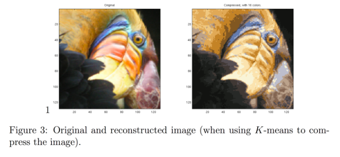
After finding the top K = 16 K=16 K=16 colors to represent the image, you can now
assign each pixel position to its closest centroid using the
find_closest_centroids function.
- This allows you to represent the original image using the centroid assignments of each pixel.
- Notice that you have significantly reduced the number of bits that are required to describe the image.
- The original image required 24 bits for each one of the 128 × 128 128\times128 128×128 pixel locations, resulting in total size of 128 × 128 × 24 = 393 , 216 128 \times 128 \times 24 = 393,216 128×128×24=393,216 bits.
- The new representation requires some overhead storage in form of a dictionary of 16 colors, each of which require 24 bits, but the image itself then only requires 4 bits per pixel location.
- The final number of bits used is therefore 16 × 24 + 128 × 128 × 4 = 65 , 920 16 \times 24 + 128 \times 128 \times 4 = 65,920 16×24+128×128×4=65,920 bits, which corresponds to compressing the original image by about a factor of 6.
# Represent image in terms of indices
X_recovered = centroids[idx, :] # Reshape recovered image into proper dimensions
X_recovered = np.reshape(X_recovered, original_img.shape)
Finally, you can view the effects of the compression by reconstructing
the image based only on the centroid assignments.
- Specifically, you can replace each pixel location with the value of the centroid assigned to
it. - Figure 3 shows the reconstruction we obtained. Even though the resulting image retains most of the characteristics of the original, we also see some compression artifacts.
# Display original image
fig, ax = plt.subplots(1,2, figsize=(8,8))
plt.axis('off')ax[0].imshow(original_img*255)
ax[0].set_title('Original')
ax[0].set_axis_off()# Display compressed image
ax[1].imshow(X_recovered*255)
ax[1].set_title('Compressed with %d colours'%K)
ax[1].set_axis_off()
Output
[4] Anomaly Detection
Finding unusual events
Unusual or an anomalous event
Let’s look at our second
unsupervised learning algorithm.Anomaly detection algorithms look at
an unlabeled dataset of normal events and thereby learns to detect or
to raise a red flag for if there is an unusual or
an anomalous event.
Example: Aircraft engines
Let’s look at an example.
Some of my friends were working on
using anomaly detection to detect possible problems with aircraft
engines that were being manufactured.When a company makes an aircraft engine, you really want that aircraft
engine to be reliable and function well because an aircraft engine
failure has very negative consequences.So some of my friends were using
anomaly detection to check if an aircraft engine after it was
manufactured seemed anomalous or if there seemed to be
anything wrong with it.
Here’s the idea, after an aircraft
engine rolls off the assembly line, you can compute a number of different
features of the aircraft engine.
So, say feature x1 measures
the heat generated by the engine.Feature x2 measures the vibration
intensity and so on and so forth for additional features as well.But to simplify the slide a bit,
I’m going to use just two features x1 and x2 corresponding to the heat and
the vibrations of the engine.
Now, it turns out that aircraft
engine manufacturers don’t make that many bad engines.And so the easier type of data
to collect would be if you have manufactured m aircraft engines
to collect the features x1 and x2 about how these m engines behave and
probably most of them are just fine that normal engines rather than
ones with a defect or flow in them.
The anomaly detection problem
And the anomaly detection problem is,
after the learning algorithm has seen these m examples of how
aircraft engines typically behave in terms of how much heat is generated and
how much they vibrate.
A brand new aircraft engine were to roll off the assembly line
If a brand new aircraft engine were
to roll off the assembly line and it had a new feature vector given
by Xtest, we’d like to know does this engine look similar to ones
that have been manufactured before?
So is this probably okay? Or is there something really weird
about this engine which might cause this performance to be suspect,
meaning that maybe we should inspect it even more carefully
before we let it get shipped out and be installed in an airplane and then
hopefully nothing will go wrong with it.
See how the anomaly detection algorithm works
Here’s how an anomaly
detection algorithm works.
Let me plot the examples x1 through
xm over here via these crosses where each cross each data point in
this plot corresponds to a specific engine with a specific amount of heat and
specific amount of vibrations.
If this new aircraft engine Xtest
rolls off the assembly lin,e and if you were to plot these values of x1 and
x2 and if it were here, you say, okay,
that looks probably okay. Looks very similar to
other aircraft engines. Maybe I don’t need to
worry about this one.
But if this new aircraft
engine has a heat and vibration signature that is
say all the way down here, then this data point down here looks very
different than once we saw up on top.And so we will probably say,
boy, this looks like an anomaly. This doesn’t look like the examples I’ve
seen before, we better inspect this more carefully before we let this engine
get installed on an airplane.
How can you have an algorithm
address this problem?
Density estimation
The most common way to carry
out anomaly detection is through a technique called
density estimation.
And what that means is, when you’re given
your training sets of these m examples, the first thing you do is build
a model for the probability of x.
In other words, the learning
algorithm will try to figure out what are the values of the features x1 and
x2 that have high probability and what are the values that are less
likely or have a lower chance or lower probability of being
seen in the data set.
In this example that we have here,
I think it is quite likely to see examples in that little ellipse in the middle, so
that region in the middle would have high probability maybe things in this ellipse
have a little bit lower probability.Things in this ellipse of this oval
have even lower probability and things outside have
even lower probability.
The details of how you decide from
the training set what regions are higher versus lower probability is something
we’ll see in the next few videos.
And having modeled or
having learned to model for p of x When you are given
the new test example Xtest.What you will do is then compute
the probability of Xtest.
Epsilon: small number
And if it is small or more precisely,
if it is less than some small number that I’m going to call epsilon,
this is a greek alphabet epsilon.
So what you should think of as
a small number, which means that p of x is very small or in other words,
the specific value of x that you saw for a certain user was very unlikely, relative
to other users that you have seen.But the p of Xtest is less than some small
threshold or some small number epsilon, we will raise a flag to say
that this could be an anomaly.
So for example,
if Xtest was all the way down here, the probability of an example landing all
the way out here is actually quite low. And so hopefully p of Xtest for this value
of Xtest will be less than epsilon and so we would flag this as an anomaly.
Whereas in contrast,
if p of Xtest is not less than epsilon, if p of Xtest is greater
than equal to epsilon, then we will say that it looks okay,
this doesn’t look like an anomaly.
And that response to if you had an example
in here say where our model p of x will say that examples near the middle here,
they’re actually quite high probability. There’s a very high chance that the new
airplane engine will have features close to these inner ellipses. And so p of Xtest will be large for
those examples and we’ll say it’s okay and
it’s not an anomaly.
Fraud detection
Anomaly detection is used
today in many applications. It is frequently used in
fraud detection where for example if you are running a website
with many different features.
If you compute xi to be the features
of user i’s activities. And examples of features might include, how often does this user login and
how many web pages do they visit? How many transactions are they making or
how many posts on the discussion forum are they making
to what is their typing speed? How many characters per second
do they seem able to type.
With data like this you can then
model p of x from data to model what is the typical
behavior of a given user. In the common workflow of fraud detection, you wouldn’t automatically turn off an
account just because it seemed anomalous. But instead you may ask the security team
to take a closer look or put in some additional security checks such as ask the
user to verify their identity with a cell phone number or ask them to pass a capture
to prove that they’re human and so on.
But algorithms like this are routinely
used today to try to find unusual or maybe slightly suspicious activity. So you can more carefully screen those
accounts to make sure there isn’t something fraudulent. And this type of fraud detection is
used both to find fake accounts and this type of algorithm is also used
frequently to try to identify financial fraud such as if there’s a very
unusual pattern of purchases.Then that may be something well
worth a security team taking a more careful look at.
anomaly detection is also frequently used in manufacturing.
anomaly detection is also
frequently used in manufacturing. You saw an example on the previous slide
with aircraft engine manufacturing. But many manufacturers in multiple
continents in many, many factories were routinely use anomaly detection to see
if whatever they just manufactured.
Anything from an airplane engine to
a printed circuit board to a smartphone to a motor, to many,
many things to see if you’ve just manufactured the unit that
somehow behaves strangely. Because that may indicate that there’s
something wrong with your airplane engine or printed circuit boards or
what have you that might cause you to want to take a more careful look before
you ship that object to the customer.
It also used to monitor
computers in clusters and in data centers where if X I are the
features of a certain machine I such as if the features captured the memory users,
the number of disk accesses per second. CPU load features can also be racial, such as the ratio of CPU
load to network traffic.
Then if ever a specific computer behaves
very differently than other computers, it might be worth taking a look at that
computer to see if something is wrong with it.Such as if it has had a hot test
failure or network hack failure or something’s wrong with it or
if maybe it has been hacked into.
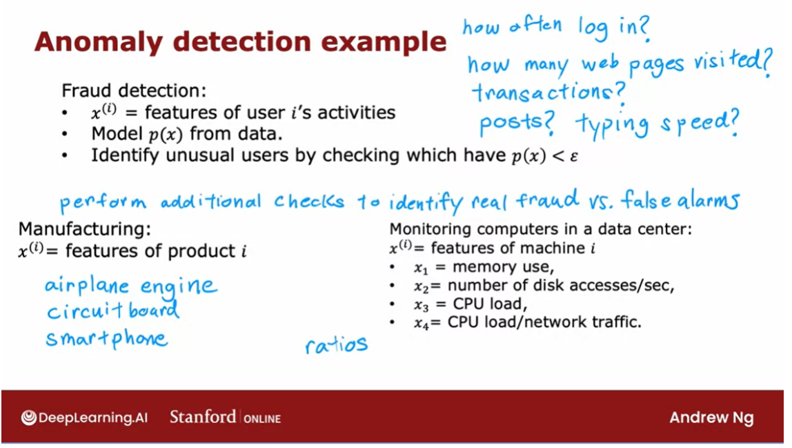
Anomaly detection is one of those
algorithms that is very widely used even though you don’t seem to
hear people talk about it that much. I remember the first time I worked on
the commercial application of anomaly detection was when I was helping a telco
company put in place anomaly detection to see when any one of the cell towers
was behaving in an unusual way.Because that probably meant there was
something wrong with the cell tower and so they want to get a technician to take so hopefully that hope more people
get good cell phone coverage.
And I’ve also used anomaly detection to
find fraudulent financial transactions And these days I often use it to help
manufacturing companies find anomalous parts that they may have manufactured but
should inspect more often.
So it is a very useful tool
to have in your tool chest. And in the next few videos we’ll
talk about how you can build and get these algorithms to work for yourself. In order to get anonymous
detection albums to work, we’ll need to use a Gaussian
distribution to model the data p of x. So, let’s go on to the next video to
talk about Gaussian distributions.
Gaussian (normal) distribution
In order to apply
anomaly detection, we’re going to need to use
the Gaussian distribution, which is also called the
normal distribution. When you hear me
say either Gaussian distribution or
normal distribution, they mean exactly
the same thing. If you’ve heard the
bell-shaped distribution, that also refers
to the same thing. But if you haven’t heard of the bell-shaped distribution,
that’s fine too.
But let’s take a look at what is the Gaussian or the
normal distribution. Say x is a number, and if x is a random number, sometimes called the
random variable, x can take on random values.If the probability
of x is given by a Gaussian or
normal distribution with mean parameter Mu, and with variance Sigma squared.
What that means is that
the probability of x looks like a curve
that goes like this. The center or the middle of the curve is given
by the mean Mu, and the standard deviation or
the width of this curve is given by that variance
parameter Sigma.Technically, Sigma is called the standard deviation
and the square of Sigma or Sigma squared is called the variance
of the distribution.
This curve here shows what is p of x or the
probability of x. If you’ve heard of the
bell-shaped curve, this is that bell-shaped
curve because a lot of classic bells say in towers were shaped like this with the bell clapper
hanging down here, and so the shape
of this curve is vaguely reminiscent
of the shape of the large bells that you will still find in
some old buildings today.
Better looking than
my hand-drawn one. There’s a picture of
the Liberty Bell. Indeed, the Liberty
Bell’s shape on top is vaguely
bell-shaped curve.
If you’re wondering what
does p of x really means? Here’s one way to interpret it. It means that if you
were to get, say, 100 numbers drawn from this
probability distribution, and you were to plot a histogram of these 100 numbers drawn from this distribution, you might get a histogram
that looks like this. It looks vaguely bell-shaped. What this curve on the
left indicates is not if you have just 100 examples or 1,000 or a million
or a billion.But if you had a practically
infinite number of examples, and you were to
draw a histogram of this practically
infinite number of examples with a very
fine histogram bin. Then you end up with essentially this bell-shaped
curve here on the left.
高斯分布数学公式:用英文介绍
The formula for p of x is
given by this expression; p of x equals 1 over
square root 2 Pi. Pi here is that 3.14159
or it’s about 22 over 7. Ratio of a circle’s diameter
circumference times Sigma times e to the
negative x minus Mu, the mean parameter squared
divided by 2 Sigma squared.
For any given value
of Mu and Sigma, if you were to plot this
function as a function of x, you get this type of
bell-shaped curve that is centered at Mu, and with the width of
this bell-shaped curve being determined by
the parameter Sigma.
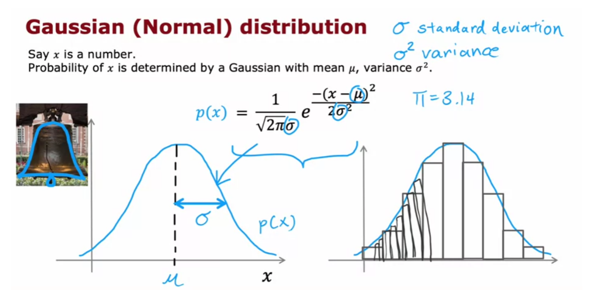
高斯分布:改变参数μ和σ
Now let’s look at a few
examples of how changing Mu and Sigma will affect the
Gaussian distribution. First, let me set Mu equals
0 and Sigma equals 1. Here’s my plot of the Gaussian
distribution with mean 0, Mu equals 0, and standard deviation
Sigma equals 1. You notice that this
distribution is centered at zero and that is the standard
deviation Sigma is equal to 1.
Now, let’s reduce the standard
deviation Sigma to 0.5. If you plot the
Gaussian distribution with Mu equals 0 and
Sigma equals 0.5, it now it looks like this. Notice that it’s
still centered at zero because Mu is zero. But it’s become a
much thinner curve because Sigma is now 0.5. You might recall that Sigma is the standard
deviation is 0.5, whereas Sigma squared is
also called the variance. That’s equal to 0.5
squared or 0.25. You may have heard
that probabilities always have to sum up to one, so that’s why the area under the curve is always
equal to one, which is why when the Gaussian distribution
becomes skinnier, it has to become taller as well.
Let’s look at another
value of Mu and Sigma. Now, I’m going to
increase Sigma to 2, so the standard deviation
is 2 and the variance is 4. This now creates a much
wider distribution because Sigma here
is now much larger, and because it’s now a wider
distribution is become shorter as well because the area under the curve is
still equals 1.
Finally, let’s try changing
the mean parameter Mu, and I’ll leave Sigma equals 0.5. In this case, the center of the distribution Mu moves
over here to the right. But the width of the distribution is
the same as the one on top because the
standard deviation is 0.5 in both of these
cases on the right.
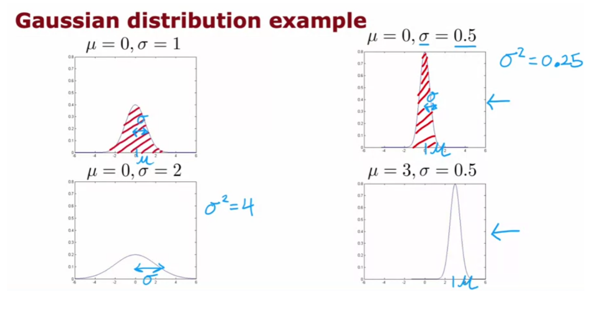
This is how different
choices of Mu and Sigma affect the
Gaussian distribution. When you’re applying this
to anomaly detection, here’s what you have to do. You are given a
dataset of m examples, and here x is just a number. Here, are plots of the training
sets with 11 examples. What we have to do is
try to estimate what a good choice is for
the mean parameter Mu, as well as for the variance
parameter Sigma squared.
Given a dataset like this, it would seem that a Gaussian distribution
maybe looking like that with a center here and a standard
deviation like that. This might be a pretty
good fit to the data.
The way you would compute Mu and Sigma squared mathematically is our estimate for Mu will be just the average of all
the training examples. It’s 1 over m times sum from i equals 1 through m of the values of your
training examples. The value we will use to
estimate Sigma squared will be the average of the squared difference
between two examples, and that Mu that you just
estimated here on the left. It turns out that if you
implement these two formulas in code with this value for Mu and this value
for Sigma squared, then you pretty much get the Gaussian distribution
that I hand drew on top.
This will give you
a choice of Mu and Sigma for a Gaussian
distribution so that it looks like the 11 training
samples might have been drawn from this
Gaussian distribution. If you’ve taken an
advanced statistics class, you may have heard that these formulas for Mu
and Sigma squared are technically called the
maximum likelihood estimates for Mu and Sigma.
Some statistics
classes will tell you to use the formula 1 over m minus 1 instead of
1 over m. In practice, using 1 over m or 1 over m minus 1 makes very
little difference. I always use 1 over m, but just some other
properties of dividing by m minus 1 that some
statisticians prefer. But if you don’t
understand what they just said, don’t worry about it.
All you need to know is that
if you set Mu according to this formula and Sigma squared according
to this formula, you’d get a pretty
good estimate of Mu and Sigma and in particular, you get a Gaussian
distribution that will be a possible probability
distribution in terms of what’s the
probability distribution that the training
examples had come from.
You can probably guess
what comes next. If you were to get an
example over here, then p of x is pretty high. Whereas if you were
to get an example, we are here, then p
of x is pretty low, which is why we would
consider this example, okay, not really anomalous, not a lot like the other ones. Whereas an example
we are here to be pretty unusual compared to
the examples we’ve seen, and therefore more
anomalous because p of x, which is the height
of this curve, is much lower over here
on the left compared to this point over here,
closer to the middle.
Now, we’ve done this only
for when x is a number, as if you had only
a single feature for your anomaly
detection problem. For practical anomaly
detection applications, you usually have a lot
of different features.
You’ve now seen how the
Gaussian distribution works. If x is a single number, this corresponds to if, say you had just one feature for your anomaly
detection problem.But for practical anomaly
detection applications, you will have many features, two or three or some even
larger number n of features.
Let’s take what you saw for
a single Gaussian and use it to build a more sophisticated anomaly
detection algorithm. They can handle
multiple features. Let’s go do that
in the next video.
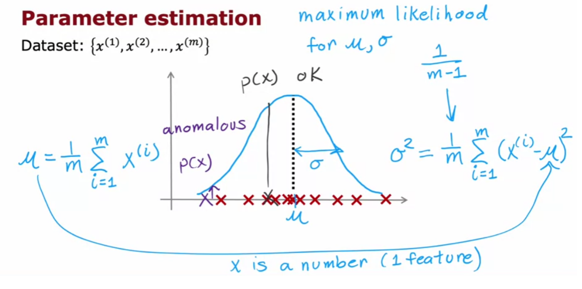
Anomaly detection algorithm
Now that you’ve seen how the Gaussian or
the normal distribution works for a single number, we’re ready to build
our anomaly detection algorithm. Let’s dive in.
You have a training set x1 through xm, where here each example
x has n features. So, each example x is
a vector with n numbers. In the case of the airplane
engine example, we had two features corresponding
to the heat and the vibrations. And so, each of these Xi’s would
be a two dimensional vector and n would be equal to 2.
But for many practical applications
n can be much larger and you might do this with dozens or
even hundreds of features. Given this training set,
what we would like to do is to carry out density estimation and
all that means is, we will build a model or
estimate the probability for p(x).
What’s the probability of
any given feature vector? And our model for
p(x) is going to be as follows, x is a feature vector with values x1,
x2 and so on down to xn. And I’m going to model p(x)
as the probability of x1, times the probability of x2, times the probability of x3
times the probability of xn, for the n th features
in the feature vectors.
If you’ve taken an advanced class
in probably in statistics before, you may recognize that this equation
corresponds to assuming that the features x1, x2 and so
on up to xm are statistically independent.But it turns out this algorithm often
works fine even that the features are not actually
statistically independent. But if you don’t understand what I
just said, don’t worry about it. Understanding statistical independence is
not needed to fully complete this class and also, be able to very effectively
use anomaly detection algorithm.
Now, to fill in this
equation a little bit more, we are saying that the probability of all
the features of this vector features x, is the product of p(x1) and
p(x2) and so on up through p(xn). And in order to model
the probability of x1, say the heat feature in this example
we’re going to have two parameters, mu 1 and sigma 1 or sigma squared is 1.
And what that means is we’re going to
estimate, the mean of the feature x1 and also the variance of feature x1 and
that will be new 1 and sigma 1.To model p(x2) x2 is a totally different feature measuring the vibrations
of the airplane engine. We’re going to have two
different parameters, which I’m going to write as mu 2,
sigma 2 squared. And it turns out this will correspond
to the mean or the average of the vibration feature and the variance
of the vibration feature and so on.
If you have additional
features mu 3 sigma 3 squared up through mu n and
sigma n squared. In case you’re wondering why
we multiply probabilities, maybe here’s 1 example that
could build intuition.
Suppose for
an aircraft engine there’s a 1/10 chance that it is really hot,
unusually hot and maybe there is a 1 in 20 chance
that it vibrates really hard. Then, what is the chance that it runs
really hot and vibrates really hard. We’re saying that the chance of that
is 1/10 times 1/20 which is 1/200. So it’s really unlikely to get an engine
that both run really hot and vibrates really hard. It’s the product of these two probabilities
A somewhat more compact way to
write this equation up here, is to say that this is equal to, the product from j =1 through n of p(xj). Would parameters mu j and sigma squared j. And this symbol here is a lot like
the summation symbol except that whereas the summation symbol
corresponds to addition, this symbol here corresponds to multiplying
these terms over here for j =1 through n.
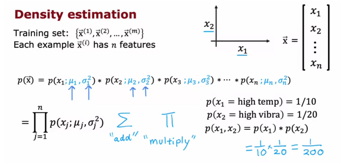
So let’s put it all together
to see how you can build an anamoly detection system. The first step is to choose
features xi that you think might be indicative
of anomalous examples. Having come up with
the features you want to use, you would then fit the parameters
mu 1 through mu n and sigma square 1 through sigma squared n,
for the n features in your data set. As you might guess, the parameter
mu j will be just the average of xj of the feature j of all
the examples in your training set. And sigma square j will be
the average of the square difference between the feature and
the value mu j, that you just computed.
And by the way,
if you have a vectorized implementation, you can also compute mu as the average
of the training examples as follows, we’re here, x and mu are both vectors. And so this would be the vectorized
way of computing mu 1 through mu and all at the same time. And by estimating these parameters
on your unlabeled training set, you’ve now computed all
the parameters of your model.
Finally, when you are given a new example,
x test or I’m just going to write
a new example as x here, what you would do is compute p(x) and
see if it’s large or small. So p(x) as you saw on the last slide
is the product from j = 1 through n of the probability of
the individual features. So p(x) j with parameters mu j and
single square j. And if you substitute in, the formula for
this probability, you end up with this expression 1 over root 2 pi
sigma j of e to this expression over here.
And so xj are the features,
this is a j feature of your new example, mu j and sigma j are numbers or parameters
you have computed in the previous step. And if you compute out this formula,
you get some number for p(x). And the final step is to see
a p(x) is less than epsilon. And if it is then you flag
that it is an anomaly.
1 intuition behind what this algorithm
is doing is that it will tend to flag an example as anomalous if 1 or more
of the features are either very large or very small relative to what it
has seen in the training set. So for each of the features x j, you’re
fitting a Gaussian distribution like this. And so if even 1 of the features
of the new example was way out here, say,
then P f xJ would be very small. And if just 1 of the terms in this product
is very small, then this overall product, when you multiply together will tend to be
very small and does p(x) will be small.
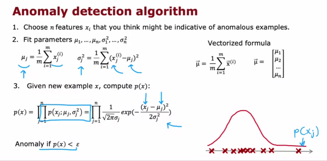
And what anomaly detection is
doing in this algorithm is a systematic way of quantifying whether or
not this new example x has any features that are unusually
large or unusually small. Now, let’s take a look at what all
this actually means on 1 example, Here’s the data set with features x 1 and
x 2. And you notice that the features
x 1 take on a much larger range of values than the features x 2.
If you were to compute the mean of
the Features x 1, you end up with five, which is why you want is equal to 1. And it turns out that for
this data said, if you compute sigma 1, it will be equal to about 2. And if you were to compute mu to
the average of the features on next to the average is three and
similarly is variance or standard deviation is much smaller,
which is why Sigma 2 is equal to 1. So that corresponds to this
Gaussian distribution for x 1 and
this Gaussian distribution for x 2.
If you were to actually
multiply p(x) 1 and p(x) 2, then you end up with this three D
surface plot for p(x) where any point, the height of this is the product
of p(x) 1 times p(x) 2. For the corresponding values of x 1 and
x 2. And this signifies that values where
p(x) is higher or more likely. So, values near the middle
kind of here are more likely. Whereas values far out here,
values out here are much less likely.
I have much lower chance. Now, let me pick two test examples,
the first 1 here, I’m going to write this x test 1 and
the second 1 down here as x test 2.
And let’s see which of these 2 examples
the algorithm will flag as anomalous. I’m going to pick The Parameter
ε to be equal to 0.02.And if you were to compute p(x) test 1, it turns out to be about 0.4 and
this is much bigger than epsilon. And so the album will say this looks okay,
doesn’t look like an anomaly.
Whereas in contrast,
if you were to compute p(x) for this point down here corresponding
to x 1 equals about eight and x 2 equals about 0.5. Kind of down here,
then p(x) test 2 is 0.0021. So this is much smaller than epsilon. And so the album will flag
this as a likely anomaly. So, pretty much as you might hope it
decides that x test 1 looks pretty normal. Whereas excess to which is much further
away than anything you see in the training set looks like it could be an anomaly.
So you’ve seen the process of how to
build an anomaly detection system. But how do you choose
the parameter epsilon? And how do you know if your anomaly
detection system is working well in the next video, let’s dive a little
bit more deeply into the process of developing and evaluating the performance
of an anomaly detection system. Let’s go on to the next video
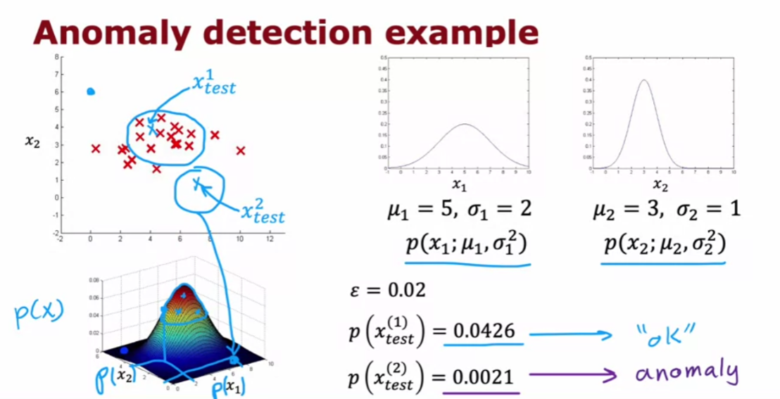
Developing and evaluating an anomaly detection system
I’d like to share with you
some practical tips for developing an anomaly
detection system. One of the key ideas
will be that if you can have a way to
evaluate a system, even as it’s being developed, you’ll be able to make
decisions and change the system and improve
it much more quickly.
real number evaluation
Let’s take a look
at what that means. When you are developing
a learning algorithm, say choosing different
features or trying different values of the
parameters like epsilon, making decisions about
whether or not to change a feature in a certain way or to increase or decrease epsilon
or other parameters, making those decisions is
much easier if you have a way of evaluating the
learning algorithm. This is sometimes called
real number evaluation, meaning that if you can quickly change the
algorithm in some way, such as change a
feature or change a parameter and have a way of computing a number that tells you if the algorithm
got better or worse, then it makes it much
easier to decide whether or not to stick with that change
to the algorithm.
This is how it’s often
done in anomaly detection. Which is, even
though we’ve mainly been talking about
unlabeled data, I’m going to change
that assumption a bit and assume that we have
some labeled data, including just a small number usually of previously
observed anomalies. Maybe after making airplane
engines for a few years, you’ve just seen a
few airplane engines that were anomalous, and for examples that
you know are anomalous, I’m going to associate a label y equals 1 to indicate
this anomalous, and for examples that
we think are normal, I’m going to associate
the label y equals 0.
The training set that the anomaly detection
algorithm will learn from is still this unlabeled training
set of x1 through xm, and I’m going to think
of all of these examples as ones that we’ll just assume are normal
and not anomalous, so y is equal to 0. In practice, you have a few anomalous examples where to slip into
this training set, your algorithm will
still usually do okay.
To evaluate your algorithm, come up with a way for you to have a real
number evaluation, it turns out to be very useful
if you have a small number of anomalous examples so that you can create a
cross validation set, which I’m going
to denote x_cv^1, y_cv^1 through
x_cv^mcv, y_cv^mcv. This is similar
notation as you had seen in the second course
of this specialization. As similarly, have a test set of some number of examples where both the cross validation
and test sets hopefully includes a few
anomalous examples.
In other words, the cross
validation and test sets will have a few examples
of y equals 1, but also a lot of examples
where y is equal to 0. Again, in practice, anomaly detection algorithm
will work okay if there are some examples that
are actually anomalous, but there were accidentally
labeled with y equals 0.
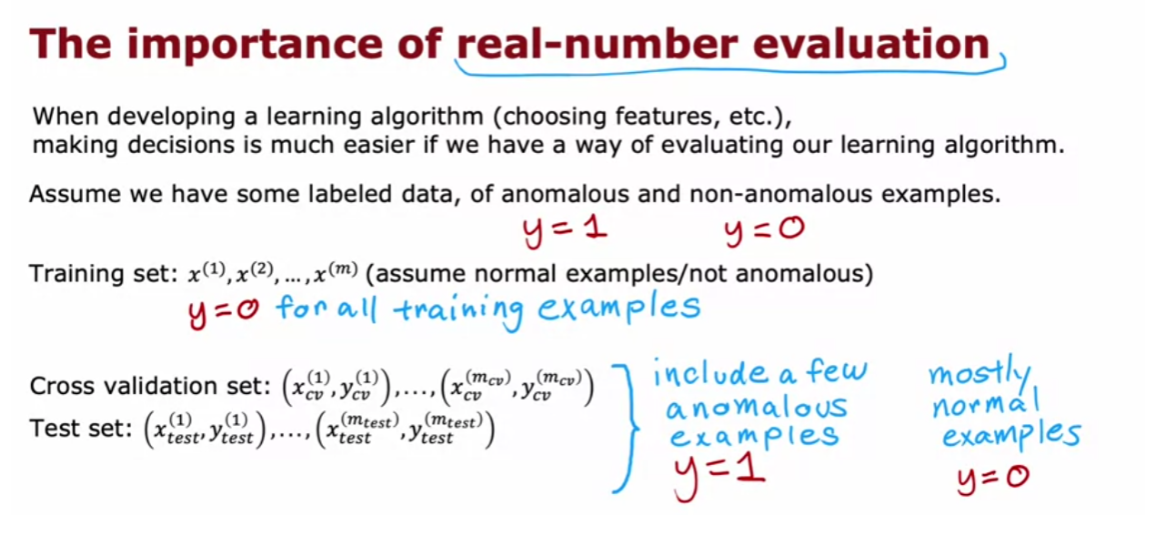
Let’s illustrate this with
the aircraft engine example. Let’s say you have
been manufacturing aircraft engines for
years and so you’ve collected data from 10,000
good or normal engines, but over the years you
had also collected data from 20 flawed or
anomalous engines. Usually the number of
anomalous engines, that is y equals 1, will be much smaller. It will not be a typical to apply this type of algorithm
with anywhere from, say, 2-50 known anomalies.
We’re going to take
this dataset and break it up into a training set, a cross validation set, and the test set.
Here’s one example. I’m going to put 6,000 good engines into
the training set. Again, if there are couple
of anomalous engines that got slipped into this
set is actually okay, I wouldn’t worry too
much about that. Then let’s put 2,000
good engines and 10 of the known anomalies into
the cross-validation set, and a separate 2,000 good and 10 anomalous engines
into the test set.
What you can do then is train the algorithm
on the training set, fit the Gaussian distributions
to these 6,000 examples and then on the
cross-validation set, you can see how many of the anomalous engines
it correctly flags.For example, you could use
the cross validation set to tune the parameter
epsilon and set it higher or lower depending on whether the algorithm
seems to be reliably detecting these 10 anomalies
without taking too many of these 2,000 good engines and flagging
them as anomalies. After you have tuned the
parameter epsilon and maybe also added
or subtracted or tuned to features X_J you can
then take the algorithm and evaluate it on your
test set to see how many of these 10
anomalous engines it finds, as well as how many
mistakes it makes by flagging the good engines
as anomalous ones.
Notice that this is still primarily an unsupervised
learning algorithm because the training sets
really has no labels or they all have labels
that we’re assuming to be y equals 0 and so we learned from the
training set by fitting the Gaussian distributions as you saw in the previous video. But it turns out
if you’re building a practical anomaly
detection system, having a small number of
anomalies to use to evaluate the algorithm that your
cross validation and test sets is very helpful for
tuning the algorithm.
Because the number of flawed
engines is so small there’s one other alternative
that I often see people use for
anomaly detection, which is to not use a test set, like to have just a training set and a cross-validation set.In this example, you will set train on 6,000 good engines, but take the remainder
of the data, the 4,000 remaining good engines as well as
all the anomalies, and put them in the
cross validation set.
You would then tune
the parameters Epsilon and add or subtract
features x_j to try to get it to do as well as possible as evaluated on the
cross validation set. If you have very
few flawed engines, so if you had only
two flawed engines, then this really makes sense to put all of that in the
cross validation set. You just don’t have
enough data to create a totally separate test set that is distinct from your
cross-validation set.
The downside of this alternative here is that after you’ve
tuned your algorithm, you don’t have a fair
way to tell how well this will actually do on future examples because you
don’t have the test set. But when your dataset is small, especially when the number
of anomalies you have, your dataset is small, this might be the best
alternative you have.I see this done quite
often as well when you just don’t have enough data to create a separate test set. If this is the case, just be aware that there’s a higher risk that you will have over-fit some of your decisions around Epsilon
and choice of features and so on to the
cross-validation set and so its performance on real data in the future may not be as good as you
were expecting.
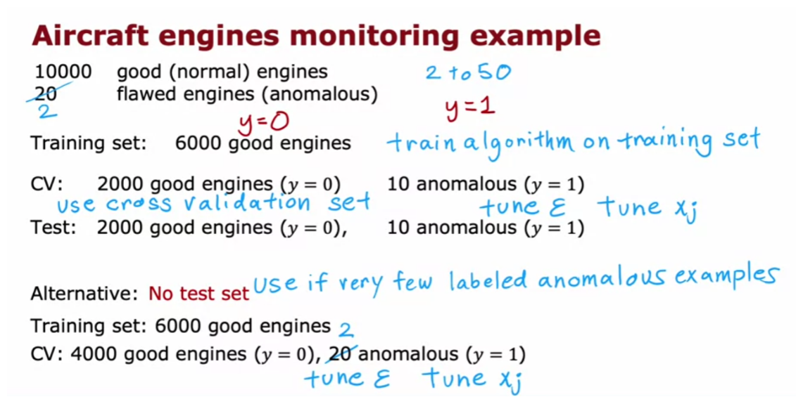
Now, let’s take a closer look at how
to actually evaluate the algorithm on your
cross-validation sets or on the test set.
Here’s what you’d do. You would first fit the model
p of x on the training set. This was a 6,000 examples
of goods engines. Then on any cross validation
or test example x, you would compute p of x and
you will predict y equals 1. That is anomalous if p of x is less than Epsilon and
you predict y is 0, if p of x is greater than
or equal to Epsilon.
Based on this, you can now
look at how accurately this algorithm’s predictions on the cross validation or test
set matches the labels, y you have in the cross
validation or the test sets.
In the third week of
the second course, we had had a couple of optional
videos on how to handle highly skewed data distributions where the number of
positive examples, y equals 1, can be
much smaller than the number of negative
examples where y equals 0. This is the case as well for many anomaly detection in
the applications where the number of anomalies in your cross-validation
set is much smaller. In our previous example, we had maybe 10 positive
examples and 2,000 negative examples because we had 10 anomalies and 2,000
normal examples.
If you saw those
optional videos, you may recall
that we saw it can be useful to compute things
like the true positive, false positive, false negative, and true negative rates. Also compute precision recall or F_1 score and that these
are alternative metrics and classification accuracy
that could work better when your data
distribution is very skewed. If you saw that video, you might consider
applying those types of evaluation metrics as
well to tell how well your learning algorithm
is doing at finding that small handful
of anomalies or positive examples amidst
this much larger set of negative examples of
normal plane engines. If you didn’t watch that video, don’t worry about it. It’s okay.
The intuition I hope you get is to use the cross-validation
set to just look at how many anomalies
is finding and also how many normal engines is incorrectly flagging
as an anomaly. Then to just use that to try to choose a good choice for
the parameter Epsilon. You find that the
practical process of building an anomaly
detection system is much easier if you actually have just a small number of labeled examples of
known anomalies.
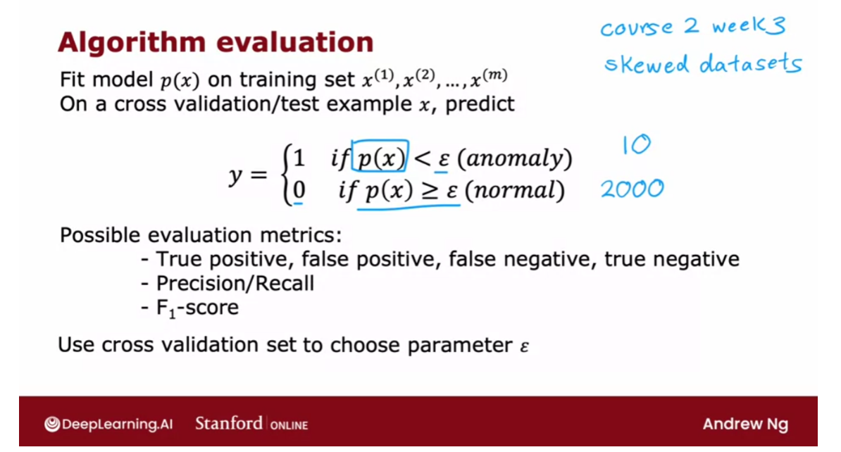
Now, this does
raise the question, if you have a few
labeled examples, since you’ll still be using an unsupervised
learning algorithm, why not take those
labeled examples and use a supervised
learning algorithm instead? In the next video,
let’s take a look at a comparison between anomaly detection and
supervised learning and when you might prefer
one over the other. Let’s go on to the next video.
Anomaly detection vs. supervised learning
When you have a few positive
examples with y = 1 and a large number of negative
examples say y = 0? When should you use anomaly detection and
when should you use supervised learning? The decision is actually quite
subtle in some applications. So let me share with you some thoughts and
some suggestions for how to pick between these
two types of algorithms.
And anomaly detection algorithm will
typically be the more appropriate choice when you have a very small
number of positive examples, 0-20 positive examples is not uncommon. And a relatively large
number of negative examples with which to try to build a model for
p of x.When you recall that the parameters for p of x are learned only from the negative
examples and this much smaller. So the positive examples is only used
in your cross validation set and test set for parameter tuning and
for evaluation.
In contrast, if you have
a larger number of positive and negative examples, then supervised
learning might be more applicable. Now, even if you have only 20
positive training examples, it might be okay to apply
a supervised learning algorithm. But it turns out that the way anomaly
detection looks at the data set versus the way supervised learning looks
at the data set are quite different.
Here is the main difference,
which is that if you think there are many different types of anomalies or
many different types of positive examples. Then anomaly detection might
be more appropriate when there are many different ways for
an aircraft engine to go wrong. And if tomorrow there may
be a brand new way for an aircraft engine to have
something wrong with it. Then your 20 say positive examples
may not cover all of the ways that an aircraft engine could go wrong. That makes it hard for any algorithm
to learn from the small set of positive examples what the anomalies,
what the positive examples look like. And future anomalies may
look nothing like any of the anomalous examples we’ve seen so
far. If you believe this to be true for
your problem, then I would gravitate to using
an anomaly detection algorithm.
Because what anomaly detection does is
it looks at the normal examples that is the y = 0 negative examples and
just try to model what they look like. And anything that deviates a lot
from normal It flags as an anomaly. Including if there’s a brand new way for an aircraft engine to fail that had
never been seen before in your data set.
In contrast, supervised learning has
a different way of looking at the problem. When you’re applying supervised
learning ideally you would hope to have enough positive examples for the average to get a sense of what
the positive examples are like. And with supervised learning,
we tend to assume that the future positive examples are likely to be similar
to the ones in the training set.
So let me illustrate
this with one example, if you are using a system to find,
say financial fraud. There are many different
ways unfortunately that some individuals are trying
to commit financial fraud. And unfortunately there are new types of financial fraud attempts every
few months or every year. And what that means is that because
they keep on popping up completely new. And unique forms of financial fraud
anomaly detection is often used to just look for anything that’s different,
then transactions we’ve seen in the past.
In contrast, if you look at the problem
of email spam detection, well, there are many different types of
spam email, but even over many years. Spam emails keep on trying
to sell similar things or get you to go to similar websites and
so on. Spam email that you will get in
the next few days is much more likely to be similar to spam emails
that you have seen in the past. So that’s why supervised
learning works well for spam because it’s trying to
detect more of the types of spam emails that you have probably seen
in the past in your training set.
Whereas if you’re trying to detect brand
new types of fraud that have never been seen before, then anomaly detection
maybe more applicable.
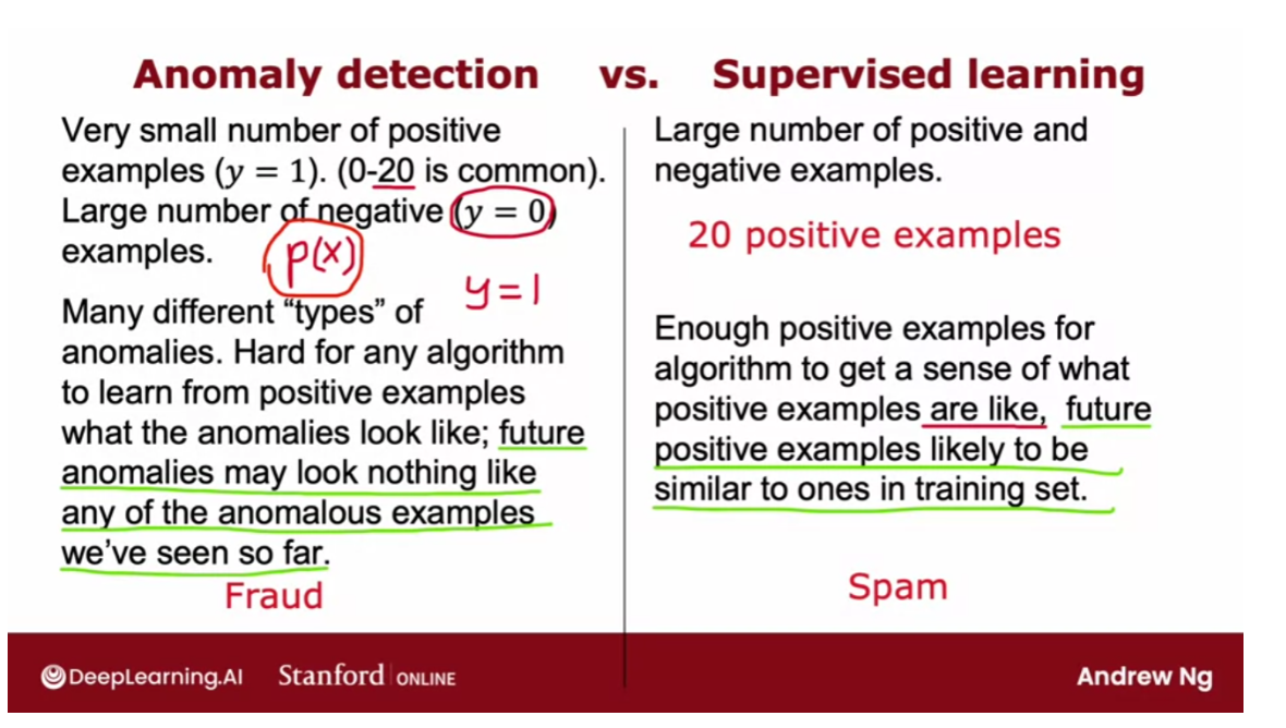
Let’s go through a few more examples. We have already seen fraud detection
being one use case of anomaly detection. Although supervised learning is used to
find previously observed forms of fraud. And we’ve seen email spam
classification typically being address using supervised learning.You’ve also seen the example
of manufacturing where you may want to find new
previously unseen defects. Such as if there are brand new ways for an aircraft engine to fail in the future
that you still want to detect. Even if you don’t have any positive
example like that in your training set. It turns out that the manufacturing
supervised learning is also used to find defects. The more for finding known and
previously seen defects.
For example, if you are a smartphone
maker, you’re making cell phones. And you know that
occasionally your machine for making the case of the smartphone
will accidentally scratch the cover. So scratches are a common defect
on smartphones and so you can get enough training examples of scratched
smartphones responding to label y =1. And just train the system to decide
if a new smartphone that you just manufactured has any scratches in it. And the difference is if you just see
scratched smartphones over and over and you want to check if your
phones are scratched, then supervised learning works well.Whereas if you suspect that they’re
going to be brand new ways for something to go wrong in the future,
then anomaly detection will work well.
Some other examples you’ve heard me talk
about monitoring machines in the data center, especially
the machine’s been hacked. It can behave differently in a brand
new way unlike any previous way in his behavior. So that would feel more like
an anomaly detection application. In fact, one theme is that many
security related applications because hackers are often finding brand
new ways to hack into systems. Many security related applications
will use anomaly detection.
Whereas returning to supervised learning,
if you want to learn to predict the weather well, there’s only a handful
types of weather that you typically see. Is it sunny, rainy, is it going to snow? And so because you see the same
output labels over and over, weather prediction would tend to
be a supervised learning task.
Or if you want to use the symptoms of
the patient to see if the patient has a specific disease that
you’ve seen before. Then that would also tend to be
a supervised learning application.
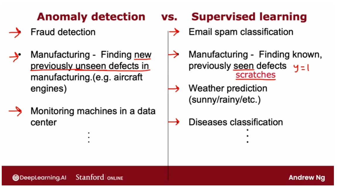
So I hope that gives you a framework for
deciding when you have a small set of positive examples as well as maybe
a large set of negative examples. Whether to use anomaly detection or
supervised learning.Anomaly detection tries to find brand
new positive examples that may be unlike anything you’ve seen before.Where supervised learning looks
at your positive examples and tries to decide if a future example is
similar to the positive examples that you’ve already seen.
Now, it turns out that when building
an anomaly detection algorithm, the choice of features is very important and
when building anomaly detection systems. I often spend a bit of time trying
to tune the features I use for the system in the next video. Let me share some practical tips on how
to tune the features you feed to anomaly detection algorithm.
Choosing what features to use
When building an anomaly
detection algorithm, I found that choosing a good choice of
features turns out to be really important. In supervised learning, if you don’t
have the features quite right, or if you have a few extra features that
are not relevant to the problem, that often turns out to be okay. Because the algorithm has to supervised
signal that is enough labels why for the algorithm to figure out what features
ignore, or how to re scale feature and to take the best advantage of
the features you do give it.
But for anomaly detection which runs,
or learns just from unlabeled data, is harder for the algorithm to figure
out what features to ignore. So I found that carefully choosing
the features, is even more important for anomaly detection, than for
supervised learning approaches.
Let’s take a look at this video as
some practical tips, for how to tune the features for anomaly detection, to try
to get you the best possible performance. One step that can help your
anomaly detection algorithm, is to try to make sure the features
you give it are more or less Gaussian.
And if your features are not Gaussian, sometimes you can change it to make
it a little bit more Gaussian. Let me show you what I mean. If you have a feature X,
I will often plot a histogram of the feature which you can
do using the python command PLT. Though you see this in
the practice lab as well, in order to look at
the histogram of the data. This distribution here
looks pretty Gaussian. So this would be a good candidate feature. If you think this is a feature that
helps distinguish between anomalies and normal examples. But quite often when you plot
a histogram of your features, you may find that the feature
has a distribution like this. This does not at all look like
that symmetric bell shaped curve. When that is the case, I would consider
if you can take this feature X, and transform it in order
to make a more Gaussian.
For example, maybe if you were
to compute the log of X and plot a histogram of log of X,
look like this, and this looks much more Gaussian. And so if this feature was feature X one,
then instead of using the original feature X one which looks like this on
the left, you might instead replace that feature with log of X one,
to get this distribution over here. Because when X one is made more Gaussian. When anomaly detection models
P of X one using a Gaussian distribution like that, is more
likely to be a good fit to the data.
Other than the log function,
other things you might do is, given a different feature X two, you may replace
it with X two, log of X two plus one. This would be a different
way of transforming X two. And more generally, log of X two plus C,
would be one example of a formula you can use, to change X
to try to make it more Gaussian. Or for a different feature,
you might try taking the square root or really the square would have
executed this X lead to the power of one half,and you may change
that exponentially term. So for a different feature X four, you might use X four to the power
of one third, for example.
So when I’m building
an anomaly detection system, I’ll sometimes take a look at my features,
and if I see any highly non Gaussian by plotting histogram, I might
choose transformations like these or others, In order to try
to make it more Gaussian. It turns out a larger value of C, will end
up transforming this distribution less. But in practice I just try
a bunch of different values of C, and then try to take a look to pick one
that looks better in terms of making the distribution more Gaussian.
Now, let me illustrate how I actually
do this and that you put a notebook. So this is what the process of
exploring different transformations in the features might look like. When you have a feature X, you can
plot a histogram of it as follows. It actually looks like there’s
a pretty cause histogram. Let me increase the number of
bins in my history gram to 50. So bins equals 50 there. That’s what histogram bins. And by the way, if you want to change
the color, you can also do so as follows. And if you want to try
a different transformation, you can try for
example to plot X square root of X. So X to the power of 0.5 with
again 50 histogram bins, in which case it might look like this. And this actually looks
somewhat more Gaussian.
But not perfectly, and
let’s try a different parameter. So let me try to the power of 4.25. Maybe I just a little bit too far. It’s the old 0.4 that
looks pretty Gaussian. So one thing you could do is replace
X with excellent power of 0.4. And so you would set X to be
equal to X to the power of 0.4. And just use the value of X in
your training process instead.
Or let me show you another transformation. Here, I’m going to try
taking the log of X. So log of X spotted with 50 bins, I’m going to use the numpy
log function as follows. And it turns out you get an error,
because it turns out that excellent. This example has some values
that are equal to zero, and we’ll log of zero is negative
infinity is not defined. So common trick is to add just
a very tiny number there. So exports 0.001, becomes non negative. And so you get the histogram
that looks like this.
But if you want the distribution to
look more Gaussian, you can also play around with this parameter,
to try to see if there’s a value of that. Cause user data to look more symmetric and
maybe look more Gaussian as follows. And just as I’m doing right now
in real time, you can see that, you can very quickly change these
parameters and plot the histogram. In order to try to take a look and
try to get something a bit more Gaussian, than was the original data next that
you saw in this histogram up above. If you read the machine learning
literature, there are some ways to automatically measure how close
these distributions are to Gaussian.
But I found it in practice,
it doesn’t make a big difference, if you just try a few values and
pick something that looks right to you, that will work well for
all practical purposes. So, by trying things out
in Jupiter notebook, you can try to pick a transformation
that makes your data more Gaussian. And just as a reminder, whatever transformation you apply to
the training set, please remember to apply the same transformation to your cross
validation and test set data as well.
Other than making sure that your
data is approximately Gaussian, after you’ve trained your
anomaly detection algorithm, if it doesn’t work that well
on your cross validation set, you can also carry out an error
analysis process for anomaly detection. In other words, you can try to look at
where the algorithm is not yet doing well whereas making errors, and then use that
to try to come up with improvements.
So as a reminder, what we want is for
P of X to be large. For normal examples X, so
greater than equal to epsilon, and p f X to be small or less than epsilon,
for the anomalous examples X. When you’ve learned the model P
of X from your unlabeled data, the most common problem that you may
run into is that, P of X is comparable in value say is, large for
both normal and for anomalous examples. As a concrete example,
if this is your data set, you might fit that Gaussian into it. And if you have an example in your
cross validation set or test set, that is over here, that is anomalous,
then this has a pretty high probability. And in fact, it looks quite similar to
the other examples in your training set. And so, even though this is an anomaly,
P of X is actually pretty large. And so the algorithm will fail to flag
this particular example as an anomaly.
In that case, what I would normally do is,
try to look at that example and try to figure out what is it that
made me think is an anomaly, even if this feature X one took on values
similar to other training examples. And if I can identify some
new feature say X two, that helps distinguish this
example from the normal examples.Then adding that feature, can help
improve the performance of the algorithm.
Here’s a picture showing what I mean. If I can come up with a new feature X two,
say, I’m trying to detect fraudulent behavior, and if X one is
the number of transactions they make, maybe this user looks like they’re making
some of the transactions as everyone else. But if I discover that this user has
some insanely fast typing speed, and if I were to add a new feature X two,
that is the typing speed of this user. And if it turns out that when I plot this
data using the old feature X one and this new feature X two,
causes X two to stand out over here. Then it becomes much easier for the anomaly detection algorithm to
recognize an X two is an anomalous user. Because when you have this new feature
X two, the learning algorithm may fit a Gaussian distribution that assigns high
probability to points in this region, a bit lower in this region, and
a bit lower in this region.
And so this example, because of
the very anomalous value of X two, becomes easier to detect as an anomaly. So just to summarize the development
process will often go through is, to train the model and
then to see what anomalies in the cross validation set the algorithm
is failing to detect. And then to look at those examples
to see if that can inspire the creation of new features that
would allow the algorithm to spot. That example takes on unusually large or
unusually small values on the new features, so that you can now successfully
flag those examples as anomalies.
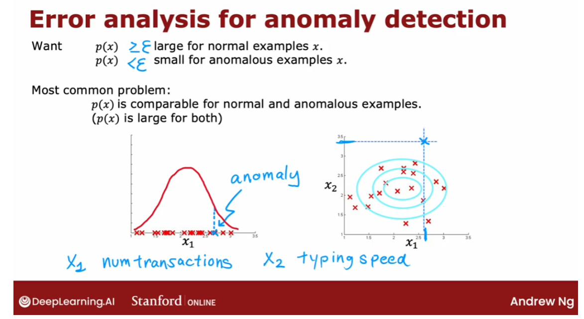
Just as one more example, let’s say you’re
building an anomaly detection system to monitor computers in the data center. To try to figure out if a computer
may be behaving strangely and deserves a closer look,
maybe because of a hardware failure, or because it’s been hacked into or
something. So what you’d like to do is, to choose
features that might take on unusually large or
small values in the event of an anomaly. You might start off with features like X
one is the memory use, X two is the number of disk accesses per second, then the CPU
load, and the volume of network traffic.
And if you train the algorithm,
you may find that it detects some anomalies but
fails to detect some other anomalies. In that case, it’s not unusual to create
new features by combining old features. So, for example, if you find that
there’s a computer that is behaving very strangely, but neither is CPU load
nor network traffic is that unusual.
But what is unusual is,
it has a really high CPU load, while having a very low
network traffic volume. If you’re running the data center that
streams videos, then computers may have high CPU load and high network traffic,
or low CPU load and no network traffic. But what’s unusual about this one
machine is a very high CPU load, despite a very low traffic volume.
In that case,
you might create a new feature X five, which is a ratio of CPU
load to network traffic. And this new feature with hope,
the anomaly detection algorithm flagged future examples like the specific
machine you may be seeing as anomalous. Or you can also consider other features
like the square of the CPU load, divided by the network traffic volume. And you can play around with
different choices of these features. In order to try to get it so that P of X
is still large for the normal examples but it becomes small in the anomalies
in your cross validation set.
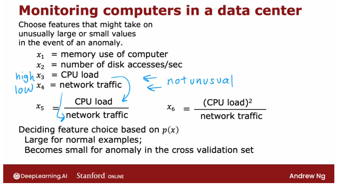
So that’s it. Thanks for
sticking with me to the end of this week. I hope you enjoy hearing about
both clustering algorithms and anomaly detection algorithms. And that you also enjoy playing
with these ideas in the practice labs.
Next week, we’ll go on to talk
about recommender systems. When you go to a website and
recommends products, or movies, or other things to you. How does that algorithm actually work? This is one of the most commercially
important algorithms in machine learning that gets talked about surprisingly little
but next week we’ll take a look at how these algorithms work so that you understand
the next time you go to the website and then recommend something to you. Maybe how that came about. As was you’ll be able to build other
algorithms like that for yourself as well. So have fun with the labs and
they look forward to seeing you next week.
[5] Practice quiz: Anomaly detection
第四题的答案是:The algorithm is less likely to classify new examples as an anomaly.
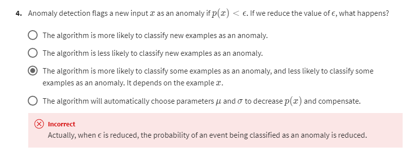
第四题第二次作答
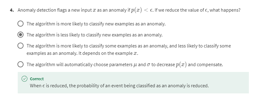
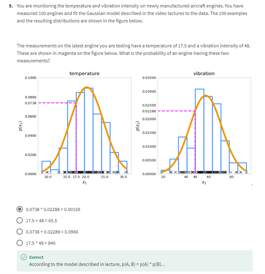
[6] Practice Lab 2
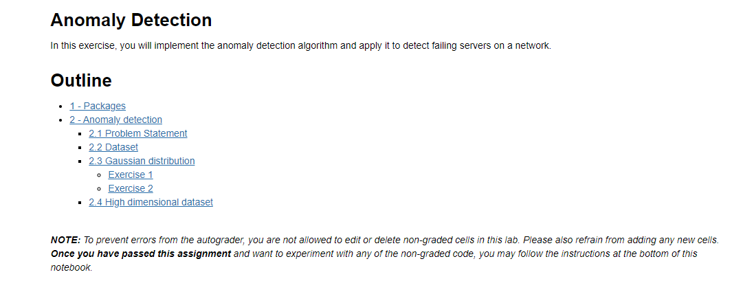
1 - Packages
First, let’s run the cell below to import all the packages that you will need during this assignment.
- numpy is the fundamental package for working with matrices in Python.
- matplotlib is a famous library to plot graphs in Python.
utils.pycontains helper functions for this assignment. You do not need to modify code in this file.
import numpy as np
import matplotlib.pyplot as plt
from utils import *%matplotlib inline
2 - Anomaly detection
2.1 Problem Statement
In this exercise, you will implement an anomaly detection algorithm to
detect anomalous behavior in server computers.
The dataset contains two features -
- throughput (mb/s) and
- latency (ms) of response of each server.
While your servers were operating, you collected m = 307 m=307 m=307 examples of how they were behaving, and thus have an unlabeled dataset { x ( 1 ) , … , x ( m ) } \{x^{(1)}, \ldots, x^{(m)}\} {x(1),…,x(m)}.
- You suspect that the vast majority of these examples are “normal” (non-anomalous) examples of the servers operating normally, but there might also be some examples of servers acting anomalously within this dataset.
You will use a Gaussian model to detect anomalous examples in your
dataset.
- You will first start on a 2D dataset that will allow you to visualize what the algorithm is doing.
- On that dataset you will fit a Gaussian distribution and then find values that have very low probability and hence can be considered anomalies.
- After that, you will apply the anomaly detection algorithm to a larger dataset with many dimensions.
2.2 Dataset
You will start by loading the dataset for this task.
- The
load_data()function shown below loads the data into the variablesX_train,X_valandy_val- You will use
X_trainto fit a Gaussian distribution - You will use
X_valandy_valas a cross validation set to select a threshold and determine anomalous vs normal examples
- You will use
# Load the dataset
X_train, X_val, y_val = load_data()
View the variables
Let’s get more familiar with your dataset.
- A good place to start is to just print out each variable and see what it contains.
The code below prints the first five elements of each of the variables
# Display the first five elements of X_train
print("The first 5 elements of X_train are:\n", X_train[:5])
Output
The first 5 elements of X_train are:[[13.04681517 14.74115241][13.40852019 13.7632696 ][14.19591481 15.85318113][14.91470077 16.17425987][13.57669961 14.04284944]]
# Display the first five elements of X_val
print("The first 5 elements of X_val are\n", X_val[:5])
Output
The first 5 elements of X_val are[[15.79025979 14.9210243 ][13.63961877 15.32995521][14.86589943 16.47386514][13.58467605 13.98930611][13.46404167 15.63533011]]
# Display the first five elements of y_val
print("The first 5 elements of y_val are\n", y_val[:5])
Output
The first 5 elements of y_val are[0 0 0 0 0]
Check the dimensions of your variables
Another useful way to get familiar with your data is to view its dimensions.
The code below prints the shape of X_train, X_val and y_val.
print ('The shape of X_train is:', X_train.shape)
print ('The shape of X_val is:', X_val.shape)
print ('The shape of y_val is: ', y_val.shape)
Output
The shape of X_train is: (307, 2)
The shape of X_val is: (307, 2)
The shape of y_val is:  (307,)
Visualize your data
Before starting on any task, it is often useful to understand the data by visualizing it.
-
For this dataset, you can use a scatter plot to visualize the data (
X_train), since it has only two properties to plot (throughput and latency) -
Your plot should look similar to the one below
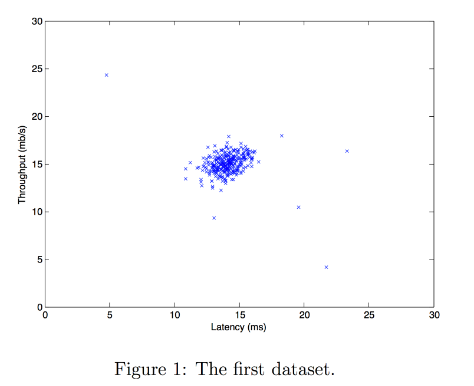
# Create a scatter plot of the data. To change the markers to blue "x",
# we used the 'marker' and 'c' parameters
plt.scatter(X_train[:, 0], X_train[:, 1], marker='x', c='b') # Set the title
plt.title("The first dataset")
# Set the y-axis label
plt.ylabel('Throughput (mb/s)')
# Set the x-axis label
plt.xlabel('Latency (ms)')
# Set axis range
plt.axis([0, 30, 0, 30])
plt.show()
Output
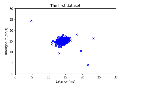
2.3 Gaussian distribution
To perform anomaly detection, you will first need to fit a model to the data’s distribution.
-
Given a training set { x ( 1 ) , . . . , x ( m ) } \{x^{(1)}, ..., x^{(m)}\} {x(1),...,x(m)} you want to estimate the Gaussian distribution for each
of the features x i x_i xi. -
Recall that the Gaussian distribution is given by
p ( x ; μ , σ 2 ) = 1 2 π σ 2 exp − ( x − μ ) 2 2 σ 2 p(x ; \mu,\sigma ^2) = \frac{1}{\sqrt{2 \pi \sigma ^2}}\exp^{ - \frac{(x - \mu)^2}{2 \sigma ^2} } p(x;μ,σ2)=2πσ21exp−2σ2(x−μ)2
where μ \mu μ is the mean and σ 2 \sigma^2 σ2 is the variance.
-
For each feature i = 1 … n i = 1\ldots n i=1…n, you need to find parameters μ i \mu_i μi and σ i 2 \sigma_i^2 σi2 that fit the data in the i i i-th dimension { x i ( 1 ) , . . . , x i ( m ) } \{x_i^{(1)}, ..., x_i^{(m)}\} {xi(1),...,xi(m)} (the i i i-th dimension of each example).
2.3.1 Estimating parameters for a Gaussian distribution
Implementation:
Your task is to complete the code in estimate_gaussian below.
Exercise 1
Please complete the estimate_gaussian function below to calculate mu (mean for each feature in X) and var (variance for each feature in X).
You can estimate the parameters, ( μ i \mu_i μi, σ i 2 \sigma_i^2 σi2), of the i i i-th
feature by using the following equations. To estimate the mean, you will
use:
μ i = 1 m ∑ j = 1 m x i ( j ) \mu_i = \frac{1}{m} \sum_{j=1}^m x_i^{(j)} μi=m1j=1∑mxi(j)
and for the variance you will use:
σ i 2 = 1 m ∑ j = 1 m ( x i ( j ) − μ i ) 2 \sigma_i^2 = \frac{1}{m} \sum_{j=1}^m (x_i^{(j)} - \mu_i)^2 σi2=m1j=1∑m(xi(j)−μi)2
If you get stuck, you can check out the hints presented after the cell below to help you with the implementation.
# UNQ_C1
# GRADED FUNCTION: estimate_gaussiandef estimate_gaussian(X): """Calculates mean and variance of all features in the datasetArgs:X (ndarray): (m, n) Data matrixReturns:mu (ndarray): (n,) Mean of all featuresvar (ndarray): (n,) Variance of all features"""m, n = X.shape### START CODE HERE ### # axis = 0 表示对每列求平均mu = np.mean(X, axis = 0)# var = 1 / m * np.sum((X - mu) ** 2, axis = 0) # 这个也可以var = np.mean((X - mu) ** 2, axis = 0)  # 第二种方法### END CODE HERE ### return mu, var
You can check if your implementation is correct by running the following test code:
# Estimate mean and variance of each feature
mu, var = estimate_gaussian(X_train)              print("Mean of each feature:", mu)
print("Variance of each feature:", var)# UNIT TEST
from public_tests import *
estimate_gaussian_test(estimate_gaussian)
Output
Mean of each feature: [14.11222578 14.99771051]
Variance of each feature: [1.83263141 1.70974533]
All tests passed!
Now that you have completed the code in estimate_gaussian, we will visualize the contours of the fitted Gaussian distribution.
You should get a plot similar to the figure below.
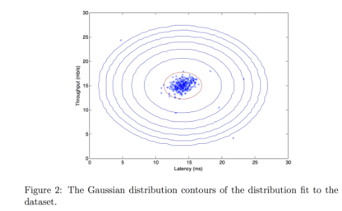
From your plot you can see that most of the examples are in the region with the highest probability, while the anomalous examples are in the regions with lower probabilities.
# Returns the density of the multivariate normal
# at each data point (row) of X_train
p = multivariate_gaussian(X_train, mu, var)#Plotting code
visualize_fit(X_train, mu, var)
Output
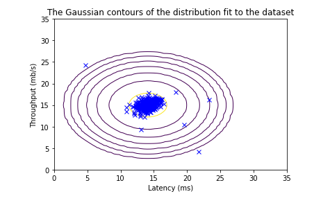
2.3.2 Selecting the threshold ϵ \epsilon ϵ
Now that you have estimated the Gaussian parameters, you can investigate which examples have a very high probability given this distribution and which examples have a very low probability.
- The low probability examples are more likely to be the anomalies in our dataset.
- One way to determine which examples are anomalies is to select a threshold based on a cross validation set.
In this section, you will complete the code in select_threshold to select the threshold ε \varepsilon ε using the F 1 F_1 F1 score on a cross validation set.
- For this, we will use a cross validation set
{ ( x c v ( 1 ) , y c v ( 1 ) ) , … , ( x c v ( m c v ) , y c v ( m c v ) ) } \{(x_{\rm cv}^{(1)}, y_{\rm cv}^{(1)}),\ldots, (x_{\rm cv}^{(m_{\rm cv})}, y_{\rm cv}^{(m_{\rm cv})})\} {(xcv(1),ycv(1)),…,(xcv(mcv),ycv(mcv))}, where the label y = 1 y=1 y=1 corresponds to an anomalous example, and y = 0 y=0 y=0 corresponds to a normal example. - For each cross validation example, we will compute p ( x c v ( i ) ) p(x_{\rm cv}^{(i)}) p(xcv(i)). The vector of all of these probabilities p ( x c v ( 1 ) ) , … , p ( x c v ( m c v ) ) p(x_{\rm cv}^{(1)}), \ldots, p(x_{\rm cv}^{(m_{\rm cv})}) p(xcv(1)),…,p(xcv(mcv)) is passed to
select_thresholdin the vectorp_val. - The corresponding labels y c v ( 1 ) , … , y c v ( m c v ) y_{\rm cv}^{(1)}, \ldots, y_{\rm cv}^{(m_{\rm cv})} ycv(1),…,ycv(mcv) are passed to the same function in the vector
y_val.
Exercise 2
Please complete the select_threshold function below to find the best threshold to use for selecting outliers based on the results from the validation set (p_val) and the ground truth (y_val).
-
In the provided code
select_threshold, there is already a loop that will try many different values of ε \varepsilon ε and select the best ε \varepsilon ε based on the F 1 F_1 F1 score. -
You need to implement code to calculate the F1 score from choosing
epsilonas the threshold and place the value inF1.-
Recall that if an example x x x has a low probability p ( x ) < ε p(x) < \varepsilon p(x)<ε, then it is classified as an anomaly.
-
Then, you can compute precision and recall by:
p r e c = t p t p + f p r e c = t p t p + f n , \begin{aligned} prec&=&\frac{tp}{tp+fp}\\ rec&=&\frac{tp}{tp+fn}, \end{aligned} precrec==tp+fptptp+fntp, where- t p tp tp is the number of true positives: the ground truth label says it’s an anomaly and our algorithm correctly classified it as an anomaly.
- f p fp fp is the number of false positives: the ground truth label says it’s not an anomaly, but our algorithm incorrectly classified it as an anomaly.
- f n fn fn is the number of false negatives: the ground truth label says it’s an anomaly, but our algorithm incorrectly classified it as not being anomalous.
-
The F 1 F_1 F1 score is computed using precision ( p r e c prec prec) and recall ( r e c rec rec) as follows:
F 1 = 2 ⋅ p r e c ⋅ r e c p r e c + r e c F_1 = \frac{2\cdot prec \cdot rec}{prec + rec} F1=prec+rec2⋅prec⋅rec
-
Implementation Note:
In order to compute t p tp tp, f p fp fp and f n fn fn, you may be able to use a vectorized implementation rather than loop over all the examples.
If you get stuck, you can check out the hints presented after the cell below to help you with the implementation.
# UNQ_C2
# GRADED FUNCTION: select_thresholddef select_threshold(y_val, p_val): """Finds the best threshold to use for selecting outliers based on the results from a validation set (p_val) and the ground truth (y_val)Args:y_val (ndarray): Ground truth on validation setp_val (ndarray): Results on validation setReturns:epsilon (float): Threshold chosen F1 (float):      F1 score by choosing epsilon as threshold""" best_epsilon = 0best_F1 = 0F1 = 0step_size = (max(p_val) - min(p_val)) / 1000for epsilon in np.arange(min(p_val), max(p_val), step_size):### START CODE HERE ### predictions = p_val < epsilontp = np.sum((predictions == 1) & (y_val == 1))fp = np.sum((predictions == 1) & (y_val == 0))fn = np.sum((predictions == 0) & (y_val == 1))prec = tp / (tp + fp)rec = tp / (tp + fn)F1 = 2 * prec * rec / (prec + rec)### END CODE HERE ### if F1 > best_F1:best_F1 = F1best_epsilon = epsilonreturn best_epsilon, best_F1
Hints
You can check your implementation using the code below
p_val = multivariate_gaussian(X_val, mu, var)
epsilon, F1 = select_threshold(y_val, p_val)print('Best epsilon found using cross-validation: %e' % epsilon)
print('Best F1 on Cross Validation Set: %f' % F1)# UNIT TEST
select_threshold_test(select_threshold)
Output
Best epsilon found using cross-validation: 8.990853e-05
Best F1 on Cross Validation Set: 0.875000
All tests passed!
Now we will run your anomaly detection code and circle the anomalies in the plot (Figure 3 below).
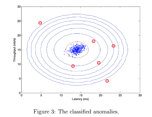
# Find the outliers in the training set
outliers = p < epsilon# Visualize the fit
visualize_fit(X_train, mu, var)# Draw a red circle around those outliers
plt.plot(X_train[outliers, 0], X_train[outliers, 1], 'ro',markersize= 10,markerfacecolor='none', markeredgewidth=2)
Output
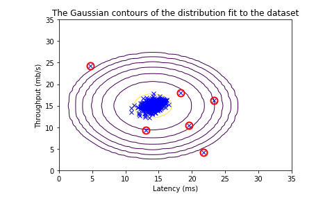
2.4 High dimensional dataset
Now, we will run the anomaly detection algorithm that you implemented on a more realistic and much harder dataset.
In this dataset, each example is described by 11 features, capturing many more properties of your compute servers.
Let’s start by loading the dataset.
- The
load_data()function shown below loads the data into variablesX_train_high,X_val_highandy_val_high_highis meant to distinguish these variables from the ones used in the previous part- We will use
X_train_highto fit Gaussian distribution - We will use
X_val_highandy_val_highas a cross validation set to select a threshold and determine anomalous vs normal examples
# load the dataset
X_train_high, X_val_high, y_val_high = load_data_multi()
Check the dimensions of your variables
Let’s check the dimensions of these new variables to become familiar with the data
print ('The shape of X_train_high is:', X_train_high.shape)
print ('The shape of X_val_high is:', X_val_high.shape)
print ('The shape of y_val_high is: ', y_val_high.shape)
Output
The shape of X_train_high is: (1000, 11)
The shape of X_val_high is: (100, 11)
The shape of y_val_high is:  (100,)
Anomaly detection
Now, let’s run the anomaly detection algorithm on this new dataset.
The code below will use your code to
- Estimate the Gaussian parameters ( μ i \mu_i μi and σ i 2 \sigma_i^2 σi2)
- Evaluate the probabilities for both the training data
X_train_highfrom which you estimated the Gaussian parameters, as well as for the the cross-validation setX_val_high. - Finally, it will use
select_thresholdto find the best threshold ε \varepsilon ε.
# Apply the same steps to the larger dataset# Estimate the Gaussian parameters
mu_high, var_high = estimate_gaussian(X_train_high)# Evaluate the probabilites for the training set
p_high = multivariate_gaussian(X_train_high, mu_high, var_high)# Evaluate the probabilites for the cross validation set
p_val_high = multivariate_gaussian(X_val_high, mu_high, var_high)# Find the best threshold
epsilon_high, F1_high = select_threshold(y_val_high, p_val_high)print('Best epsilon found using cross-validation: %e'% epsilon_high)
print('Best F1 on Cross Validation Set:  %f'% F1_high)
print('# Anomalies found: %d'% sum(p_high < epsilon_high))
Output
Best epsilon found using cross-validation: 1.377229e-18
Best F1 on Cross Validation Set:  0.615385
# Anomalies found: 117
lab得分
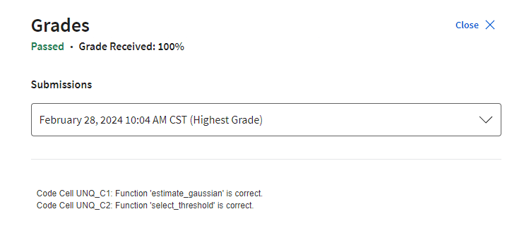
lab中有用的函数
import numpy as np
import matplotlib.pyplot as pltdef load_data():X = np.load("data/X_part1.npy")X_val = np.load("data/X_val_part1.npy")y_val = np.load("data/y_val_part1.npy")return X, X_val, y_valdef load_data_multi():X = np.load("data/X_part2.npy")X_val = np.load("data/X_val_part2.npy")y_val = np.load("data/y_val_part2.npy")return X, X_val, y_valdef multivariate_gaussian(X, mu, var):"""Computes the probability density function of the examples X under the multivariate gaussian distribution with parameters mu and var. If var is a matrix, it istreated as the covariance matrix. If var is a vector, it is treatedas the var values of the variances in each dimension (a diagonalcovariance matrix"""k = len(mu)if var.ndim == 1:var = np.diag(var)X = X - mup = (2* np.pi)**(-k/2) * np.linalg.det(var)**(-0.5) * \np.exp(-0.5 * np.sum(np.matmul(X, np.linalg.pinv(var)) * X, axis=1))return pdef visualize_fit(X, mu, var):"""This visualization shows you the probability density function of the Gaussian distribution. Each examplehas a location (x1, x2) that depends on its feature values."""X1, X2 = np.meshgrid(np.arange(0, 35.5, 0.5), np.arange(0, 35.5, 0.5))Z = multivariate_gaussian(np.stack([X1.ravel(), X2.ravel()], axis=1), mu, var)Z = Z.reshape(X1.shape)plt.plot(X[:, 0], X[:, 1], 'bx')if np.sum(np.isinf(Z)) == 0:plt.contour(X1, X2, Z, levels=10**(np.arange(-20., 1, 3)), linewidths=1)# Set the titleplt.title("The Gaussian contours of the distribution fit to the dataset")# Set the y-axis labelplt.ylabel('Throughput (mb/s)')# Set the x-axis labelplt.xlabel('Latency (ms)')
其他
git commit -m "Finish lab2 of week 01 of Unsupervised Learning, Recommenders, Reinforcement Learning. Learning notes of week 01 done."这篇关于机器学习专项课程03:Unsupervised Learning, Recommenders, Reinforcement Learning笔记 Week01的文章就介绍到这儿,希望我们推荐的文章对编程师们有所帮助!