本文主要是介绍鼠标滑入后边框逐渐包裹效果,希望对大家解决编程问题提供一定的参考价值,需要的开发者们随着小编来一起学习吧!
实现效果:鼠标滑入组件后,组件由无边框变为由边框包裹,边框从四个角逐渐变长包裹完整个组件;鼠标滑出后边框逐渐变短到消失。从两个例子来看:
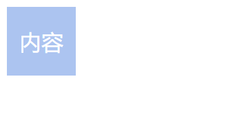
1.普通四边形组件被包裹
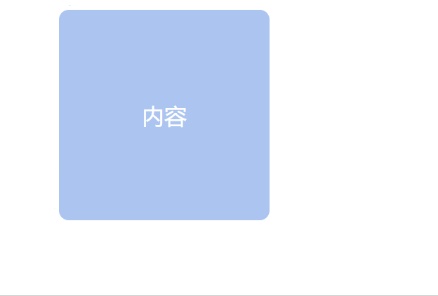
2.有圆弧的四边形组件被包裹
一、普通四边形组件,滑入需边框包裹:
1、普通四边形组件包裹效果主要实现过程:
- 四周的”边框”实际为四个长方形。为了尽量减少html元素,利用组件的 before 和 after 选择器充当组件的上下两个长方形,再增加两个div充当组件左右两个长方形。
- 设置四周的元素的位置,位置与每个顶点对齐。
- 初始时无边框,所以设置上下元素的高度height = border的宽度,width = 0;设置左右元素的宽度width= border的宽度,height = 0。
- 当鼠标滑入时,上下两个元素width变大,左右两个元素height变大。即:设置上下元素的width = 组件的width + border的宽度; 左右元素的height = 组件的height + border的宽度。(加上边框的宽度才能刚好对齐)
HTML:
<div class="box"><div class="hover-left"></div><div class="hover-right"></div>内容</div>CSS(less):
.hover(@height, @width) {height: @height;width: @width;position: absolute;z-index: 0;content: '';display: inline-block;background: #2d77ff;
}.box {position: relative;width: 50px;height: 50px;background: #acc4f0;transition: all 0.3s ease;color: #fff;display: flex;justify-content: center;align-items: center;&::before {.hover(3px, 0);top: -3px;left: 0px;transition: width 0.4s ease;}.hover-right {.hover(0, 3px);top: 0px;right: -3px;transition: height 0.4s ease;}&::after {.hover(3px, 0);bottom: -3px;right: 0px;transition: width 0.4s ease;}.hover-left {.hover(0, 3px);bottom: 0px;left: -3px;transition: height 0.4s ease;}&:hover {box-shadow: 0px 3px 6px rgba(45, 123, 234, 0.3);&::before {width: calc(100% + 3px);}.hover-right {height: calc(100% + 3px);}&::after {width: calc(100% + 3px);}.hover-left {height: calc(100% + 3px);}}
}
二、有圆弧(border-radius)的组件,滑入需边框包裹:
与上面例子不同点:
- 边框起始位置不同。因为有圆弧,所以边框起始位置改为每个角圆弧结束的位置。
- 每个作为边框的节点需要设置一个角为圆弧。如果仅仅宽度为边框的宽度,则包裹不了组件,需要包裹后的弧度为10px的话,则上下边框节点的高度需要达到10px,左右节点宽度也需达到10px,然后设置每个节点对应一个角为10px。
- 若需要边框为3px,则设置边框节点的位置突出3px,即上方的top = - 3px,下方的bottom = - 3px,,,多余部分设置被内容挡住在下一层。
- 拿上方的边框节点举例:由于突出部分3px,高度10px,则包裹时此边框节点在右边将有10-3px=7px的长度露出,则需设置上边框节点包裹组件时对应的宽度 width = 组件的width - 7px,但同时边框需露出3px,所以 width = 组件的width - 7px + 3px (这里略绕,看下图可明晰一点)
如图:

HTML:
<div class="box"><div class="hover-left"></div><div class="hover-right"></div><div class="content">内容</div>
</div>
CSS(less):
// 重点:设置圆弧和位置起点
.hover(@height, @width, @radius) {height: @height;width: @width;position: absolute;z-index: 0;content: '';display: inline-block;background: #2d77ff;border-radius: @radius;  // !
}.box {position: relative;width: 50px;height: 50px;background: #acc4f0;border-radius: 10px;transition: all 0.3s ease;&::before {.hover(10px, 0, 0 10px 0 0);top: -3px;  // !left: 7px;  // !transition: width 0.4s ease;}.hover-right {.hover(0, 10px, 0 0 10px 0);top: 7px;right: -3px;transition: height 0.4s ease;}&::after {.hover(10px, 0, 0 0 0 10px);bottom: -3px;right: 7px;transition: width 0.4s ease;}.hover-left {.hover(0, 10px, 10px 0 0 0);bottom: 7px;left: -3px;transition: height 0.4s ease;}&:hover {box-shadow: 0px 3px 6px rgba(45, 123, 234, 0.3);&::before {width: calc(100% - 4px);}.hover-right {height: calc(100% - 4px);}&::after {width: calc(100% - 4px);}.hover-left {height: calc(100% - 4px);}}.content {position: absolute;top: 0;left: 0;background: #acc4f0;border-radius: 7px; // < 10pxwidth: 100%;height: 100%;z-index: 1;color: #fff;display: flex;justify-content: center;align-items: center;}
}
这篇关于鼠标滑入后边框逐渐包裹效果的文章就介绍到这儿,希望我们推荐的文章对编程师们有所帮助!


