本文主要是介绍【CSS】flex实战 - 移动版携程网首页制作 - CSS3 - flex布局,希望对大家解决编程问题提供一定的参考价值,需要的开发者们随着小编来一起学习吧!

文章目录
- 0. 起步
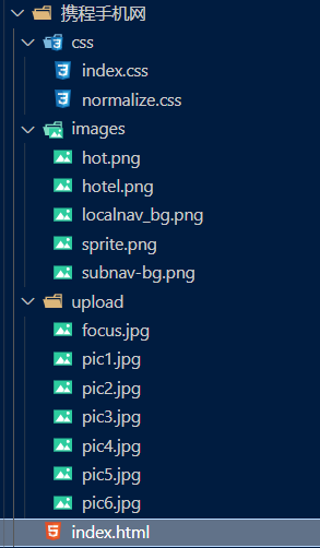
- 目录结构
- index.html
- index.css
- 1. 顶部搜索框
- 1.1 目标
- 1.2 整体布局
- 1.3 填充头像区域
- 1.4 搜索框区域
- 1.5 效果
- 2. 焦点图模块
- 2.1 布局
- 2.2 效果
- 3. 局部导航栏
- 3.1 布局
- 3.2 填充内容
- 3.3 效果
- 4. 主导航栏
- 4.1 布局
- 4.2 填充内容
- 4.3 背景颜色渐变
- 4.4 效果
- 5. 侧导航栏
- 5.1 布局
- 5.2 效果
- 6. 热门活动区域
- 6.1 热门活动
- 6.2 更多福利
- 6.3 活动详情
- 6.4 效果
学学JavaScript,学学Vue,再用用ElementUI,感觉好久没有自己写过CSS了,需要练习练习~
关于flex布局,可以看看之前的博文【CSS】十分钟彻底弄懂flex布局 - 弹性盒 - 伸缩盒 - 代替浮动
今天主要是来一次移动端的实战内容
内容很简单,会用到很多CSS3的知识,巩固一下~
目标
0. 起步
目录结构
index.html
<!DOCTYPE html>
<html lang="en"><head><meta charset="UTF-8"><meta http-equiv="X-UA-Compatible" content="IE=edge"><meta name="viewport" content="width=device-width, initial-scale=1.0"><link rel="stylesheet" href="./css/normalize.css"><link rel="stylesheet" href="./css/index.css"><title>携程在手,说走就走</title>
</head><body><div class="search-index"><div class="search"></div><a href="#" class="user"></a></div>
</body></html>
index.css
body {max-width: 540px;min-width: 320px;margin: 0 auto;font: normal 14px/1.5 Tahoma, "Lucida Grande", Verdana, "Microsoft Yahei",STXihei, hei;color: #000;background: #f2f2f2;overflow-x: hidden;-webkit-tap-highlight-color: transparent;
}
1. 顶部搜索框
1.1 目标
1.2 整体布局
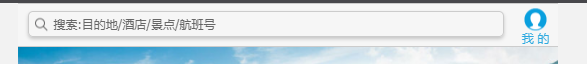
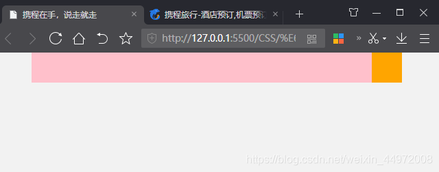
顶部一个盒子,固定定位,定在顶部,然后居中对齐
中间两个盒子,左边宽度自适应,右边固定宽度
<body><div class="search-index"><div class="search"></div><a href="#" class="user"></a></div>
</body>
/* 搜索模块 */
.search-index {display: flex;position: fixed;top: 0;left: 50%;transform: translateX(-50%);width: 100%;min-width: 320px;max-width: 540px;height: 44px;background-color: pink;
}.search {flex: 1;
}.user {width: 44px;height: 44px;background-color: orange;
}
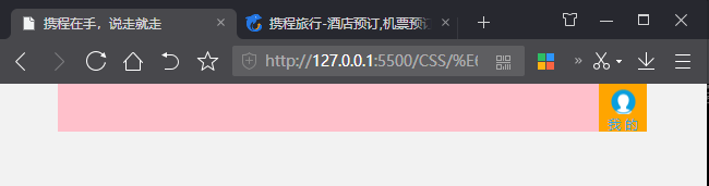
1.3 填充头像区域
用伪元素将头像显示出来,头像使用的是精灵图
精灵图使用二倍图,将图片等比例缩放为原来的一半,然后测量位置
<a href="#" class="user">我 的</a>
a {text-decoration: none;
}.user {width: 44px;height: 44px;background-color: orange;font-size: 12px;text-align: center;color: #2eaae0;
}.user::before {content: "";display: block;width: 23px;height: 23px;/* 使用精灵图 */background: url(../images/sprite.png) no-repeat -59px -194px;/* 二倍图 */background-size: 104px auto;margin: 5px auto 0;
}
1.4 搜索框区域
将盒子改成border-box的盒模型
div {box-sizing: border-box;
}
<div class="search">搜索:目的地/酒店/景点/航班号</div>
设置搜索框的大小再加入一些阴影,文字垂直居中
.search {position: relative;height: 26px;/* 行高不是26px而是24px因为使用的是CSS3盒模型 */line-height: 24px;border: 1px solid #ccc;flex: 1;font-size: 12px;color: #666;margin: 7px 10px;padding-left: 26px;border-radius: 5px;/* 设置阴影 */box-shadow: 0 2px 4px rgba(0, 0,0,.2);
}
搜索图标一样用的精灵图,采用伪元素插入到前面
.search::before {content: "";/* display: block; *//* 改成绝对定位,不占用原来位置,不会把文字挤下去 */position: absolute;top: 5px;left: 5px;width: 15px;height: 15px;background: url(../images/sprite.png) no-repeat -59px -279px;background-size: 104px auto;
}
再给整个搜索模块加背景色和上下边框
.search-index {display: flex;position: fixed;top: 0;left: 50%;transform: translateX(-50%);width: 100%;min-width: 320px;max-width: 540px;height: 44px;background-color: #F6F6F6;border-top: 1px solid #ccc;border-bottom: 1px solid #ccc;这篇关于【CSS】flex实战 - 移动版携程网首页制作 - CSS3 - flex布局的文章就介绍到这儿,希望我们推荐的文章对编程师们有所帮助!


