本文主要是介绍html 视频平滑代码,前端每日实战:24# 视频演示如何用纯 CSS 创作出平滑的层叠海浪特效...,希望对大家解决编程问题提供一定的参考价值,需要的开发者们随着小编来一起学习吧!
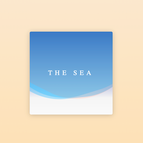
效果预览
按下右侧的“点击预览”按钮可以在当前页面预览,点击链接可以全屏预览。
可交互视频教程
此视频是可以交互的,你可以随时暂停视频,编辑视频中的代码。
请用 chrome, safari, edge 打开观看。
源代码下载
每日前端实战系列的全部源代码请从 github 下载:
代码解读
定义 dom,容器中包含一行文本和3条做海浪特效的 :
the sea
居中显示:
html, body {
height: 100%;
display: flex;
align-items: center;
justify-content: center;
background: linear-gradient(antiquewhite, navajowhite);
}
设置容器样式:
.sea {
width: 300px;
height: 300px;
background-color: whitesmoke;
background-image: linear-gradient(
darkblue,
rgba(255, 255, 255, 0) 80%,
rgba(255, 255, 255, 0.5));
border-radius: 5px;
box-shadow: 0 2px 30px rgba(0, 0, 0, 0.2);
}
设置文字样式:
.sea {
position: relative;
}
.sea .title {
color: white;
font-size: 24px;
font-family: serif;
text-align: center;
line-height: 250px;
text-transform: uppercase;
letter-spacing: 0.4em;
position: absolute;
z-index: 1;
width: 100%;
}
制作海浪动画效果:
.sea .wave {
position: absolute;
top: -250px;
left: -100px;
width: 500px;
height: 500px;
background: deepskyblue;
border-radius: 43%;
filter: opacity(0.4);
animation: drift linear infinite;
}
.sea .wave:nth-of-type(1) {
animation-duration: 5s;
}
.sea .wave:nth-of-type(2) {
animation-duration: 7s;
}
.sea .wave:nth-of-type(3) {
animation-duration: 9s;
}
@keyframes drift {
from {
transform: rotate(360deg);
}
}
加大海浪的波动幅度,增加颜色差异:
.sea .wave {
transform-origin: 50% 48%;
}
.sea .wave:nth-of-type(3) {
background-color: orangered;
filter: opacity(0.1);
}
最后,隐藏容器外的内容:
.sea {
overflow: hidden;
}
大功告成!
这篇关于html 视频平滑代码,前端每日实战:24# 视频演示如何用纯 CSS 创作出平滑的层叠海浪特效...的文章就介绍到这儿,希望我们推荐的文章对编程师们有所帮助!


