本文主要是介绍【深耕 Python】Data Science with Python 数据科学(7)书352页练习题,希望对大家解决编程问题提供一定的参考价值,需要的开发者们随着小编来一起学习吧!
写在前面
关于数据科学环境的建立,可以参考我的博客:
【深耕 Python】Data Science with Python 数据科学(1)环境搭建
往期数据科学博文:
【深耕 Python】Data Science with Python 数据科学(2)jupyter-lab和numpy数组
【深耕 Python】Data Science with Python 数据科学(3)Numpy 常量、函数和线性空间
【深耕 Python】Data Science with Python 数据科学(4)(书337页)练习题及解答
【深耕 Python】Data Science with Python 数据科学(5)Matplotlib可视化(1)
【深耕 Python】Data Science with Python 数据科学(6)Matplotlib可视化(2)
代码说明: 由于实机运行的原因,可能省略了某些导入(import)语句。
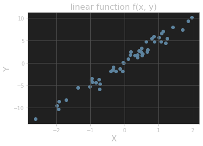
Question 1
Add a title and axis labels to the plot shown in Figure 11.15.
# ex 1
import matplotlib.pyplot as plt
y = 5 * x + rng.standard_normal(n_pts)
fig, ax = plt.subplots()
ax.scatter(x, y)
plt.title("linear function f(x, y)", fontsize=16)
plt.xlabel("X", fontsize=16)
plt.ylabel("Y", fontsize=16)
plt.grid()
plt.show()
输出的图像:
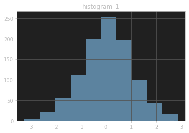
Question 2
Add titles to the histograms in Section 11.3.3.
Answer 1
# ex 2
values = rng.standard_normal(1000)
fig, ax = plt.subplots()
ax.hist(values)
plt.title("histogram_1")
plt.grid()
plt.show()
输出的图像:
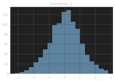
Answer 2
fig, ax = plt.subplots()
ax.hist(values, bins=20)
plt.title("histogram_2")
plt.grid()
plt.show()
输出的图像:
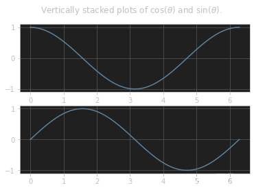
Question 3
One common plotting task is including multiple subplots in the same figure. Show that the code in Listing 11.10 creates vertically stacked subplots, as shown in Figure 11.18. (Here the suptitle() method produces a “supertitle” that sits above both plots. See the Matplotlib documentation on subplots for other ways to create multiple subplots.)
# ex 3
import numpy as np
from math import tau
x = np.linspace(0, tau, 100)
fig, (ax1, ax2) = plt.subplots(2)
fig.suptitle(r"Vertically stacked plots of $\cos(\theta)$ and $\sin(\theta)$.")
ax1.grid()
ax1.plot(x, np.cos(x))
ax2.grid()
ax2.plot(x, np.sin(x))
输出的图像:
Question 4
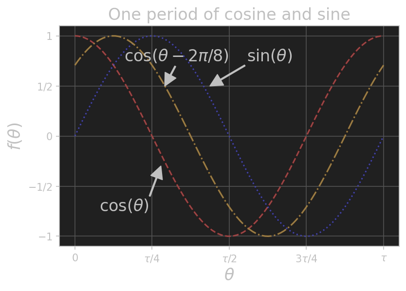
Add a plot of the function cos(x - t/8) to the plot in Figure 11.14 with color “orange” and linestyle “dashdot”. Extra credit: Add an annotation as well. (The extra-credit step is much easier in an interactive Jupyter notebook, especially when finding the right coordinates for the annotation label and arrow.)
#%%
# ex 4
from math import tau
import numpy as np
import matplotlib.pyplot as pltx = np.linspace(0, tau, 100)fig, ax = plt.subplots()ax.set_xticks([0, tau / 4, tau / 2, 3 * tau / 4, tau])
ax.set_yticks([-1, -1 / 2, 0, 1 / 2, 1])
plt.grid()ax.set_xticklabels([r'$0$', r'$\tau/4$', r'$\tau/2$', r'$3\tau/4$', r'$\tau$'])
ax.set_yticklabels([r'$-1$', r'$-1/2$', r'$0$', r'$1/2$', r'$1$'])ax.set_title("One period of cosine and sine", fontsize=16)
ax.set_xlabel(r"$\theta$", fontsize=16)
ax.set_ylabel(r"$f(\theta)$", fontsize=16)ax.annotate(r"$\cos(\theta)$", xy=(1.75, -0.3), xytext=(0.5, -0.75), arrowprops={"facecolor": "black", "width": 1},fontsize=16)
ax.annotate(r"$\sin(\theta)$", xy=(2.75, 0.5), xytext=(3.5, 0.75), arrowprops={"facecolor": "black", "width": 1},fontsize=16)
ax.annotate(r"$\cos(\theta - 2\pi / 8)$", xy=(1.83, 0.5), xytext=(1.0, 0.75), arrowprops={"facecolor": "black", "width": 1},fontsize=16)
fig.set_dpi(150)ax.plot(x, np.cos(x), color="red", linestyle="dashed")
ax.plot(x, np.sin(x), color="blue", linestyle="dotted")
ax.plot(x, np.cos(x - tau / 8), color="orange", linestyle="dashdot")
plt.show()
输出的图像:
参考文献 Reference
《Learn Enough Python to be Dangerous——Software Development, Flask Web Apps, and Beginning Data Science with Python》, Michael Hartl, Boston, Pearson, 2023.
这篇关于【深耕 Python】Data Science with Python 数据科学(7)书352页练习题的文章就介绍到这儿,希望我们推荐的文章对编程师们有所帮助!