本文主要是介绍vue+vuex封装移动端三段布局组件(head、content、foot),希望对大家解决编程问题提供一定的参考价值,需要的开发者们随着小编来一起学习吧!
一、背景
这个布局组件的诞生契机来自于我们前端小组在两个月内同时进行三个H5项目时期,每个项目动辄20+个页面,简直让人秃头……
基本上所有H5页面大抵都是三段式布局,头部和底部fixed布局,中间内容fixed可滚动,如下图;
| head |
|
content
|
| foot |
如果每个页面都要承担实现布局的任务,显而易见这是非常重复且不利于维护的,毕竟大家各有各的开发习惯,可见四五个前端人员开发的布局样式将会是五花八门;此外还有一个非常重要的原因是H5在不同的场景上表现需要定制化差异,下面的表格是我们项目中会遇到的场景:
| H5运行场景 | 显示头部 | 隐藏头部 |
|---|---|---|
| 嵌入APP | 沉浸式,且头部需要适配手机状态栏高度 | 非沉浸式,app提供标题导航栏 |
| 手机浏览器 | 是 | 否 |
| 公众号 | 否 | 是 |
尤其是app中的沉浸式效果,需要头部设置一个状态栏高度的padding,状态栏高度通过和app交互获取。如果设置padding这个操作每一个页面都去实现那就显得太繁琐了,因此封装通用的布局组件具有很好的实用性,统一的写法也方便后续不同开发人员维护。
二、实现思路
其实最开始的时候考虑了flex布局实现,flex-direction:column;flex:1就可以实现content自适应,但是在ios上滑动head和foot会出现回弹的效果,很明显这不是我们想要的效果,因此三段内容必须都是fixed。
实现思路主要就是,head和foot组件中mounted钩子获取组件本身的高度,然后commit保存到vuex中,content组件监听vuex这两个高度的变化动态设置style的top和bottom;
talk is cheap,show me the code,具体实现过程看以下的代码。
三、实现代码
假设我们实现的布局组件名称分别是:mHead、mContent、mFoot,文件结构如下:
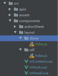
1. vuex布局组件模块:
// src/components/layout/store/index.js
const layout = {state: {// mHead组件的高度top: "0px",// mFoot组件的高度bottom: "0px",// 状态栏的高度,在app打开webview加载H5的时候和app通信获取,具体实现方式依据通信框架而定statusBarHeight: null},mutations: {setTop(state, data) {state.top = data;},setBottom(state, data) {state.bottom = data;},setStatusBarHeight(state, data) {state.statusBarHeight = data;}}
};
export default layout;
引入模块:
// src/store/index.jsimport Vue from "vue";
import Vuex from "vuex";
import layout from "@/components/layout/store/index";
Vue.use(Vuex);export default new Vuex.Store({....actions: {},modules: { layout, ....}
});
2. 封装工具类:
// src/components/layout/util/index.jsimport store from "@/store/index";export const LAYOUT_TYPE = {HEAD: "top",FOOT: "bottom"
};// 重新计算布局,当head和foot中的元素在业务逻辑中动态的显示或者隐藏会改变容器的高度,因此需要调用这个方法重新计算
export const resetLayout = function(type) {this.$nextTick(() => {if (!type || type == LAYOUT_TYPE.HEAD) {let head = document.getElementById("mHead");setState(type, head.getBoundingClientRect().height + "px");}if (!type || type == LAYOUT_TYPE.FOOT) {let foot = document.getElementById("mFoot");setState(type, foot.getBoundingClientRect().height + "px");}});
};// 保存到vuex
export const setState = (type, height) => {let commitName = type === LAYOUT_TYPE.HEAD ? "setTop" : "setBottom";store.commit(commitName, height);
};// 设备类型是否是IOS手机
export const isIOS = !!navigator.userAgent.match(/\(i[^;]+;( U;)? CPU.+Mac OS X/
);
3. mHead组件(src/components/layout/mHead.vue):
<template><divid="mHead"ref="mHead"v-show="show":class="['mHead', paddingTopClass]":style="{paddingTop: statusBarHeight}"><slot> </slot></div>
</template><script>
import {LAYOUT_TYPE,resetLayout,setState,isIOS
} from "components/layout/util";
export default {name: "mHead",props: {// 组件可见性show: {type: Boolean,default: true}},watch: {// 当可见性改变的时候,重新计算高度show(newVal) {if (!newVal) setState(LAYOUT_TYPE.HEAD, "0px");else resetLayout.call(this, LAYOUT_TYPE.HEAD);}},mounted() {// 对于缓存的组件,初始化的时候会触发activated钩子,所以在这里可以不用设置,防止重复设置if (!this.$route?.meta?.keepAlive) {setState(LAYOUT_TYPE.HEAD,this.head.getBoundingClientRect().height + "px");}},computed: {statusBarHeight() {return this.$store.state.layout.statusBarHeight;},head() {return this.$refs["mHead"];},paddingTopClass() {if (this.statusBarHeight) {return "";} else {// !!这里是假设一个值,实际上应该根据通信框架去编写判断方法!!!let isApp = true;// 如果没有状态栏高度参数,则根据手机操作系统去设置padding样式return isApp? isIOS? "ignore-padding-top-ios": "ignore-padding-top-other": "padding-top-none";}}},activated() {setState(LAYOUT_TYPE.HEAD, this.head.getBoundingClientRect().height + "px");}
};
</script><style scoped lang="less">
/*安卓手机通用的状态栏高度*/
@normalStatusBar: 25px;
.mHead {top: 0;width: 100%;left: 0;position: fixed;z-index: 5;
}
/*ios手机可以设置为安全区域的高度*/
.ignore-padding-top-ios {padding-top: constant(safe-area-inset-top);padding-top: env(safe-area-inset-top);
}
.ignore-padding-top-other {padding-top: @normalStatusBar;
}
.padding-top-none {padding-top: 0;
}
</style>
4. mFoot组件(src/components/layout/mFoot.vue):
<template><div class="mFoot" ref="mFoot" id="mFoot" v-show="show"><slot></slot></div>
</template><script>
import {LAYOUT_TYPE,resetLayout,setState
} from "components/layout/layoutUtil";export default {name: "mFoot",props: {show: {type: Boolean,default: true}},mounted() {if (!this.$route?.meta?.keepAlive) {setState(LAYOUT_TYPE.FOOT,this.foot.getBoundingClientRect().height + "px");}},activated() {setState(LAYOUT_TYPE.FOOT, this.foot.getBoundingClientRect().height + "px");},computed: {foot() {return this.$refs["mFoot"];}},watch: {show(newVal) {if (!newVal) setState(LAYOUT_TYPE.FOOT, "0px");else resetLayout.call(this, LAYOUT_TYPE.FOOT);}}
};
</script><style scoped lang="less">
.mFoot {position: fixed;bottom: 0;left: 0;width: 100%;padding-top: constant(safe-area-inset-bottom);padding-top: env(safe-area-inset-bottom);background: white;z-index: 5;
}
</style>
实现过程其实和mHead组件非常相似,只是mHead组件多了设置状态栏高度的逻辑;
5. mContent组件(src/components/layout/mContentvue):
<template><divid="mContent"class="mContent":style="{ bottom: bottom, top: top }"><slot></slot></div>
</template><script>
export default {name: "mContent",props: {// 内容到顶, top:0,常用于导航头部是透明的exceptHead: {type: Boolean,default: false}},data() {return {bottom: "0px",top: "0px",// 组件是否是激活状态,因为缓存组件在失活的时候也是会响应保存在vuex中的高度,所以需要有一个标志去控制响应的逻辑active: false};},mounted() {this.active = true;this.$nextTick(() => {if (document.getElementById("mHead") && !this.exceptHead) {this.top = this.$store.state.layout.top;}let foot = document.getElementById("mFoot");if (foot) {this.bottom = this.$store.state.layout.bottom;}});},watch: {"$store.state.layout.bottom": function(newVal) {if (this.active) {this.bottom = newVal;}},"$store.state.layout.top": function(newVal) {if (this.active && !this.exceptHead) {this.top = newVal;}}},activated() {this.active = true;},deactivated() {this.active = false;}
};
</script>
<style scoped lang="less">
.mContent {z-index: 5;position: absolute;left: 0;width: 100%;overflow-y: auto;overflow-x: hidden;-webkit-overflow-scrolling: touch;
}
</style>
至此,就可以完成三个布局组件的实现了,考虑到这三个组件会在每个页面都会使用,所以可以在项目的入口文件设置为全局组件:
// src/main.js// 引入布局组件
import mHead from "components/layout/mHead";
import mContent from "components/layout/mContent";
import mFoot from "components/layout/mFoot";
Vue.component("m-head", mHead);
Vue.component("m-content", mContent);
Vue.component("m-foot", mFoot);
在每个页面就可以这么使用了:
<template><div><m-head>.......</m-head><m-content>.......</m-content><m-foot>.......</m-foot></div>
</template>
可以愉快的专注于实现各个页面的功能了!
但是这三个组件也不是非常的完美的适用于各个场景,有一定的局限性:
1. 如果头部和底部组件的高度在业务逻辑处理中会出现动态变化的情况,需要调用封装的重新计算布局方法;

2. 一个页面按理说应该只会存在这一个这种布局,但是有的业务功能需要两个页面才能实现,比如在我们积分商城的首页,点击顶部的搜索需要自动打开搜索页面并且打开键盘,如下:


关键在于自动打开键盘这个功能必须在一个页面才能实现,点击搜索=》搜索页面显示=》输入框focus;因此在一个页面中就会出现两个三段式布局,如果两个页面的布局组件不一致,比如一个有头部一个没有,或者两个头部的高度不一样,都会影响到各自的显示,因为vuex只保存了一个top和一个bottom,当一个页面出现两个布局的时候就会产生混乱的情况。
暂时我还没有遇到这种情况,确实这种情况比较少,目前也没有想到什么比较好的解决办法,以后完善之后在来填坑^-^~
四、一点思考
其实布局组件的实现并不复杂,不使用它们一样可以实现各个页面的功能,但是在高效率开发和便于维护的角度上需要我们有多一些的思考,多一些实践。
这篇关于vue+vuex封装移动端三段布局组件(head、content、foot)的文章就介绍到这儿,希望我们推荐的文章对编程师们有所帮助!


