前言
盒子模型作为CSS基础中的基础,曾一度以为掌握了IE和W3C标准下的块级盒子模型即可,但近日在学习行级盒子模型时发现原来当初是如此幼稚可笑。本文尝试全面叙述块级、行级盒子模型的特性。作为近日学习的记录。何
为盒子模型?
盒子模型到底何方神圣居然可以作为CSS的基础?闻名不如见面,上图了喂!
再来张切面图吧!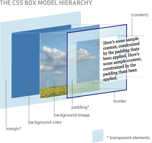
下面我们以 <div></div> 为栗子。<div></div> 标签被浏览器解析后会生成div元素并添加到document tree中,但CSS作用的对象并不是document tree,而是根据document tree生成的render tree,而盒子模型就是render tree的节点。
* 注意:
* 1. CSS作用的是盒子(Box), 而不是元素(Element);
* 2. JS无法直接操作盒子。
盒子模型的结构
由于块级盒子在验证效果时干扰信息更少,便于理解盒子模型,因此下面将以块级盒子模型来讲解。
注意: 行级盒子模型与块级盒子模型结构一致,只是行级盒子在此基础上有自身特性而已。
从上面两幅图说明盒子模型其实就是由以下4个盒子组成:
1. content box:必备,由content area和4条content/inner edge组成;
2. padding box:可选,由padding和4条padding edge组成。若padding宽度设置为0,则padding edge与content edage重叠;
3. border box:可选,由border和4条border edge组成。若border宽度设置为0,则border edge与padding edage重叠;
4. margin box:可选,由margin和4条margin/outer edge组成。若margin宽度设置为0,则margin edge与border edage重叠。
对于刚接触CSS的同学,经常会将"通过width/height属性设置div元素的宽/高"挂在口边,其实这句话是有误的。
1. 首先css属性width和height作用于div元素所产生的盒子,而不是元素本身;
2. 另外盒子模型由4个盒子组成,那width和height到底是作用于哪些盒子呢?
这里就分为IE盒子模型和标准盒子模型了。
IE box model
IE5.5(怪异模式)采用IE盒子模型,其它将使用W3C标准盒子模型。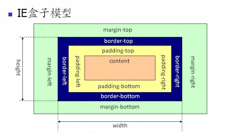
width = content-width + padding-width + border-width
height = content-height + padding-height + border-height
Standard box model
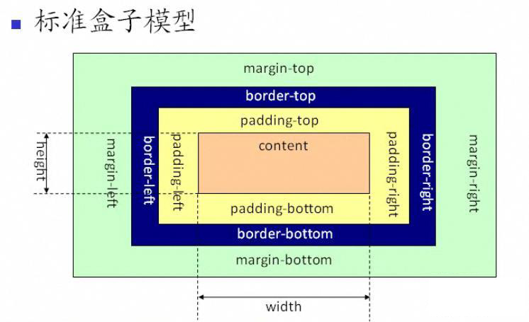
width = content-width
height = content-height
游走于IE box model 和 Standard box model间的通道——box-sizing属性
我们看到存在两种width/height的划分方式,到底哪种才对呢?其实两种都对,具体看如何使用而已。另外IE8开始支持CSS3属性box-sizing,让我们可以自由选择采用哪种盒子:)
box-sizing:content-box/border-box/inherit
content-box——默认值,采用Standard box model
border-box——采用IE box model
inherit——继承父元素属性值
sample:

Element{-moz-box-sizing: border-box; // FireFox3.5+-o-box-sizing: border-box; // Opera9.6(Presto内核)-webkit-box-sizing: border-box; // Safari3.2+-ms-box-sizing: border-box; // IE8box-sizing: border-box; // IE9+,Chrome10.0+,Safari5.1+,Opera10.6
}
行级盒子——怀疑人生de起点:)
之前我理解的盒子模型如上所述,当我看到行级盒子的种种现象时,便开始怀疑人生了:(
width/height不起作用。。。
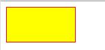
.defined-wh{width: 100px;height: 50px;border: solid 1px red;background: yellow;
}
对于block-level box
<div class="defined-wh"></div>
对于inline-level box
<span class="defined-wh"></span>

行级盒子的宽度怎么会是0呢?高度是有的但不是50px啊,到底什么回事啊?
原因很简单,那就是行级盒子的content box的高/宽根本就不是通过height/width来设置的。
content box/area的高由font-size决定的;
content box/area的宽等于其子行级盒子的外宽度(margin+border+padding+content width)之和。
行级盒子被挤断了。。。
.broken{border: solid 1px red;background: yellow;
}
对于block-level box
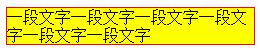
<div class="broken">一段文字一段文字一段文字一段文字一段文字一段文字</div>
对于inline-level box
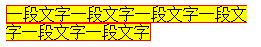
<span class="broken">一段文字一段文字一段文字一段文字一段文字一段文字</span>
行级盒子被五马分尸了,可怜兮兮的。更可怜的是我理解不了。。。
其实W3C Recommendation有说明的哦!
>The box model for inline elements in bidirectional context
>When the element's 'direction' property is 'ltr', the left-most generated box of the first line box in which the element appears has the left margin, left border and left padding, and the right-most generated box of the last line box in which the element appears has the right padding, right border and right margin.
>When the element's 'direction' property is 'rtl', the right-most generated box of the first line box in which the element appears has the right padding, right border and right margin, and the left-most generated box of the last line box in which the element appears has the left margin, left border and left padding.
就是说当inline-level box宽度大于父容器宽度时会被拆分成多个inline-level box,
当属性direction为ltr时,margin/border/padding-left将作用于第一个的inline-level box,margin/border/padding-right将作用于最后一个的inline-level box;若属性direction为rtl时,margin/border/padding-right将作用于第一个的inline-level box,margin/border/padding-left将作用于最后一个的inline-level box。
看到了没?行级盒子真的会被分尸的,好残忍哦:|
行级盒子怎么不占空间了?怎么刷存在感啊。。。
.existed{margin: 20px;padding: 20px;border: solid 1px red;background: yellow;background-clip: content-box;
}
对于block-level box
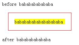
<div>before bababababababa</div>
<div class="existed">babababababababababa</div>
<div>after bababababababa</div>
对于inline-level box
<div>before bababababababa</div>
<span class="existed">babababababababababa</span>
<div>after bababababababa</div>
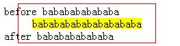
看,行级盒子的margin/border/padding-top/bottom怎么均不占空间的?难道行级盒子仅有content box占空间吗?
这里已经涉及到水平和垂直方向排版的范畴了,仅以盒子模型已无法解析理解上述的问题。
(要结合https://www.w3.org/TR/CSS2/box.html和https://www.w3.org/TR/CSS21/visuren.html、https://www.w3.org/TR/CSS21/visudet.html来理解了!)
在深入解释inline-level box的上述现象前,我们需要补充一下:
1. 一个元素会对应0~N个box;(当设置`display:none;`时,则对应0个box)
2. 根据`display`属性值,元素会对应不同类型的controlling box(inline/block-level box均是controlling box的子类). 就CSS2而言`display:inline|inline-block|inline-table|table-cell|table-column-group`的元素对应inline-level box,而`display:block|list-item|table|table-caption|table-header-group|table-row|table-row-group|table-footer-group`的元素则对应block-level box;
3. box布局/排版时涉及到定位问题,而CSS中通过positioning scheme来定义,其包含normal flow、floats和absolute positioning三种定位方式.而normal flow包含block formatting、inline formatting和relative positioning,其中BFC为block formatting的上下文,IFC为inline formatting的上下文。
因此大家请注意,前方高能,前方高能!!!
和IFC一起看inline-level box
IFC(Inline Formatting Context),直译为“行内格式化上下文”,这是什么鬼的翻译啊?反正我对于名词一向采用拿来主义,理解名词背后的含义才是硬道理。
我们简单理解为每个盒子都有一个FC特性,不同的FC值代表一组盒子不同的排列方式。有的FC值表示盒子从上到下垂直排列,有的FC值表示盒子从左到右水平排列等等。而IFC则是表示盒子从左到右的水平排列方式,仅此而已(注意:一个盒子仅且仅有一个FC值)。而inline-level box的FC特性值固定为IFC。
另外仅处于in-flow的盒子才具有FC特性,也就是positioning scheme必须为Normal flow的盒子才具有FC特性。
除了IFC外,对于inline-level box排版而言还有另一个重要的对象,那就是line box。line box是一个看不见摸不着的边框,但每一行所占的垂直高度其实是指line box的高度,而不是inline-level box的高度。
line box的特点:
1. 同一行inline-level box均属于同一个line box;
2. line box高度的计算方式(https://www.w3.org/TR/CSS21/visudet.html#line-height)
>The height of each inline-level box in the line box is calculated. For replaced elements, inline-block elements, and inline-table elements, this is the height of their margin box; for inline boxes, this is their 'line-height'.
>The inline-level boxes are aligned vertically according to their 'vertical-align' property. In case they are aligned 'top' or 'bottom', they must be aligned so as to minimize the line box height. If such boxes are tall enough, there are multiple solutions and CSS 2.1 does not define the position of the line box's baseline.
>The line box height is the distance between the uppermost box top and the lowermost box bottom.
.parent{line-height: 1;font-size: 14px;border: solid 1px yellow;
}
.child{font-size: 30px;vertical-align: middle;border: solid 1px blue;
}
.inline-block{display: inline-block;overflow: hidden;border: solid 1px red;
}
.other{border: solid 1px green;
}
<span class="parent"><span class="child"><span class="inline-block">display:inline-block元素</span>xp子元素的文字</span>xp父元素的文字 </span> <div class="other">其他元素</div>

1. 根据规则,span.parent所在行的line box的高度受span.parent、span.child、span.inline-block元素对应的inline-level box"高度"的影响。其中span.parent的"高度"为其line-height实际值,span.child的"高度"为其line-height实际值,而span.inline-block的"高度"为其margin box的高度。由于设置line-height:1,因此span.parent和span.child的content box高度等于line-height实际值;
2. 根据vertical-align属性垂直对齐,造成各“高度”间并不以上边界或下边界对齐;
3. span.inline-block红色的上边框(border top)到span.child蓝色的下边框(border bottom)的距离再减去1px即为line box的高度。(line box的下界其实是span.child的content box的下限的,你看"其他元素"的上边框不是和span.child的下边框重叠了吗?如果那是line box的下界,那怎会出现重叠呢)
这里又涉及到另一个属性vertical-align了,由于它十分复杂,还是另开文章来叙述吧!
行级盒子小结
就盒子模型而言
1. inline-level box与block-level box结构一致;
2. content box的高度仅能通过属性font-size来设置,content box的宽度则自适应其内容而无法通过属性width设置;
3. 当inline-level box的宽度大于containing block,且达到内容换行条件时,会将inline-level拆散为多个inline-level box并分布到多行中,然后当属性direction为ltr时,margin/border/padding-left将作用于第一个的inline-level box,margin/border/padding-right将作用于最后一个的inline-level box;若属性direction为rtl时,margin/border/padding-right将作用于第一个的inline-level box,margin/border/padding-left将作用于最后一个的inline-level box。
垂直排版特性
inline-level box排版单位不是其本身,而是line box。重点在于line box高度的计算。
1. 位于该行上的所有in-flow的inline-level box均参与该行line box高度的计算;(注意:是所有inline-level box,而不仅仅是子元素所生成的inline-level box)
2. replaced elements, inline-block elements, and inline-table elements将以其对应的opaque inline-level box的margin box高度参与line box高度的计算。而其他inline-level box则以line-height的实际值参与line box高度的计算;
3. 各inline-level box根据vertical-align属性值相对各自的父容器作垂直方向对齐;
4. 最上方的box的上边界到最下方的下边界则是line box的高度。(表述不够清晰,请参考实例理解)
Collapsing margins
大家必定听过或遇过collapsing margins吧,它是in-flow的block-level box排版时的一类现象。说到排版那必须引入另一个FC特性值——BFC(Block Formatting Context)的。
BFC则是表示盒子从上到下的垂直排列方式,仅此而已(注意:一个盒子仅且仅有一个FC值)。而block-level box的FC特性值固定为BFC。
collapsing margins规则
1. 元素自身margin-top/bottom collapsing
anonymous block-level box
<div class="margins"></div>
anonymous block-level box
<div class="margins border"></div>
anonymous block-level box
.margins{margin: 50px 0 70px;}
.border{border: solid 1px red;} 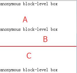
A区域大小等于C区域大小
当block-level box高度为0,垂直方向的border和padding为0,并且没有in-flow的子元素。那么它垂直方向的margin将会发生重叠。
2. 父子元素margin-top/top 或 margin-bottom/bottom collapsing

当父子元素margin-top间或margin-bottom间没有padding、border阻隔时,则会margin会发生重叠。
注意空白字符会造成目标父子元素间的存在anonymous block-level box,导致margin不重叠。
3. 兄弟元素margin-bottom/top collapsing
<div class="margins">former</div>
<div class="margins">latter</div>
.margins{margin: 50px 0 25px;} 两个相邻的in-flow block-level box的上下margin将发生重叠。
上述为默认情况下block-level box(即display:block,其它为默认值时)的margin重叠规则
那非默认情况下呢?相比非默认情况下的margin重叠规则,我们更关心是什么时候不会产生重叠。这时又引入了另一个概念——生成新BFC。也就是block-level box A与block-level box B的FC特性值BFC可能是不同的。
当两个相邻box的FC值不为同一个BFC时,它们的margin绝对不会重叠。
那么剩下的问题就是,到底何时会产生新的BFC?哪些block-level box会采用新的BFC?默认BFC又是谁生成的呢?
其实根元素(html)会生成默认BFC供其子孙block-level box使用。
采用floats或absolute positioning作为positioning scheme时,或display:inline-block/table-cell/table-caption/flex/inline-flex或overflow属性值不为visible时,则会产生新的BFC;而新的BFC将作为子孙block-level box的FC属性值。
注意:
1. 产生新BFC的盒子不会与子盒子发生margin重叠;
2. display:inline-block的盒子不与 兄弟 和 父 盒子发生margin重叠,是因为display:inline-block的盒子的FC特性值为IFC,还记得line box吗?没有margin重叠是自然不过的事了;
3. positioning scheme为floats的盒子不与floated的兄弟盒子发生margin重叠,也不会与前一个in-flow的兄弟盒子发生margin重叠。(注意:与父盒子也不会发生margin重叠)
<div class="margins border">sibling</div>
<div class="margins border float">floats1</div>
<div class="margins border float">floats2</div>
.margins{margin: 50px 0 50px;}
.border{border: solid 1px red;}
.float{float:left;width:200px;} 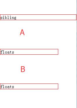
归纳FC、BFC和IFC
由于上述主要阐述inline/block-level box,因此通过“仅此而已”来简化BFC和IFC的内涵。下面我们稍微全面一点去理解BFC和IFC如何影响inline/block-level box。
FC(Formatting Context),用于初始化时设置盒子自身尺寸和排版规则。注意“初始化”,暗指positioning scheme采用的是normal flow,要知道floats和absolute positioning均不是默认/初始化值。也就是说我们在讨论FC及BFC和IFC时,均针对in-flow box而言的。
BFC
对于不产生新BFC的盒子
1. block-level boxes垂直排列,盒子的left outer edge与所在的containing block的左边相接触,默认情况下(width为auto时)right outer edge则与所在的containing block的右边相接触。即使存在floated的兄弟盒子。
<div id="container" style="border:solid 2px red;"><div id="left" style="float:left;width:300px;height:30px;background:yellow;opacity:0.2;"></div><div id="right" style="height:30px;background:#999;"></div>
</div>

虽然 div#left 浮点了,但 div#right 的left outer edge还是与 div#container 的left content edge相接触。 div#right 所在的containing block就是 div#container 的content box.
2. block-level box高度的计算
The element's height is the distance from its top content edge to the first applicable of the following:
the bottom edge of the last line box, if the box establishes a inline formatting context with one or more lines
the bottom edge of the bottom (possibly collapsed) margin of its last in-flow child, if the child's bottom margin does not collapse with the element's bottom margin
the bottom border edge of the last in-flow child whose top margin doesn't collapse with the element's bottom margin
zero, otherwise
Only children in the normal flow are taken into account (i.e., floating boxes and absolutely positioned boxes are ignored, and relatively positioned boxes are considered without their offset).
也就out-flow box不影响block-level box高度的计算。也就是解释了为何div中仅含floated元素时,div盒子高度为0的现象了。
对于产生新BFC的盒子
对于产生新BFC的盒子而言,除了不发生collapsing margins的情况外,还有两个与浮点相关的现象。
1. out-flow box纳入block-level box高度的计算
In addition, if the element has any floating descendants whose bottom margin edge is below the element's bottom content edge, then the height is increased to include those edges. Only floats that participate in this block formatting context are taken into account, e.g., floats inside absolutely positioned descendants or other floats are not.
也就positioning scheme为floats的box也会影响block-level box高度的计算。
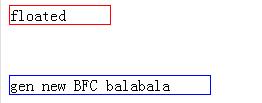
2. 誓死不与positioning scheme为floats的兄弟盒子重叠
The border box of a table, a block-level replaced element, or an element in the normal flow that establishes a new block formatting context (such as an element with 'overflow' other than 'visible') must not overlap the margin box of any floats in the same block formatting context as the element itself. If necessary, implementations should clear the said element by placing it below any preceding floats, but may place it adjacent to such floats if there is sufficient space. They may even make the border box of said element narrower than defined by section 10.3.3. CSS2 does not define when a UA may put said element next to the float or by how much said element may become narrower.
产生新BFC的block-level box不与floated-box重叠,而是floated-box的margin-box与block-level box的border-box相接触。
水平方向
<div style="float:left;width:100px;border: solid 1px red;margin-right:50px;">floated</div>
<div style="width:200px;border: solid 1px blue;margin-left:100px;overflow:hidden;">gen new BFC balabala</div>

垂直方向
<div style="float:left;width:100px;border: solid 1px red;margin-bottom:50px;">floated</div>
<div style="width:200px;border: solid 1px blue;margin-top:100px;overflow:hidden;">gen new BFC balabala</div>
IFC
提起IFC那就不能不说line box,而line box高度的计算方式上面已经叙述了,那line box的宽度呢?
line box默认情况下左边框与containing block的左边框接触,右边框与containing block的右边框接触。若存在floated兄弟盒子,则line box的宽度为containing block的宽度减去floated-box的outer-box的宽度。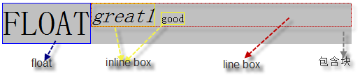
而inline-level box必须包含在line box中,若inline-level box的`white-space:nowrap或pre外的其他值`时,就会将inline-level box拆分为多个inline-level box并散落到多个line box中,从而实现文字环绕图片的效果了。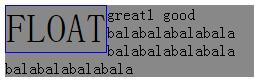
否则inline-level box会捅破line box(即line box宽度不变)
行——换与不
先看看关于换行的CSS属性吧!
white-spacenormal: 忽略/合并空白pre: 保留空白,如同<pre>的行为nowrap: 忽略/合并空白,文本不会换行,直到遇到<br/>pre-wrap: 保留空白,但是会正常地进行换行pre-line: 忽略/合并空白,但是会正常地进行换行inherit: 从父元素继承。word-wrapnormal: 只在允许的断字点换行break-word: 在长单词或URL地址内部进行换行word-breaknormal:依照亚洲和非亚洲语言的文本规则,允许在单词内换行。keep-all:让亚洲语言文本如同非亚洲语言文本那样不允许在任意单词内换行。break-all:允许非亚洲语言文本行如同亚洲语言文本那样可以在任意单词内换行。
具体示例可参考:css中强制换行word-break、word-wrap、white-space区别实例说明
在处理换行问题上,我们要处理的对象分为亚洲语言文本和非亚洲语言文本。对于亚洲语言文本是以字作为操作单元,而非亚洲语言文本是以单词作为操作单元。而换行是针对特定语言文本的操作单元来处理,所以默认情况下会看到一串没空格的“中文”自动换行,而一串没空格的“英文”却没有换行的现象。
对于我们(亚洲人)而言,一般采用 word-break:break-all;word-wrap:break-word; 来实现中英文自动换行效果,但英文单词本身是不能这样简单粗暴地换行的。
英语单词移行有一定规则,归纳如下:
1.移行处要用连字符号“-”,只占一个印刷符号的位置并放在该行的最后.
2.移行时一般按照音节进行,故只可在两音节之间分开,不能把一个完整的音节分写在上下两行.例如:Octo-ber(正),Octob-er(误).
3.复合词要在构成该词的两部分之间移行.如:some-thing,bed-room等.
4.如果复合词原来就有连字符号,则就在原连字符号处分行.如:good-looking等.
5.两个不同的辅音字母在一起时,移行时前后各一个.如:cap-tain,ex-pose等.
6.当两个音节间只有一个辅音字母时,如果该辅音字母前的元音字母按重读开音节的规则发音,该辅音字母移至下一行.如:fa-ther等.但如果元音按重读闭音节的规则发音,则该辅音字母保留在上一行末尾.例如:man-age等.
7.当遇到双写辅音字母时,一般把它们分成前后各一个.例如:mat-ter等.
8.当重读音节在后面时,元音字母前的辅音字母通常移到下一行.如:po-lite等.
9.单音节词不可移行.如:length,long,dance等.
10.前缀或后缀要保持完整,不可分开写.如:unfit,disappear等.
11.阿拉伯数字不分开移行书写.
12.不论音节多少,专有名词不宜分写.例如:Nancy,Russia等.
13.缩写词、略写词或某些词的缩写形式不可移行书写.例如:U.N.(联合国),P.R.C.(中华人民共和国),isn't.
14.不能构成一个音节的词尾不分写.例如:stopped等.
15.字母组合或辅音连缀不可移行.例如:machine,meat等.
CSS简化了上述的规则,若需要换行处恰好是一个复合词,就在原连字符号处分行;其它情况则整个单词移到下一行。因此使用 word-wrap:break-word; 就OK了。
另外我们还可以通过 word-break:keep-all;white-space:nowrap; 来实现打死都不换行的效果
总结
洋洋洒洒总算把Box Model、BFC和IFC描述了个大概。对于BFC折腾点就是在collapsing margins那,另外还有产生新BFC这个行为上(这个跟浮动等有交集,以后再理清吧);而IFC重点在于理解line box,其实line box也像block-level box那样是垂直排列的,而inline-level box则是以line box作为容器实现水平排列罢了。到这里会发现理解IFC比BFC蛋疼多了,不过有了这篇作基础,后面理解text-align、line-height和vertical-align就轻松不少了。
本文纯个人理解,若有纰漏,望各位指正,谢谢!
尊重原创,转载请注明来自:http://www.cnblogs.com/fsjohnhuang/p/5259121.html肥子John^_^
感谢
http://div.io/topic/834?page=1#3261(BFC)
http://www.cnblogs.com/giggle/p/5236982.html(BFC)
https://segmentfault.com/a/1190000003043991 (IFC)
http://www.cnblogs.com/winter-cn/archive/2013/05/11/3072929.html(BFC/IFC)
[KB010: 常规流( Normal flow ) ](http://www.w3help.org/zh-cn/kb/010/)
[CSS 101: Block Formatting Contexts](http://yuiblog.com/blog/2010/05/19/css-101-block-formatting-contexts/)
转载:http://www.cnblogs.com/fsjohnhuang/p/5259121.html


