本文主要是介绍ElementUI 组件:Layout布局(el-row、el-col),希望对大家解决编程问题提供一定的参考价值,需要的开发者们随着小编来一起学习吧!
ElementUI安装与使用指南
Layout布局
点击下载learnelementuispringboot项目源码
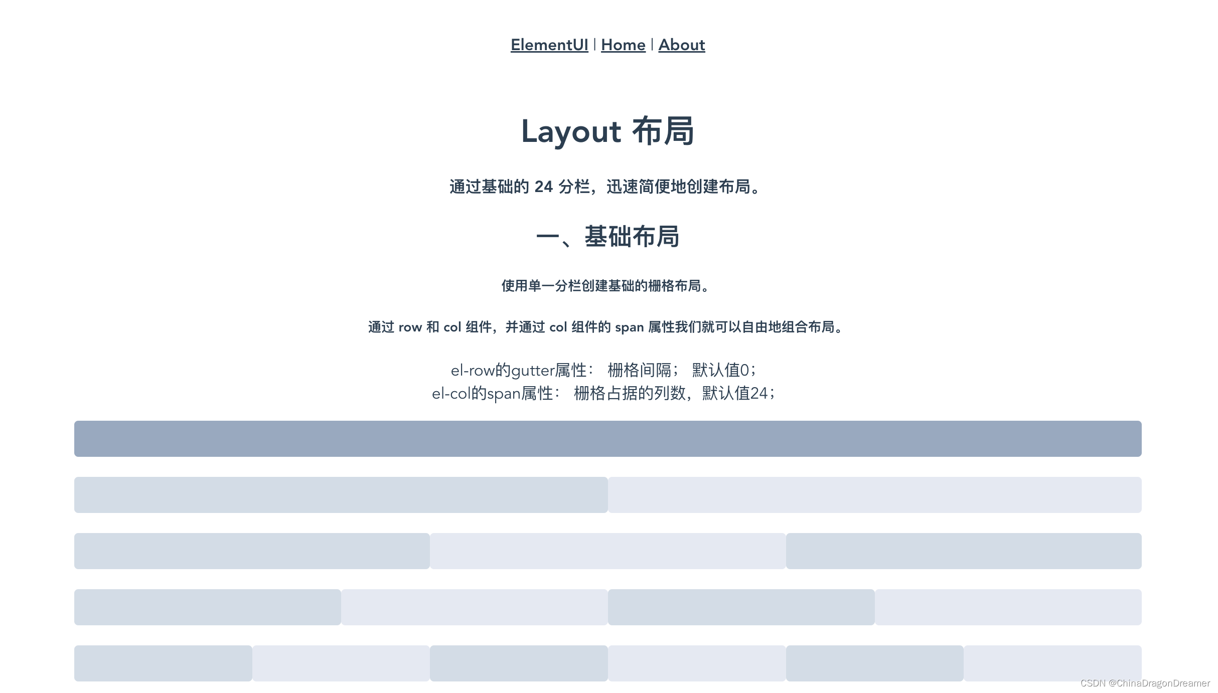
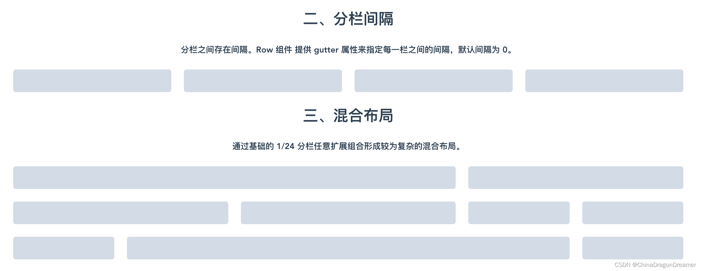
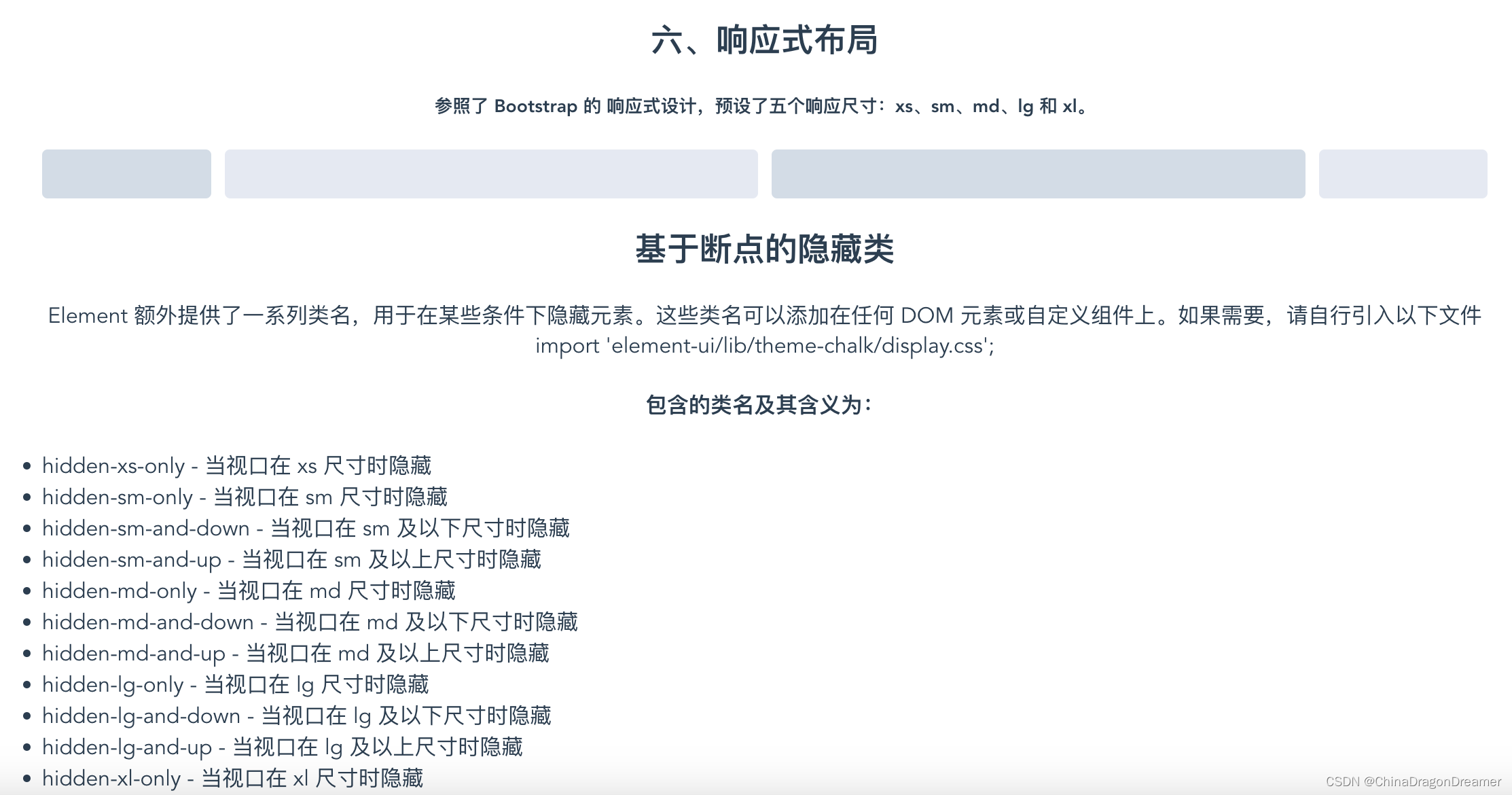
效果图
el-row_el-col.vue页面效果图

项目里el-row_el-col.vue代码
<script>
export default {name:'el-row_el-col 布局'
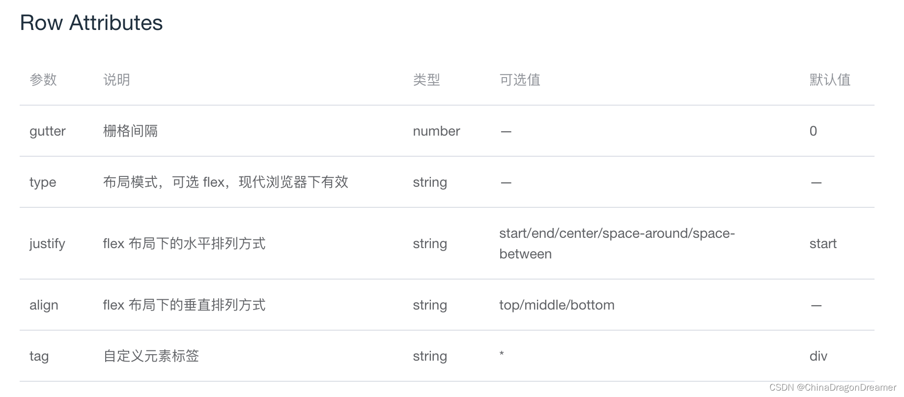
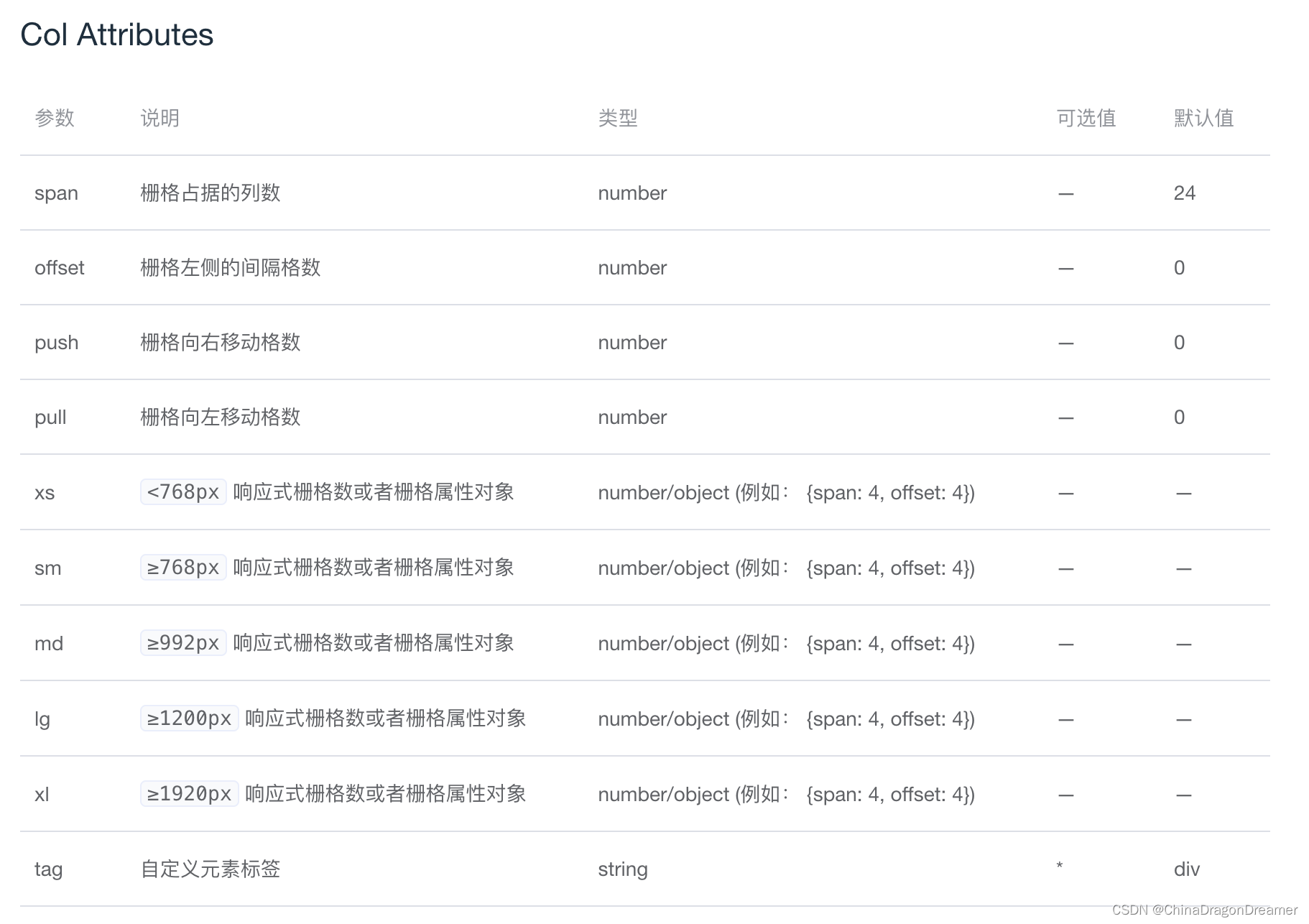
}</script><template><div class="root"><h1>Layout 布局</h1><h4>通过基础的 24 分栏,迅速简便地创建布局。</h4><h2>一、基础布局</h2><h5>使用单一分栏创建基础的栅格布局。</h5><h5>通过 row 和 col 组件,并通过 col 组件的 span 属性我们就可以自由地组合布局。</h5><p>el-row的gutter属性: 栅格间隔; 默认值0;<br/>el-col的span属性: 栅格占据的列数,默认值24;</p>
<!--<el-row :gutter="10"><el-col span="32" :span="8"> <div></div></el-col> 8/32 即此div显示宽度为1/4</el-row>--><el-row><el-col :span="24"><div class="grid-content bg-purple-dark"></div></el-col></el-row><el-row><el-col :span="12"><div class="grid-content bg-purple"></div></el-col><el-col :span="12"><div class="grid-content bg-purple-light"></div></el-col></el-row><el-row><el-col :span="8"><div class="grid-content bg-purple"></div></el-col><el-col :span="8"><div class="grid-content bg-purple-light"></div></el-col><el-col :span="8"><div class="grid-content bg-purple"></div></el-col></el-row><el-row><el-col :span="6"><div class="grid-content bg-purple"></div></el-col><el-col :span="6"><div class="grid-content bg-purple-light"></div></el-col><el-col :span="6"><div class="grid-content bg-purple"></div></el-col><el-col :span="6"><div class="grid-content bg-purple-light"></div></el-col></el-row><el-row><el-col :span="4"><div class="grid-content bg-purple"></div></el-col><el-col :span="4"><div class="grid-content bg-purple-light"></div></el-col><el-col :span="4"><div class="grid-content bg-purple"></div></el-col><el-col :span="4"><div class="grid-content bg-purple-light"></div></el-col><el-col :span="4"><div class="grid-content bg-purple"></div></el-col><el-col :span="4"><div class="grid-content bg-purple-light"></div></el-col></el-row><h2>二、分栏间隔</h2><h5>分栏之间存在间隔。Row 组件 提供 gutter 属性来指定每一栏之间的间隔,默认间隔为 0。</h5><el-row :gutter="20"><el-col :span="6"><div class="grid-content bg-purple"></div></el-col><el-col :span="6"><div class="grid-content bg-purple"></div></el-col><el-col :span="6"><div class="grid-content bg-purple"></div></el-col><el-col :span="6"><div class="grid-content bg-purple"></div></el-col></el-row><h2>三、混合布局</h2><h5>通过基础的 1/24 分栏任意扩展组合形成较为复杂的混合布局。</h5><el-row :gutter="20"><el-col :span="16"><div class="grid-content bg-purple"></div></el-col><el-col :span="8"><div class="grid-content bg-purple"></div></el-col></el-row><el-row :gutter="20"><el-col :span="8"><div class="grid-content bg-purple"></div></el-col><el-col :span="8"><div class="grid-content bg-purple"></div></el-col><el-col :span="4"><div class="grid-content bg-purple"></div></el-col><el-col :span="4"><div class="grid-content bg-purple"></div></el-col></el-row><el-row :gutter="20"><el-col :span="4"><div class="grid-content bg-purple"></div></el-col><el-col :span="16"><div class="grid-content bg-purple"></div></el-col><el-col :span="4"><div class="grid-content bg-purple"></div></el-col></el-row><h2>四、分栏偏移</h2><h5>支持偏移指定的栏数。通过制定 col 组件的 offset 属性可以指定分栏偏移的栏数。</h5><el-row :gutter="20"><el-col :span="6"><div class="grid-content bg-purple"></div></el-col><el-col :span="6" :offset="6"><div class="grid-content bg-purple"></div></el-col></el-row><el-row :gutter="20"><el-col :span="6" :offset="6"><div class="grid-content bg-purple"></div></el-col><el-col :span="6" :offset="6"><div class="grid-content bg-purple"></div></el-col></el-row><el-row :gutter="20"><el-col :span="12" :offset="6"><div class="grid-content bg-purple"></div></el-col></el-row><h2>五、对齐方式</h2><h5>通过 flex 布局来对分栏进行灵活的对齐。</h5><p>将 type 属性赋值为 'flex',可以启用 flex 布局,并可通过 justify 属性来指定 start, center, end, space-between, space-around 其中的值来定义子元素的排版方式。</p><el-row type="flex" class="row-bg"><el-col :span="6"><div class="grid-content bg-purple"></div></el-col><el-col :span="6"><div class="grid-content bg-purple-light"></div></el-col><el-col :span="6"><div class="grid-content bg-purple"></div></el-col></el-row><el-row type="flex" class="row-bg" justify="center"><el-col :span="6"><div class="grid-content bg-purple"></div></el-col><el-col :span="6"><div class="grid-content bg-purple-light"></div></el-col><el-col :span="6"><div class="grid-content bg-purple"></div></el-col></el-row><el-row type="flex" class="row-bg" justify="end"><el-col :span="6"><div class="grid-content bg-purple"></div></el-col><el-col :span="6"><div class="grid-content bg-purple-light"></div></el-col><el-col :span="6"><div class="grid-content bg-purple"></div></el-col></el-row><el-row type="flex" class="row-bg" justify="space-between"><el-col :span="6"><div class="grid-content bg-purple"></div></el-col><el-col :span="6"><div class="grid-content bg-purple-light"></div></el-col><el-col :span="6"><div class="grid-content bg-purple"></div></el-col></el-row><el-row type="flex" class="row-bg" justify="space-around"><el-col :span="6"><div class="grid-content bg-purple"></div></el-col><el-col :span="6"><div class="grid-content bg-purple-light"></div></el-col><el-col :span="6"><div class="grid-content bg-purple"></div></el-col></el-row><h2>六、响应式布局</h2><h5>参照了 Bootstrap 的 响应式设计,预设了五个响应尺寸:xs、sm、md、lg 和 xl。</h5><el-row :gutter="10"><el-col :xs="8" :sm="6" :md="4" :lg="3" :xl="1"><div class="grid-content bg-purple"></div></el-col><el-col :xs="4" :sm="6" :md="8" :lg="9" :xl="11"><div class="grid-content bg-purple-light"></div></el-col><el-col :xs="4" :sm="6" :md="8" :lg="9" :xl="11"><div class="grid-content bg-purple"></div></el-col><el-col :xs="8" :sm="6" :md="4" :lg="3" :xl="1"><div class="grid-content bg-purple-light"></div></el-col></el-row><h2>基于断点的隐藏类</h2><p>Element 额外提供了一系列类名,用于在某些条件下隐藏元素。这些类名可以添加在任何 DOM 元素或自定义组件上。如果需要,请自行引入以下文件import 'element-ui/lib/theme-chalk/display.css';</p><h4>包含的类名及其含义为:</h4><ul id="ulist"><li>hidden-xs-only - 当视口在 xs 尺寸时隐藏</li><li>hidden-sm-only - 当视口在 sm 尺寸时隐藏</li><li>hidden-sm-and-down - 当视口在 sm 及以下尺寸时隐藏</li><li>hidden-sm-and-up - 当视口在 sm 及以上尺寸时隐藏</li><li>hidden-md-only - 当视口在 md 尺寸时隐藏</li><li>hidden-md-and-down - 当视口在 md 及以下尺寸时隐藏</li><li>hidden-md-and-up - 当视口在 md 及以上尺寸时隐藏</li><li>hidden-lg-only - 当视口在 lg 尺寸时隐藏</li><li>hidden-lg-and-down - 当视口在 lg 及以下尺寸时隐藏</li><li>hidden-lg-and-up - 当视口在 lg 及以上尺寸时隐藏</li><li>hidden-xl-only - 当视口在 xl 尺寸时隐藏</li></ul></div></template><style>.el-row{margin-bottom: 20px;&:last-child{margin-bottom: 0;}}.el-col {border-radius: 4px;}.bg-purple-dark {background: #99a9bf;}.bg-purple {background: #d3dce6;}.bg-purple-light {background: #e5e9f2;}.grid-content {border-radius: 4px;min-height: 36px;}.row-bg {padding: 10px 0;background-color: #f9fafc;}.root{margin-left: 300px;margin-right: 300px;}#ulist{padding: 0;margin: 0;//list-style-type: none;}#ulist li{//float: left;text-align: left;}</style>
el-row属性简介
el-col属性简介
这篇关于ElementUI 组件:Layout布局(el-row、el-col)的文章就介绍到这儿,希望我们推荐的文章对编程师们有所帮助!


