本文主要是介绍Vant Weapp的Slider组件自定义button,希望对大家解决编程问题提供一定的参考价值,需要的开发者们随着小编来一起学习吧!
js部分:
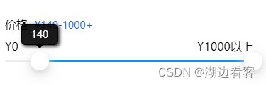
<van-slider v-model="value" range @drag="priceChange" @drag-end="sliderDragEnd" use-button-slot max="1000" min="0" step="10"><view class="custom-button" slot="left-button"><view :class="dragActiveL?'custom-popover dragActive':'custom-popover'">{{ priceMin }}<view class="arrow-down"></view></view></view><view class="custom-button" slot="right-button"><view :class="dragActiveR?'custom-popover dragActive':'custom-popover'">{{ priceMax }}<view class="arrow-down"></view></view></view></van-slider>css部分:
.custom-button {width: 26px;color: #fff;font-size: 10px;line-height: 18px;text-align: center;background-color: blue;border-radius: 100px;
}.custom-popover {display: none;position: absolute;background: rgba(0, 0, 0,0.9);border: 1px solid rgba(0, 0, 0, 0.9);padding: 5px;border-radius: 5px;box-shadow: 2px 2px 5px rgba(0, 0, 0, 0.9);text-align: center;z-index: 9999;top: -40px;left: 50%; transform: translateX(-50%); min-width: 40px; font-size: 14px; color: #fff; }.dragActive{display: block !important;}.arrow-down {width: 0;height: 0;border-left: 6px solid transparent;border-right: 6px solid transparent;border-top: 6px solid black; position: absolute;bottom: -6px; left: 50%;transform: translateX(-50%); }.custom-button{position: relative;width: 26px !important;height: 26px !important;border-radius: 50% !important;background-color: #fff !important;box-shadow: 0 4px 8px 0 #dddddd, 0 6px 20px 0 #dddddd;
}
这篇关于Vant Weapp的Slider组件自定义button的文章就介绍到这儿,希望我们推荐的文章对编程师们有所帮助!


