本文主要是介绍css 锥形渐变实现三角探照灯效果,希望对大家解决编程问题提供一定的参考价值,需要的开发者们随着小编来一起学习吧!
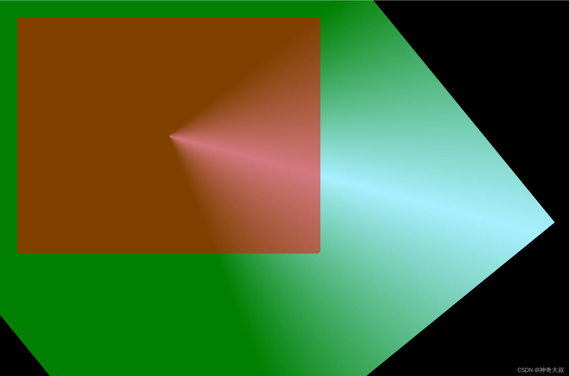
锥形渐变实现探照灯,通过元素覆盖在上面并设置透明度,实现取出探照灯的效果
效果图:
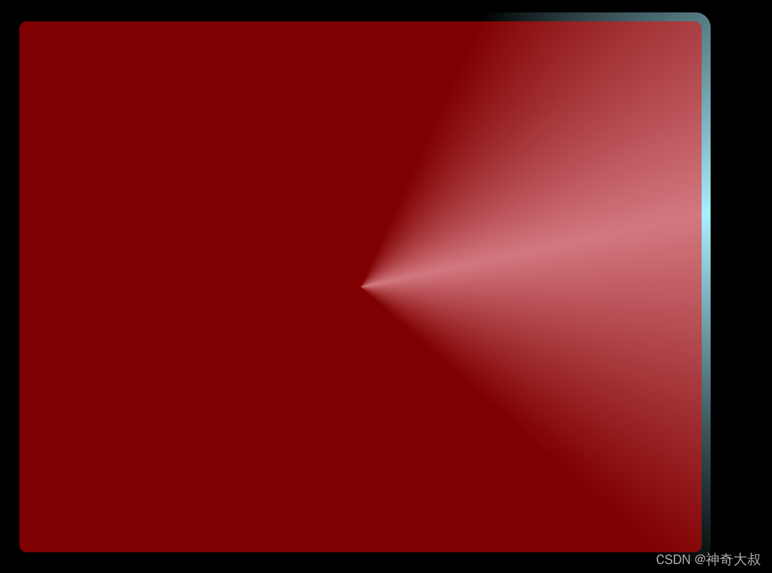
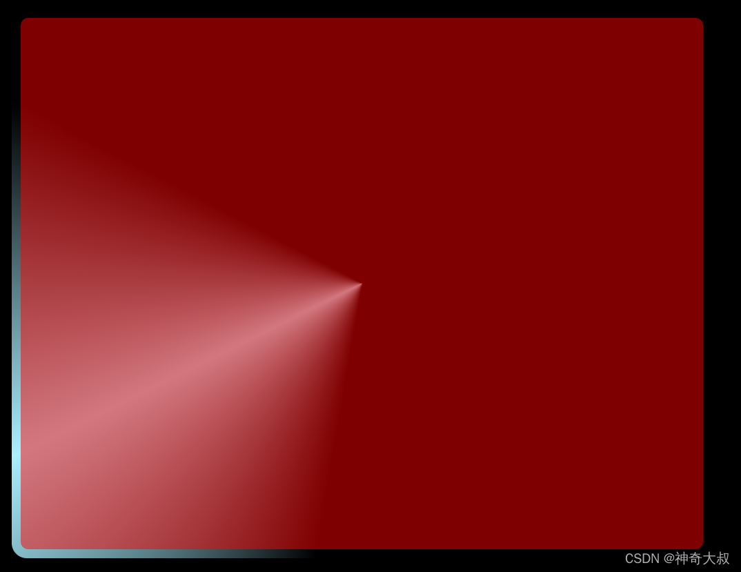
原理:
代码示例:
.conic {position: relative;z-index: 0;width: 400px;height: 300px;margin: 20px;border-radius: 10px;//隐藏探照灯其他区域overflow: hidden;padding: 2rem;}//探照灯的实现
.conic::before {content: '';position: absolute;left: -50%;top: -50%;width: 200%;height: 200%;background-color: green;background-repeat: no-repeat;background-position: 0 0;background-image: conic-gradient(transparent, rgba(168, 239, 255, 1), transparent 30%);animation: rotate 4s linear infinite;
}//通过透明度使得探照灯上的元素能看见探照灯
.conic::after {content: '';position: absolute;z-index: -1;left: 6px;top: 6px;width: calc(100% - 12px);height: calc(100% - 12px);background: red;border-radius: 5px;opacity: .5;
}@keyframes rotate {100% {transform: rotate(1turn);}
}<div class="conic"></div>
这篇关于css 锥形渐变实现三角探照灯效果的文章就介绍到这儿,希望我们推荐的文章对编程师们有所帮助!


