本文主要是介绍WPF2022终结版系列课程笔记 1 WPF 基本布局,希望对大家解决编程问题提供一定的参考价值,需要的开发者们随着小编来一起学习吧!
本笔记为B站
微软系列技术教程 WPF项目实战合集(2022终结版) 项目记录
WPF 基本布局
WPF布局原则
一个窗口中只能包含一个元素
不应显示设置元素尺寸
不应使用坐标设置元素的位置
可以嵌套布局容器
WPF布局容器
StackPanel: 水平或垂直排列元素、Orientation属性分别: Horizontal / Vertical
WrapPanel : 水平或垂直排列元素、针对剩余空间不足会进行换行或换列进行排列
DockPanel : 根据容器的边界、元素进行Dock.Top、Left、Right、Bottom设置
Grid : 类似table表格、可灵活设置行列并放置控件元素、比较常用
UniformGrid : 指定行和列的数量, 均分有限的容器空间
Canvas : 使用固定的坐标设置元素的位置、不具备锚定停靠等功能。
Grid
学过web的应该知道table表格, 而Grid与其类似, Grid具备分割空间的能力。
RowDefinitions / ColumnDefinitions 用于给Grid分配行与列。
ColumnSpan / RowSpan 则用于设置空间元素的 跨列与阔行。
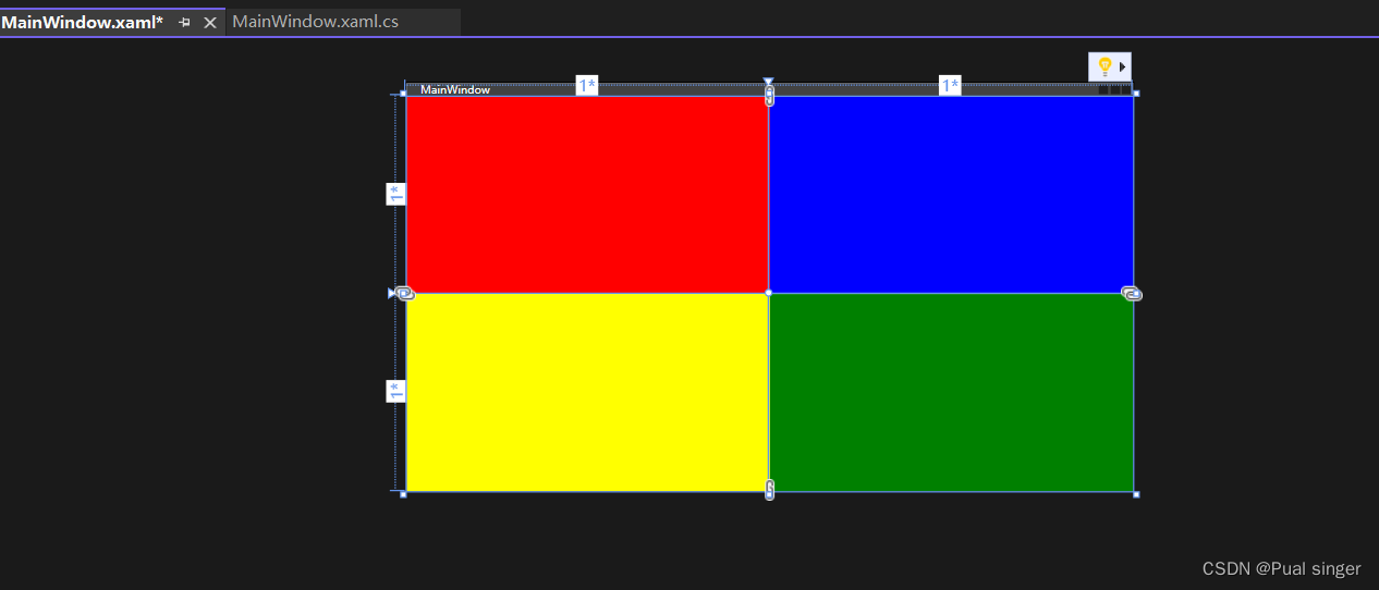
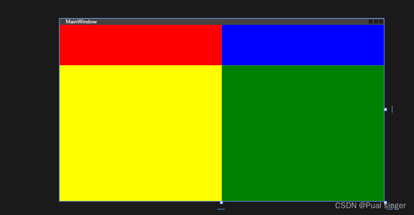
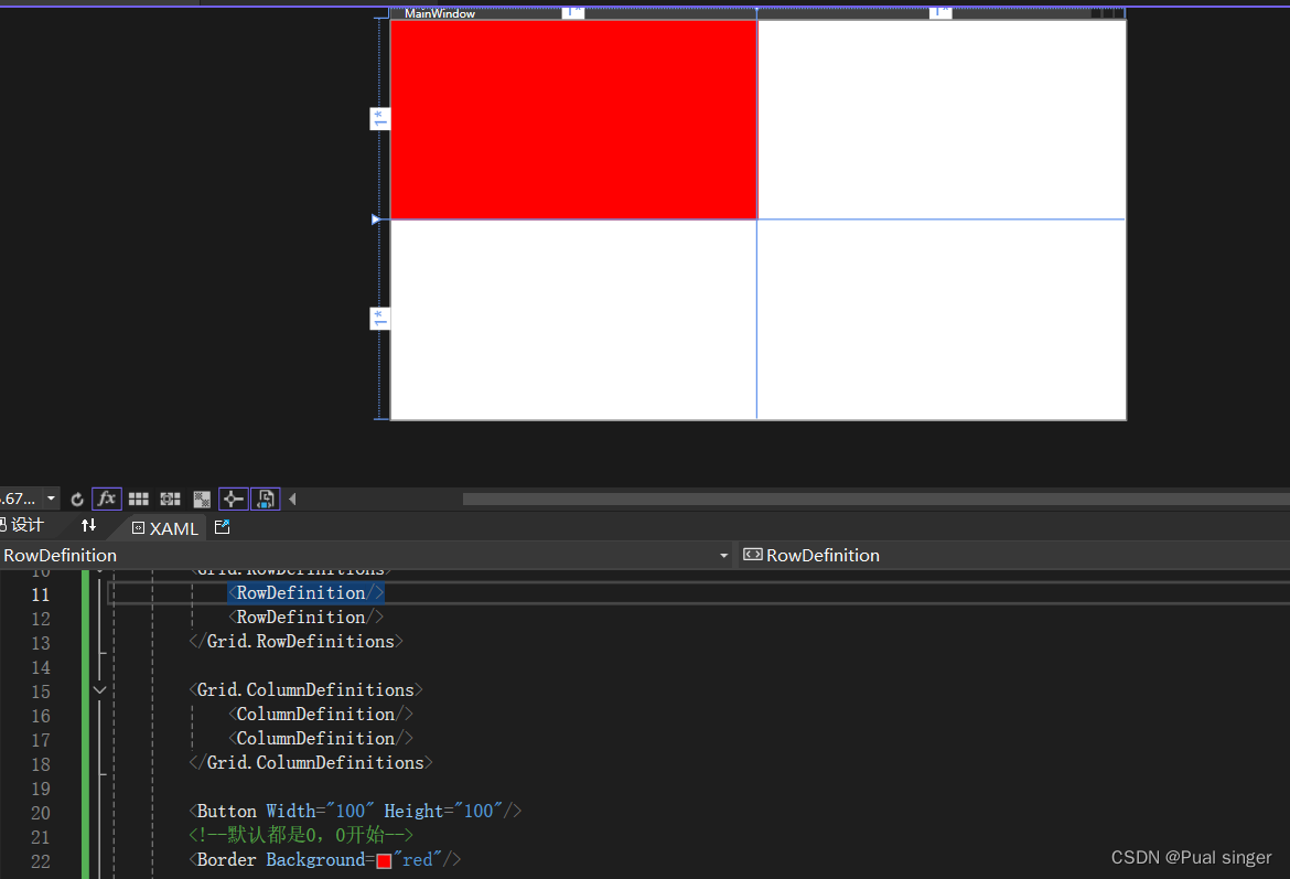
<Window x:Class="WpfApp1.MainWindow"xmlns="http://schemas.microsoft.com/winfx/2006/xaml/presentation"xmlns:x="http://schemas.microsoft.com/winfx/2006/xaml"xmlns:d="http://schemas.microsoft.com/expression/blend/2008"xmlns:mc="http://schemas.openxmlformats.org/markup-compatibility/2006"xmlns:local="clr-namespace:WpfApp1"mc:Ignorable="d"Title="MainWindow" Height="450" Width="800"><Grid><Grid.RowDefinitions><RowDefinition/><RowDefinition/></Grid.RowDefinitions><Grid.ColumnDefinitions><ColumnDefinition/><ColumnDefinition/></Grid.ColumnDefinitions><!--默认都是0,0开始--><Border Background="red"/><Border Grid.Row="1" Background="Yellow"/><Border Grid.Column="1" Background="Blue"/><Border Grid.Row="1" Grid.Column="1" Background="Green"/></Grid>
</Window>
此时页面被平均分为四个
自适应
若设置为自适应
<Grid><Grid.RowDefinitions><RowDefinition Height="auto"/><RowDefinition/></Grid.RowDefinitions>
因为第一行没有任何元素和高度,整个元素 就被隐藏了
添加一个按钮定义宽高
以行内,最高元素高度为标准,来定义高度
<Grid><Grid.RowDefinitions><RowDefinition Height="auto"/><RowDefinition/></Grid.RowDefinitions><Grid.ColumnDefinitions><ColumnDefinition/><ColumnDefinition/></Grid.ColumnDefinitions><Button Width="100" Height="100"/><!--默认都是0,0开始--><Border Background="red"/><Border Grid.Row="1" Background="Yellow"/><Border Grid.Column="1" Background="Blue"/><Border Grid.Row="1" Grid.Column="1" Background="Green"/>
</Grid>
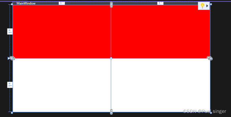
绝对尺寸
<Grid.RowDefinitions><RowDefinition Height="100"/><RowDefinition/>
</Grid.RowDefinitions>
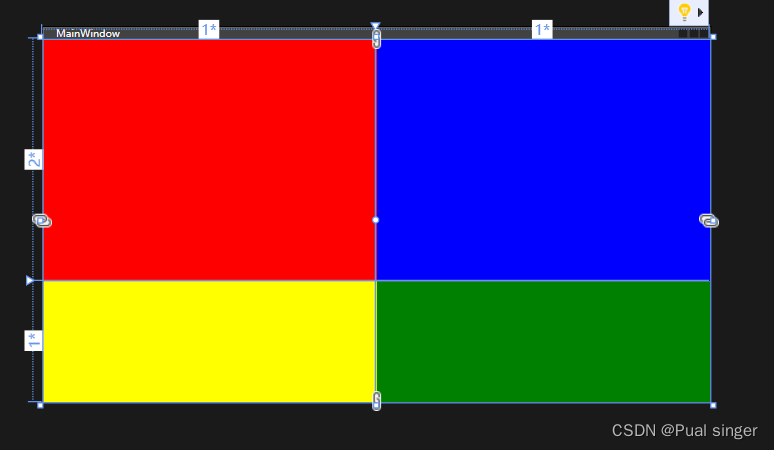
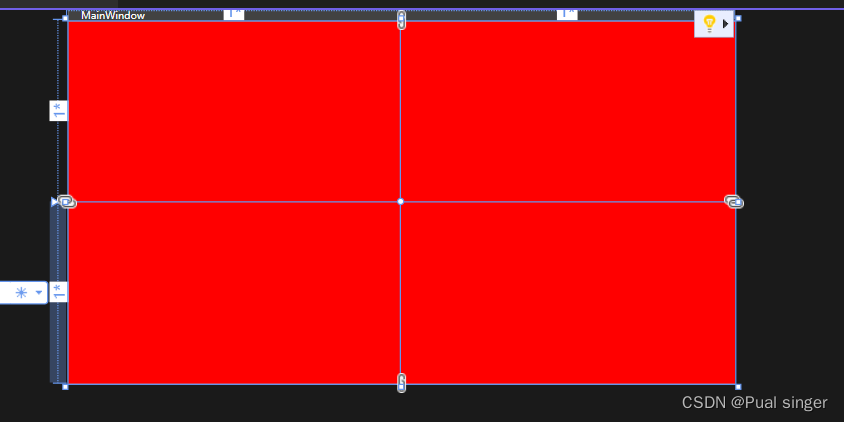
比例
2* 代表第一行高度是第二行得两倍
<Grid.RowDefinitions><RowDefinition Height="2*"/><RowDefinition/>
</Grid.RowDefinitions><Grid.ColumnDefinitions><ColumnDefinition/><ColumnDefinition/>
</Grid.ColumnDefinitions>
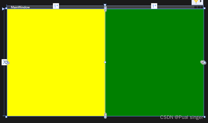
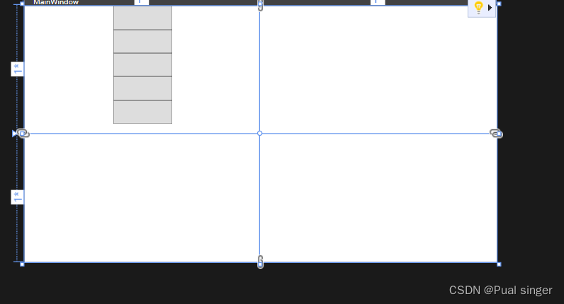
元素跨行跨列
默认情况下,元素占一行一列
让他占据两列得空间
<Grid><Grid.RowDefinitions><RowDefinition/><RowDefinition/></Grid.RowDefinitions><Grid.ColumnDefinitions><ColumnDefinition/><ColumnDefinition/></Grid.ColumnDefinitions><Border Background="red" Grid.ColumnSpan="2"/>
</Grid>
两行
<Border Background="red" Grid.ColumnSpan="2"Grid.RowSpan="2"/>
StackPanel
StackPanel主要用于垂直或水平排列元素、在容器的可用尺寸内放置有限个元素,
元素的尺寸总和(长/高)不允许超过StackPanel的尺寸, 否则超出的部分不可见。
默认的排列方式,是从上往下
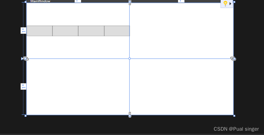
<Grid><Grid.RowDefinitions><RowDefinition/><RowDefinition/></Grid.RowDefinitions><Grid.ColumnDefinitions><ColumnDefinition/><ColumnDefinition/></Grid.ColumnDefinitions><StackPanel><Button Width="100" Height="40"/><Button Width="100" Height="40"/><Button Width="100" Height="40"/><Button Width="100" Height="40"/><Button Width="100" Height="40"/></StackPanel>
</Grid>
可以通过Orientation(Horizontal/Vertical) 设置排列方向
<Grid><Grid.RowDefinitions><RowDefinition/><RowDefinition/></Grid.RowDefinitions><Grid.ColumnDefinitions><ColumnDefinition/><ColumnDefinition/></Grid.ColumnDefinitions><StackPanel Orientation="Horizontal"><Button Width="100" Height="40"/><Button Width="100" Height="40"/><Button Width="100" Height="40"/><Button Width="100" Height="40"/><Button Width="100" Height="40"/></StackPanel>
</Grid>
WrapPanel
WrapPanel默认排列方向与StackPanel相反、WrapPanel的Orientation默认为Horizontal。
WrapPanel具备StackPanel的功能基础上具备在尺寸变更后自动适应容器的宽高进行换行换列处理。
<WrapPanel Grid.Row="1"><Button Width="100" Height="40"/><Button Width="100" Height="40"/><Button Width="100" Height="40"/><Button Width="100" Height="40"/><Button Width="100" Height="40"/>
</WrapPanel>
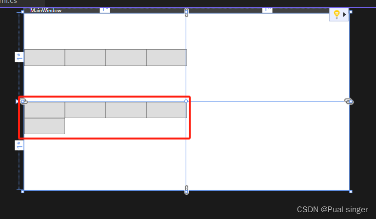
也可以通过设置Orientation(Horizontal/Vertical) 设置排列方向
DockPanel
默认DockPanel中的元素具备DockPanel.Dock属性,
该属性为枚举具备: Top、Left、Right、Bottom。
默认情况下, DockPanel中的元素不添加DockPanel.Dock属性, 则系统则会默认添加 Left。
DockPanel有一个LastChildFill属性, 该属性默认为true, 该属性作用为, 当容器中的最后一个元素时, 默认该元素填充DockPanel所有空间。
<Window x:Class="WpfApp1.MainWindow"xmlns="http://schemas.microsoft.com/winfx/2006/xaml/presentation"xmlns:x="http://schemas.microsoft.com/winfx/2006/xaml"xmlns:d="http://schemas.microsoft.com/expression/blend/2008"xmlns:mc="http://schemas.openxmlformats.org/markup-compatibility/2006"xmlns:local="clr-namespace:WpfApp1"mc:Ignorable="d"Title="MainWindow" Height="450" Width="800"><Grid><DockPanel><Button Width="100" Height="40"/><Button Width="100" Height="40"/><Button Width="100" Height="40"/><Button Width="100" Height="40"/></DockPanel></Grid>
</Window>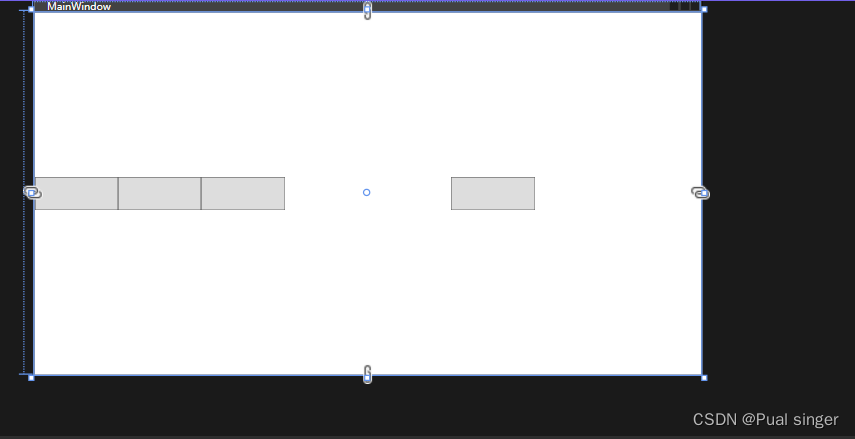
最后一个元素,跟前面的分开得原因是,最后一个元素默认填充剩余空间,但是他的宽度不够,就放在中间
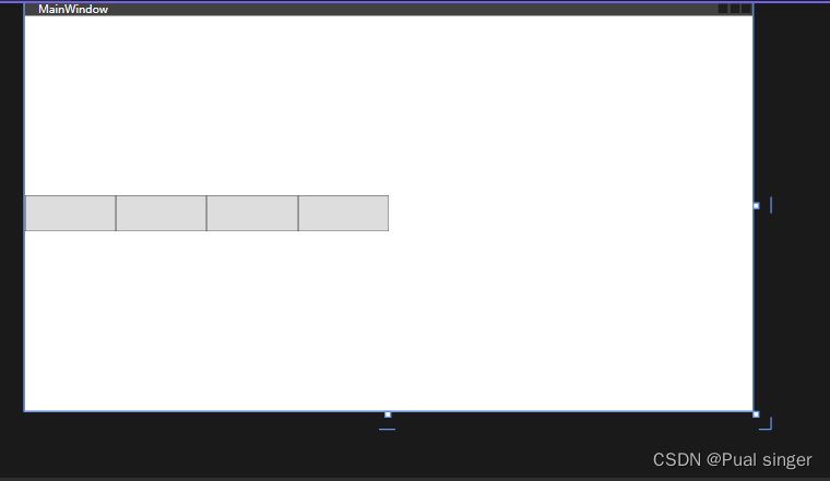
将LastChildFill 设为False,最后一个元素就会跟随默认向左停靠
<Grid><DockPanel LastChildFill="False"><Button Width="100" Height="40"/><Button Width="100" Height="40"/><Button Width="100" Height="40"/><Button Width="100" Height="40"/></DockPanel>
</Grid>
可以单独定义停靠方向
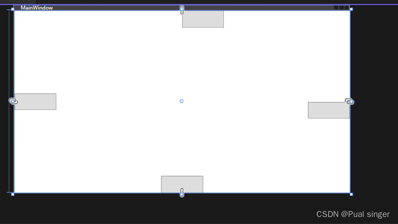
<Grid><DockPanel LastChildFill="False"><Button Width="100" Height="40" DockPanel.Dock="Left"/><Button Width="100" Height="40" DockPanel.Dock="Top"/><Button Width="100" Height="40" DockPanel.Dock="Right"/><Button Width="100" Height="40" DockPanel.Dock="Bottom"/></DockPanel>
</Grid>
UniformGrid
: 指定行和列的数量, 均分有限的容器空间
<Window x:Class="WpfApp1.MainWindow"xmlns="http://schemas.microsoft.com/winfx/2006/xaml/presentation"xmlns:x="http://schemas.microsoft.com/winfx/2006/xaml"xmlns:d="http://schemas.microsoft.com/expression/blend/2008"xmlns:mc="http://schemas.openxmlformats.org/markup-compatibility/2006"xmlns:local="clr-namespace:WpfApp1"mc:Ignorable="d"Title="MainWindow" Height="450" Width="800"><Grid><UniformGrid Columns="3" Rows="3"><Button/><Button/><Button/><Button/><Button/><Button/><Button/><Button/><Button/></UniformGrid></Grid>
</Window>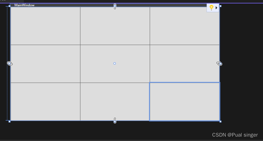
也可以不指定 行列数量
<Grid><UniformGrid><Button/><Button/><Button/><Button/><Button/><Button/><Button/><Button/><Button/></UniformGrid>
</Grid>
结果相同
项目作业
这篇关于WPF2022终结版系列课程笔记 1 WPF 基本布局的文章就介绍到这儿,希望我们推荐的文章对编程师们有所帮助!


