本文主要是介绍用 element ui 实现季度选择器,希望对大家解决编程问题提供一定的参考价值,需要的开发者们随着小编来一起学习吧!
由于在数据项目中经常以各种时间条件查询数据,所以时间选择器(DatePicker)组件是很常用的组件。但是在我使用的 Element UI 中,缺少了季度选择器的功能。
简易实现
一开始我根据时间范围使用 select 去遍历,如 2024-Q1、2023-Q4、2023-Q3 如此类推。
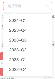
element 并无季度选择器
其实也算是快速解决了 element ui 无法选择季度的问题。但总感觉特别的 low,后来有时间了就去隔壁 ant design 看了看。
发现在新版的 ant design 都支持季度和季度范围选择器了……
查了查新的 element plus 也只是只支持了 'year' | 'years' |'month' | 'date' | 'dates' | 'datetime' | 'week' | 'datetimerange' | 'daterange' | 'monthrange' 这些个类型。
工具不给力,又不想用其他库的情况下只能手搓了。
手搓季度选择器
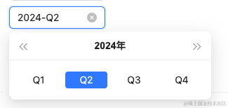
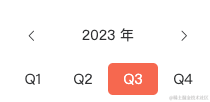
季度面板
参考 ant design 做了一个类似的面板。
<template><div class="quarter-panel"><div class="quarter-panel-header"><iclass="quarter-panel-header-icon el-icon-arrow-left"@click="currentYear--"/><div class="quarter-panel-header-title">{{ currentYear }} 年</div><iclass="quarter-panel-header-icon el-icon-arrow-right"@click="currentYear++"/></div><div class="quarter-panel-content"><divv-for="option in quarterOptions"class="quarter-panel-item-btn":class="getComputedClass(option.value)":key="option.value"@click="emitClick(option.value)">{{ option.label }}</div></div></div>
</template><script>
import dayjs from 'dayjs'
import customParseFormat from 'dayjs/plugin/customParseFormat'dayjs.extend(customParseFormat)export default {name: 'QuarterPanel',props: {value: String,dice: Number,min: String,max: String,todayDisabled: Boolean,featureDisabled: Boolean,},data() {return {currentYear: 2023,}},computed: {day() {if (this.value) {return dayjs(this.value, 'YYYY-MM-DD')}return dayjs()},computedDate() {return this.day.startOf('quarter').format('YYYY-MM-DD')},quarterOptions() {return [{ label: 'Q1', value: `${this.currentYear}-01-01` },{ label: 'Q2', value: `${this.currentYear}-04-01` },{ label: 'Q3', value: `${this.currentYear}-07-01` },{ label: 'Q4', value: `${this.currentYear}-10-01` },]},},mounted() {this.currentYear = dayjs().year()},methods: {getDisabled(value) {let isFeature = falseif (this.todayDisabled) {isFeature = dayjs().subtract(1, 'day').startOf('quarter').isBefore(dayjs(value))} else if (this.featureDisabled) {isFeature = dayjs().startOf('quarter').isBefore(dayjs(value))}const isMin = this.min? dayjs(this.min, 'YYYY-MM-DD').startOf('quarter').isAfter(dayjs(value, 'YYYY-MM-DD')): falseconst isMax = this.max? dayjs(this.max, 'YYYY-MM-DD').startOf('quarter').isBefore(dayjs(value, 'YYYY-MM-DD')): falsereturn isFeature || isMin || isMax},getComputedClass(value) {if (this.computedDate === value) {return 'quarter-panel-item-btn-active'}if (this.getDisabled(value)) {return 'quarter-panel-item-btn-disabled'}return ''},emitClick(value) {if (this.getDisabled(value)) {return}this.$emit('input', value)},},watch: {dice() {this.currentYear = this.day.year()},},
}
</script><style lang="scss" scoped>
$--gw-primary-color: #f6674f;.quarter-panel {width: 200px;color: #303133;.quarter-panel-header {height: 30px;padding: 12px;display: flex;align-items: center;.quarter-panel-header-icon {font-size: 12;margin: 5px;cursor: pointer;&:hover {color: $--gw-primary-color;}}.quarter-panel-header-title {flex: 1;text-align: center;font-size: 16;}}.quarter-panel-content {display: flex;align-items: center;.quarter-panel-item-btn {flex: 1;font-size: 14;height: 30px;line-height: 30px;text-align: center;cursor: pointer;border: solid 1px transparent;border-radius: 5px;&:hover {color: $--gw-primary-color;border: solid 1px $--gw-primary-color;}}.quarter-panel-item-btn-active {background: $--gw-primary-color;color: #ffffff;&:hover {color: #ffffff;}}.quarter-panel-item-btn-disabled {color: #909399;background: #f2f6fc;cursor: not-allowed;&:hover {color: #909399;background: #f2f6fc;}}}
}
</style>
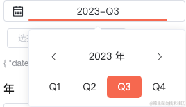
季度选择器
将面板放到 el-popover 中实现类似 DatePicker 的效果。并且提供了像清空数据、最大值、最小值等常用功能。
<template><div class="quarter-picker" :class="{ 'quarter-picker-disabled': disabled }"><div class="quarter-picker-date-button"><i class="iconfont icon-date-select-icon quarter-picker-time-icon" /><el-popoverplacement="bottom-start"width="200"trigger="click"ref="datePopover":disabled="disabled"@show="initPopover"><divclass="quarter-picker-date-button-item quarter-picker-date-button-item-long"slot="reference"><span v-if="form.date" class="button-item-span">{{ dateQuarterStr }}</span><span v-else class="button-item-span">选择时间</span><div class="bottom-line" /></div><quarterPanelv-model="form.date":dice="dice":min="min":max="max":featureDisabled="featureDisabled":todayDisabled="todayDisabled"@input="emitDateChange()"/></el-popover><iv-show="form.date && clearable"class="el-icon-close quarter-picker-clear-icon"@click.stop="clearCurrentDate"/></div></div>
</template><script>
import dayjs from 'dayjs'
import customParseFormat from 'dayjs/plugin/customParseFormat'
import quarterOfYear from 'dayjs/plugin/quarterOfYear'import quarterPanel from './quarterPanel.vue'dayjs.extend(customParseFormat)
dayjs.extend(quarterOfYear)/*** date 日期*/
export default {name: 'QuarterPicker',components: {quarterPanel,},props: {date: String,min: String,max: String,featureDisabled: Boolean,todayDisabled: Boolean,disabled: Boolean,clearable: Boolean,},data() {return {form: {date: '',},dice: 0,}},mounted() {this.syncData()},computed: {dateQuarterStr() {if (!this.form.date) return '选择季'const dj = dayjs(this.form.date).startOf('quarter')return `${dj.year()}-Q${dj.quarter()}`},},methods: {initPopover() {this.dice++},syncData() {this.form.date = this.date},clearCurrentDate() {if (this.disabled) returnthis.form.date = ''this.emitDateChange()},emitDateChange() {this.$emit('change', this.form)this.closePopovers()},closePopovers() {this.$refs.datePopover.doClose()},},watch: {date() {if (this.form.date !== this.date) {this.syncData()}},},
}
</script><style scoped lang="scss">
$--gw-primary-color: #f6674f;.quarter-picker {display: flex;flex-direction: row;align-items: center;justify-content: flex-end;.quarter-picker-date-button {display: flex;position: relative;flex-direction: row;align-items: center;justify-content: center;user-select: none;margin-left: 5px;width: 250px;padding-left: 10px;height: 28px;background: #ffffff;border: 1px solid #dcdfe6;font-size: 14px;font-family: Microsoft YaHei;font-weight: 400;color: #282c32;border-radius: 4px;.quarter-picker-time-icon {position: absolute;left: 12px;}.quarter-picker-date-button-item {position: relative;height: 28px;line-height: 28px;text-align: center;width: 70px;cursor: pointer;.bottom-line {position: absolute;bottom: 0;left: 0;right: 0;height: 2px;border-radius: 1px;background: transparent;}&:hover {.bottom-line {background: $--gw-primary-color;}}}.quarter-picker-date-button-item-long {width: 200px;.button-item-span {display: inline-block;width: 90px;text-align: center;}.button-item-span-active {color: $--gw-primary-color;}}.quarter-picker-clear-icon {position: absolute;right: 12px;font-size: 14;cursor: pointer;&:hover {color: $--gw-primary-color;}}}
}.quarter-picker-disabled {.quarter-picker-date-button {color: #c0c4cc;background-color: #f2f6fc;.quarter-picker-date-button-item {cursor: not-allowed;}}.quarter-picker-date-button-item {&:hover {.bottom-line {background: transparent !important;}}}.quarter-picker-clear-icon {cursor: not-allowed !important;&:hover {color: #c0c4cc !important;}}
}
</style>
组件的使用
最后就是组件的使用了:
<QuarterPickertype="quarter":date="quarter.date":min="minDate":max="maxDate":featureDisabled="options.featureDisabled":todayDisabled="options.todayDisabled":disabled="options.disabled":clearable="options.clearable"@change="handleQuarterPickerChange"/>
handleQuarterPickerChange({ date }) {this.quarter.date = datethis.$message({message: '触发查询请求',type: 'success',})
},
最后
另外,季度范围选择器也可以用类似的思路来实现。以上就是个人解决季度选择器的方式。希望能对有类似需求的同学一些帮助。
这篇关于用 element ui 实现季度选择器的文章就介绍到这儿,希望我们推荐的文章对编程师们有所帮助!


