本文主要是介绍SVG 渐变(linearGradient、radialGradient),希望对大家解决编程问题提供一定的参考价值,需要的开发者们随着小编来一起学习吧!
渐变简介
渐变是一种从一种颜色到另一种颜色的平滑过渡。
在SVG中,有两种主要的渐变类型:
- 线性渐变(linearGradient)
- 放射性渐变(radialGradient)
SVG中的渐变不仅可以用于填充图形元素,还可以填充文本元素。
linearGradient(线性渐变)
- (x1,y1)到(x2,y2)的连线是线性渐变的径向。
- 渐变径向起点之前的为最小offset的stop-color的纯色。
- 渐变径向终点之后的为最大offset的stop-color的纯色。
<svg width="100%" height="100%" version="1.1" xmlns="http://www.w3.org/2000/svg"><linearGradient id="linearGradient_x1_1" x1="0%" y1="0%" x2="100%" y2="0%"><stop offset="0%" style="stop-color:rgb(255,255,0); stop-opacity:1"/><stop offset="100%" style="stop-color:rgb(255,0,0); stop-opacity:1"/></linearGradient><linearGradient id="linearGradient_x1_2" x1="50%" y1="0%" x2="100%" y2="0%"><stop offset="0%" style="stop-color:rgb(255,255,0); stop-opacity:1"/><stop offset="100%" style="stop-color:rgb(255,0,0); stop-opacity:1"/></linearGradient><linearGradient id="linearGradient_x1_3" x1="100%" y1="0%" x2="100%" y2="0%"><stop offset="0%" style="stop-color:rgb(255,255,0); stop-opacity:1"/><stop offset="100%" style="stop-color:rgb(255,0,0); stop-opacity:1"/></linearGradient><linearGradient id="linearGradient_x2_1" x1="0%" y1="0%" x2="0%" y2="0%"><stop offset="0%" style="stop-color:rgb(255,255,0); stop-opacity:1"/><stop offset="100%" style="stop-color:rgb(255,0,0); stop-opacity:1"/></linearGradient><linearGradient id="linearGradient_x2_2" x1="0%" y1="0%" x2="50%" y2="0%"><stop offset="0%" style="stop-color:rgb(255,255,0); stop-opacity:1"/><stop offset="100%" style="stop-color:rgb(255,0,0); stop-opacity:1"/></linearGradient><linearGradient id="linearGradient_x2_3" x1="0%" y1="0%" x2="100%" y2="0%"><stop offset="0%" style="stop-color:rgb(255,255,0); stop-opacity:1"/><stop offset="100%" style="stop-color:rgb(255,0,0); stop-opacity:1"/></linearGradient><ellipse cx="120" cy="80"  rx="100" ry="50" style="fill:url(#linearGradient_x1_1)" /><ellipse cx="350" cy="80"  rx="100" ry="50" style="fill:url(#linearGradient_x1_2)" /><ellipse cx="580" cy="80"  rx="100" ry="50" style="fill:url(#linearGradient_x1_3)" /><ellipse cx="120" cy="200" rx="100" ry="50" style="fill:url(#linearGradient_x2_1)" /><ellipse cx="350" cy="200" rx="100" ry="50" style="fill:url(#linearGradient_x2_2)" /><ellipse cx="580" cy="200" rx="100" ry="50" style="fill:url(#linearGradient_x2_3)" /><path d="M70,20 v250 M120,20 v250 M170,20 v250 M300,20 v250 M350,20 v250 M400,20 v250 M530,20 v250 M580,20 v250 M630,20 v250" stroke="blue" stroke-width="2" />
</svg>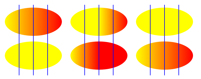
<svg xmlns="http://www.w3.org/2000/svg" width="250" height="200" ><linearGradient id="linearGradient" x1="0%" y1="0%" x2="100%" y2="0%"><stop offset="0%" style="stop-color:rgb(255,255,0); stop-opacity:1"/><stop offset="100%" style="stop-color:rgb(255,0,0); stop-opacity:1"/></linearGradient><text x="10" y="30" font-size="30px" fill="url(#linearGradient)">跟我一起学SVG</text>
</svg>
radialGradient(放射性渐变)
- <stop> 标签定义了梯度停点(渐变点)
- offset 表示梯度值,0%是最上层(最内侧),100%是最下层(最外层)
- (cx,cy)为最下层(最外层)
- (fx,fy)为最上层(最内层)渐变中心点
- r 为最内层和最外层(最上层和最下层)渐变半径
<svg width="100%" height="100%" version="1.1" xmlns="http://www.w3.org/2000/svg"><radialGradient id="radialGradient_r1" cx="50%" cy="50%" r="0%" fx="50%" fy="50%"><stop offset="0%" style="stop-color:red;stop-opacity:1" /><stop offset="50%" style="stop-color:green;stop-opacity:0.5" /><stop offset="100%" style="stop-color:blue;stop-opacity:1" /></radialGradient><radialGradient id="radialGradient_r2" cx="50%" cy="50%" r="50%" fx="50%" fy="50%"><stop offset="0%" style="stop-color:red;stop-opacity:1" /><stop offset="50%" style="stop-color:green;stop-opacity:0.5" /><stop offset="100%" style="stop-color:blue;stop-opacity:1" /></radialGradient><radialGradient id="radialGradient_r3" cx="50%" cy="50%" r="100%" fx="50%" fy="50%"><stop offset="0%" style="stop-color:red;stop-opacity:1" /><stop offset="50%" style="stop-color:green;stop-opacity:0.5" /><stop offset="100%" style="stop-color:blue;stop-opacity:1" /></radialGradient><radialGradient id="radialGradient_c1" cx="0%" cy="50%" r="50%" fx="50%" fy="50%"><stop offset="0%" style="stop-color:red;stop-opacity:1" /><stop offset="50%" style="stop-color:green;stop-opacity:0.5" /><stop offset="100%" style="stop-color:blue;stop-opacity:1" /></radialGradient><radialGradient id="radialGradient_c2" cx="50%" cy="50%" r="50%" fx="50%" fy="50%"><stop offset="0%" style="stop-color:red;stop-opacity:1" /><stop offset="50%" style="stop-color:green;stop-opacity:0.5" /><stop offset="100%" style="stop-color:blue;stop-opacity:1" /></radialGradient><radialGradient id="radialGradient_c3" cx="100%" cy="50%" r="50%" fx="50%" fy="50%"><stop offset="0%" style="stop-color:red;stop-opacity:1" /><stop offset="50%" style="stop-color:green;stop-opacity:0.5" /><stop offset="100%" style="stop-color:blue;stop-opacity:1" /></radialGradient><radialGradient id="radialGradient_f1" cx="50%" cy="50%" r="50%" fx="0%" fy="50%"><stop offset="0%" style="stop-color:red;stop-opacity:1" /><stop offset="50%" style="stop-color:green;stop-opacity:0.5" /><stop offset="100%" style="stop-color:blue;stop-opacity:1" /></radialGradient><radialGradient id="radialGradient_f2" cx="50%" cy="50%" r="50%" fx="50%" fy="50%"><stop offset="0%" style="stop-color:red;stop-opacity:1" /><stop offset="50%" style="stop-color:green;stop-opacity:0.5" /><stop offset="100%" style="stop-color:blue;stop-opacity:1" /></radialGradient><radialGradient id="radialGradient_f3" cx="50%" cy="50%" r="50%" fx="100%" fy="50%"><stop offset="0%" style="stop-color:red;stop-opacity:1" /><stop offset="50%" style="stop-color:green;stop-opacity:0.5" /><stop offset="100%" style="stop-color:blue;stop-opacity:1" /></radialGradient><ellipse cx="120" cy="80"  rx="100" ry="50" style="fill:url(#radialGradient_r1)" /><ellipse cx="350" cy="80"  rx="100" ry="50" style="fill:url(#radialGradient_r2)" /><ellipse cx="580" cy="80"  rx="100" ry="50" style="fill:url(#radialGradient_r3)" /><ellipse cx="120" cy="200" rx="100" ry="50" style="fill:url(#radialGradient_c1)" /><ellipse cx="350" cy="200" rx="100" ry="50" style="fill:url(#radialGradient_c2)" /><ellipse cx="580" cy="200" rx="100" ry="50" style="fill:url(#radialGradient_c3)" /><ellipse cx="120" cy="320" rx="100" ry="50" style="fill:url(#radialGradient_f1)" /><ellipse cx="350" cy="320" rx="100" ry="50" style="fill:url(#radialGradient_f2)" /><ellipse cx="580" cy="320" rx="100" ry="50" style="fill:url(#radialGradient_f3)" /><path d="M70,20 v380 M120,20 v380 M170,20 v380 M300,20 v380 M350,20 v380 M400,20 v380 M530,20 v380 M580,20 v380 M630,20 v380" stroke="red" stroke-width="2" />
</svg>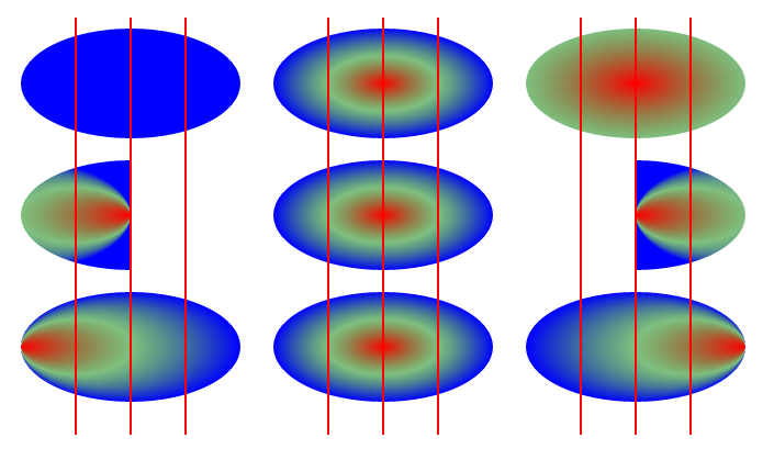
<svg xmlns="http://www.w3.org/2000/svg" width="250" height="200" ><radialGradient id="radialGradient" cx="50%" cy="50%" r="50%" fx="50%" fy="50%"><stop offset="0%" style="stop-color:red;stop-opacity:1" /><stop offset="50%" style="stop-color:green;stop-opacity:0.5" /><stop offset="100%" style="stop-color:blue;stop-opacity:1" /></radialGradient><text x="10" y="30" font-size="30px" fill="url(#radialGradient)">跟我一起学SVG</text>
</svg>
这篇关于SVG 渐变(linearGradient、radialGradient)的文章就介绍到这儿,希望我们推荐的文章对编程师们有所帮助!


