本文主要是介绍JetpackCompose之ConstraintLayout,希望对大家解决编程问题提供一定的参考价值,需要的开发者们随着小编来一起学习吧!
Jetpack Compose系列(10) - ConstraintLayout
ConstraintLayout
在View体系中,ConstraintLayout就已经展现出其关于布局构建功能的强大性,能够避免过多的布局嵌套导致页面过多的渲染和代码维护性,这么方便快捷且强大的组件当然要保留到Compose中啦。
通过对子项之间进行约束条件,从而定位子项的布局。
虽说作用都一致,但在用法上也会有些许差异,尤其需要注意下API是否已经变更。
依赖
在app的build.gradle中,引入
implementation("androidx.constraintlayout:constraintlayout-compose:1.0.0")
(Compose和Constraintlayout都还没有到稳定版本,所以对相关库的依赖一定都要更新到最新适配版本,不然可能存在不兼容问题。另外注意这里的compose,引用错误会导致导入原View体系的Comstrainlayout)
构造函数
ConstraintLayout有两个构造函数:
@Composable
inline fun ConstraintLayout(modifier: Modifier = Modifier,optimizationLevel: Int = Optimizer.OPTIMIZATION_STANDARD,crossinline content: @Composable ConstraintLayoutScope.() -> Unit
)
和
@OptIn(ExperimentalMotionApi::class)
@Suppress("NOTHING_TO_INLINE")
@Composable
inline fun ConstraintLayout(constraintSet: ConstraintSet,modifier: Modifier = Modifier,optimizationLevel: Int = Optimizer.OPTIMIZATION_STANDARD,animateChanges: Boolean = false,animationSpec: AnimationSpec<Float> = tween<Float>(),noinline finishedAnimationListener: (() -> Unit)? = null,noinline content: @Composable () -> Unit
)
各主要参数含义如下:
· modifier: Modifier = Modifier :修饰符
· content: ConstraintLayoutScope.() -> Unit :子视图内容,可以添加任意数量。
· constraintSet: ConstraintSet :对子View约束相关的描述
· content: () -> Unit :使用ConstraintSet参数定义的子级内容
· optimizationLevel: Int : 适用于在管理约束时设置优化级别,默认选项是 Optimizer.OPTIMIZATION_STANDARD。
约束ID
既然是约束布局,那么肯定要有约束条件,而使用约束条件的前提就是不同控件间有id,通过相应的id去约束各个组件间的关系,Compose中的ConstraintLayout支持DSL,有两种方式来创建id:
· 引用是使用 createRefs()(或 createRef())创建的,ConstraintLayout 中的每个可组合项都需要有与之关联的引用。
· 约束条件是使用 constrainAs 修饰符提供的,该修饰符将引用作为参数,可让您在主体 lambda 中指定其约束条件。
在ConstraintLayout中,约束条件是使用 linkTo 或其他有用的函数指定。parent 是一个现有的引用,可用于指定对ConstraintLayout 可组合项本身的约束条件。
例如,如下代码:
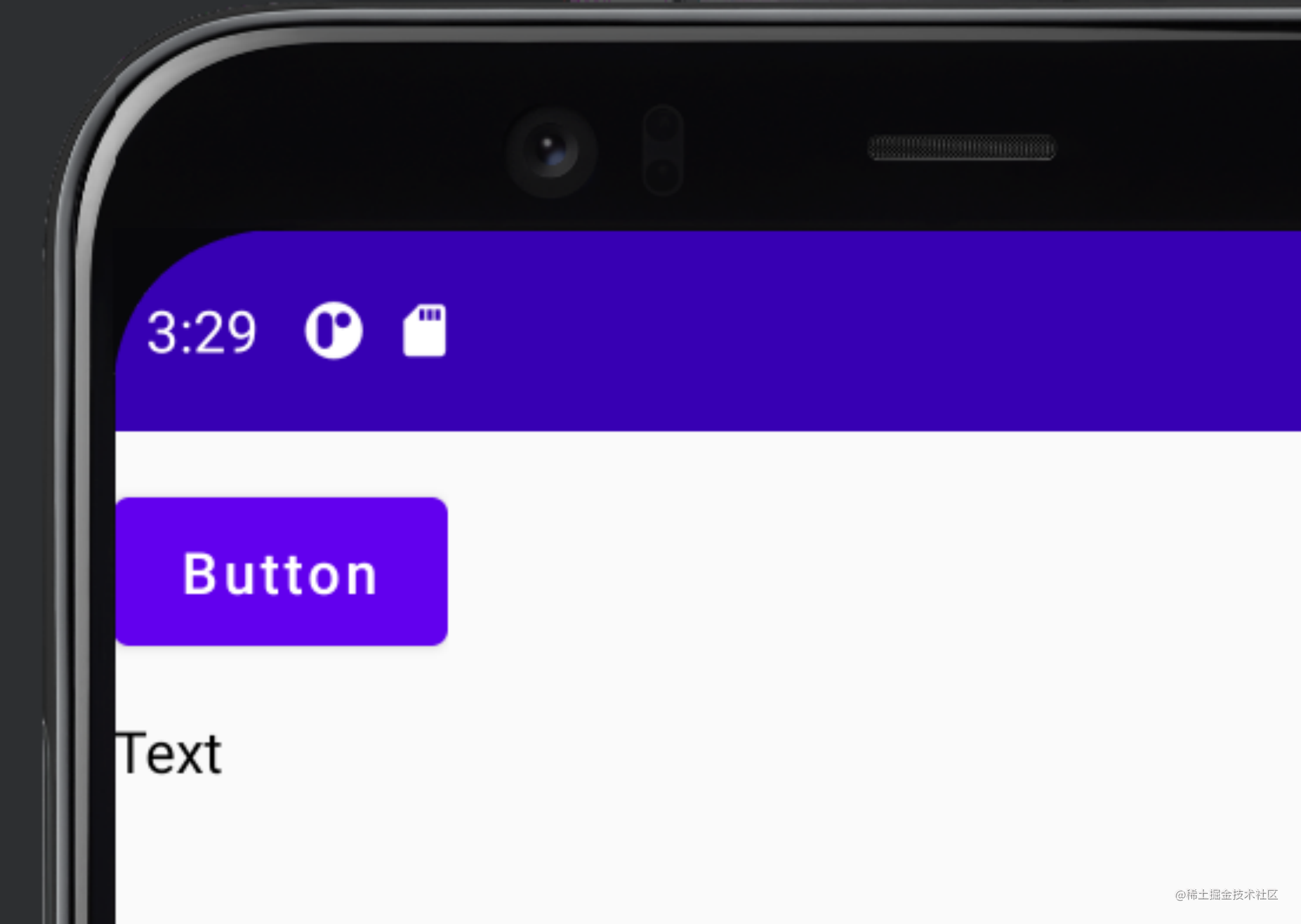
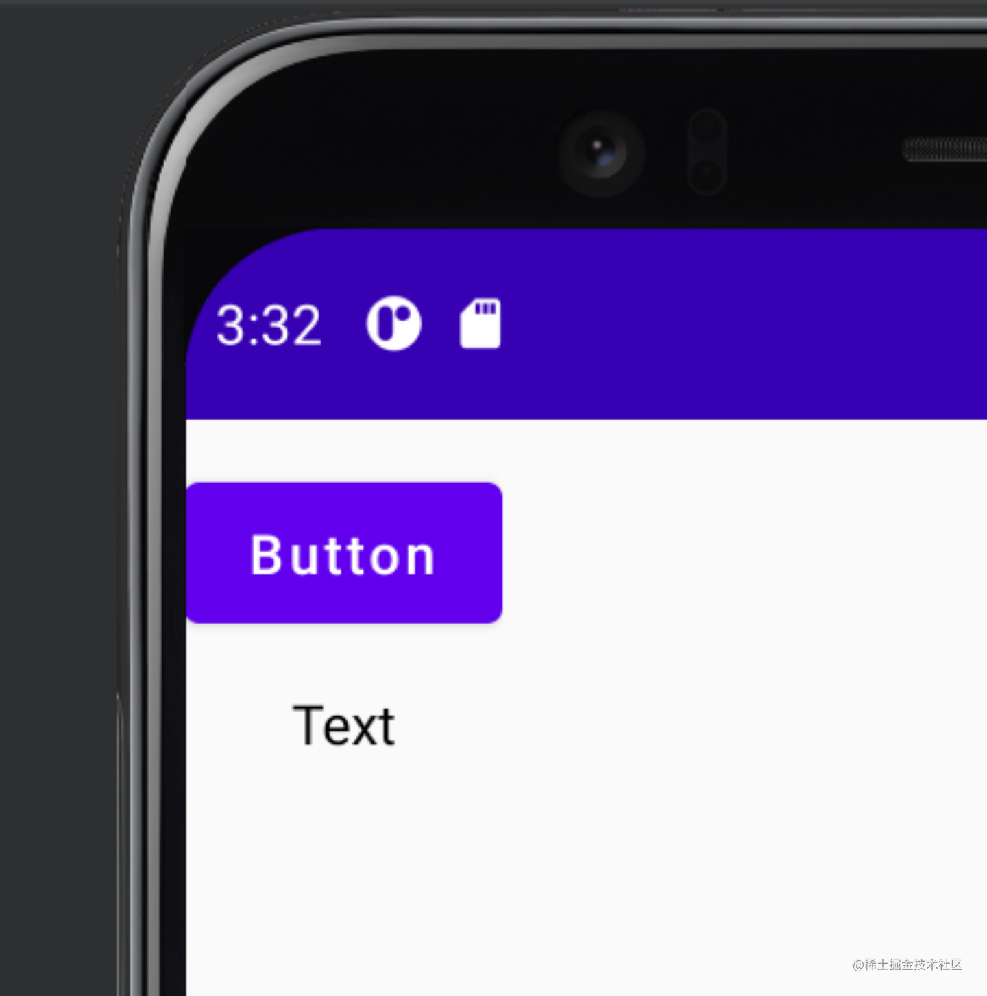
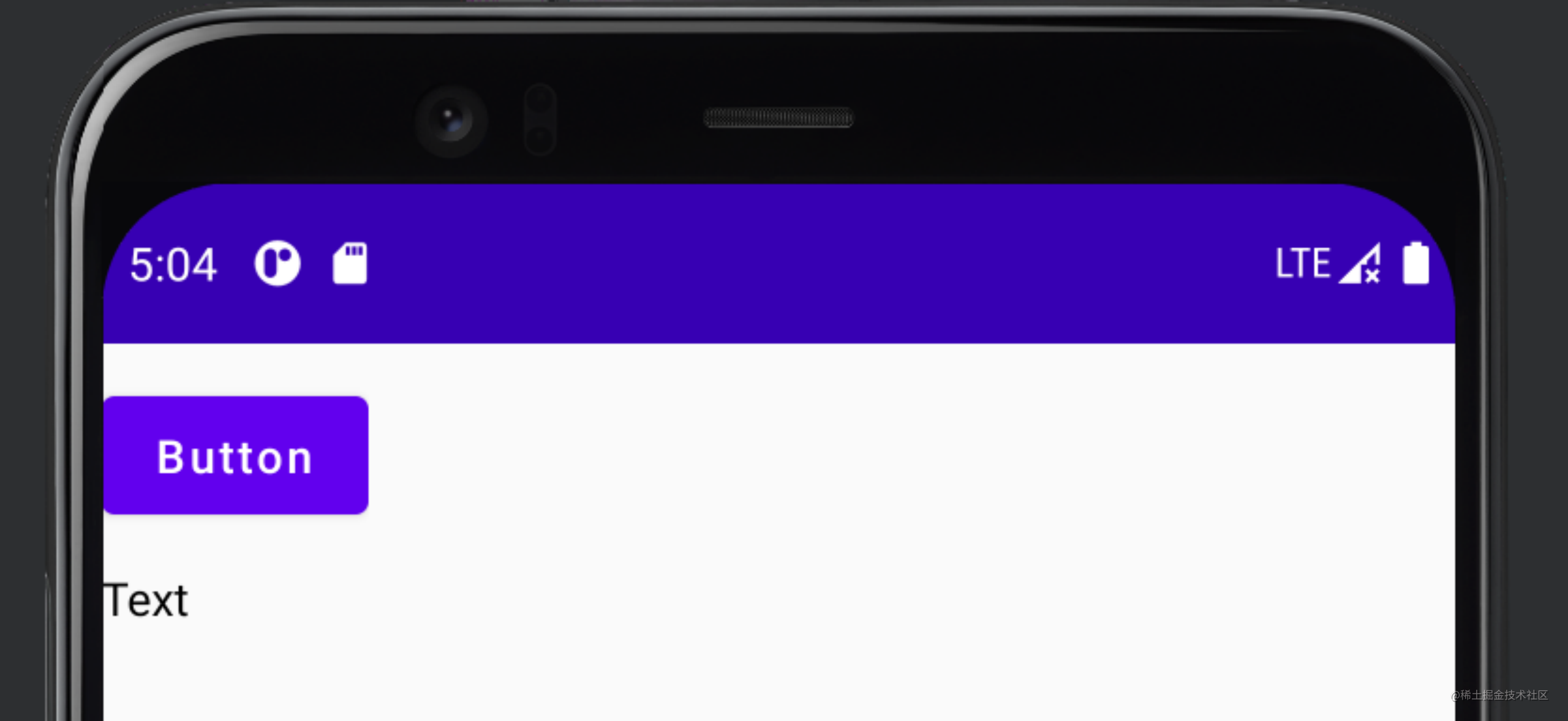
ConstraintLayout {// Create references for the composables to constrainval (button, text) = createRefs()Button(onClick = { /* Do something */ },modifier = Modifier.constrainAs(button) {top.linkTo(parent.top, margin = 16.dp)}) {Text("Button")}Text("Text", Modifier.constrainAs(text) {top.linkTo(button.bottom, margin = 16.dp)})
}
看到constrainAs()和constrain()不明白什么意思?别急,我们看到最后你就都明白了。
这里使用 16.dp 的外边距来约束 Button 顶部到父元素的距离,同样使用 16.dp 的外边距来约束 Text 到 Button 底部的距离。对应的生成效果为:
如果希望文本相对Button水平居中,可以使用 centerHorizontallyTo 函数将 Text 的 start 和 end 均设置为 parent 的边缘。例如,修改原代码中的Text():
Text("Text", Modifier.constrainAs(text) {top.linkTo(button.bottom, margin = 16.dp)// 添加下面代码:centerHorizontallyTo(parent)
})
对应效果为:
ConstraintLayout 会尽可能占用小布局,以封装其内容。这就是 这里的Text 似乎以 Button 而非父元素为中心的原因所在。如果需要其他大小调整行为,应将大小调整修饰符(例如 fillMaxSize、size)应用于 ConstraintLayout 可组合项,就像 Compose 中的任何其他布局一样。
DSL 还支持创建准则、限制和链。
例如如下代码:
ConstraintLayout {val (button1, button2, text) = createRefs()Button(onClick = { /* Do something */ },modifier = Modifier.constrainAs(button1) {top.linkTo(parent.top, margin = 16.dp)}) {Text("Button 1")}Text("Text", Modifier.constrainAs(text) {top.linkTo(button1.bottom, margin = 16.dp)centerAround(button1.end)})val barrier = createEndBarrier(button1, text)Button(onClick = { /* Do something */ },modifier = Modifier.constrainAs(button2) {top.linkTo(parent.top, margin = 16.dp)start.linkTo(barrier)}) {Text("Button 2")}
}
对应的效果为:
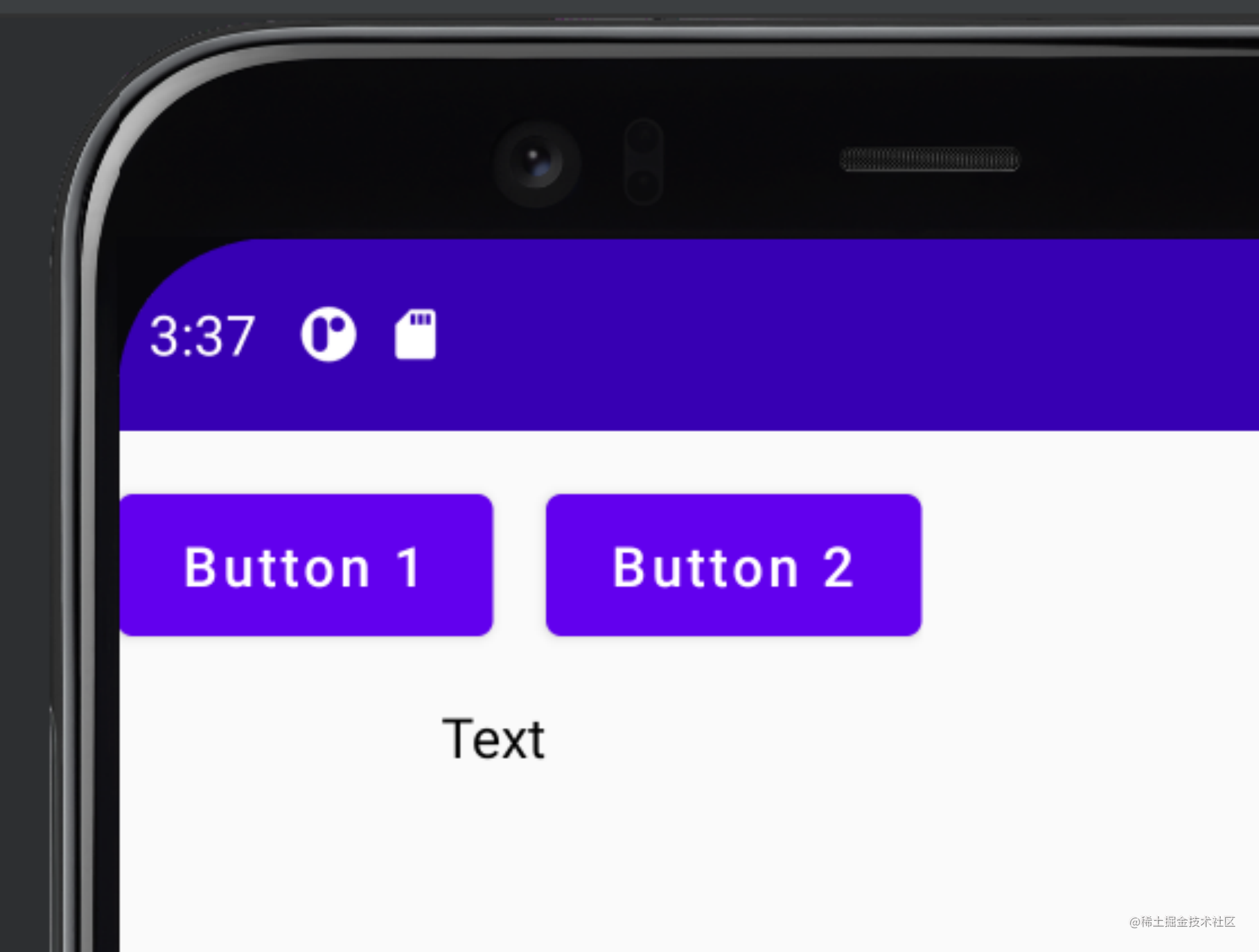
注意,在这里:
· 限制(以及所有其他DSL)可以在 ConstraintLayout 的正文中创建,但不能在 constrainAs 内部创建。
· linkTo 可用于约束准则和限制,就像它运用于布局边缘的工作原理一样。
Guideline
即引导线,可以从特定的位置(某一方向上的偏移量或者某一方向上的比例)创建一条实际并不可见的参考线,提供给各个控件约束条件,可以给出占屏幕百分比。其种类共有以下几种:
createGuidelineFromStart(offset: Dp)
createGuidelineFromAbsoluteLeft(offset: Dp)
createGuidelineFromStart(fraction: Float)
createGuidelineFromAbsoluteLeft(fraction: Float)
createGuidelineFromEnd(offset: Dp)
createGuidelineFromAbsoluteRight(offset: Dp)
createGuidelineFromEnd(fraction: Float)
createGuidelineFromAbsoluteRight(fraction: Float)
createGuidelineFromTop(offset: Dp)
createGuidelineFromTop(fraction: Float)
createGuidelineFromBottom(offset: Dp)
createGuidelineFromBottom(fraction: Float)
看名知意,这些方法都是在上、下、左、右方向分别支持某一偏移量,或某比例进行创建引导线。而…FromAbsolute…的表示绝对的左右偏移方向。
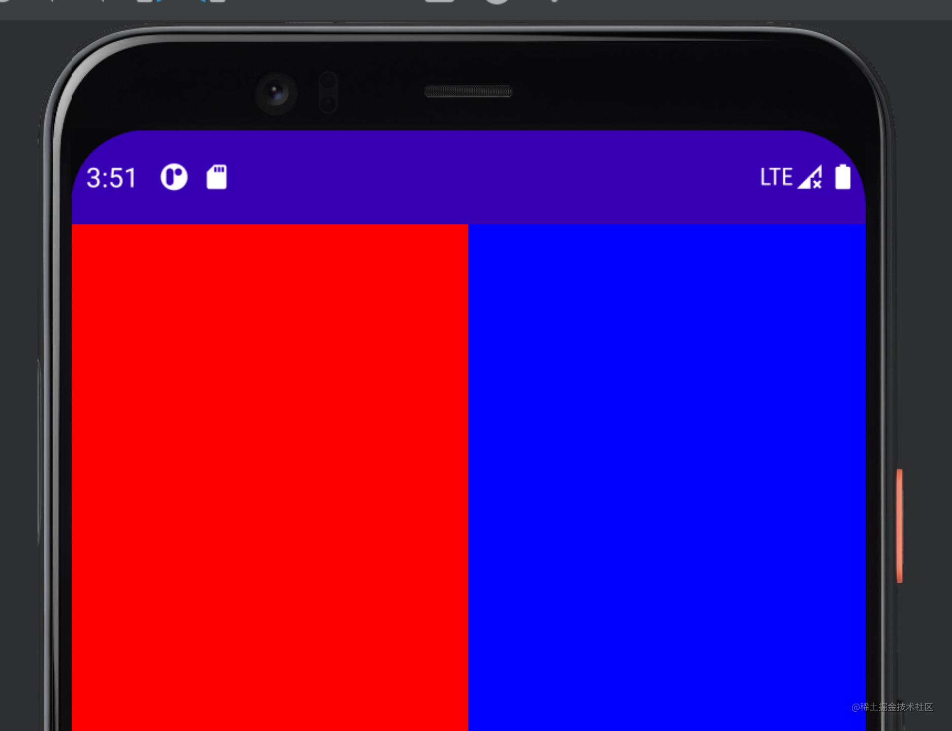
例如,我们使用ConstraintLayoutScope()来进行示例:
ConstraintLayout(modifier = Modifier.fillMaxSize()
) {val guideline = createGuidelineFromStart(0.5f)val (box1, box2) = createRefs()Box(modifier = Modifier.fillMaxSize().background(color = Color.Red).constrainAs(box1) {end.linkTo(guideline)})Box(modifier = Modifier.fillMaxSize().background(color = Color.Blue).constrainAs(box2) {start.linkTo(guideline)})
}
代码中可以看出,引导线在中间,路边是不同的Box控件,对应的显示为:
自定义维度
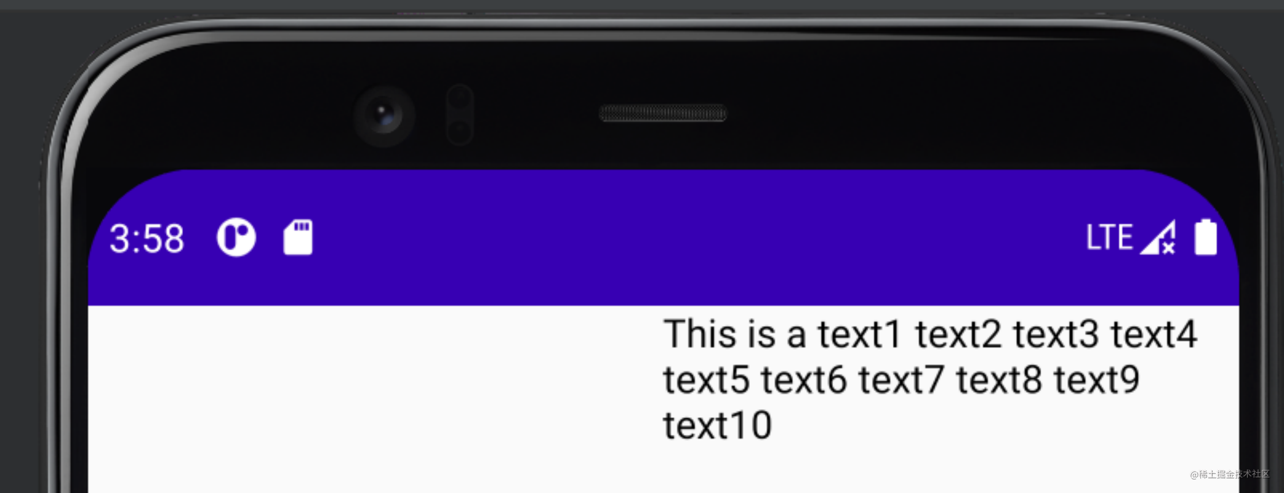
默认情况下,系统允许 ConstraintLayout 的子项选择封装其内容所需的大小。例如,这意味着当文本过长时,可以超出界面边界:例如如下示例:
ConstraintLayout {val text = createRef()val guideline = createGuidelineFromStart(fraction = 0.5f)Text("This is a text1 text2 text3 text4 text5 text6 text7 text8 text9 text10",Modifier.constrainAs(text) {linkTo(start = guideline, end = parent.end)})
}
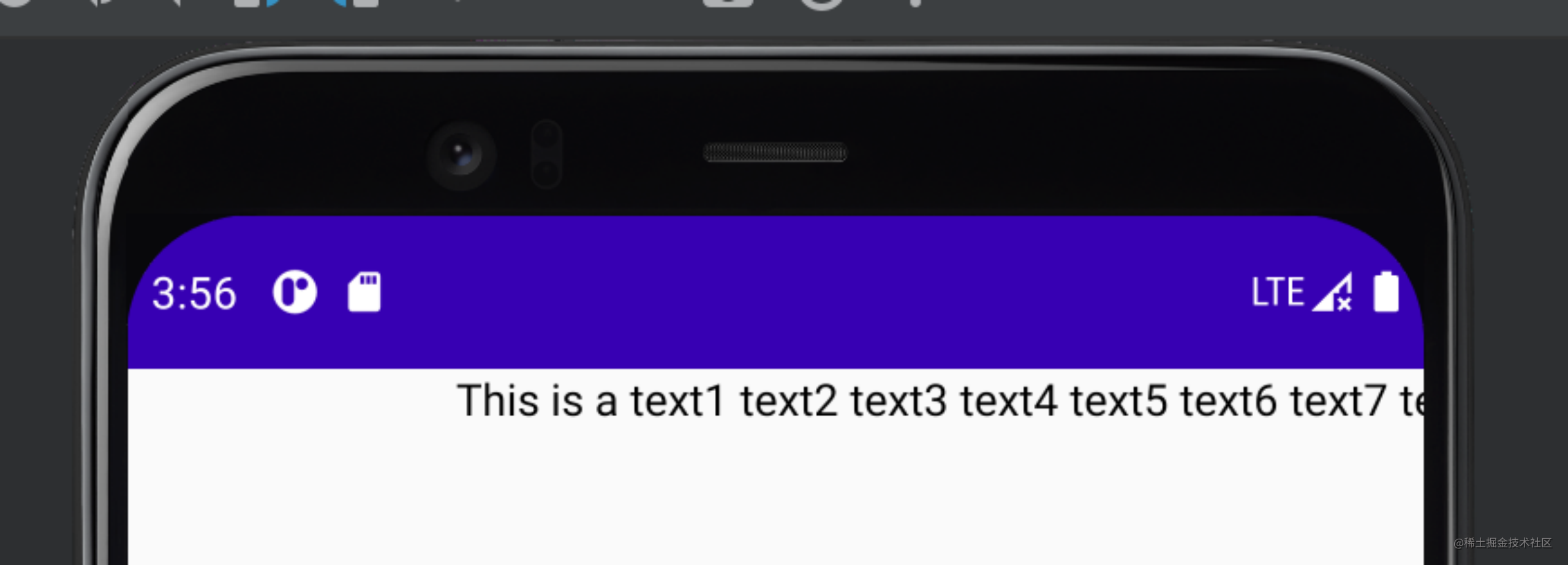
可见文本在text8时就超出了屏幕宽度限制,这个时候就应该换行了。换行可以使用with:
原代码中的Text()修改为:
Text("This is a text1 text2 text3 text4 text5 text6 text7 text8 text9 text10",Modifier.constrainAs(text) {linkTo(start = guideline, end = parent.end)width = Dimension.preferredWrapContent}
)
所对应效果为:
这里引申出一个新的函数Dimension,其各参数如下:
· preferredWrapContent - 布局是封装内容,受限于该维度的约束条件;
· wrapContent - 布局是封装内容,即使约束条件不允许该内容;
· fillToConstraints - 布局将展开,以填充由该维度的约束条件定义的空间;
· preferredValue - 布局是固定的 dp 值,受限于该维度的约束条件;
· value - 布局是固定的 dp 值,无论该维度中的约束条件如何。
此外,某些情况下Dimension 可以强制转换,例如:
width = Dimension.preferredWrapContent.atLeast(100.dp)
Barrier
即屏障,其作用见名知意。同样的创建屏障的参数也有如下几个:
·createStartBarrier()
·createAbsoluteLeftBarrier()
·createTopBarrier()
·createEndBarrier()
·createAbsoluteRightBarrier()
·createBottomBarrier()
同样的是四个方向,加上两个绝对方向。
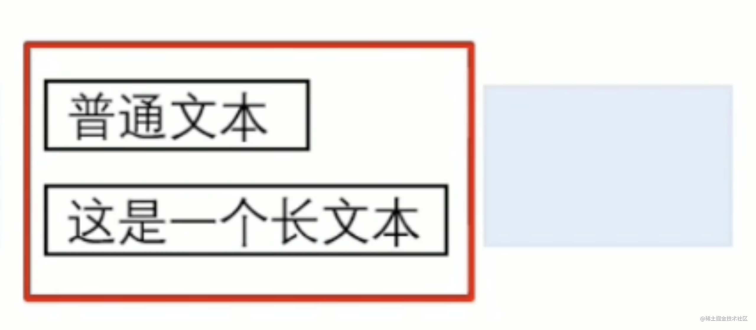
使用场景
如何理解这个函数呢?例如我们现在有个这个场景,有个长文本、一个短文本,同时还有一个按钮,这时我们要限制按钮在长文本的右边,但长文本和短文本是可以相互变化的,即不固定的,此时Barrier就应运而生来表达这种关系:
例如以下代码:
ConstraintLayout(ConstraintSet {val Text1 = createRefFor("Text1")val Text2 = createRefFor("Text2")val Button3 = createRefFor("Button3")constrain(Text1) {top.linkTo(parent.top)start.linkTo(parent.start)}constrain(Text2) {top.linkTo(Text1.bottom)start.linkTo(parent.start)}val barrier = createEndBarrier(Text1, Text2)constrain(Button3) {start.linkTo(barrier)top.linkTo(Text1.top)bottom.linkTo(Text2.bottom)}}
) {Text(text = "长文本卡啦啦啦啦啦啦啦",modifier = Modifier.layoutId("Text1").background(color = Color.Red).width(180.dp).height(50.dp))Text(text = "短文本",modifier = Modifier.layoutId("Text2").background(color = Color.Yellow).width(110.dp).height(50.dp))Button(onClick = { /*TODO*/ },modifier = Modifier.layoutId("Button3").background(color = Color.Blue).width(200.dp).height(100.dp)){Text(text = "Button")}
}
对应的效果为:
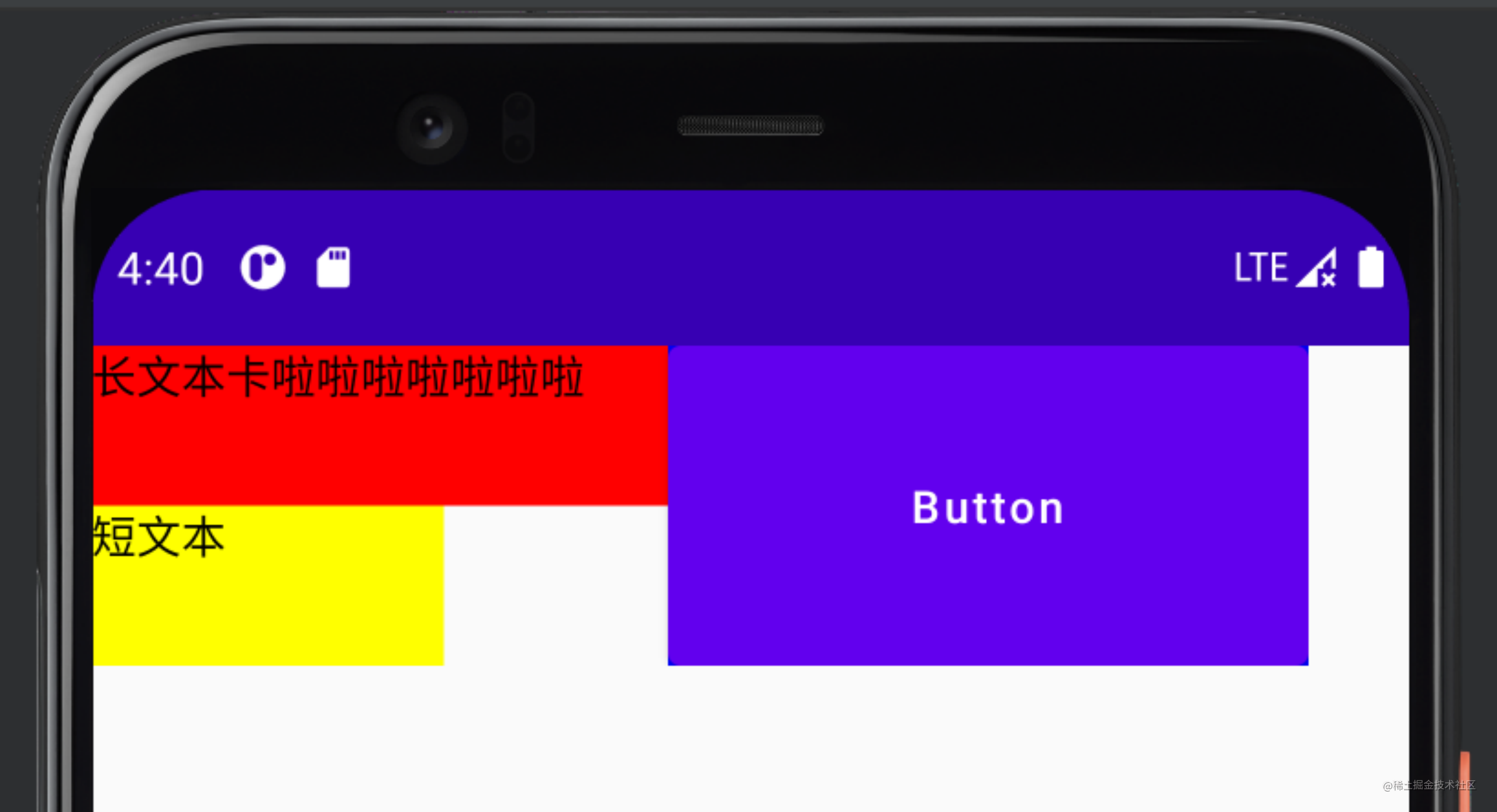
无论后续修改两个文本哪个是长文本、哪个为段文本,Button都在右边。
Chain
即,链。类似于View体系中xml文件里的chain。作用类似于将一系列组件按顺序打包成一行或一列。此API目前被官方标记为可改进状态,后续可能有所更改。
其创建方式如下:
createHorizontalChain()     //创建横向的链
createVerticalChain()       //创建竖向的链
这俩构造函数为:
fun createHorizontalChain(vararg elements: ConstrainedLayoutReference,chainStyle: ChainStyle = ChainStyle.Spread
)
fun createVerticalChain(vararg elements: ConstrainedLayoutReference,chainStyle: ChainStyle = ChainStyle.Spread
)
可以看出,第一个参数是控件的编号,第二个参数是链的类型。而其类型又分为三种:
·Spread:默认类型,所有控件平均分布在父布局中;
·SpreadInside:第一个和最后一个分布在链条的两端,其余的控件平均分布剩下的空间;
·Packed:所有控件包在一起,并放置在链条的中间。
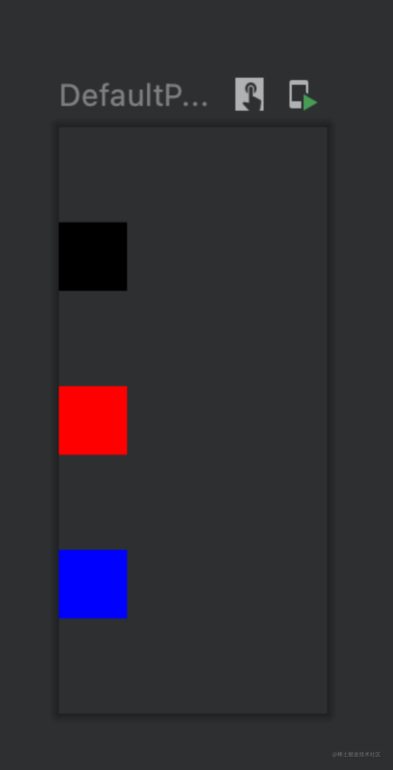
例如如下代码:
ConstraintLayout(modifier = Modifier.fillMaxSize()) {val (box1, box2, box3) = createRefs()createVerticalChain(box1, box2, box3)Box(modifier = Modifier.size(100.dp).background(Color.Black).constrainAs(box1) {})Box(modifier = Modifier.size(100.dp).background(Color.Red).constrainAs(box2) {})Box(modifier = Modifier.size(100.dp).background(Color.Blue).constrainAs(box3) {})
}
对应的预览效果为:
constrainAs () 和constrain ()
看到这里你应该就明白了这两个函数的主要用法和意义,除了定义id和编号外,实现约束位置的主要逻辑都在这两个函数里。
其函数参数属性如下:
· parent
· start
· absolutLeft
· top
· end
· absoluteRight
· bottom
· baseline
见名知意,各参数含义作用看名称就能明白。使用linkTo()函数链接到另一个控件的相应属性上即可。当然,不能让一个控件左侧对齐另一个控件的上侧,这样会报错。
Decoupled API
另一种使用方式:除了以内嵌方式指定约束条件,在某些情况下,还可以使约束条件与它们所应用到的布局分离:常见的为根据界面配置轻松更改约束条件,或在 2 个约束条件集之间添加动画效果。这个功能能大大的改善代码的耦合度。
这些情况下,可以通过不同的方式使用 ConstraintLayout:
· 将 ConstraintSet 作为参数传递给 ConstraintLayout。
· 使用 layoutId 修饰符将在 ConstraintSet 中创建的引用分配给可组合项。
此 API 形状适用于上面显示的第一个 ConstraintLayout 示例,它针对界面宽度进行了优化。
@Composable
fun CustomView() {BoxWithConstraints {val constraints = if (maxWidth < maxHeight) {decoupledConstraints(margin = 16.dp) // Portrait constraints} else {decoupledConstraints(margin = 32.dp) // Landscape constraints}ConstraintLayout(constraints) {Button(onClick = { /* Do something */ },modifier = Modifier.layoutId("button")) {Text("Button")}Text("Text", Modifier.layoutId("text"))}}
}private fun decoupledConstraints(margin: Dp): ConstraintSet {return ConstraintSet {val button = createRefFor("button")val text = createRefFor("text")constrain(button) {top.linkTo(parent.top, margin= margin)}constrain(text) {top.linkTo(button.bottom, margin)}}
}
对应的显示情况也在预料之中:
目前为止,ConstraintLayout所有知识点几乎都在这,当然,也肯定会有遗漏,欢迎留言交流。
这篇关于JetpackCompose之ConstraintLayout的文章就介绍到这儿,希望我们推荐的文章对编程师们有所帮助!