本文主要是介绍基于matplotlib以及seaborn对2000年-2015年全球人口预期寿命的分析报告,希望对大家解决编程问题提供一定的参考价值,需要的开发者们随着小编来一起学习吧!
Content
1. Introduction
1.1 Background Overview
1.2 About the dataset
1.3 The libraries that I used
2. Data processing
2.1 Read file and get an overview of the data
2.2 Data cleaning
2.2.1. Data type conversion
2.2.2 Delete duplicate value
2.2.3 Missing value processing
2.2.4 Detect, mark, and replace outliers with averages(should be done)
3. Questions and Answers By Data Visualization
3.1 The First Question (Use Heat Map)
3.2 The Second Question (Use Bar Plot)
3.3 The Third Question (Use Histplot)
3.4 The Fourth Question (Use Line Graph)
3.4 The Fourth Question (Use Box Plot)
4. Prediction
5. Summary
5.1 What I Have Learned From the Ananlysis
5.2 Conclusion of my questions
5.3 Possible Future Work with My own idea
5.4 Some useful resources that I have found
1. Introduction
1.1 Background Overview
Over the past few decades, the economic and social conditions of countries around the world have changed dramatically, and the impact on life expectancy has gradually emerged. Economic growth and improvements in education and health care have led to significant increases in life expectancy, especially in developing countries. At the same time, some developed countries are trying to improve life expectancy through a variety of measures, such as improving public health, enhancing medical care and encouraging healthy lifestyles. Therefore, studying the various factors that affect life expectancy, their relationships and their distribution will not only help to improve people's health and well-being, but also help to develop more effective public health policies and social welfare programmes.
1.2 About the dataset
This data set from the WHO (world health organization), being downloaded by me on Life Expectancy (WHO) | Kaggle. Specifically, WHO tracks the health status of all countries, as well as many other relevant factors, through the Global Health Observatory (GHO) data repository, datasets that are made available to the public for health data analysis. In this dataset, it relates to life expectancy and health factors for 193 countries were collected from the same WHO data repository website, for which corresponding economic data were collected from the United Nations website. Among all categories of health-related factors, the authors of this dataset chose only those key factors that were more representative. It has been noted that in the past 15 years, compared with the previous 30 years, there has been tremendous development in the health sector, especially in developing countries, where human mortality rates have declined. Therefore, data for 193 countries from 2000 to 2015 are available for further analysis.
1.3 The libraries that I used
- Pandas
- Numpy
- Seaborn
- Matplotlib
- Sklearn
2. Data processing
2.1 Read file and get an overview of the data
First of all, read the file.
# 1. Read the dataset downloaded by me before I start to do my work.
df = pd.read_csv("../dataset/Life Expectancy Data.csv")# 2. Get the numbers of columns and rows
df.shape
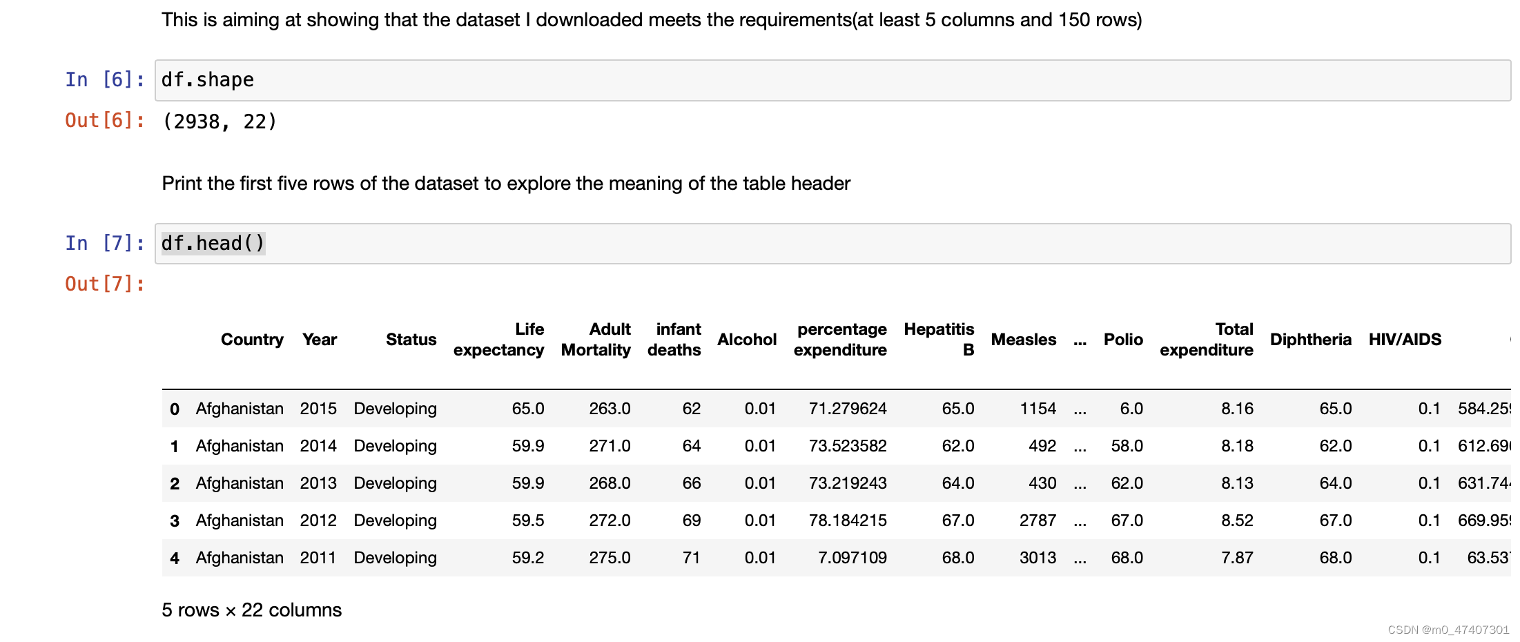
Obviously, the data set has 2938 rows and 22 columns.
# 3. Get the name of columns
df.columns
Here, I try to get the name of columns so that I can understand what the dataset really is.
And results are as followings:

Although I get these results and know their names, I still do not know the true meanings of them. Thus, I collecte some information on the Internet and show them below:
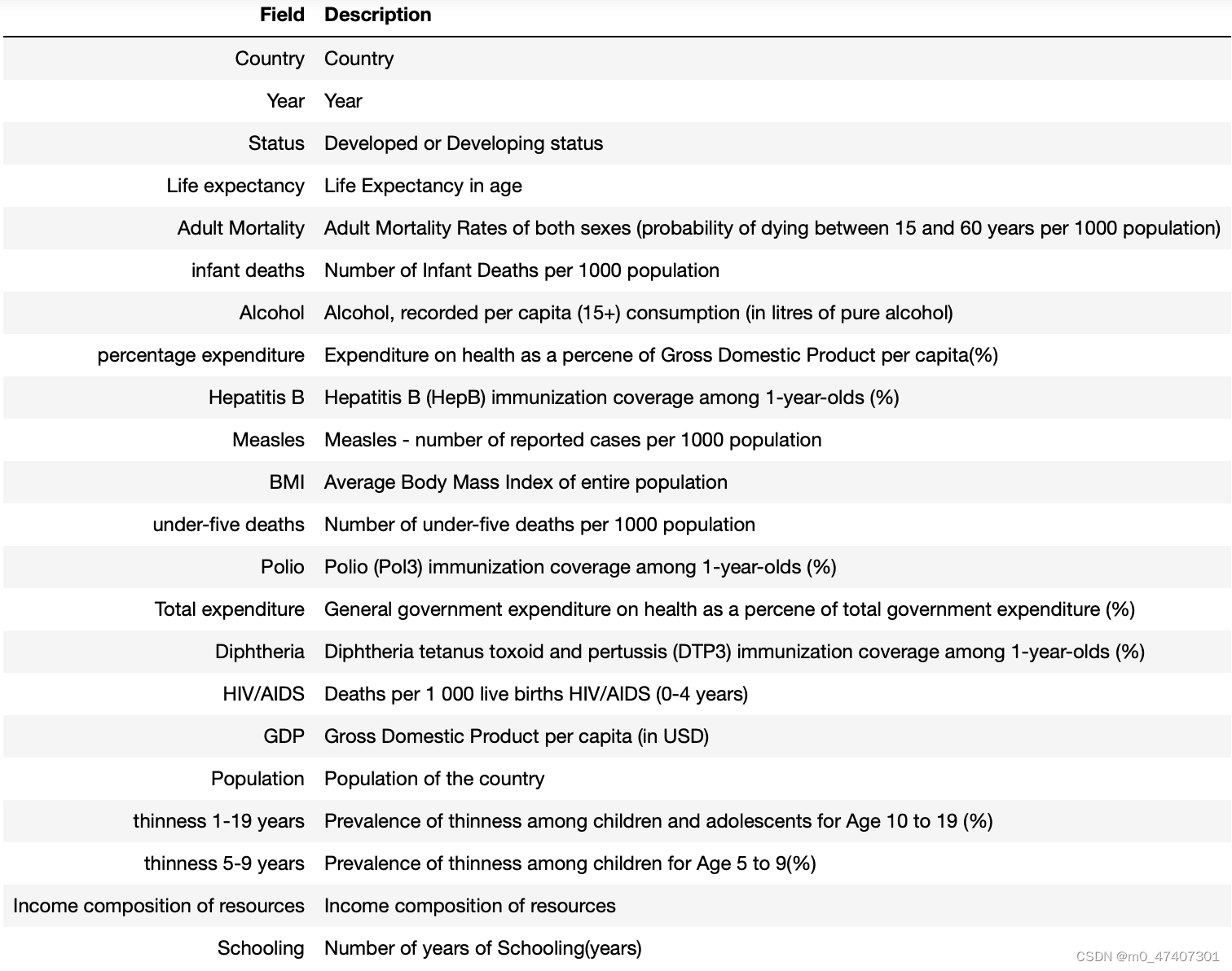
Now, I can try to do more about it.
First of all, check the missing values for all columns and show some basic information for eachh column.
df.info()
df.describe()
And I got the results as followings:
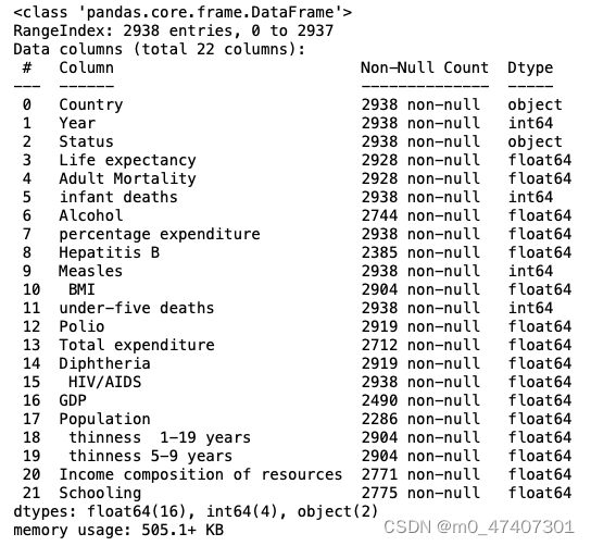

Look at some basic information about the data framework. And I found that the data of some colunmns like Country,Year,status and so on are perfect, which means there are no missing values. Whereas, some columns like Alcohol, Total expenditure, GDP and so on are imperfect, which means there are relatively more missing values. Because the time is limited, I do not have enough time to find out all relations between each type of data. So my questions will not be extremly detailed. Now, I am going to start data clean.
2.2 Data cleaning
2.2.1. Data type conversion
Data transformation improves the availability and accessibility of data, making it easier to understand and use. By transforming the data, you can organize it into a more structured and consistent form, reducing the complexity of the data and making it more suitable for further analysis and processing. After a basic look at the data, I found that the column was in string format and the other columns were ints or floats. This is not conducive to my data processing, so as a first step, I will convert the 'Status' column to an integer type, developed to 1, and developing to 0, so that I can proceed further:
df['Status'] = df['Status'].replace({'Developed': 1, 'Developing': 0})2.2.2 Delete duplicate value
The advantage of removing duplicate values for data processing is to improve the accuracy and reliability of data. Duplicate values may lead to redundant information in the data set, which will affect the accuracy and credibility of the analysis results. By removing duplicate values, I can ensure that each record is unique, avoiding the interference of duplicate data to the analysis. So in the second step, I remove duplicates.
Because there are no duplicate values in the original data here, I have manually created 4 duplicate values in the row to show the process of removing duplicate values.
# Detect the duplicates and calculate it
duplicates = df.duplicated()
num_duplicates = sum(duplicates)# Print the number of the duplicates
print(f"There are totally {num_duplicates} duplicates in the dataset。")
Result: There are totally 4 duplicates in the dataset。
Next, I deleted the detected duplicates.
df.drop_duplicates(inplace=True)Then, check whether I have done it.
# Detect the duplicates and calculate it
duplicates = df.duplicated()
num_duplicates = sum(duplicates)# Print the number of the duplicates
print(f"There are totally {num_duplicates} duplicates in the dataset。")
Result: There are totally 0 duplicates in the dataset
Apparently, I successfully did it.
# inplace = Ture (Indicates that the original data set is modified)
2.2.3 Missing value processing
Missing value treatment on the benefits of data processing is to improve the integrity of the data, the accuracy and reliability.Missing values are cases where some variables or observations in the index data set are missing.Ignoring missing values can lead to bias, inaccurate analytic results, and misleading conclusions.So in the third step, I do the missing value processing.
First of all, find the sum of the number of rows with empty data for each column to see roughly how many missing values there are in each column:
df.isnull().sum()And I got the results as followings:

Then, I start to fill them with the mean values of each column:
# Calculate the number of missing values in each column
missing_values = df.isnull().sum()# Get the column names with missing values
columns_with_missing_values = missing_values[missing_values != 0].index# Iterate over columns with missing values
for column in columns_with_missing_values:# Fill missing values with the mean of the columndf[column].fillna(value=df[column].mean(), inplace=True)# Calculate the number of missing values after filling
missing_values_after_fill = df.isnull().sum()# Print the number of missing values after filling
print(missing_values_after_fill)
I won't elaborate the process of its achievement here because of the code comments.
2.2.4 Detect, mark, and replace outliers with averages(should be done)
The benefits of dealing with outliers lie in improving the accuracy, stability, and reliability of data analysis. By identifying and handling outliers, we can eliminate their interference in the results, improve the stability of the data, and improve the visualization and interpretation of the data. Therefore, handling outliers is an important step in data processing.
However, because this data set contains different types of data and comes from different countries, these results in data that may indeed be correct, but normal outlier processing can result in the deletion of normal data, affecting the analysis. Thus, here I make a fake data into the dataset. I insert two data with a life expectancy of 150-200 years into the dataset as examples to handle outliers.
Then, I start to do it.
# To limit the maximum and minimum of the life expectancy
min_age = 40
max_age = 120num_outliers = sum((df['Life expectancy '] < min_age) | (df['Life expectancy '] > max_age))
print(f"There are totally {num_outliers} outliers.")
Result: There are totally 2 outliers.
Then, delete them.
# Delete the outliers
df = df[(df['Life expectancy '] >= min_age) & (df['Life expectancy '] <= max_age)]
Then, check whether I have done it.
num_outliers = sum((df['Life expectancy '] < min_age) | (df['Life expectancy '] > max_age))
print(f"There are totally {num_outliers} outliers.")
There are totally 0 outliers.
And now, the process of data clean has been done. I can start to analyse the relations that reflected by the data.
3. Questions and Answers By Data Visualization
3.1 The First Question (Use Heat Map)
Introduction of heat map:
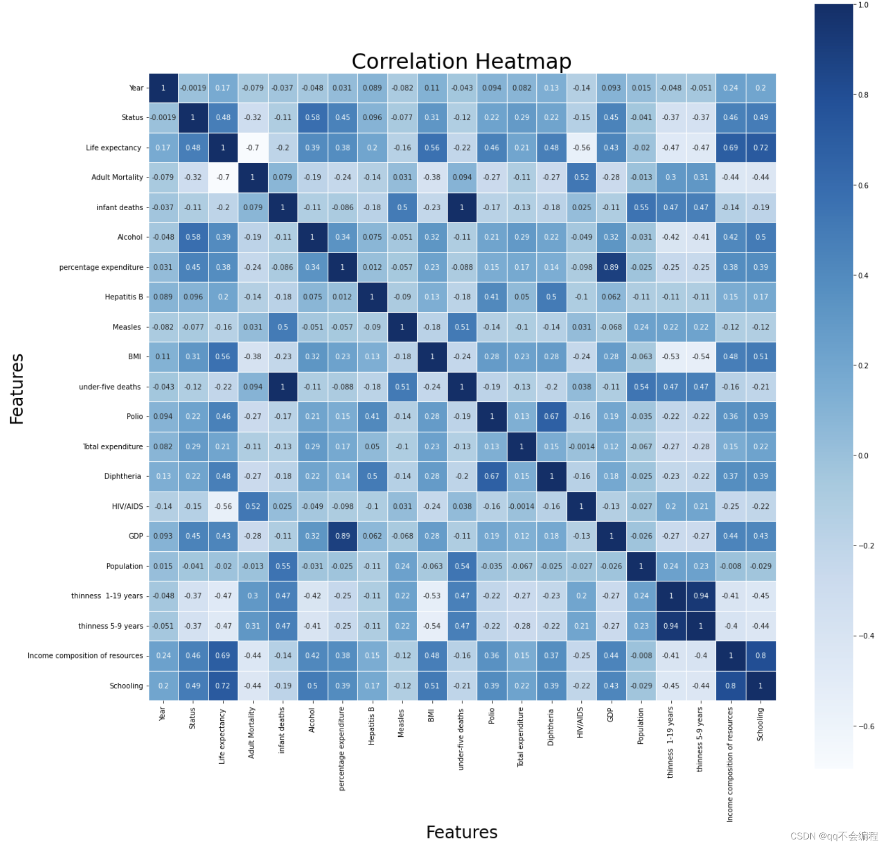
Correlation coefficient heat map is a heat map based on correlation coefficient used to show the strength and direction of correlation between variables. Correlation coefficient measures the degree of linear relationship between two variables, which can help us understand and discover the correlation relationship between variables. Thus, this question is designed for the use of it.
Solution process:
To solve this problem, I thought of the correlation heat map I learned in my data analysis class, which was drawn here using the seaborn library in my favorite blue color.
# Compute the correlation matrix
corr_matrix = df.corr()# Filter the correlations to only keep those with absolute value greater than 0.3
corr_filtered = np.abs(corr_matrix) > 0.3# Create a graph and subgraph object
fig, ax = plt.subplots(figsize=(20, 20))# Draw a heatmap of the filtered correlation matrix
sns.heatmap(corr_matrix, annot=True, square=True, linewidths=.5, cmap='Blues')# Set the title and axis label of the graph
ax.set_title('Correlation Heatmap', fontsize= 30)
ax.set_xlabel('Features', fontsize=24)
ax.set_ylabel('Features', fontsize=24)# Find the correlations greater than 0.3 in absolute value with 'life expectancy'
corr_filtered = df.corr()['Life expectancy '].abs() > 0.3# Sort the filtered correlations in descending order based on absolute value
corr_sorted = df.corr()['Life expectancy '][corr_filtered].abs().sort_values(ascending=False)# Loop through the sorted correlations and print out the feature names and their corresponding correlation coefficients
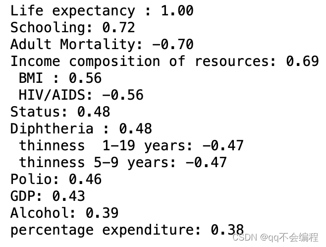
for feature in corr_sorted.index:corr = df.corr().loc[feature, 'Life expectancy ']print(f"{feature}: {corr:.2f}")
Now, I can show you the figure I draw and the result it prints:
# Strong correlation: the absolute value of correlation coefficient is greater than or equal to 0.7
Moderate correlation: absolute correlation coefficients ranged from 0.3 to 0.7
Weak correlation: The absolute value of the correlation coefficient is between 0 and 0.3
Thus, I can conclude from the figure.
Answer:
I chose the correlation coefficient over 0.3 as the main influencing factor.
And thses are the main factors and their exact numerical value :
1. Schooling: 0.72(Strong correlation)
2. Adult Mortality: -0.7(Strong correlation)
3. Income composition of resources: 0.69(Moderate correlation)
4. HIV/AIDS: -0.56(Moderate correlation)
5. BMI: 0.56(Moderate correlation)
6. Diptheria: 0.48(Moderate correlation)
7. thiness 1-19 years & 5-9 years: -0.47(Moderate correlation)
8. Polio: 0.46(Moderate correlation)
9. GDP: 0.43(Moderate correlation)
10. Alcohol: 0.39(Moderate correlation)
11. percentage expenditure: 0.38(Moderate correlation)
I've arranged them in order of the absolute value of the correlation coefficient from the largest to the smallest, so you can intuitively see the big factors affecting life expectancy. However, This is just a basic overview. After doing these, I can try to do more to explore more relations between them and life expectancy. And it is needed to be aware that the correlation coefficient does not represent for the true relation they truly have. That is, further research is needed to determine exactly what the relationship is.
3.2 The Second Question (Use Bar Plot)
Q: What does life expectancy have to do with whether a country is developed?
Introduction of bar plot:
A Bar plot is a common data visualization chart used to show how different categories compare or are distributed. It visually compares the differences between different categories by using vertical or horizontal bars to represent the size or frequency of the data. Here I use it to show the impact of whether a country is a developed country on life expectancy.
Solution process:
Average life expectancy is calculated by grouping countries according to whether they are developed or not, here I use one of the knowledge that I learned from our data analysis course:
data1 = df.groupby('Status')['Life expectancy '].mean().reset_index()The specific steps are as follows:
1. df.groupby('Status') : First, use the groupby() function to group data box df according to the "Status" column. This groups the rows in the data box by Status.
2. ['Life expectancy '] : Then, the column "Life expectancy" is selected by using square brackets and the column name "Life expectancy" on the grouped results.
3.. mean() : Using the mean() function expectancy on the selected column of "Life expectancy", calculate the mean value for each group (different states).
4.. reset_index() : Finally, use the.reset_index() function to reset the grouping results to a new data box and reassign the index values. This converts the "Status" column from an index column to a normal column.
Then, draw a figure:
# Create a bar plot with seaborn
sns.barplot(data=data1, x='Status', y='Life expectancy ')# Add title and axis labels
plt.title('Average Life Expectancy')
plt.xlabel('Status')
plt.ylabel('Life Expectancy (years)')# Add labels for the life expectancy values above each bar
for i, value in enumerate(data1['Life expectancy ']):plt.text(i, value + 0.5, f'{value:.1f}', ha='center')# Show the plot
plt.show()
And the bar plot is as following:
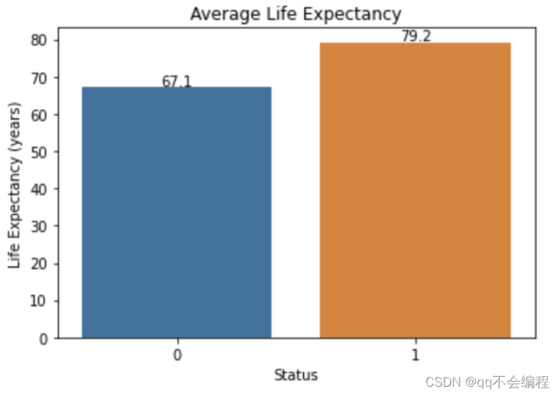
# “0” represents for "developing" while "1" represents for "developed"
Then, I can conclude the answer:
Answer:
It is clear from the histogram achieved by the data set that the average life expectancy in developing countries(67.1) is much shorter than the average life expectancy in developed countries(79.2). It can therefore be concluded that the average life expectancy in developed countries is generally longer than that in developing countries.
3.3 The Third Question (Use Histplot)
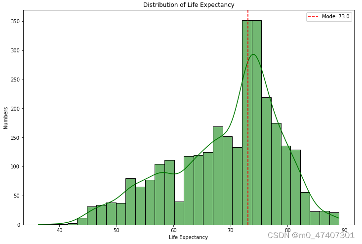
Q: Which age is the global life expectancy concentrated between 2000 and 2015?
Introduction of Histplot:
Frequency histogram is a chart form for visualizing data distribution, which has the following advantages: First, frequency histogram can clearly show the distribution of data, and help us intuitively understand the central trend, dispersion degree and outlier situation of the data set. Secondly, frequency histograms can represent large amounts of data succinctly, especially for continuous data or large-scale data sets. In addition, the frequency histogram drawing process is relatively simple, easy to understand and interpret, so that people can quickly obtain information about the data from the graph to support data analysis and decision. So in this case, the frequency histogram is the perfect way to solve this problem.
Solution process:
To complete this task, I need to draw a histplot to show it.
# Create a figure object and set the size of the figure to 12x8
plt.figure(figsize=(12, 8))# Use sns.histplot to plot a histogram of life expectancy, with kernel density estimation and filled in green color
sns.histplot(df['Life expectancy '], kde=True, color="green")# Calculate the value with the highest proportion in life expectancy
"""
.mode() : Calculates the mode in this column, which is the value that appears most frequently. If there are more than one mode, all modes are returned.
.values: Converts the mode to an array of values (NumPy array).
[0] : Selects the first element in the array, the first mode.
"""
mode = df['Life expectancy '].mode().values[0]# Mark the life expectancy value with the highest proportion on the graph
plt.axvline(x=mode, color='red', linestyle='--', label=f'Mode: {mode}')# Set the title, x-axis label, and y-axis label of the graph
plt.title('Distribution of Life Expectancy')
plt.xlabel('Life Expectancy')
plt.ylabel('Numbers')# Add a legend
plt.legend()# Show the graph
plt.show()
And the histplot is as following:
Since the explanation is already detailed in my code comments, I won't go into the details here.
Answer:
After drawing this figure, I found that mostly Life expectancy is concentrated on 73 years old.
3.4 The Fourth Question (Use Line Graph)
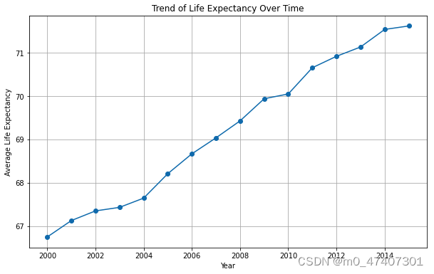
Q: Was there a downward trend in life expectancy all over the world from 2000 to 2015? Or upward trend?
Introduction of Line graph:
The benefit of line charts is that they can show trends and changes in data in a clear and intuitive way. By connecting data points to form lines, we can more easily observe trends such as growth, decline, fluctuation, etc. In addition, a line chart can highlight the differences between different groups or categories, helping us compare and analyze data. It also shows correlations between variables and highlights outliers or outliers. Using a line chart, we can quickly see the overall trend in the data, including cyclical changes and possible seasonal patterns. Therefore, the line chart is a powerful visualization tool that helps us understand and interpret the data better, and also helps me solve this problem.
Solution process:
Then, I start to draw this figure.
# Group the data by 'Year' and calculate the mean life expectancy for each year
mean_life_expectancy = df.groupby('Year')['Life expectancy '].mean()# Create a figure object
plt.figure(figsize=(10, 6))# Plot the line chart
plt.plot(mean_life_expectancy.index, mean_life_expectancy.values, marker='o')# Set the title and axis labels
plt.title('Trend of Life Expectancy Over Time')
plt.xlabel('Year')
plt.ylabel('Average Life Expectancy')# Display grid lines
plt.grid(True)# Show the plot
plt.show()
For more explanation of the code:
1. The code uses the groupby() function to group the DataFrame df by the 'Status' column.
2. The mean() function is applied to the 'Life expectancy ' column within each group to calculate the average life expectancy.
3. The reset_index() function is called to reset the index of the resulting DataFrame. This is necessary because the grouping operation changes the structure of the DataFrame, and resetting the index ensures that the resulting DataFrame has a proper index for further analysis or visualization.
4. The resulting DataFrame, data1, contains two columns: 'Status' and the mean 'Life expectancy' for each status category.
And the figure is as following:
Answer:
It has been shown clearly on the graph that the average life expectancy were rising from 2000 to 2015, instead of downward trend, which was from about 67 years old to 72 years old.
3.4 The Fifth Question (Use Box Plot)
Q: Find the top five countries in the world with the longest life expectancy
Introduction of Line graph:
The purpose of a boxplot is to describe the median, upper and lower quartiles and outliers of the data, as well as the distribution of the data and the presence of outliers. It can help us observe the central tendency of the data, the degree of dispersion and anomalies. In fact, I wanted to use it to deal with outliers, but then I thought that if you could use it to show the distribution of life expectancy in densely populated countries, that would be quite feasible.
Solution process:
# Set the size of the figure
plt.figure(figsize=(35, 32))# Create a box plot
sns.boxplot(data=df, x='Country', y='Life expectancy ')# Rotate the x-axis labels for better readability
plt.xticks(rotation=90)# Set the title of the plot
plt.title('Life Expectancy Distribution in Densely Populated Countries')# Set the label for the x-axis
plt.xlabel('Country')# Display the plot
plt.show()
More explantion:
The purpose of this code is to create a boxplot to show the distribution of life expectancy in a densely populated country.
First, set the size of the figure using plt.figure(figsize=(35, 32)). Set the width of the figure to 35 units and the height to 32 units.
Then, create a boxplot using sns.boxplot(data=df, x='Country', y='Life expectancy '). data=df specifies that the data source is DataFrame df, x='Country' means showing the country on the X-axis and y='Life expectancy 'means showing life expectancy on the Y-axis.
Next, rotate the X-axis label by plt.xticks(rotation=90) to better read the country name of the long label.
And then, Set the title of the graph to "Life Expectancy Distribution in Densely Populated Countries "using plt.title('Life Expectancy Distribution in Densely Populated Countries') Densely Populated Countries" to describe the theme of the chart.
Set the label of the X-axis to "Country" by plt.xlabel('Country') to describe the meaning of the X-axis.
Finally, plt.show() is used to display the entire graph, presenting the boxplot to the user for viewing and analysis.
Thus, the result is as following:

However, the number of countries in the dataset is too large for me to find a clear top five. So, what I want to do now is sort the countries in order of life expectancy from longest to shortest, and then present the data and boxplot, so that you can show the results and the top five countries concretely and visually.
Now, start with the average life expectancy for each country.
mean_life_expectancy_by_country = df.groupby('Country')['Life expectancy '].mean()Then, use “ascending=False” to sort in reverse order, resulting in a sort from long to short life expectancy.
sorted_countries = mean_life_expectancy_by_country.sort_values(ascending=False)At last, show the figure:
# Set the size of the figure
plt.figure(figsize=(35, 32))# Create a box plot
sns.boxplot(data=df, x='Country', y='Life expectancy ', order=sorted_countries.index)# Rotate the x-axis labels for better readability
plt.xticks(rotation=90)# Get the x-axis labels and print the first five
x_labels = [tick.get_text() for tick in plt.gca().get_xticklabels()]
print("The top five countries :")
for label in x_labels[:5]:print(label)
The result is as following:
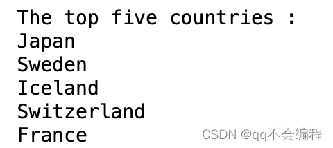
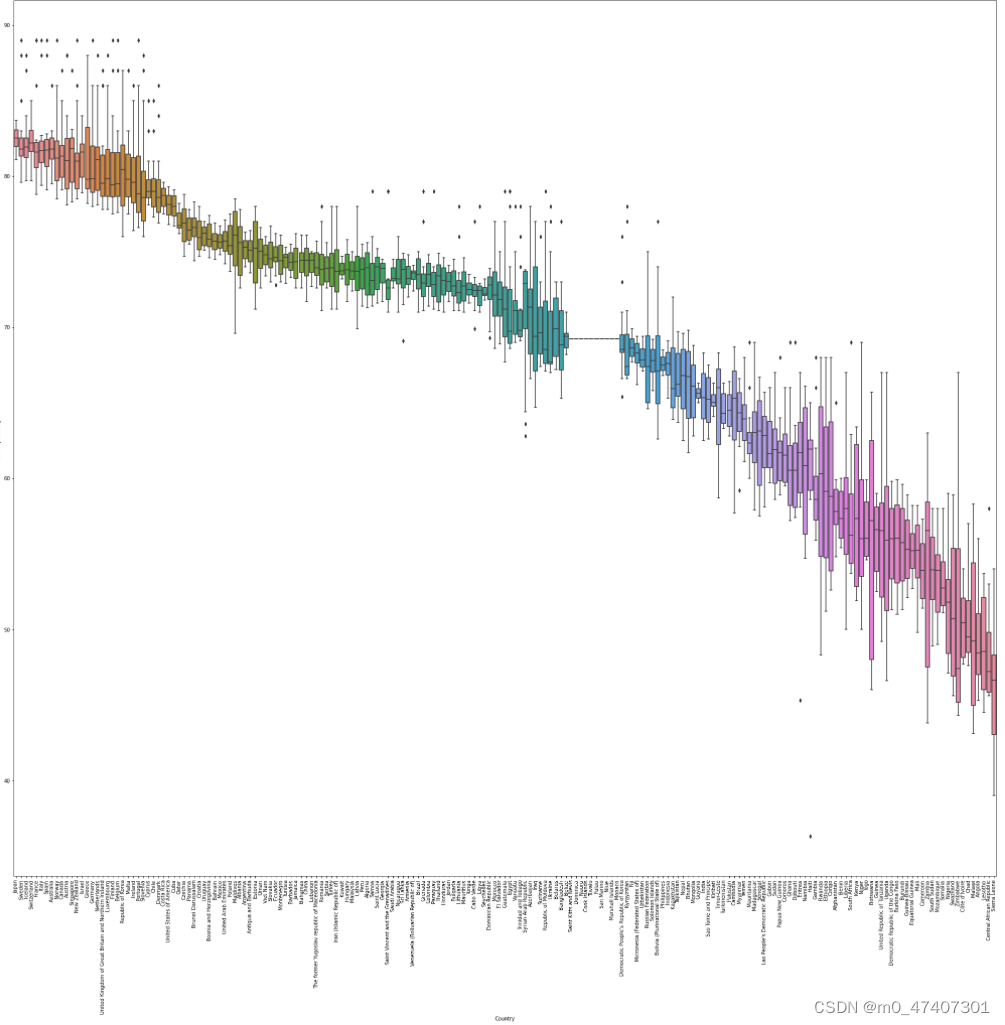
Now, I can directly found the top five countries according to the result.
Answer:
The top five countries are respectively as followings:
1. Japan
2. Sweden
3. Iceland
4. Switzerland
5. France
4. Prediction
First of all, here I intend to use the linear regression I learned in class for model fitting to predict the world average life expectancy in 2020-2025. So here I'll install the necessary libraries. Here I import the PolynomialFeatures, LinearRegression, and cross_val_score classes to create a polynomial regression model, a linear regression model, and to evaluate model performance.
from sklearn.preprocessing import PolynomialFeatures
from sklearn.linear_model import LinearRegression
from sklearn.model_selection import cross_val_score
Next, I rename the 'Life expectancy' column in the data box df to 'Life_expectancy' for later use.
I then select the data from 2000 to 2015 and store it in a new data box named df.
Calculate the average global life per year and store it in a numpy array named y.
Then create the argument X, which is a numpy array containing years from 2000 to 2015.
df = df[df['Year'].between(2000, 2015)]
y = df.groupby('Year')['Life_expectancy '].mean().values
X = np.array(range(2000, 2016)).reshape(-1, 1)
Next, I use the PolynomialFeatures class to create X_poly, which contains quadratic polynomial features. This produces a new argument matrix containing the first and second powers of the original argument X.
poly = PolynomialFeatures(degree=2)
X_poly = poly.fit_transform(X)
Create a linear regression model.
Use cross validation to evaluate the performance of linear regression models. This calculates the R-squared value of the model using 50 fold cross validation and stores the results in a numpy array named scores.
Cross validation scores and average scores of printed models.
model = LinearRegression()
print('Cross-validation scores:', scores)
print('Mean score:', np.mean(scores))
The linear regression model was trained using polynomial features.
Create the dataset future_years containing the year to be predicted and transform it with PolynomialFeatures to generate future_X_poly containing polynomial features for all years.
model.fit(X_poly, y)
future_years = np.array(range(2016, 2026)).reshape(-1, 1)
future_X_poly = poly.transform(future_years)
Predictions for the predicted years are made using trained models and the results are stored in an array of predictions called numpy. Plot the raw data and the predicted results. The map was generated using the matplotlib library, where X[:, 0] and y are independent and dependent variables of raw data, and future_years[:, 0] and predictions are independent and dependent variables of outcomes.
predictions = model.predict(future_X_poly)
plt.figure(figsize=(8, 6))
plt.scatter(X[:, 0], y, marker='o', label='Historical Data')
plt.plot(future_years[:, 0], predictions, marker='o', label='Predicted Data')
plt.title('The Prediction of Global Life Expectancy')
And here is the result:
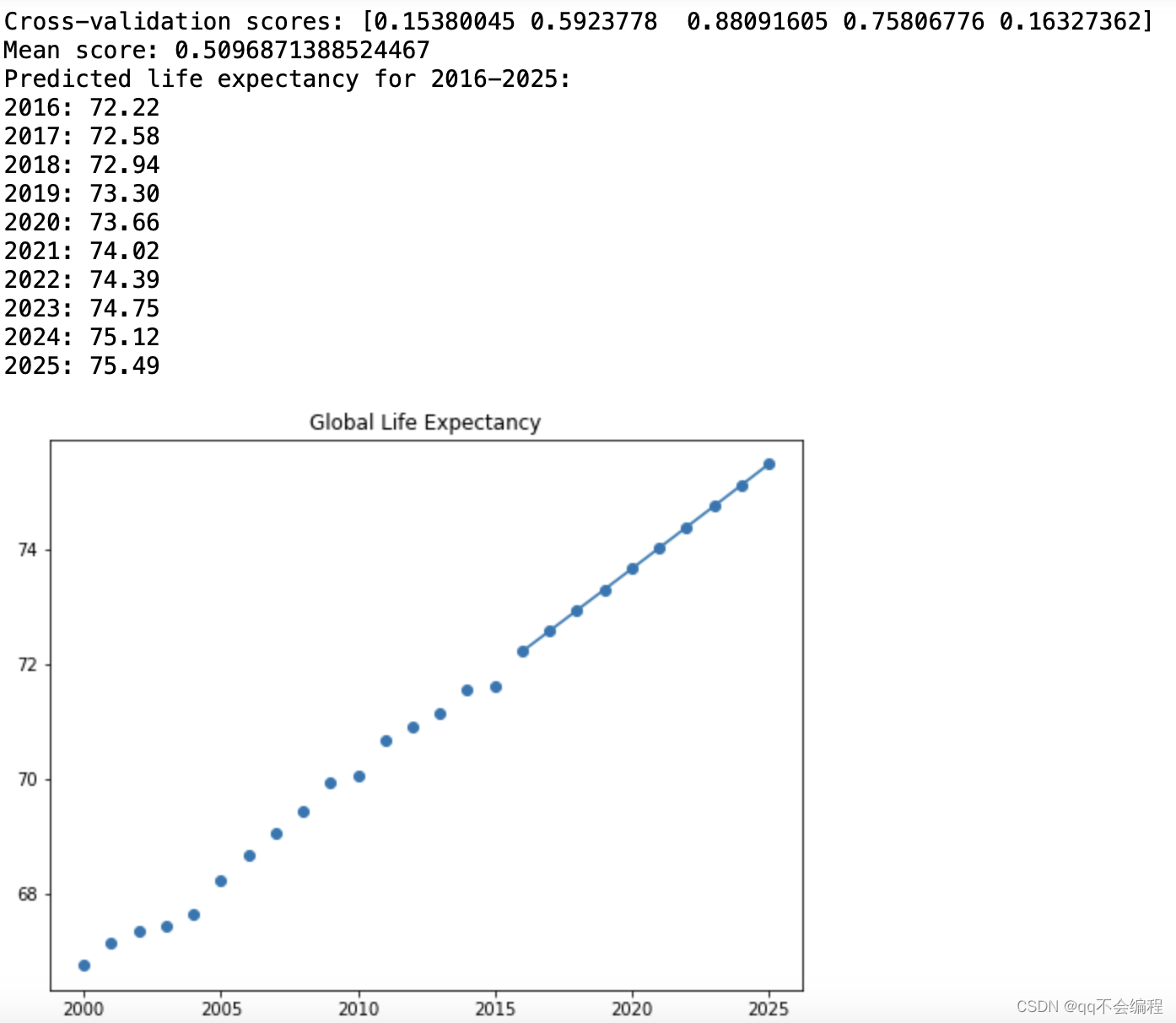
According to the results of cross-validation, the average score of my model is 0.51, which means that the model has good performance. More specifically, the R-squared value (coefficient of determination) of the model is greater than 0, which means that the model fits better than random guesses. It can be said that the fitting effect was successful this time.
5. Summary
5.1 What I Have Learned From the Ananlysis
Thus, I have done all my work. And actually, I really gained a lot from the analysis.
For example:
1. I have a clearer understanding of the process of data analysis, from downloading data sets to data cleaning, to raising problems and using data visualization tools to solve problems. I realized the huge role that data analytics can play in our lives.
2. inplace = Ture (Indicates that the original data set is modified)
3.. reset_index() : how to use the.reset_index() function to reset the grouping results to a new data box and reassign the index values.
4. .mode() : Calculates the mode in this column, which is the value that appears most frequently. If there are more than one mode, all modes are returned.
.values: Converts the mode to an array of values (NumPy array).
5. plt.axvline(x=mode, color='red', linestyle='--', label=f'Mode: {mode}'): How to use it to mark the life expectancy value with the highest proportion on the graph
6. How to use the linear progression to predict the tendency of the future.
7. .......
5.2 Conclusion of my questions
In this data visualization analysis, I used a data set containing life expectancy and other relevant factors, and carried out a series of data analysis and visualization operations through different visualization tools such as heat map, bar chart, histplot, line graph and boxplot, and reached the following conclusions:
1. Main factors affecting life expectancy and their correlation: We found that education level, adult mortality rate, income composition, HIV/AIDS, BMI and other factors showed different degrees of correlation with life expectancy. These findings could help us understand which factors are most important for human longevity.
2. Relationship between developed countries and life expectancy: The bar chart shows the difference between the average life expectancy of developed countries and developing countries. The results show that life expectancy is generally higher in developed countries, which may be related to improvements in education, health care and the economy.
3. Global Age concentration: The histogram reveals the age range of the global concentration of life expectancy between 2000 and 2015, with most countries having a concentration of life expectancy around 73 years. This provides an interesting insight into global life expectancy patterns.
4. Trends in Global Life expectancy: The line chart shows trends in global life expectancy from 2000 to 2015. The results show that the global average life expectancy is on the rise, indicating a global increase in human longevity.
5. Global differences in life levels: Using boxplots, we compare life levels in different countries. The results showed that life expectancy levels were significantly higher in some countries than in others. Japan, Sweden, Iceland, Switzerland and France are the top five countries with the highest average life expectancy.
5.3 Possible Future Work with My own idea
For future work on the same topic, consider the following directions and use of other relevant data sets:
1. Study socio-economic factors: In addition to the factors already analyzed, more socio-economic factors related to longevity can be explored, such as employment rate, poverty rate, social welfare expenditure, etc. The relationship between these factors and longevity can be analysed more comprehensively using other relevant data sets, such as those of the World Bank, the United Nations or national statistical agencies.
2. Influence of environmental factors: Environmental factors also have an important impact on life expectancy. The relationship between air quality, water quality, environmental pollution and life span can be studied. Using data sets from environmental protection agencies or health organizations, it is possible to further understand the impact of environmental factors on longevity and make policy recommendations accordingly.
3. Location-based analysis: Consider the use of geographic information systems (GIS) and geospatial data sets to analyze the impact of geographic location on longevity. We can explore the difference of life span between different regions, cities or villages, and study the influence of geographical factors and climate factors on life span.
4. Health behavior and lifestyle: Study the influence of individual health behavior and lifestyle on longevity. Health survey data sets or epidemiological research data sets can be used to analyze the relationship between smoking, diet, exercise and other factors and longevity, and make relevant health policy recommendations.
Although I didn't do it in this problem, I'll explore it on my own time after class.
5.4 Some useful resources that I have found
1. Kaggle: Your Machine Learning and Data Science Community A powerful website with enormous datasets, I found my dataset there.
2. 一次完整的数据分析流程包括哪些环节? - 简书 It taught me a more clearer process of data analysis.
3. Pandas中关于reindex(), set_index()和reset_index()的用法_reindex reset_index_lightis_tian的博客-CSDN博客
It taught me how to use reset_index()
4. mode() function in Python statistics module - GeeksforGeeks It taught me how to find the mode of data.
5. matplotlib.pyplot.axvline — Matplotlib 3.7.1 documentation It taught me how to use plt.axvline(), and I must say that the official documentation is very useful if you have grammar problems.
6.在matplotlib中添加数据注释,显示两个折线图_plt两个折线图_可可宋的博客-CSDN博客
It taught me how to add the notation of the detailed data.
7. 如何用 python sklearn 做回归预测? - 知乎
sklearn.linear_model.LinearRegression — scikit-learn 1.2.2 documentation3.1. Cross-validation: evaluating estimator performance — scikit-learn 1.2.2 documentationThese pages contain detailed explanations of the concept of linear regression that I use and how to use the corresponding scikit-learn function and its classes.
In fact, there are some scattered knowledge points I learned through the search engine, but there are too many, and I will not list them all here. Here is only a list of the main ways to obtain the knowledge points.
8.机器学习_K折交叉验证知识详解(深刻理解版)(全网最详细)_五折交叉验证得到五个模型_WeThinkIn的博客-CSDN博客
This page taught me what is the K-fold cross-validation and how it can be used in the predication.
Thus, I think I have done all my work. I am really enjoyful about my work. And I will do more work after this data analysis.
这篇关于基于matplotlib以及seaborn对2000年-2015年全球人口预期寿命的分析报告的文章就介绍到这儿,希望我们推荐的文章对编程师们有所帮助!


