本文主要是介绍vue 流光边框矩形圆形容器,希望对大家解决编程问题提供一定的参考价值,需要的开发者们随着小编来一起学习吧!
实现流光边框一般是用渐变背景加动画实现,然后使用内部盒子遮挡内部空间,达到边框流光的效果
思路:背景渐变+旋转动画
功能:
- 自定义渐变(是否渐变<不渐变没有流光效果>,渐变颜色,渐变角度,渐变宽度)
- 自定义动画时间
1 基础实现
<template><Box> 测试 </Box>
</template>
<script setup lang="ts">
import Box from "./Box.vue";
</script>
<style scoped></style>
<template><div class="box"><div class="content"><slot></slot></div></div>
</template>
<script setup lang="ts"></script>
<style scoped lang="scss">
.box {display: flex;justify-content: center;align-items: center;text-align: center;position: relative;width: 100%;height: 100%;padding: 5px;border-radius: 10px;overflow: hidden;&:before {content: "";background-image: linear-gradient(120deg, #5ddcff, #3c67e3 40%, #4e00c2);position: absolute;z-index: 0;padding-left: 130%;padding-bottom: 130%;animation: rotate 8s linear infinite;}.content {height: 100%;width: 100%;display: flex;align-items: center;padding: 24px 20px;background: #f1d674;z-index: 2;border-radius: 6px;}
}
@keyframes rotate {0% {transform: rotate(0deg);}100% {transform: rotate(360deg);}
}
</style>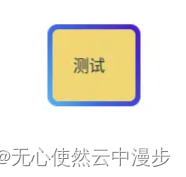
动图(略)
2 封装组件
2.1 圆形边框
使用mask属性,使得中间部分背景不被遮挡
<template><div class="box" :style="{ width: width + 'px', height: height + 'px' }"><slot></slot></div>
</template>
<script setup lang="ts">
const props = defineProps({width: {type: Number, //容器宽default: 100,},height: {type: Number, //容器高default: 100,},colors: {//颜色数组type: Array,default: () => [{color: "#64dcfd",width: 0,},{color: "#406cf1",width: 100,},{color: "#4501ac",width: 101,},],},angle: {//渐变角度type: Number,default: 120,},borderWidth: {//流光边框宽度type: Number,default: 10,},gradient: {//是否渐变type: Boolean,default: true,},duration: {//动画时间type: String,default: "5s",},
});const background = computed(() => {const positions = [];const colorsCopy = JSON.parse(JSON.stringify(props.colors));colorsCopy.forEach((s, index) => {const sum = colorsCopy.slice(0, index).reduce((a, b) => a + b.width, 0);if (!props.gradient) {positions.push(sum);}positions.push(sum + s.width);});return `linear-gradient(${props.angle}deg, ${colorsCopy.map((s, index) => {if (!props.gradient) {return `${s.color} ${positions[index]}px, ${s.color} ${positions[2 * index + 1]}px`;}return `${s.color} ${positions[index]}px`;}).join(",")})`;
});const borderLR = computed(() => {return props.width / 2 - props.borderWidth + "px";
});
const borderLRShink = computed(() => {return props.width / 2 - props.borderWidth - 1 + "px";
});
</script>
<style scoped lang="scss">
.box {display: flex;justify-content: center;align-items: center;position: relative;width: 100%;height: 100%;border-radius: 50%;overflow: hidden;&:before {content: "";background-image: v-bind(background);position: absolute;width: 100%;height: 100%;border-radius: 50%;animation: rotate v-bind(duration) linear infinite;mask: radial-gradient(transparent,transparent v-bind(borderLRShink),#000 v-bind(borderLR));-webkit-mask: radial-gradient(transparent,transparent v-bind(borderLRShink),#000 v-bind(borderLR));}
}
@keyframes rotate {0% {transform: rotate(0deg);}100% {transform: rotate(360deg);}
}
</style>


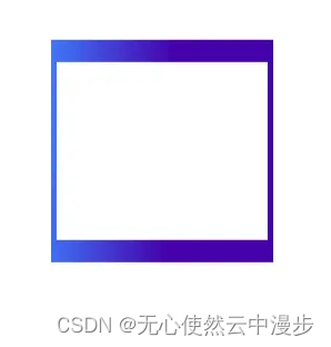
2.2 矩形边框
使用伪元素,自定义中间部分背景
<template><div class="box" :style="{ width: width + 'px', height: height + 'px' }"><slot></slot></div>
</template>
<script setup lang="ts">
const props = defineProps({width: {type: Number, //容器宽default: 100,},height: {type: Number, //容器高default: 100,},colors: {//颜色数组type: Array,default: () => [{color: "#64dcfd",width: 0,},{color: "#406cf1",width: 100,},{color: "#4501ac",width: 101,},],},angle: {//渐变角度type: Number,default: 120,},borderWidth: {//左右流光边框宽度type: [Array, Number],default: [20, 5],},gradient: {//是否渐变type: Boolean,default: true,},duration: {//动画时间type: String,default: "5s",},innerBackground: {//内部背景type: String,default: "#FFF",},
});const background = computed(() => {const positions = [];const colorsCopy = JSON.parse(JSON.stringify(props.colors));colorsCopy.forEach((s, index) => {const sum = colorsCopy.slice(0, index).reduce((a, b) => a + b.width, 0);if (!props.gradient) {positions.push(sum);}positions.push(sum + s.width);});return `linear-gradient(${props.angle}deg, ${colorsCopy.map((s, index) => {if (!props.gradient) {return `${s.color} ${positions[index]}px, ${s.color} ${positions[2 * index + 1]}px`;}return `${s.color} ${positions[index]}px`;}).join(",")})`;
});const innerWidth = computed(() => {let doubleBorderWidth = 0;if (Array.isArray(props.borderWidth)) {if (props.borderWidth.length === 2) {doubleBorderWidth = props.borderWidth[1] * 2;} else if (props.borderWidth.length === 1) {doubleBorderWidth = props.borderWidth[0] * 2;}} else {doubleBorderWidth = props.borderWidth * 2;}return props.width - doubleBorderWidth + "px";
});
const innerheight = computed(() => {let doubleBorderWidth = 0;if (Array.isArray(props.borderWidth)) {if (props.borderWidth.length === 2) {doubleBorderWidth = props.borderWidth[0] * 2;} else if (props.borderWidth.length === 1) {doubleBorderWidth = props.borderWidth[0] * 2;}} else {doubleBorderWidth = props.borderWidth * 2;}return props.height - doubleBorderWidth + "px";
});
const colorSize = computed(() => {return (Math.ceil(Math.sqrt(props.width * props.width + props.height * props.height)) + "px");
});
</script>
<style scoped lang="scss">
.box {display: flex;justify-content: center;align-items: center;position: relative;width: 100%;height: 100%;overflow: hidden;&:before {content: "";background-image: v-bind(background);position: absolute;width: v-bind(colorSize);height: v-bind(colorSize);animation: rotate v-bind(duration) linear infinite;}&:after {content: "";background: v-bind(innerBackground);position: absolute;z-index: 1;width: v-bind(innerWidth);height: v-bind(innerheight);}
}
@keyframes rotate {0% {transform: rotate(0deg);}100% {transform: rotate(360deg);}
}
</style>
这篇关于vue 流光边框矩形圆形容器的文章就介绍到这儿,希望我们推荐的文章对编程师们有所帮助!


