本文主要是介绍tsm2_2_Leverage_index_Sharpe Treynor Calmar semivariance_beta_Probability_Markov_Direct Linear_suppl,希望对大家解决编程问题提供一定的参考价值,需要的开发者们随着小编来一起学习吧!
Leveraged Long or Short Index Funds杠杆多头或空头指数基金
As index markets have become more popular, fi nancial engineering has created a wide range of innovative trading vehicles. Mutual funds, such as Rydex and ProFunds, cater/ˈkeɪtər/迎合 to market timers, a group of money managers that may trade in and out of the funds each day. These funds track the major index markets closely, but offer unique variations. There are both long and short funds, and each may be leveraged.
- When you buy a long fund that tracks the S&P 500 (called Nova by Rydex), you are simply long the equivalent of the S&P 500.
- However, when you buy a short S&P fund, called Ursa, you profit when the S&P index price drops.
In addition, both Rydex and ProFunds offer leverage of 1.5 or 2.0 on these funds, so that a gain of 1.0% in the S&P 500 translates into a gain of 2.0% in ProFunds’ UltraBull S&P fund; a drop of 1.0% in the S&P would generate a profit of 2.0% in ProFunds’ UltraBear fund. The motivation behind the short funds, or inverse funds, is to circumvent the U.S. government rule that does not permit short sales in retirement accounts.
In the following calculations, leverage is the leverage factor of the fund. Initial index values for both long and short funds are
- where XC, XH and XL = the leveraged index closing, high, and low prices
C, H, and L = the underlying close, high, and low prices or index values.
- where XC, XH and XL = the leveraged index closing, high, and low prices
- Each subsequent index value for long funds is
- For each subsequent value for the short funds invert the middle term:
If there is no leverage, then substitute the value 1 for leverage in the equations.
Cross-Market and Weighted Index跨市场和加权指数
It is very convenient to create an index for two markets that cannot normally be compared because they trade in different units. For example, if you wanted to show the spread between gold and IBM如果您想显示黄金和 IBM 之间的价差, you could index them both beginning at the same date. The new indexes would then be in the same units (percent) and would be easy to compare.
Most often, an index combines a number of related markets into a single number. A simple aggregate index is the ratio of unweighted sums of market prices in a specific year to the same markets in the base year. Most of the popular indexes, such as the New York Stock Exchange Composite Index, fall into this class. A weighted aggregate index biases certain markets by weighting them to increase or decrease their effect on the composite value. The index is then calculated as in the simple aggregate index. When combining markets into a single index value, the total of all the weights will equal 1 and all weights are expressed as a percentage.
U.S. Dollar Index
A practical example of a weighted index is the U.S. Dollar Index, traded as DX on the New York Board of Trade (NYBOT) and USDX on the Intercontinental Exchange (ICE). It is a trade-weighted geometric average of six currencies:
- the euro, 57.6%;
- the Japanese yen, 13.6%;
- the UK pound, 11.9%;
- the Canadian dollar, 9.1%;
- the Swedish krona/ ˈkroʊnə /瑞典克朗, 4.2%; and
- the Swiss franc瑞士法郎, 3.6%.
The Dollar Index serves as a valuable economic indicator, but shows only 13.6% representing Asia. It is not a good substitute for a diversified world market portfolio它并不能很好地替代多元化的世界市场投资组合(it only represents a limited set of currencies and regions).
The Dollar Index rises when the U.S. dollar increases in value relative to the other currencies. In the daily calculation of the Dollar Index, each price change is represented as a percent. If, for example, the euro rises 50 points from 1.2500 to 1.2550 , the change is 1.2550/1.2500 -1 = .004; this is multiplied by its weighting factor 0.576 and contributes -0.002304=-0.004*0.576 to the index (a rising euro is a falling dollar).
Standard Measurements of Performance
As important as standardizing risk and return is the need to compare the performance of two funds or two trading models in order to decide which is best. That decision is normally made based on a combination of return and risk. The simplest and most practical of these measurements is the information ratio (IR)
where both annualized returns
(
daily return==>
Annualized Daily Return = (1 + Daily Return) ^ 252 - 1 OR![]()
VS![]() ==>
==>
Annualized Daily Log Return Rate =![]() OR
OR![]()
)
and annualized risk (the same as annualized volatility
Annualized Volatility = Daily Standard Deviation of the return * sqrt(252) * 100%) have been given in the#1tsm2_mean_date xticklabel_histogram tick mark dist_Skewness Kurtosis_moment_P/E_t-Statist_returNAV_LIQING LIN的博客-CSDN博客
When you compare performance using any return/risk ratio, you are looking for the optimum point on the efficient frontier(Along the efficient frontier, there exists a tangent point that denotes the best optimal portfolio available and gives the highest rate of return in exchange for the lowest risk possible. This optimal portfolio at the tangent point is known as the market portfolio.). That is,
- any fund with a higher return but the same risk will be preferable, and
- any fund with the same return but a lower risk will be preferable.
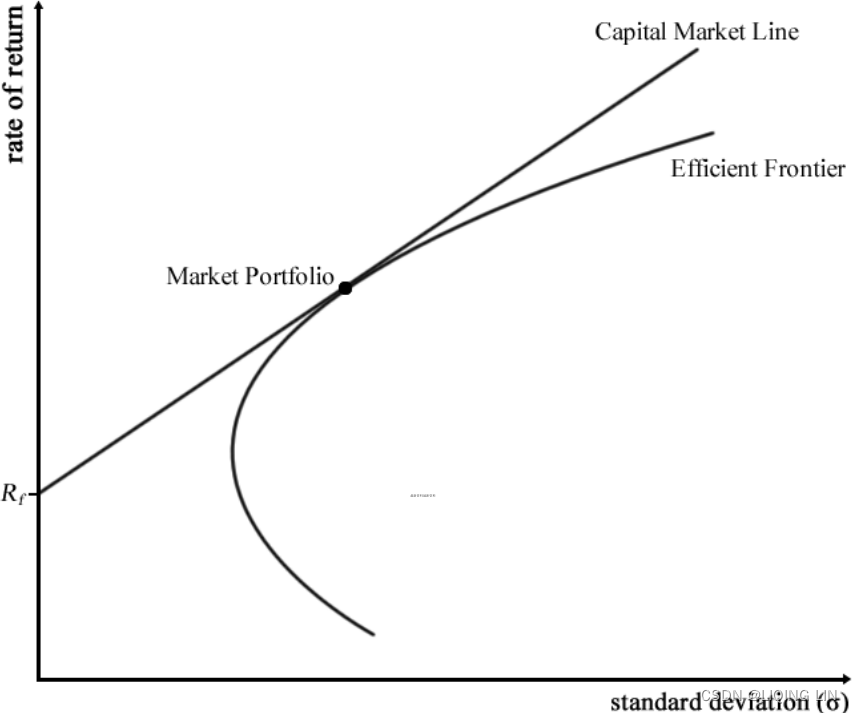 mpf2_线性规划_CAPM_sharpe_Arbitrage Pricin_Inversion Gauss Jordan_Statsmodel_Pulp_pLU_Cholesky_QR_Jacobi_LIQING LIN的博客-CSDN博客
Sharpe Ratio
The Sharpe ratio (is a risk-adjusted performance measure defined as the portfolio's excess returns over the risk-free rate per unit of its risk in standard deviations.mpf2_线性规划_CAPM_sharpe_Arbitrage Pricin_Inversion Gauss Jordan_Statsmodel_Pulp_pLU_Cholesky_QR_Jacobi_LIQING LIN的博客-CSDN博客), presented by William F. Sharpe, is the most popular of all performance measures. It differs from the more generic information ratio in that it isolates excess return by subtracting the risk-free rate of return from the fund performance
OR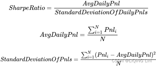
Here, we have the following:t6_Managing the Risk_limit_metrics of Algorithmic Strategies_Sharpe_adjust_trade side_position_share_LIQING LIN的博客-CSDN博客
 : PnL on the
  trading day.
- N : Number of trading days over which this Sharpe is being computed.
Treynor Ratio特雷诺比率
The Treynor ratio also isolates excess return; however, it replaces the annualized risk of the fund or trading program with the beta of the portfolio.它用投资组合的贝塔值取代了基金或交易程序的年化风险 Beta is the volatility (risk) of a stock relative a benchmark index, for example, the S&P. The portfolio beta is the sum of the weighted individual stock betas within the portfolio. If the fund has a beta of 1.2, then it has 20% more volatility than the overall market and moves generally in the same direction (see the previous section on beta).
- https://blog.csdn.net/Linli522362242/article/details/131147792
0 < β < 1, the volatility of the single market is less than the index - β = 1, the volatility of the single market is the same as the index
- β > 1, the volatility of the single market is greater than the index
- mpf2_线性规划_CAPM_sharpe_Arbitrage Pricin_Inversion Gauss Jordan_Statsmodel_Pulp_pLU_Cholesky_QR_Jacobi_LIQING LIN的博客-CSDN博客Another line of interest in CAPM(Capital Asset Pricing Model) studies is the Security Market Line (SML). The SML plots the asset's expected returns against its beta.{ Beta is a measure of the systematic risk of a stock. In essence, it describes the sensitivity of stock returns with respect to movements(sigma: volatility) in the market.}
- For a security with a beta value of 1, its returns perfectly match the market's returns.
- Any security priced被定价 above the SML is deemed to be undervalued since investors expect a higher return given the same amount of risk.
- Conversely, any security priced below the SML is deemed to be overvalued, as follows:
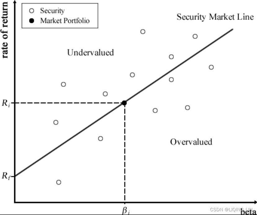
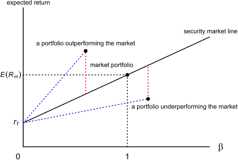 当一个单一资产落在证券市场线的上方,代表在同样风险下有比较高的回报,也就是资产被低估,应该买进;当落于证券市场线下方,代表资产被高估,应该卖出。
The equation that describes the SML(Security Market Line) can be written as follows:
 or
or
The term-
 is the market risk premium, and
 -
 is the expected return on the market portfolio.
 -
 is the return on the risk-free rate,
 -
 is the expected return on asset, i,
 -
and
 is the beta of the asset.
-
The Treynor ratio is ![]()
OR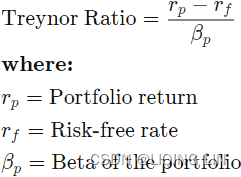
- The Treynor ratio is a risk/return measure that allows investors to adjust a portfolio's returns for systematic risk.
- A higher Treynor ratio result means a portfolio is a more suitable investment.
- The Treynor ratio(the Treynor ratio utilizes a portfolio beta, or systematic risk, to measure volatility) is similar to the Sharpe ratio, although the Sharpe ratio
 uses a portfolio's standard deviation to adjust the portfolio returns.
 -
最终,特雷诺比率试图衡量一项投资在为承担投资风险的投资者提供补偿方面的成功程度。 特雷诺比率依赖于投资组合的贝塔值(即投资组合回报对市场变动的敏感性)来判断风险。
该比率背后的前提是投资者必须对投资组合固有的风险进行补偿,因为多元化并不能消除风险。
-
特雷诺比率的一个主要弱点是其向后看的性质。 未来的投资表现和表现可能与过去不同。 特雷诺比率的准确性很大程度上取决于使用适当的基准来衡量贝塔值。
例如,如果用特雷诺比率来衡量国内大盘共同基金的风险调整回报,则衡量该基金相对于Russell 2000小型股票指数的贝塔值是不合适的。
相对于这一基准,该基金的贝塔值可能会被低估,因为大盘股的波动性通常低于小盘股。 相反,贝塔值应该根据更能代表大盘股的指数来衡量,例如罗素 1000 指数。
此外,没有可以对特雷诺比率进行排序的维度。 在比较类似的投资时,在其他条件相同的情况下,特雷诺比率越高越好,但没有定义它比其他投资好多少。
Calmar ratio & Sortino ratio-Other Performance Measurements
There are numerous variations on performance measures of varying degrees of usefulness. Most often the simplest ones are the best. The value of any measurement is to rank one trading system or fund above another in terms of risk and reward; that is, to help make the decision that one is better. 任何衡量的价值都是将一个交易系统或基金在风险和回报方面排名高于另一个; 也就是说,帮助做出更好的决定。The developers of each performance measure believe that each of others is flawed, yet the most popular ratios will usually rank the candidate programs in similar order.
The most common performance measure after the information ratio is simply the maximum drawdown relative the investment size. The maximum drawdown should always be measured as a percentage from a highest NAV to the lowest subsequent NAV. The maximum drawdown is important because, in a long performance record, a single, large drawdown can be lost in the standard deviation when there are an overwhelming/ˌoʊvərˈwelmɪŋ/令人不知所措的,巨大的 number of “normal” drawdowns. A statistician might be satisfied saying that there is a very, very small chance of that large drawdown occurring again, but an investor might want to know that it did happen and understand why it happened. One measure that accounts for this is the Calmar ratio![]()
- One strength of the Calmar ratio is its use of the maximum drawdown as a measure of risk. For one thing, it's more understandable than other, more abstract risk gauges风险指标, and this makes it preferable for some investors. In addition, even though it is updated monthly, the Calmar ratio's standard three-year time frame makes it more reliable than other gauges with shorter time frames that might be more affected by natural market volatility.
- On the flip side, the Calmar ratio's focus on drawdown means it's view of risk is rather limited compared to other gauges, and it ignores general volatility. This makes it less statistically significant and useful.
Another measure that tries to focus on the drawdowns is the Sortino ratio. It uses downside volatility as the risk, which is the lower partial moment of degree 2, but can also be substituted with the standard deviation of those days in which the NAV was lower than the previous high NAV (see the section on semivariance![]() #1tsm2_mean_date xticklabel_histogram tick mark dist_Skewness Kurtosis_moment_P/E_t-Statist_returNAV_LIQING LIN的博客-CSDN博客).
#1tsm2_mean_date xticklabel_histogram tick mark dist_Skewness Kurtosis_moment_P/E_t-Statist_returNAV_LIQING LIN的博客-CSDN博客).
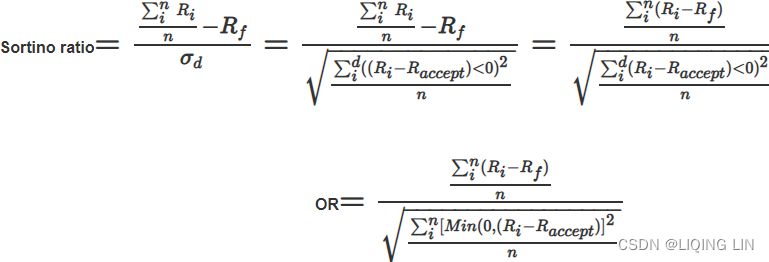
: Actual or expected portfolio return
: risk-free rate OR the target or required rate of return
: standard deviation of the dowside (stddev of losses)
Note, you can let OR
- only uses observations where the trading strategy loses money(here based on
) and
- ignores the ones where the trading strategy makes money(here
).
- pffs15_Shapiro_Anderson_normaltest_skewness_Sortino_Bartlett_homoskedasticity_heteroskedasticity_LIQING LIN的博客-CSDN博客
These performance measures will be used throughout the book when comparing different systems. They will be discussed further, along with other performance measures, in Chapter 21, System Testing.
Probability
Calculation must measure the incalculable计算必须衡量不可计算的 —Dixon G. Watts
Change is a term that causes great anxiety. However, the effects and likelihood of a chance occurrence can only be measured—not predicted. The area of study that deals with uncertainty is probability. Everyone uses probability in daily thinking and actions. When you tell someone that you will “be there in 30 minutes,” you are assuming:
- • Your car will start.
- • You will not have a breakdown.
- • You will have no unnecessary delays.
- • You will drive at a predictable speed.
- • You will have the normal number of green lights.
All these circumstances are extremely probabilistic, and yet everyone makes the same assumptions. Actually, the 30-minute arrival is intended only as an estimate of the average time it should take for the trip. If the arrival time were critical, you would extend your estimate to 40 or 45 minutes to account for unexpected events. In statistics, this is called increasing the confidence interval. You would not raise the time to two hours because the likelihood of such a delay would be too remote. Estimates imply an allowable variation, all of which is considered normal.
Probability is the measuring of the uncertainty surrounding an average value. Probabilities are measured in percent of likelihood. For example, if numbers from a total M of N are expected to fall within a specific range, the probability N of any one number P satisfying the criteria is
When making a trade, or forecasting prices, we can only talk in terms of probabilities or ranges. We expect prices to rise 30 to 40 points, or we have a 65% chance of a $400 profit from a trade. Nothing is certain, but a high probability of success is very attractive.
Laws of Probability
Two basic principles of probability are easily explained by using examples with playing cards. In a deck of 52 cards, there are 4 suits of 13 cards each.
- The probability of drawing a specific card on any one turn is
.
- Similarly, the chances of drawing a particular suit or card number are ¼ and
, respectively.
The probability of any one of these three possibilities occurring is the sum of their individual probabilities. This is known as the law of addition.
- The probability of success in choosing a numbered card, suit, or specific card (that is, either a 10, or a spade, or the queen of hearts) is

The other basic principle, the law of multiplication, states that the probability of two occurrences happening simultaneously or in succession is equal to the product of their separate probabilities.
- The likelihood of drawing a 3 and a club from the same deck in two consecutive turns (replacing the card after each draw) or of drawing the same cards from two decks simultaneously is

Joint and Marginal Probability联合概率和边际概率
Price movement is not as clearly defined as a deck of cards. There is often a relationship between successive events. For example, over two consecutive days, prices must have one of the following sequences or joint events: (up, up), (down, down), (up, down), (down, up), with the joint probabilities of 0.40, 0.10, 0.35, and 0.15, respectively. In this example, there is the greatest expectation that prices will rise. The marginal probability of a price rise on the first day is shown in Table 2.4, which concludes that there is a 75%=0.40+0.35=0.75 chance of higher prices on the first day and a 55%=0.40+0.15=0.55 chance of higher prices on the second day.
(known) Table 2.4 Marginal Probability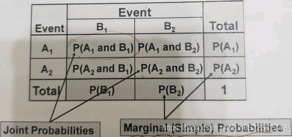
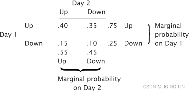
Contingent Probability或然概率
What is the probability of an outcome “conditioned” on the result of a prior event? In the example of joint probability, this might be the chance of a price increase on the second day when prices declined on the first day. The notation for this situation (the probability of A conditioned on B) is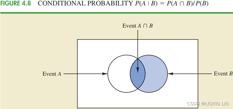
n3_knn breastCancer NaiveBayesLikelihood_voter_manhat_Euclid_Minkow_空值?_SBS特征选取_Laplace_zip_NLP_spam_LIQING LIN的博客-CSDN博客![]()

![]()
then 
NOTE 
AND

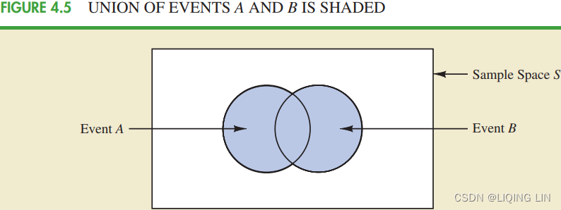
The probability of either a price increase on Day 1 or a price increase on Day 2 is 

Markov Chains
If we believe that today’s price movement is based in some part on what happened yesterday, we have a situation called conditional probability. This can be expressed as a Markov process, or Markov chain. The results, or outcomes, of a Markov chain express the probability of a state or condition occurring. For example, the possibility of a clear, cloudy, or rainy day tomorrow can be related to today’s weather.
TABLE 2.5 Transition Matrix
FIGURE 2.11 Probability network.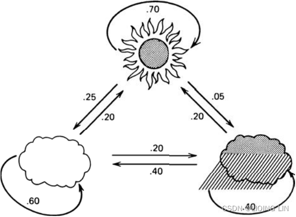
The different combinations of dependent possibilities are given by a transition matrix. In our weather prediction example, a clear day has
- a 70% chance of being followed by another clear day,
- a 25% chance of a cloudy day, and
- only a 5% chance of rain.
- In Table 2.5, each possibility today is shown on the left, and its probability of changing tomorrow is indicated across the top. Each row totals 100% and accounts for all weather combinations. The relationship between these events can be shown as a continuous network (see Figure 2.11).
Start with either an up or down day, and then calculate the probability of the next day being up or down. This is done easily by simply counting the number of cases, given in Table 2.6a, then dividing to get the percentages, as shown in Table 2.6b. 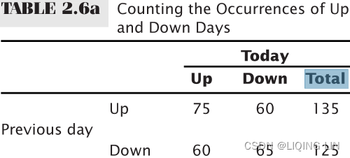 vs
vs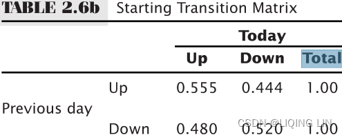
The Markov process can reduce intricate/ˈɪntrɪkət/错综复杂的,难理解的 relationships to a simpler form. First, consider a two-state process. Using the markets as an example, what is the probability of an up or down day following an up day, or following a down day? If there is a 70% chance of a higher day following a higher day (which we can say is an uptrend) and a 55% chance of a higher day following a lower day, what is the probability of any day within an uptrend being up?
Because the first day may be designated as up or down, it is an exception to the general rule and therefore is given the weight of 50%. The probability of the second day being up or down is the sum of the joint probabilities.

![]()
The probability of the second day being up is 62.5%. Continuing in the same manner, use the probability of an up day as 0.625, the down as 0.375=1-0.625, and calculate the third day, 
and the fourth day, 
which can now be seen to be converging. To generalize the probability of an up day, look at what happens on the ith day: ![]()
Because the probability is converging, the relationship ![]()
- can be substituted and used to solve the equation

- giving the probability of any day being up within an uptrend as


We can find the chance of an up or down day if the 5-day trend is up simply by substituting the direction of the 5-day trend (or n-day trend) for the previous day’s direction in the example just given.
FIGURE 2.11 Probability network.
Predicting the weather is a more involved case of multiple situations converging and may be very representative of the way prices react to past prices. By approaching the problem in the same manner as the two-state process, a probability is assigned to each situation for the first day; the second day’s probability is
first day : Clear Cloudy Rainy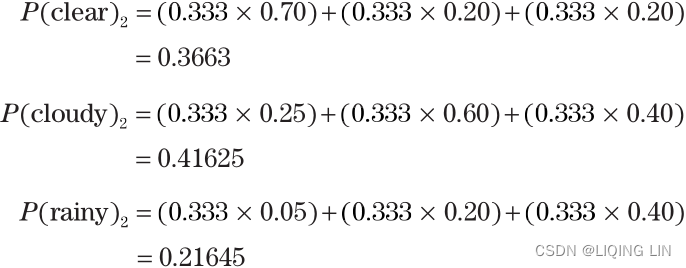
Then, using the second day results, the third day is
The general form for solving these three equations is
where each i+1 element can be set equal to the corresponding ith value. There are then three equations in three unknowns, which can be solved directly or by matrix multiplication, as shown in Appendix 2, “Solution to Weather Probabilities Expressed as a Markov Chain.” (Solving systems of linear equationsmpf2_线性规划_CAPM_sharpe_Arbitrage Pricin_Inversion Gauss Jordan_Statsmodel_Pulp_pLU_Cholesky_QR_Jacobi_LIQING LIN的博客-CSDN博客) Otherwise, it will be necessary to use the additional relationship![]()
The results are 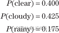
- Let
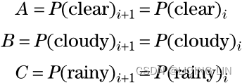 because when they converge all ith elements will equal (i + 1)th elements. The equations are
In addition, ==> C= 1-A-B
 - To solve this system of equations using matrices, convert and add equation (3) to (4),

which becomes the matrix
- 1. Reduce the first row,
==>,
 and make the leading entries of rows 2 and 3 zero:
and

- 2. Reduce the second row,
==>,
 and make the second entries of rows 1 and 3 zero:
and
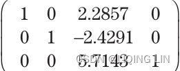
- 3. Reduce the third row,
==>,
 and make the third entry of rows 1 and 2 zero:
and
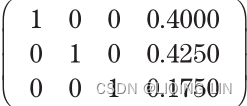
- Then A = 0.4000, B = 0.4250, and C = 0.1750.
- python code: mpf2_线性规划_CAPM_sharpe_Arbitrage Pricin_Inversion Gauss Jordan_Statsmodel_Pulp_pLU_Cholesky_QR_Jacobi_LIQING LIN的博客-CSDN博客
- 1. Reduce the first row,
Bayes’ Theorem
Equation 9-2. Bayes’ theorem https://blog.csdn.net/Linli522362242/article/details/105973507 Bayes’ theorem (Equation 9-2) tells us how to update the probability distribution over the latent variables after we observe some data X. It computes the posterior distribution p(z|X), which is the conditional probability of z given X.
Although historic generalization exists concerning the outcome of an event, a specific current market situation may alter the probabilities. Bayes’ theorem combines the original probability estimates with the added-event probability (the reliability of the new information) to get a posterior or revised probability得到后验概率或 修正概率:
Assume that the price changes P(up) and P(down) are both original probabilities, and an added-event probability, such as an unemployment report, trade balance, crop report, inventory stocks, or Federal Reserve interest rate announcement is expected to have an overriding effect on tomorrow’s movement. Then the new probability P(Up | added-event) is: 
where up and down refer to the original historic probabilities, and P(A and B) is a joint probability.
 m06_twitter U Naive Bayes_PermissionError [Errno 13]_NLP_bag词袋_Ngram_spaCy_pipeline_joblib_os创建进入子目录_LIQING LIN的博客-CSDN博客
![]()
where
- P(Added-event | up) = the probability of the new event being a correct predictor of an upwards move
- P(Added-event | down) = the probability of prices going down when the added news indicates up
For example, if a quarter percent decline in interest rates has a 90% chance of causing stock prices to move higher, then
P(Added-event | up) = 0.90 and P(Added-event | down) = 0.10
Supply and Demand
Price is the balancing point of supply and demand. In order to estimate the future price of any product or explain its historic patterns, it will be necessary to relate the factors of supply and demand and then adjust for inflation, technological improvement, and other indicators common to econometric analysis. The following sections briefly describe these factors.
Demand
The demand![]() for a product declines as price increases
for a product declines as price increases![]() . The rate of decline is always dependent on the need for the product and its available substitutes at different price levels. In Figure 2.12a,
. The rate of decline is always dependent on the need for the product and its available substitutes at different price levels. In Figure 2.12a,
- D represents normal demand for a product over some fixed period. As prices rise
 , demand declines
 fairly rapidly.
 - D′ represents increased demand, resulting in higher prices at all levels.
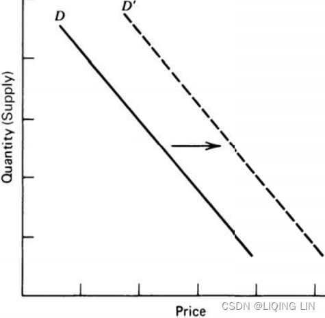 FIGURE 2.12a Shift in demand.
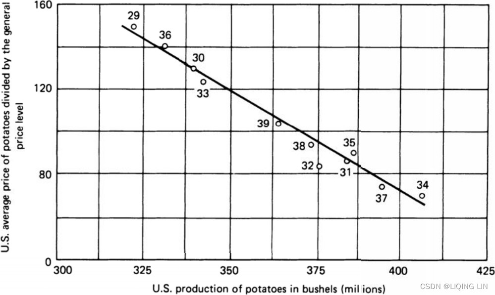
FIGURE 2.12b Potatoes: U.S. average farm price on December 15th versus total production: 1929–1939.
Figure 2.12b represents the actual demand relationship for potatoes from 1929 to 1939. Although this example is the same as the theoretical relationship in Figure 2.12a, in most cases the demand relationship is not a straight line. Production costs and minimum demand prevent the curve from going to zero; instead, it approaches a minimum price level. This can be seen previously in the frequency distribution for wheat, Figure 2.3#1tsm2_mean_date xticklabel_histogram tick mark dist_Skewness Kurtosis_moment_P/E_t-Statist_returNAV_LIQING LIN的博客-CSDN博客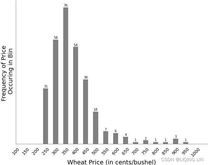 , where the left side of the distribution falls (lower price) off sharply. On the higher end of the scale, there is a lag in the response to increased prices and a consumer reluctance/rɪˈlʌktəns/不情愿 to reduce purchasing even at higher prices (called “inelastic demand”).
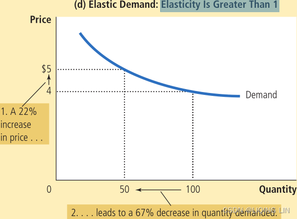
- The price elasticity of demand determines whether the demand curve is steep or flat陡峭还是平坦. Note that all percentage changes are calculated using the midpoint method.

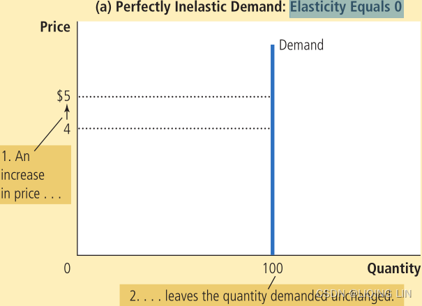
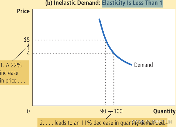
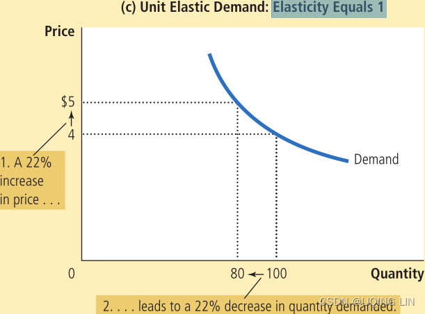
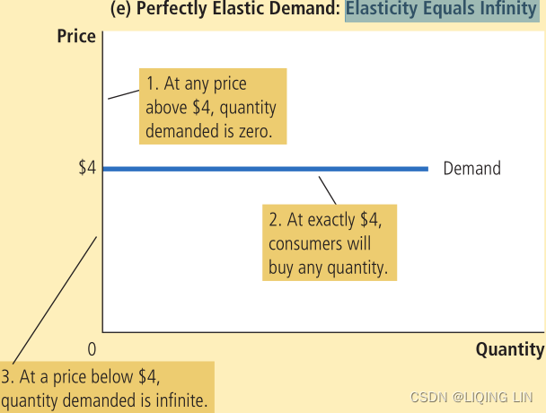
1. At any price above $4, quantity demanded is zero.
2. At exactly $4, consumers will buy any quantity.
3. At a price below $4, quantity demanded is infinite.
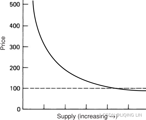 FIGURE 2.12c Demand curve, including extremes.
Coffee is well-known for having inelastic demand—most coffee drinkers will pay the market price rather than consume less. Figure 2.12c shows a more representative demand curve, including extremes, where 100 represents the cost of production for a producer. The demand curve, therefore, shows the rate at which a change in quantity demanded brings about a change in price. Note that, although a producer may lose money below 100, lack of demand and the need for income can force sales at a loss.
Elasticity of Demand
Elasticity is the key factor in expressing the relationship between price and demand and defines the shape of the curve. It is the relative change in demand as price increases: 

A market that always consumes the same amount of a product, regardless of price, is called inelastic;
- as price rises, the demand remains the same, and
is negatively very small. An elastic market is just the opposite.
- As demand increases, price remains the same and
is negatively very large. Figure 2.13 shows the demand curve for various levels of demand elasticity.
If supply increases for a product that has existed in short supply供不应求 for many years, consumer purchasing habits will require time to adjust. The demand elasticity will gradually shift from relatively inelastic (Figure 2.13b) to relatively elastic (Figure 2.13a).
 FIGURE 2.13 Demand elasticity: (a) Relatively elastic; (b) Relatively inelastic; (c) Normal market.
Supply

The price elasticity of supply determines whether the supply curve is steep or flat. Note that all percentage changes are calculated using the midpoint method.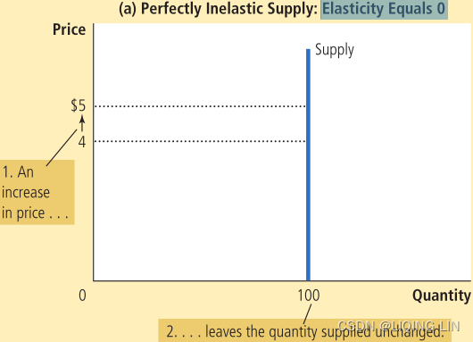
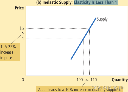
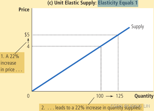
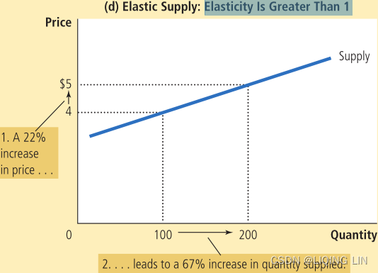
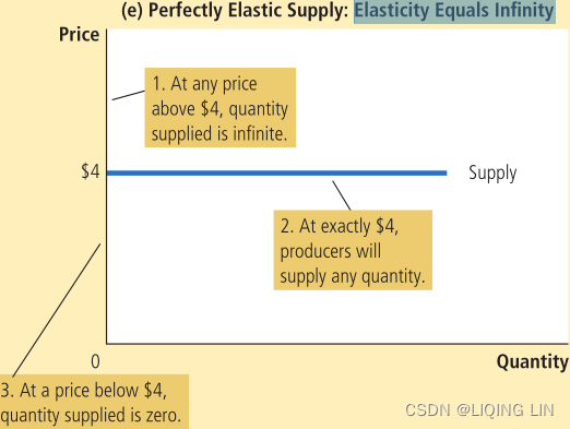
1. At any price above $4, quantity supplied is infinite.
2. At exactly $4, producers will supply any quantity.
3. At a price below $4, quantity supplied is zero.
How the Price Elasticity of Supply Can Vary Because firms often have a maximum capacity for production, the elasticity of supply may be very high at low levels of quantity supplied and very low at high levels of quantity supplied.
- Here an increase in price from $3 to $4 increases the quantity supplied from 100 to 200. Because the 67% increase in quantity supplied (computed using the midpoint method) is larger than
 the 29% increase in price, the supply curve is elastic in this range.
 - By contrast, when the price rises from $12 to $15, the quantity supplied rises only from 500 to 525. Because the 5% increase in quantity supplied is smaller than the 22% increase in price, the supply curve is inelastic in this range.
The supply side of the economic equation is the normal counterpart of demand. Figure 2.14a shows that, as price increases, the supplier will respond by offering greater amounts of the product. Figure 2.14b demonstrates the supply at price extremes. At low levels, below production costs, there is a nominal supply by those producers who must maintain operations due to high fixed costs and difficulty restarting after a shutdown (as in mining). At high price levels, supply is erratic. There may be insufficient supply in the short term, followed by the appearance of new supplies or substitutes, as in the case of a location shortage. When there is a shortage of orange juice, South American countries are willing to fill the demand; when there is an oil disruption, other OPEC nations will increase production. In most cases, however, it is reduced demand that brings price down. FIGURE 2.14 Supply-price relationship: (a) Shift in supply; (b) Supply curve, including extremes.
Elasticity of Supply
The elasticity of supply is the relationship between the change in supply and the change in price:


 The elasticity of supply, the counterpart of demand elasticity, is a positive number because price and quantity move in the same direction at the same time.
Equilibrium
The demand for a product and the supply of that product cross at a point of equilibrium. The current price of any product, or any security, represents the point of equilibrium for that product at that moment in time. This is the basis for the technical assessment that the price, at any moment in time, represents the netting of all fundamental information 即价格在任何时刻都代表所有基本信息的净额结算. Figure 2.15 shows a constant demand line D and a shifting supply, increasing to the right from S to S′.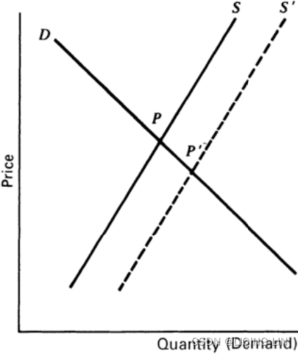
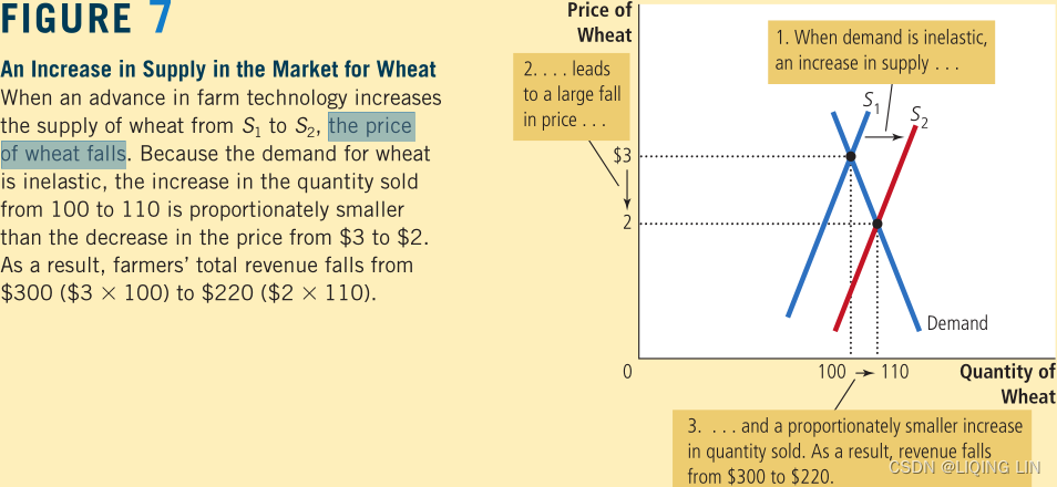
FIGURE 2.15 Equilibrium with shifting supply.
The demand line D and the original supply line S meet at the equilibrium price P; after the increase in supply, the supply line shifts to S' . The point of equilibrium P′ represents a lower price, the consequence of larger supply with unchanged demand. Because supply and demand each have varying elasticities and are best represented by curves, the point of equilibrium can shift in any direction in a market with changing factors.
Equilibrium will be an important concept in developing trading strategies. Although the supply and demand balance may not be calculated, in practical terms equilibrium is a balance between buyers and sellers, a price level at which everyone is willing to trade, although not always happy to do so at that price. Equilibrium is associated with lower volatility and often lower volume because the urgency to buy or sell has been removed. Imbalance in the supply-demand-price relationship causes volatility. Readers interested in a practical representation of equilibrium, or price-value relationships, should study “Price Distribution Systems” in Steidlmayer’s Market Profile, Chapter 18.
Cobweb Charts蜘蛛网图表
The point at which the supply and demand lines cross is easily translated into a place on a price chart where the direction is sideways 供给线和需求线交叉的点很容易转化为价格图表上方向横向的位置. The amount of price volatility during this sideways period (called noise) depends upon the price level, market participation, and various undertones/ˈʌndərtoʊn/ of instability各种不稳定因素 caused by other factors. Very little is discussed about how price patterns reflect the shift in sentiment between the supply and demand lines, yet there is a clear representation of this action using cobweb charts.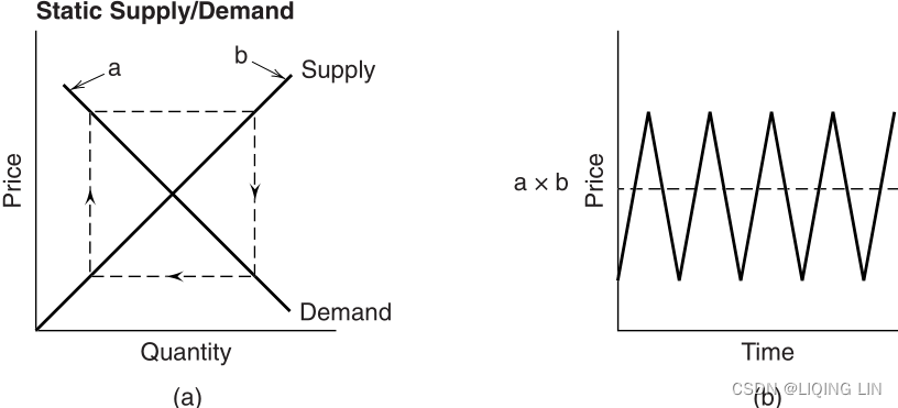
FIGURE 2.16 Static supply/demand cobweb: (a) Dotted lines represent a shift of sentiment from supply to demand to supply, and so forth; (b) the price pattern likely to result from the cobweb in (a).
Figure 2.16a shows a static (symmetric) supply-demand chart with dotted lines representing the “cobweb.” A shift in the perceived importance of supply and demand factors can cause prices to reflect the pattern shown by the direction of the arrows on the cobweb供求因素重要性的转变可能导致价格反映蜘蛛网上箭头方向所示的模式,从而产生如图 2.16b 所示的横盘市场, producing the sideways market represented by Figure 2.16b.
- If the cobweb were closer to the intersection of the supply and demand lines, the volatility of the sideways price pattern would be lower;
- if the cobweb were further away from the intersection, the pattern would be more volatile.
Most supply/demand relationships are not static and can be represented by lines that cross at oblique/əˈbliːk/斜的 angles. In Figure 2.17a, the cobweb is shown to begin near the intersection and move outwards, each shift forming a different length strand/ strænd /(绳、线、毛发等的)股,缕 of the web, moving away from equilibrium. Figure 2.17b shows that the corresponding price pattern is one that shifts from equilibrium to increasing volatility. A reversal in the arrows on the cobweb would show decreasing volatility moving toward equilibrium.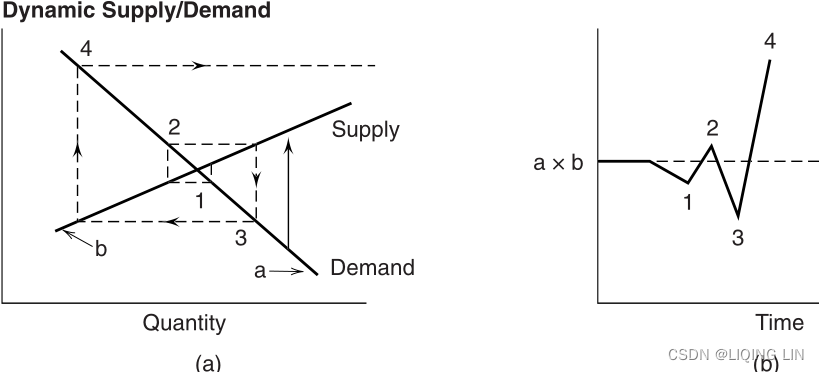
FIGURE 2.17 Dynamic supply/demand cobweb: (a) Dotted lines represent a cobweb moving away from equilibrium: (b) the price pattern shows increasing volatility.
Building a Model
A model can be created to explain or forecast price changes. Most models explain rather than forecast. Explanatory models analyze sets of data at concurrent times: that is, they look for relationships between multiple factors and their effect on price at the same moment in time. They can also look for causal, or lagged relationships, where prices respond to other factors after one or more days. It is possible to use the explanatory model to determine the normal price at a particular moment. Although not considered forecasting, any variation in the actual market price from the normal or expected price could present a trading opportunity.
Methods of selecting the best forecasting model can affect its credibility. An analytic approach selects the factors and specifies the relationships in advance. Tests are then performed on the data to verify the premise/ˈpremɪs/前提. Many models, though, are refined by fitting the data, using regression analysis or some mass testing process, which applies a broad selection of variables and weighting factors to find the best fit. These models, created with perfect hindsight事后诸葛亮, are far less likely to be successful at forecasting future price levels. Even an analytic approach that is subsequently fine-tuned could be in danger of losing its forecasting ability.


FIGURE 2.18 Cocoa factors.
The factors that comprise a model can be both numerous and difficult to obtain. Figure 2.18 shows the interrelationship between factors in the cocoa industry. Although this chart is comprehensive/ ˌkɑːmprɪˈhensɪv /综合性的,全面的 in its intramarket relationships, it does not emphasize the global influences that have become a major part of price movement since the mid-1970s. The change in value of the U.S. dollar and the volatility of interest rates have had far greater influence on price than some of the “normal” fundamental factors for many commodities. Companies with high debt may find the price fluctuations in their stock are larger due to interest rate changes than increases or decreases in revenues.
Models that explain price movements must be constructed from the primary factors of supply and demand. A simple example for estimating the price of fall potatoes is
P/PPI = a + bS + cD
where
- P = the average price of fall potatoes received by farmers
- PPI = the Producer Price Index(which measures the cost of a basket of goods and services bought by firms rather than consumers.)
- S = the apparent domestic free supply (production less exports and diversions)
表观国内自由供给(产量减去出口和转移) - D = the estimated deliverable supply
- a, b, and c = constants determined by regression analysis
This model implies that consumption must be constant (i.e., inelastic demand ); demand factors are only implicitly included in the estimated deliverable supply. Exports and diversion represent a small part of the total production. The use of the PPI gives the results in relative terms based on whether the index was used as an inflator通货膨胀价格指数 or deflator扣除通货膨胀因素的价格指数 of price.
A general model, presented by Weymar, may be written as three behavior-based equations and one identity:
- Consumption

- Production

The first two equations show that both demand and supply depend on current and/ or lagged prices, the traditional macroeconomic theory; production and consumption are therefore dependent on past prices. - Inventory

The third equation, inventory level, is simply the total of previous inventories, plus new production, less current consumption.
The inventory function itself, the third equation, is composed of two separate relationships: manufacturers’ inventories and speculators’投机者 inventories. Each reacts differently to expected price change. - Supply of storage

The last equation, supply of storage, demonstrates that people are willing to carry larger inventories if they expect prices to increase substantially/ səbˈstænʃəli / 大幅度,大量地 . - where
- C = the consumption
- P = the price
 = the lagged price
- H = the production (harvest)
- I = the inventory
- P′ = the expected price at some point in the future
- e = the corresponding error factor
Changing Factors
Although the PPI(Producer Price Index) was always considered the component of inflation and used in forecasting prices, the value of the U.S. dollar has not been an input. Currency values have always fluctuated but have taken on more significance following the dropping of the gold standard by most countries. The value of a currency is based on the health of the economy as measured by production output and inflation, among other factors.
Wheat is a good example to show the impact of these changes. As an export market for the United States, the price of wheat reflects the world value, that is, what other countries are willing to pay. Wheat is fungible/ˈfʌndʒəb(ə)l/代替的;可取代的, in other words, a country in need will buy from any source with the lowest price, and that keeps all prices competitive.
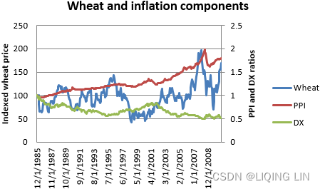 FIGURE 2.19 Cash wheat with the PPI and dollar index (DX), from 1985 through October 2010.
Rather than the complex analysis of factors shown in the previous section on cocoa, we will only look at the impact of inflation and currency changes on the price of wheat. Figure 2.19 shows the monthly price of cash wheat现货小麦的月度价格, along with the PPI and the U.S. dollar index (DX). The dollar index shows the relative value of the U.S. dollar; therefore, a decline in DX indicates a weaker U.S. dollar. Both the PPI and DX have been indexed to begin 1985 with the value of 100.
In Figure 2.19 the PPI nearly doubles from 1.0 to 1.8 while the U.S. dollar halves to 0.51. At the same time wheat prices rise 69% from 100 to 169 (the cash price from $3.56 to $7.13). If we are only concerned with the big picture, the macro factors rather than the seaonality of price, then the rise in wheat prices over this 25-year interval can be completely explained by either the PPI or the DX. In fact, they are clearly related because inflation (PPI) has a negative effect on the currency value.如果我们只关注大局、宏观因素而不是价格的季节性,那么这25年期间小麦价格的上涨完全可以用PPI或DX来解释。 事实上,它们显然是相关的,因为通货膨胀(PPI)对货币价值有负面影响。
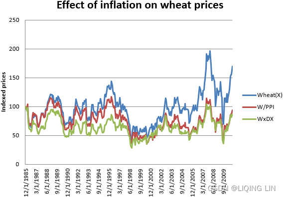 FIGURE 2.20 Wheat prices adjusted for PPI and Dollar Index根据 PPI 和美元指数调整后的小麦价格
By dividing the indexed price of wheat by the PPI or multiplying wheat by the DX value, Figure 2.20 shows that the long-term price of wheat is unchanged. By observation, we can conclude that the rise in wheat prices is attributed to inflation(PPI), the decline in the value of the U.S. dollar, or both.
If we then want to look at the effect of seasonality, or supply and demand, factors that cause wheat prices to lose 75% of its value or gain 100%, we need to remove the effects of inflation first. For trading, this means selling DX in the same dollar value as buying wheat so that, if the price of wheat rises due to the U.S. dollar falling, the change in value of the hedge position is close to zero. 对于交易而言,这意味着以与购买小麦相同的美元价值出售 DX,这样,如果小麦价格因美元贬值而上涨,对冲头寸的价值变化接近于零。
-
您提供的声明讨论了在分析季节性或供需因素对小麦价格的影响时调整通货膨胀的重要性。 通货膨胀是商品和服务价格随着时间的推移而普遍上涨,从而降低了货币的购买力。 在分析小麦价格变化时,重要的是要根据通货膨胀的影响进行调整,以便这些变化准确反映潜在的供需因素。
调整通货膨胀的一种方法是在小麦交易时使用货币对冲。 货币对冲是一种在投资外国资产时用来抵消或降低货币波动风险的金融工具。 就小麦交易而言,这意味着卖出与买入小麦数量相当的美元指数(DX),以抵消货币波动对投资的影响。
例如,如果投资者想要购买价值 10,000 美元的小麦,他们可以出售价值 10,000 美元的 DX 以创建货币对冲。 如果小麦价格 因供需因素 而上涨,但美元 因通胀而 贬值,则小麦投资价值的变化 将被 货币对冲价值的变化所抵消。 这使得投资者能够隔离供需因素对小麦价格的影响,而不会受到通货膨胀对美元的影响。
通过消除通货膨胀的影响,投资者可以更准确地评估季节性、供需等因素对小麦价格的影响,并做出更明智的交易决策。
In the case of wheat, it is clear that the price is affected by inflation. It may be that the success of most wheat trading strategies depends on the trend of inflation, rather than the underlying wheat factors. However, if the intent is to profit from seasonal moves, then a rally in May when a good crop is being harvested may be obscured by a rise in the U.S. dollar.那么 5 月份丰收时的反弹可能会被美元升值所掩盖。 Without hedging the potential effects of the dollar you leave the results of the strategy to chance如果不对冲美元的潜在影响,你就会让策略的结果听天由命。. This will be discussed with examples in Chapter 10, Seasonality and Calendar Patterns.
Economic Reports
Economic reports are released nearly every day. Based on the economic condition of the nation, investor focus shifts from one report to another. Since 2008 the focus has been on the employment reports, the ultimate solution to recovery这是经济复苏的最终解决方案; GDP, a measure of that recovery; and of less importance housing, consumer confidence, and various manufacturing data. The Leading Economic Index (LEI), released by the Conference Board each month, tries to anticipate the direction of the economy about six months ahead based on
- • Average weekly hours, manufacturing
平均每周工时,制造 - • Average weekly initial claims for unemployment insurance
平均每周首次申请失业保险 - • Manufacturers’ new orders, consumer goods and materials
制造商的新订单、消费品和材料 - • Index of supplier deliveries—vendor performance
供应商交货指数——供应商绩效 - • Manufacturers’ new orders, nondefense capital goods
制造商的新订单、非国防资本货物 - • Building permits, new private housing units
建筑许可证、新私人住房单元 - • Stock prices, 500 common stocks
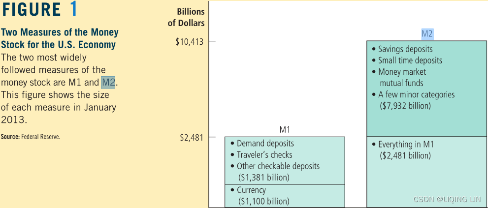
股票价格,500 股普通股 - • Money supply, M2
货币供应量,M2 - • Interest rate spread, 10-year Treasury bonds less federal funds
利差,10 年期国债减去联邦基金 - • Index of consumer expectations
消费者期望指数
Most of these seem reasonable, but the weighting of them is not clear. It has been said that the direction of the stock market plays a relatively large part in the index.
Can these and other indicators be used for trading? Are they timely, or are the expectations of their impact in the market even before the reports are released? With many reports, the market anticipates the numbers. If unemployment was expected to increase, then the stock market tends to sell off ahead of the report, or if economists anticipate the Fed lowering rates, then the yield curve will adjust to that expectation ahead of the announcement. 如果失业率预计会增加,那么股市往往会在报告发布前遭到抛售,或者如果经济学家预计美联储会降息,那么收益率曲线将在报告发布前根据这一预期进行调整。Therefore, it is the difference between the expectation and the actual report that moves the market, and only secondarily is it the actual numbers released. For example, if the GDP was expected to rise from 3.5% to 4.0% and the actual number came in at 3.6% the market would sell off. But then it would rally again because 3.6% is still a good number indicating growth因此,影响市场的是预期与实际报告之间的差异,其次才是实际发布的数据。 例如,如果 GDP 预计从 3.5% 升至 4.0%,而实际数字为 3.6%,市场就会出现抛售。 但随后它会再次反弹,因为 3.6% 仍然是一个表明增长的好数字. While large, unexpected changes move the market, the cumulative effect of small changes could also be signifi cant.
Ruggiero has quantified the significance of some of these indicators, concentrating on predicting the direction of yields, which is key to much of the financial market price moves. 鲁杰罗量化了其中一些指标的重要性,专注于预测收益率的方向,这是金融市场价格走势的关键。
Interest rates
通胀收益率震荡指标
where Yield is the 3-month Treasury bill and is the 20-day average of the ratio, R.
- • If ( R < 0.2 or IYO < 0) and
>
 then rates will rise
 - • If ( R > 0.3 or IYO > 0.5) and
< Yield t−3mo then rates will fall
Money Supply
Using monthly data for M2 and the 3-month Treasury bill yields, where m is the current month 
Consumer Sentiment消费者信心
Using the University of Michigan’s Consumer Sentiment Survey (CS), and where m is the month it is released, 
Unemployment Claims 失业救济申请
Using monthly unemployment claims (UC) released on the first Friday of each month, 
The big picture of price direction is very important, and an accurate forecast can greatly improve results. Using fundamental data in a systematic way is perfectly consistent with other algorithmic approaches.
历次美联储加息周期中美股与 A 股表现分析https://pdf.dfcfw.com/pdf/H3_AP202205171566100730_1.pdf?1652790214000.pdf
核心结论:
- 截至今年 5 月,美联储已累计加息 75bp,缩表也将于 6 月份开启,市场 预计美联储在年内至少加息 200bp 的概率高达 89%。往前看,支撑 A 股实 现 V 形反转的力量正不断积蓄,如股权风险溢价已处于历史极高值、稳 增长政策不断发力等,那么美联储加息会否对 A 股的反转行情构成压制?
➢ 加息周期中,美股的表现可以分为两种情况。
- ➢ 第一,美股面临盈利上行+货币紧缩的组合。此时美股通常会在加息初期 出现 5%-10%幅度的调整,持续时长也通常在 2 个月以内。随后盈利上行 仍将支撑美股继续走高。直到盈利增速出现下行,或投资者对盈利的预期 转弱,美股才会真正开启大级别的下跌行情,而这通常发生在加息周期结 束之后。
- ➢ 第二,美股面临盈利下行+货币紧缩的组合。换言之美国经济处于滞胀状 态,典型如 20 世纪 70 年代。这段时期,美股通常在货币政策收紧之前 就出现调整,因为经济下行压力已经开始显现。而滞胀期美股能够企稳的 最关键原因是估值能达到历史低位,或滞胀结束。
➢ 加息周期中,A 股的大级别涨跌并无显著规律。
- 1)2007 年之前的两次加 息周期中,A 股的大级别行情主要受股权分置改革等制度的影响。
- 2)2015 年至 2018 年,A 股成熟度提升,中美股市联动性相较之前有所增强。但 中美经济周期错位、两国货币政策的差异(2016 年、2018 年)、以及 2016 年熔断事件均导致两国股市的表现存在差异。
- 3)总结来说,我们认为不 宜将美联储加息纳入判断 A 股大级别行情的框架中。美联储加息对 A 股 的影响至多是月度级别或周度级别的。
➢ 美联储加息对 A 股的影响机制有二。
- ➢ 第一,全球流动性收紧,叠加美元指数走高,全球资金在加息预期发酵、 加息刚刚落地时持续流出新兴市场股市。但这一规律在 A 股市场上不够 显著,原因在于上一轮加息周期恰逢 A 股国际化程度快速提升。互联互 通机制的落地、A 股积极寻求纳入 MSCI、富士罗素指数,这些因素导致外 资在加息期间依然对 A 股保持了净流入。
- ➢ 第二,相较于加息,海外经济下行、美股剧烈波动的风险更值得关注。这 源于每轮加息周期结束后,美国均会出现经济下行,并出现 15%-50%不等 的大级别下跌,1970 年以来未有例外。从历史经验来看,美股剧烈波动 曾导致 A 股熊转牛的拐点滞后 1-3 个月。
- ➢ 风险提示:报告基于对历史规律的总结,历史规律在未来可能失效。
这篇关于tsm2_2_Leverage_index_Sharpe Treynor Calmar semivariance_beta_Probability_Markov_Direct Linear_suppl的文章就介绍到这儿,希望我们推荐的文章对编程师们有所帮助!


