本文主要是介绍前端学习笔记vue-01(仿照网易严选),希望对大家解决编程问题提供一定的参考价值,需要的开发者们随着小编来一起学习吧!
仿照网易严选
安装vue-cli
cnpm intall vue-cli -g
项目初始化
vue init webpack “vue-wangyi”
使用vant
https://youzan.github.io/vant/#/zh-CN/button
通过 npm 安装
npm i vant -S
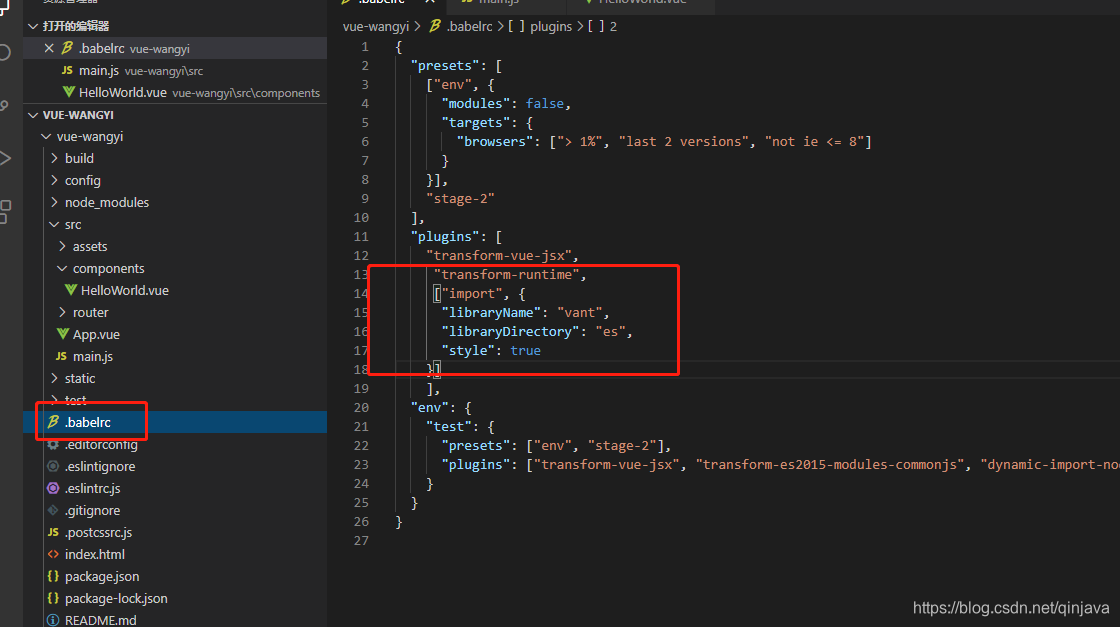
// 在.babelrc 中添加配置
// 注意:webpack 1 无需设置 libraryDirectory
{
“plugins”: [
[“import”, {
“libraryName”: “vant”,
“libraryDirectory”: “es”,
“style”: true
}]
]
}
在main.js全局引入
import { Button } from ‘vant’
Vue.use(Button)
网易严选适配js
; (function(win, lib) {var doc = win.document;var docEl = doc.documentElement;var metaEl = doc.querySelector('meta[name="viewport"]');var flexibleEl = doc.querySelector('meta[name="flexible"]');var dpr = 0;var scale = 0;var tid;var flexible = lib.flexible || (lib.flexible = {});if (metaEl) {console.warn("将根据已有的meta标签来设置缩放比例");var match = metaEl.getAttribute("content").match(/initial\-scale=([\d\.]+)/);if (match) {scale = parseFloat(match[1]);dpr = parseInt(1 / scale)}} else {if (flexibleEl) {var content = flexibleEl.getAttribute("content");if (content) {var initialDpr = content.match(/initial\-dpr=([\d\.]+)/);var maximumDpr = content.match(/maximum\-dpr=([\d\.]+)/);if (initialDpr) {dpr = parseFloat(initialDpr[1]);scale = parseFloat((1 / dpr).toFixed(2))}if (maximumDpr) {dpr = parseFloat(maximumDpr[1]);scale = parseFloat((1 / dpr).toFixed(2))}}}}if (!dpr && !scale) {var isAndroid = win.navigator.appVersion.match(/android/gi);var isIPhone = win.navigator.appVersion.match(/iphone/gi);var devicePixelRatio = win.devicePixelRatio;if (isIPhone) {if (devicePixelRatio >= 3 && (!dpr || dpr >= 3)) {dpr = 3} else {if (devicePixelRatio >= 2 && (!dpr || dpr >= 2)) {dpr = 2} else {dpr = 1}}} else {dpr = 1}scale = 1 / dpr}docEl.setAttribute("data-dpr", dpr);if (!metaEl) {metaEl = doc.createElement("meta");metaEl.setAttribute("name", "viewport");if ( !! win.webPageScalable) {metaEl.setAttribute("content", "initial-scale=" + scale + ", user-scalable=yes")} else {metaEl.setAttribute("content", "initial-scale=" + scale + ", maximum-scale=" + scale + ", minimum-scale=" + scale + ", user-scalable=no viewport-fit=cover")}if (docEl.firstElementChild) {docEl.firstElementChild.appendChild(metaEl)} else {var wrap = doc.createElement("div");wrap.appendChild(metaEl);doc.write(wrap.innerHTML)}}function refreshRem() {var width = docEl.getBoundingClientRect().width;var ua = navigator.userAgent.toLowerCase();if (!/ipad.*yanxuan/.test(ua)) {if (width / dpr > 750) {width = 750 * dpr}}var rem = width / 10;docEl.style.fontSize = rem + "px";flexible.rem = win.rem = rem}win.addEventListener("resize",function() {clearTimeout(tid);tid = setTimeout(refreshRem, 300)},false);win.addEventListener("pageshow",function(e) {if (e.persisted) {clearTimeout(tid);tid = setTimeout(refreshRem, 300)}},false);if (doc.readyState === "complete") {doc.body.style.fontSize = 12 * dpr + "px"} else {doc.addEventListener("DOMContentLoaded",function(e) {doc.body.style.fontSize = 12 * dpr + "px"},false)}refreshRem();flexible.dpr = win.dpr = dpr;flexible.refreshRem = refreshRem;flexible.rem2px = function(d) {var val = parseFloat(d) * this.rem;if (typeof d === "string" && d.match(/rem$/)) {val += "px"}return val};flexible.px2rem = function(d) {var val = parseFloat(d) / this.rem;if (typeof d === "string" && d.match(/px$/)) {val += "rem"}return val}
})(window, window["lib"] || (window["lib"] = {}));
写个html网易严选js的移动端适配
test.html
打印下win对象
<meta charset="utf-8">
<meta name="viewport" content="width=device-width, user-scalable=no, initial-scale=1.0, maximum-scale=1.0, minimum-scale=1.0">
<script type="text/javascript">
; (function(win, lib) {console.log(win);
})(window, window["lib"] || (window["lib"] = {}));
</script>
<div><h1>老阿木的移动端适配方案的简单使用</h1>
</div>

一步一步调式和打印网易严选js的功能
<meta charset="utf-8">
<meta name="viewport" content="width=device-width, user-scalable=no, initial-scale=1.0, maximum-scale=1.0, minimum-scale=1.0">
<script type="text/javascript">
; (function(win, lib) {var doc = win.document;var docEl = doc.documentElement;var metaEl = doc.querySelector('meta[name="viewport"]');console.log(metaEl);
})(window, window["lib"] || (window["lib"] = {}));
</script>
<div><h1>老阿木的移动端适配方案的简单使用</h1>
</div>
适配rem
rem是CSS3新增的相对长度单位,是指相对于根元素html的font-size计算值的大小。简单可理解为屏幕宽度的百分比。
与em相同的是它们都是使用元素设定字体大小,不同的是em是根据父级元素设置大小。而rem在根据指定html根元素的字符大小而定的,从IE6到Chrome中,默认根元素的font-size都是16px的。如果想要设置12px的
简单rem适配实现
<html >
<meta charset="utf-8">
<meta name="viewport" content="width=device-width, user-scalable=no, initial-scale=1.0, maximum-scale=1.0, minimum-scale=1.0">
<style type="text/css"> .h1{font-size: 16px;font-weight: normal;}.imgclass{width: 30 rem;display: block;}
</style>
<script type="text/javascript">
//得到屏幕的宽度var win=document.documentElement.clientWidth;console.log(win);//得到html元素var _html=document.getElementsByTagName('html')[0]console.log(_html);//设置根元素字体的大小_html.style.fontSize=win/20 +'px'</script>
<div><h1>我的移动端适配方案的思路简单讲解</h1><img class="imgclass" src="aa.png" alt="">
</div>
</html>
引入rem.js到vue工程项目中
;(function (designWidth, maxWidth) {var doc = document,win = window;var docEl = doc.documentElement;var tid;var rootItem, rootStyle;function refreshRem() {var width = docEl.getBoundingClientRect().width;if (!maxWidth) {maxWidth = 540;};if (width > maxWidth) {width = maxWidth;}//与淘宝做法不同,直接采用简单的rem换算方法1rem=100pxvar rem = width * 100 / designWidth;//兼容UC开始rootStyle = "html{font-size:" + rem + 'px !important}';rootItem = document.getElementById('rootsize') || document.createElement("style");if (!document.getElementById('rootsize')) {document.getElementsByTagName("head")[0].appendChild(rootItem);rootItem.id = 'rootsize';}if (rootItem.styleSheet) {rootItem.styleSheet.disabled || (rootItem.styleSheet.cssText = rootStyle)} else {try {rootItem.innerHTML = rootStyle} catch (f) {rootItem.innerText = rootStyle}}//兼容UC结束docEl.style.fontSize = rem + "px";};refreshRem();win.addEventListener("resize", function () {clearTimeout(tid); //防止执行两次tid = setT imeout(refreshRem, 300);}, false);win.addEventListener("pageshow", function (e) {if (e.persisted) { // 浏览器后退的时候重新计算clearTimeout(tid);tid = setTimeout(refreshRem, 300);}}, false);if (doc.readyState === "complete") {doc.body.style.fontSize = "16px";} else {doc.addEventListener("DOMContentLoaded", function (e) {doc.body.style.fontSize = "16px";}, false);}
})(375, 750);
在main.js全局引入
import ‘./assets/rem’
设置reset.css,重置样式
/*
html5doctor.com Reset Stylesheet
v1.4.1
2010-03-01
Author: Richard Clark - http://richclarkdesign.com
*/
html, body, div, span, object, iframe,
h1, h2, h3, h4, h5, h6, p, blockquote, pre,
abbr, address, cite, code,
del, dfn, em, img, ins, kbd, q, samp,
small, strong, sub, sup, var,
b, i,
dl, dt, dd, ol, ul, li,
fieldset, form, label, legend,
table, caption, tbody, tfoot, thead, tr, th, td,
article, aside, canvas, details, figcaption, figure,
footer, header, hgroup, menu, nav, section, summary,
time, mark, audio, video {margin:0;padding:0;border:0;outline:0;font-size:100%;vertical-align:baseline;background:transparent;box-sizing:border-box;
}
body {line-height:1;
}:focus {outline: 1;
}article,aside,canvas,details,figcaption,figure,
footer,header,hgroup,menu,nav,section,summary { display:block;
}ul {list-style:none;
}blockquote, q {quotes:none;
}blockquote:before, blockquote:after,
q:before, q:after {content:'';content:none;
}a {margin:0;padding:0;border:0;font-size:100%;vertical-align:baseline;background:transparent;
}ins {background-color:#ff9;color:#000;text-decoration:none;
}mark {background-color:#ff9;color:#000; font-style:italic;font-weight:bold;
}del {text-decoration: line-through;
}abbr[title], dfn[title] {border-bottom:1px dotted #000;cursor:help;
}table {border-collapse:collapse;border-spacing:0;
}hr {display:block;height:1px;border:0;   border-top:1px solid #cccccc;margin:1em 0;padding:0;
}input, select {vertical-align:middle;
}
删除helloword.vue的原始信息
开始开发页面
这篇关于前端学习笔记vue-01(仿照网易严选)的文章就介绍到这儿,希望我们推荐的文章对编程师们有所帮助!


