本文主要是介绍FloatingActionButton 完全解析 Design Support Library 2,希望对大家解决编程问题提供一定的参考价值,需要的开发者们随着小编来一起学习吧!
分享一下我老师大神的人工智能教程!零基础,通俗易懂!http://blog.csdn.net/jiangjunshow
也欢迎大家转载本篇文章。分享知识,造福人民,实现我们中华民族伟大复兴!
FloatingActionButton 完全解析[Design Support Library(2)]
转载请标明出处:
[http://blog.csdn.net/lmj623565791/article/details/46678867](http://blog.csdn.net/lmj623565791/article/details/46678867;
本文出自:【张鸿洋的博客】
哈,跟随着上篇Android 自己实现 NavigationView [Design Support Library(1)]之后,下面介绍个Design Support Library中极其简单的控件:FloatingActionButton。
一、简单使用
布局:
<android.support.design.widget.FloatingActionButton android:layout_width="wrap_content" android:layout_height="wrap_content" android:layout_gravity="right|bottom" android:src="@drawable/ic_discuss" />- 1
- 2
- 3
- 4
- 5
- 6
- 7
使用非常简单,直接当成ImageView来用即可。
效果图:
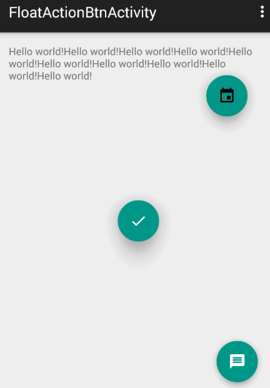
可以看到我们的FloatingActionButton正常显示的情况下有个填充的颜色,有个阴影;点击的时候会有一个rippleColor,并且阴影的范围可以增大,那么问题来了:
这个填充色以及rippleColor如何自定义呢?
默认的颜色取的是,theme中的colorAccent,所以你可以在style中定义colorAccent。
colorAccent 对应EditText编辑时、RadioButton选中、CheckBox等选中时的颜色。详细请参考:Android 5.x Theme 与 ToolBar 实战
rippleColor默认取的是theme中的colorControlHighlight。
我们也可以直接用过属性定义这两个的颜色:
app:backgroundTint="#ff87ffeb"app:rippleColor="#33728dff"- 1
- 2
立体感有没有什么属性可以动态指定?
和立体感相关有两个属性,elevation和pressedTranslationZ,前者用户设置正常显示的阴影大小;后者是点击时显示的阴影大小。大家可以自己设置尝试下。
综上,如果你希望自定义颜色、以及阴影大小,可以按照如下的方式(当然,颜色你也可以在theme中设置):
<android.support.design.widget.FloatingActionButton android:layout_width="wrap_content" android:layout_height="wrap_content" android:layout_gravity="right|bottom" android:src="@drawable/ic_discuss" app:backgroundTint="#ff87ffeb" app:rippleColor="#33728dff" app:elevation="6dp" app:pressedTranslationZ="12dp" />- 1
- 2
- 3
- 4
- 5
- 6
- 7
- 8
- 9
- 10
至于点击事件,和View的点击事件一致就不说了~~
二、5.x存在的一些问题
在5.x的设备上运行,你会发现一些问题(测试系统5.0):
- 木有阴影
记得设置app:borderWidth="0dp"。
- 按上述设置后,阴影出现了,但是竟然有矩形的边界(未设置margin时,可以看出)
需要设置一个margin的值。在5.0之前,会默认就有一个外边距(不过并非是margin,只是效果相同)。
so,良好的实践是:
- 添加属性
app:borderWidth="0dp" - 对于5.x设置一个合理的margin
如下:
<android.support.design.widget.FloatingActionButton android:layout_width="wrap_content" android:layout_height="wrap_content" android:layout_gravity="end|bottom" app:borderWidth="0dp" android:layout_margin="@dimen/fab_margin" android:src="@drawable/ic_headset" />- 1
- 2
- 3
- 4
- 5
- 6
- 7
values
<dimen name="fab_margin">0dp</dimen>- 1
values-v21
<dimen name="fab_margin">16dp</dimen>- 1
三、简单实现FloatActionButton
参考参考资料4
可以通过drawable来实现一个简单的阴影效果:
drawable/fab.xml
<?xml version="1.0" encoding="utf-8"?><selector xmlns:android="http://schemas.android.com/apk/res/android"> <item android:state_pressed="true"> <layer-list> <!-- Shadow --> <item android:top="1dp" android:right="1dp"> <layer-list> <item> <shape android:shape="oval"> <solid android:color="#08000000"/> <padding android:bottom="3px" android:left="3px" android:right="3px" android:top="3px" /> </shape> </item> <item> <shape android:shape="oval"> <solid android:color="#09000000"/> <padding android:bottom="2px" android:left="2px" android:right="2px" android:top="2px" /> </shape> </item> <item> <shape android:shape="oval"> <solid android:color="#10000000"/> <padding android:bottom="2px" android:left="2px" android:right="2px" android:top="2px" /> </shape> </item> <item> <shape android:shape="oval"> <solid android:color="#11000000"/> <padding android:bottom="1px" android:left="1px" android:right="1px" android:top="1px" /> </shape> </item> <item> <shape android:shape="oval"> <solid android:color="#12000000"/> <padding android:bottom="1px" android:left="1px" android:right="1px" android:top="1px" /> </shape> </item> <item> <shape android:shape="oval"> <solid android:color="#13000000"/> <padding android:bottom="1px" android:left="1px" android:right="1px" android:top="1px" /> </shape> </item> <item> <shape android:shape="oval"> <solid android:color="#14000000"/> <padding android:bottom="1px" android:left="1px" android:right="1px" android:top="1px" /> </shape> </item> <item> <shape android:shape="oval"> <solid android:color="#15000000"/> <padding android:bottom="1px" android:left="1px" android:right="1px" android:top="1px" /> </shape> </item> <item> <shape android:shape="oval"> <solid android:color="#16000000"/> <padding android:bottom="1px" android:left="1px" android:right="1px" android:top="1px" /> </shape> </item> </layer-list> </item> <!-- Blue button pressed --> <item> <shape android:shape="oval"> <solid android:color="#90CAF9"/> </shape> </item> </layer-list> </item> <item android:state_enabled="true"> <layer-list> <!-- Shadow --> <item android:top="2dp" android:right="1dp"> <layer-list> <item> <shape android:shape="oval"> <solid android:color="#08000000"/> <padding android:bottom="4px" android:left="4px" android:right="4px" android:top="4px" /> </shape> </item> <item> <shape android:shape="oval"> <solid android:color="#09000000"/> <padding android:bottom="2px" android:left="2px" android:right="2px" android:top="2px" /> </shape> </item> <item> <shape android:shape="oval"> <solid android:color="#10000000"/> <padding android:bottom="2px" android:left="2px" android:right="2px" android:top="2px" /> </shape> </item> <item> <shape android:shape="oval"> <solid android:color="#11000000"/> <padding android:bottom="1px" android:left="1px" android:right="1px" android:top="1px" /> </shape> </item> <item> <shape android:shape="oval"> <solid android:color="#12000000"/> <padding android:bottom="1px" android:left="1px" android:right="1px" android:top="1px" /> </shape> </item> <item> <shape android:shape="oval"> <solid android:color="#13000000"/> <padding android:bottom="1px" android:left="1px" android:right="1px" android:top="1px" /> </shape> </item> <item> <shape android:shape="oval"> <solid android:color="#14000000"/> <padding android:bottom="1px" android:left="1px" android:right="1px" android:top="1px" /> </shape> </item> <item> <shape android:shape="oval"> <solid android:color="#15000000"/> <padding android:bottom="1px" android:left="1px" android:right="1px" android:top="1px" /> </shape> </item> <item> <shape android:shape="oval"> <solid android:color="#16000000"/> <padding android:bottom="1px" android:left="1px" android:right="1px" android:top="1px" /> </shape> </item> </layer-list> </item> <!-- Blue button --> <item> <shape android:shape="oval"> <solid android:color="#03A9F4"/> </shape> </item> </layer-list> </item></selector>- 1
- 2
- 3
- 4
- 5
- 6
- 7
- 8
- 9
- 10
- 11
- 12
- 13
- 14
- 15
- 16
- 17
- 18
- 19
- 20
- 21
- 22
- 23
- 24
- 25
- 26
- 27
- 28
- 29
- 30
- 31
- 32
- 33
- 34
- 35
- 36
- 37
- 38
- 39
- 40
- 41
- 42
- 43
- 44
- 45
- 46
- 47
- 48
- 49
- 50
- 51
- 52
- 53
- 54
- 55
- 56
- 57
- 58
- 59
- 60
- 61
- 62
- 63
- 64
- 65
- 66
- 67
- 68
- 69
- 70
- 71
- 72
- 73
- 74
- 75
- 76
- 77
- 78
- 79
- 80
- 81
- 82
- 83
- 84
- 85
- 86
- 87
- 88
- 89
- 90
- 91
- 92
- 93
- 94
- 95
- 96
- 97
- 98
- 99
- 100
- 101
- 102
- 103
- 104
- 105
- 106
- 107
- 108
- 109
- 110
- 111
- 112
- 113
- 114
- 115
- 116
- 117
- 118
- 119
- 120
- 121
- 122
- 123
- 124
- 125
- 126
- 127
- 128
- 129
- 130
- 131
- 132
- 133
- 134
- 135
- 136
- 137
- 138
- 139
- 140
- 141
- 142
- 143
- 144
- 145
- 146
- 147
- 148
- 149
- 150
- 151
- 152
- 153
- 154
- 155
- 156
- 157
- 158
- 159
- 160
- 161
- 162
- 163
- 164
- 165
- 166
- 167
- 168
- 169
- 170
- 171
- 172
- 173
- 174
- 175
- 176
- 177
- 178
- 179
- 180
- 181
- 182
- 183
- 184
- 185
- 186
- 187
- 188
- 189
- 190
- 191
- 192
- 193
- 194
- 195
- 196
- 197
- 198
- 199
- 200
- 201
- 202
- 203
- 204
- 205
- 206
- 207
- 208
- 209
- 210
- 211
- 212
- 213
- 214
- 215
- 216
- 217
- 218
- 219
- 220
- 221
- 222
- 223
- 224
- 225
- 226
- 227
- 228
- 229
- 230
- 231
- 232
- 233
- 234
- 235
- 236
- 237
- 238
- 239
- 240
一个相当长的drawable,不过并不复杂,也比较好记忆。首先为一个View添加阴影,使用的是color从#08000000到#1500000,取的padding值为4、2、2、1…1;这样就可以为一个View的四边都添加上阴影效果。
当然了,为了阴影更加逼真,把上述的Layer-list又包含到了一个item中,并为该item设置了top和right,为了让左,下的阴影效果比上、右重,当然你可以设置其他两边,改变效果。
最后添加一个item设置为按钮的填充色(注意该item的层级)。
该drawable为一个selector,所以press和默认状态写了两次基本一致的代码,除了填充色不同。
使用:
<ImageButton android:layout_width="56dp" android:layout_height="56dp" android:layout_gravity="bottom|right" android:layout_margin="20dp" android:background="@drawable/fab" android:src="@drawable/ic_done" />- 1
- 2
- 3
- 4
- 5
- 6
- 7
- 8
效果图:

ok,到此FloatActionButton就介绍完毕啦~~有兴趣的话,也可以从github挑选个库看看别人的实现。
ok~
新浪微博
微信公众号:hongyangAndroid
(欢迎关注,第一时间推送博文信息)

参考资料
- http://antonioleiva.com/floating-action-button/
- https://code.google.com/p/android/issues/detail?id=175067
- https://github.com/chrisbanes/cheesesquare
- http://www.myandroidsolutions.com/2015/01/01/android-floating-action-button-fab-tutorial/
给我老师的人工智能教程打call!http://blog.csdn.net/jiangjunshow

这篇关于FloatingActionButton 完全解析 Design Support Library 2的文章就介绍到这儿,希望我们推荐的文章对编程师们有所帮助!


