本文主要是介绍CSS实现水波浪效果(附gif图及源码),希望对大家解决编程问题提供一定的参考价值,需要的开发者们随着小编来一起学习吧!
不多说先上图,如下图
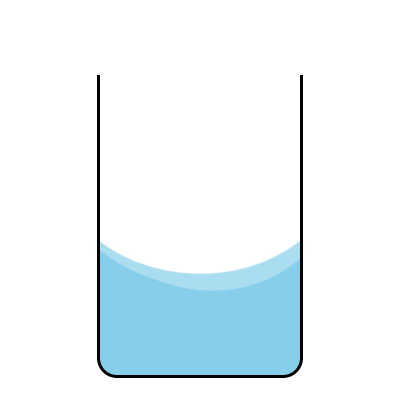
其实上图实现的水波浪的效果并不是让蓝色部分的水动,而是使白色区域变化(让两个椭圆绕Z轴旋转)
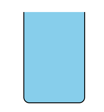
那么我们先在html用一个div做一个杯子,下面是div的样式代码
div {margin: 300px auto;width: 200px;height: 300px;border-radius: 0 0 20px 20px;border: 3px solid black;border-top: none;position: relative;background-color: skyblue;overflow: hidden;
}
然后通过溢出隐藏,使用伪元素(before,after)制作白色区域:是两个椭圆(此处我先把边框显示出来易于观察)
div::before,
div::after {content: '';position: absolute;width: 300px;height: 270px;border-radius: 55% 45%;bottom: 33%;left: 50%;border: 1px solid black;transform: translateX(-50%);background-color: #fff;animation: rotate 5s linear infinite;
}
div::after {left: 47%;bottom: 30%;border-radius: 45% 50%;opacity: 0.3;
}
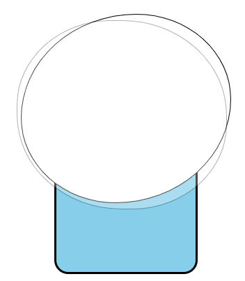
通过定位(绝对定位)让两个椭圆错开,然后伪元素after降低一下透明度,然后使用溢出隐藏
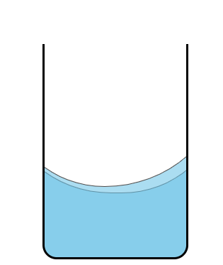
把最后添加动画(随便把椭圆的边框样式去掉)
@keyframes rotate {0% {transform: translate(-50%) rotateZ(0deg);}100% {transform: translate(-50%) rotateZ(360deg);}
这样就完成了, 如果还是不怎么清楚那个波浪的轨迹怎么来的,可以把溢出隐藏先注释掉,观察两个椭圆的转动轨迹
下面是源码:
<!DOCTYPE html>
<html lang="en">
<head><meta charset="UTF-8"><meta name="viewport" content="width=device-width, initial-scale=1.0"><meta http-equiv="X-UA-Compatible" content="ie=edge"><title>Document</title><style>div {margin: 300px auto;width: 200px;height: 300px;border-radius: 0 0 20px 20px;border: 3px solid black;border-top: none;position: relative;background-color: skyblue;overflow: hidden;}div::before,div::after {content: '';position: absolute;width: 300px;height: 270px;border-radius: 55% 45%;bottom: 33%;left: 50%;transform: translateX(-50%);background-color: #fff;animation: rotate 5s linear infinite;}div::after {left: 47%;bottom: 30%;border-radius: 45% 50%;opacity: 0.3;}@keyframes rotate {0% {transform: translate(-50%) rotateZ(0deg);}100% {transform: translate(-50%) rotateZ(360deg);}}</style>
</head>
<body><div></div>
</body>
</html>
这篇关于CSS实现水波浪效果(附gif图及源码)的文章就介绍到这儿,希望我们推荐的文章对编程师们有所帮助!


