本文主要是介绍uniapp tababr凸出图标已经自定义tabbar,希望对大家解决编程问题提供一定的参考价值,需要的开发者们随着小编来一起学习吧!
uniapp关于tabbar的文档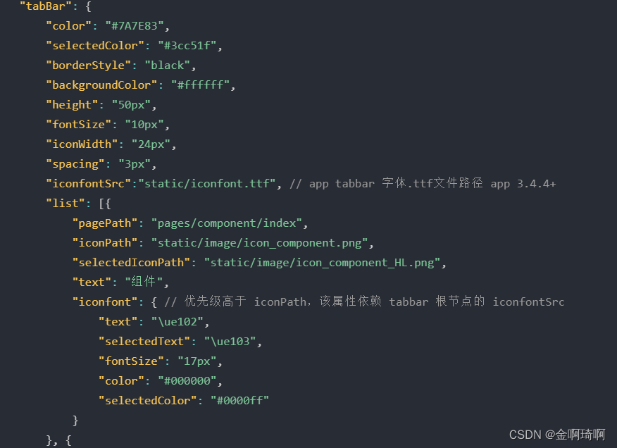
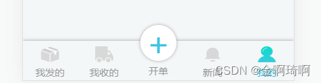
现在我想tabbar中间的显示为凸出的图标,类似下图
- 只需要在app中使用,不用兼容小程序的话,可以使用官方的midButton配置项,该配置项不兼容各种小程序。

"midButton": {"height": "70px", //修改距离底下的高度 "iconWidth": "50px", // 缩放图片大小 自己调整 "iconPath": "static/33cd2904c1d0e00cce947d9248eee4a.png","selectedIconPath": "static/5x471a3cb9de2330f0d7ee72547772bd7.png","text": "开单"
},
- 另一种方法,可以使用uniapp的组件,类于m-tabbar直接导入到项目中,进行使用,可以根据自身需求改变其中样式 【该组件,需请在page.json中tabbarde list添加全部tabbar】
<m-tabbar native :beforeChange="onBeforeChange"><template v-slot:tabbar_index_2><view class="custom_style"><view class="custom_style_icon">+</view><view class="custom_style_text">下单</view></view></template></m-tabbar>methods: {onBeforeChange(next) {next()uni.showModal({title: '非法进入',content: '您正在非法进入其他页面,是否继续',success: function (res) {if (res.confirm) {next()} else if (res.cancel) {console.log('用户点击取消');}}// })}}
对应写上样式,根据需求进行修改路由守卫。可以将该组件进行重新封装。
封装代码如下:
<template name="zxd-tabbar"><view><m-tabbar native :beforeChange="onBeforeChange"><template v-slot:tabbar_index_2><view class="custom_style"><view class="custom_style_icon">+<!-- <image src="/static/bro_union_plus.png" mode=""></image> --></view><view class="custom_style_text">下单</view></view></template></m-tabbar></view>
</template><script>export default {data() {return {}},onLoad() {},methods: {onBeforeChange(next) {next()// uni.showModal({// 	title: '非法进入',// 	content: '您正在非法进入其他页面,是否继续',// 	success: function (res) {// 		if (res.confirm) {// 			next()// 		} else if (res.cancel) {// 			console.log('用户点击取消');// 		}// 	}// })}}}
</script><style lang="less" scoped>@ThemeColor: #3cc4e0;.custom_style {color: #aaa;display: flex;flex-direction: column;align-items: center;justify-content: center;font-size: 24upx;gap: 10upx;.custom_style_icon {background-color: @ThemeColor;color: #fff;font-size: 80rpx;width: 90upx;height: 90upx;border-radius: 100%;display: flex;justify-content: center;align-items: center;margin-top: -40upx;}.custom_style_text {// background-color: @ThemeColor;// font-size: 28rpx;// width: 120rpx;// height: 120rpx;border-radius: 100%;display: flex;justify-content: center;align-items: center;// margin-top: -40rpx;}}
</style>
在各个主页面最后进行引用该组件,进行使用
<zxd-tabbar></zxd-tabbar>
- 或者进行自定义组件【该组件在页面中进行引用,需计算tabbar的高度,尤其是含有列表滚动的页面】 封装组件如下:
<template><view class="tabbar-container"><block><view class="tabbar-item" v-for="(item, index) in tabbarList":class="[item.centerItem ? ' center-item' : '']" @click="changeItem(item)"><view class="item-top"><text v-if="item.centerItem">+</text><image :src="currentItem == item.id ? item.selectedIconPath : item.iconPath" v-else></image></view><view class="item-bottom" :class="[currentItem == item.id ? 'item-active' : '']"><text>{{ item.text }}</text></view></view></block></view>
</template><script>export default {props: {currentPage: {type: Number,default: 0}},data() {return {currentItem: 0,tabbarList: [{id: 0,pagePath: "/pages/tabbar/order/order",iconPath: "/static/ic_order_in.png",selectedIconPath: "/static/ic_order_on.png",text: "我发的",centerItem: false},{id: 1,pagePath: "/pages/tabbar/received/received",iconPath: "/static/ic_received_in.png",selectedIconPath: "/static/ic_received_on.png",text: "我收的",centerItem: false},{id: 2,pagePath: "/pages/order/orderWrite/orderWrite",iconPath: "/static/ic_main_in.png",selectedIconPath: "/static/ic_main_on.png",text: "开单",centerItem: true},{id: 3,pagePath: "/pages/tabbar/news/news",iconPath: "/static/ic_news_in.png",selectedIconPath: "/static/ic_news_on.png",text: "新闻",centerItem: false},{id: 4,pagePath: "/pages/tabbar/main/main",iconPath: "/static/ic_main_in.png",selectedIconPath: "/static/ic_main_on.png",text: "我的",centerItem: false}]};},mounted() {this.currentItem = this.currentPage;uni.hideTabBar();},methods: {changeItem(item) {let _this = this;// console.log(item)if (item.id == 2) {  //通过不同的路径进行跳转,并没有把这个页面写在tarbar中uni.navigateTo({url: '/pages/order/orderWrite/orderWrite'})return}// _this.currentItem = item.id;uni.switchTab({url: item.pagePath});}}};
</script>
<style lang='less'>@ThemeColor: #3cc4e0;view {padding: 0;margin: 0;box-sizing: border-box;}.tabbar-container {position: fixed;bottom: 0;left: 0;width: 100%;height: 110rpx;box-shadow: 0 0 5px #999;display: flex;align-items: center;padding: 5rpx 0;color: #999999;}.tabbar-container .tabbar-item {width: 20%;height: 100rpx;display: flex;flex-direction: column;justify-content: center;align-items: center;text-align: center;}.tabbar-container .item-active {color: #3cc4e0;}.tabbar-container .center-item {display: block;position: relative;}.tabbar-container .tabbar-item .item-top {width: 70rpx;height: 70rpx;padding: 10rpx;}.tabbar-container .center-item .item-top {flex-shrink: 0;width: 100rpx;height: 100rpx;position: absolute;top: -50rpx;left: calc(50% - 50rpx);border-radius: 50%;box-shadow: 0 0 5px #999;background-color: #ffffff;display: flex;align-items: center;justify-content: center;}.tabbar-container .tabbar-item .item-top image {width: 100%;height: 100%;}.tabbar-container .tabbar-item .item-top text {color: #3cc4e0;font-size: 90upx;}.tabbar-container .tabbar-item .item-bottom {font-size: 28rpx;width: 100%;}.tabbar-container .center-item .item-bottom {position: absolute;bottom: 5rpx;}
</style>
在页面中使用如下,需要传对应的currentPage值,不然会出现点击闪烁的问题
<zxd-tabbar :currentPage='0'></zxd-tabbar>
这篇关于uniapp tababr凸出图标已经自定义tabbar的文章就介绍到这儿,希望我们推荐的文章对编程师们有所帮助!


