本文主要是介绍Android中drawable使用总结,希望对大家解决编程问题提供一定的参考价值,需要的开发者们随着小编来一起学习吧!
文章目录
- StateListDrawable
- GradientDrawable
- LayerDrawable
- 能动态改变图片颜色的Tint使用
- 属性按钮3种状态demo
- getCompoundDrawables()
- getIntrinsicWidth() 获取drawable图片的宽高(和设备有关)
- 注意
StateListDrawable
StateListDrawable 是 Drawable 的子类,该类定义了不同状态值下与之对应的图片资源,我们可以利用该类保存多种状态值,多种图片资源
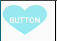
例如可以将button设置成点击和放开时不同背景图
xml实现:
1、drawable下新建selector.xml
<?xml version="1.0" encoding="utf-8"?>
<selector xmlns:android="http://schemas.android.com/apk/res/android"><item android:drawable="@mipmap/heart0" android:state_pressed="false"/><item android:drawable="@mipmap/heart1" android:state_pressed="true"/>
</selector>
2、布局中使用
<Buttonandroid:id="@+id/button"android:layout_width="wrap_content"android:layout_height="wrap_content"android:background="@drawable/selector"android:text="button"android:textColor="@android:color/white"/>
代码实现:
selector.xml 会被解析成一个 StateListDrawable 对象,下面我们要做的就是我们怎样手动的用代码来写个 StateListDrawable,并且同样实现上面 xml 定义drawable的功能,既然能用 xml实现,为什么还要用代码呢?项目中有这样的需求,项目有主色系,这个色值是后台规定的,所以我们要用代码动态实现这个效果
关键代码
button.setBackground(initStateListDrawable());private StateListDrawable initStateListDrawable(){//初始化一个空对象StateListDrawable stalistDrawable = new StateListDrawable();//获取对应的属性值 Android框架自带的属性 attrint pressed = android.R.attr.state_pressed;stalistDrawable.addState(new int []{-pressed}, getResources().getDrawable(R.mipmap.heart0));stalistDrawable.addState(new int []{pressed}, getResources().getDrawable(R.mipmap.heart1));//没有任何状态时显示的图片,我们给它设置我空集合stalistDrawable.addState(new int []{}, getResources().getDrawable(R.mipmap.heart0));return stalistDrawable;}
布局中去掉background属性
<Buttonandroid:id="@+id/button"android:layout_width="wrap_content"android:layout_height="wrap_content"android:text="button"android:textColor="@android:color/white"/>
效果是和上边的一样的
其中代码中的“-”负号表示对应的属性值为false
GradientDrawable
使用优势
- 快速实现一些基本图形(线,矩形,圆,椭圆,圆环)
- 快速实现一些圆角,渐变,阴影等效果
- 代替图片设置为View的背景
- 可以减少apk大小,提升用户下载意愿
- 还可以减少内存占用
- 方便修改与维护
效果1
在drawable下新建shape.xml
<?xml version="1.0" encoding="utf-8"?>
<shape xmlns:android="http://schemas.android.com/apk/res/android"android:shape="rectangle"><gradientandroid:angle="270"android:endColor="#DB7093"android:startColor="#FFB6C1" /><paddingandroid:left="20dp"android:top="10dp"android:right="20dp"android:bottom="50dp" /><corners android:radius="5dp" />
</shape>
布局中使用
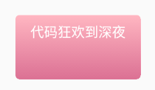
<EditTextandroid:id="@+id/button"android:layout_width="wrap_content"android:layout_height="wrap_content"android:text="代码狂欢到深夜"android:textColor="@android:color/white"android:background="@drawable/shape"/>
效果2
<?xml version="1.0" encoding="utf-8"?>
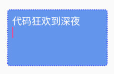
<shape xmlns:android="http://schemas.android.com/apk/res/android"android:shape="rectangle"><solid android:color="#6495ED" /><strokeandroid:width="2dp"android:color="#0000ff"android:dashWidth="1dp"android:dashGap="3dp" /><paddingandroid:bottom="10dp"android:left="10dp"android:right="10dp"android:top="10dp" /><corners android:radius="5dp" />
</shape>
官方文档给出的xml定义说明
<?xml version="1.0" encoding="utf-8"?>
<shapexmlns:android="http://schemas.android.com/apk/res/android"android:shape=["rectangle" | "oval" | "line" | "ring"] ><cornersandroid:radius="integer"android:topLeftRadius="integer"android:topRightRadius="integer"android:bottomLeftRadius="integer"android:bottomRightRadius="integer" /><gradientandroid:angle="integer"android:centerX="integer"android:centerY="integer"android:centerColor="integer"android:endColor="color"android:gradientRadius="integer"android:startColor="color"android:type=["linear" | "radial" | "sweep"]android:useLevel=["true" | "false"] /><paddingandroid:left="integer"android:top="integer"android:right="integer"android:bottom="integer" /><sizeandroid:width="integer"android:height="integer" /><solidandroid:color="color" /><strokeandroid:width="integer"android:color="color"android:dashWidth="integer"android:dashGap="integer" />
</shape>
给你个完美的解释
<shapexmlns:android="http://schemas.android.com/apk/res/android"android:shape=["rectangle" | "oval" | "line" | "ring"] >...
</shape>
<shape>shape的形状,默认为矩形。可以设置为矩形(rectangle)、椭圆形(oval)、线(line)、环形(ring)
当android:shape="ring"时,shape有以下一些属性可用使用:
- android:innerRadius
尺寸。 内环的半径。一个尺寸值(dip等等)或者一个尺寸资源 - android:innerRadiusRatio
Float类型。这个值表示内部环的比例,例如,如果android:innerRadiusRatio = " 5 ",那么内部的半径等于环的宽度除以5。这个值会被android:innerRadius重写。 默认值是9 - android:thickness
尺寸。环的厚度,是一个尺寸值或尺寸的资源 - android:thicknessRatio
Float类型。厚度的比例。例如,如果android:thicknessRatio= " 2 ",然后厚度等于环的宽度除以2。这个值是被android:innerRadius重写, 默认值是3 - android:useLevel
Boolean类型。如果用在 LevelListDrawable里,那么就是true。如果通常不出现则为false
<cornersandroid:radius="integer"//Dimension。圆角的半径。会被下面每个特定的圆角属性重写android:topLeftRadius="integer"android:topRightRadius="integer"android:bottomLeftRadius="integer"android:bottomRightRadius="integer" />
<corners>表示的是矩形的四个角弧度,只能用在android:shape = "rectangle"的时候
<gradientandroid:angle="integer"//Integer 渐变的角度。0 代表从 left 到 right。90 代表bottom到 top。必须是45的倍数,默认为0。android:centerX="integer"//Float 渐变中心的相对X坐标,在0到1.0之间。android:centerY="integer"//Float 渐变中心的相对Y坐标,在0到1.0之间。android:centerColor="integer"//Color 可选的颜色值。基于startColor和endColor之间android:endColor="color"//Color 结束的颜色android:gradientRadius="integer"//Float 渐变的半径。只有在android:type="radial"才使用。android:startColor="color"//Color 开始的颜色值。android:type=["linear" | "radial" | "sweep"]//渐变的模式。android:useLevel=["true" | "false"] />//渐变的模式。如果要使用LevelListDrawable对象,就要设置为true。设置为true无渐变。false有渐变色
<gradient>表示渐变颜色填充
其中android:type表示渐变的模式,可选的参数包括:
- “linear” 线形渐变。这也是默认的模式
- “radial” 辐射渐变。startColor即辐射中心的颜色
- “sweep” 扫描线渐变
<paddingandroid:left="integer"//Dimension。左边填充距离android:top="integer"android:right="integer"android:bottom="integer" />
<padding>表示内容与视图边界的距离
<sizeandroid:width="integer"//Dimension。shape的高度。android:height="integer" />//Dimension。shape的宽度。
<size>表示shape的大小
<solidandroid:color="color" />//Color。颜色值,十六进制数,或者一个Color资源
<solid>表示shape填充的颜色,与<gradient>的渐变功能一样只是此处填充的是纯色。所以一般情况下<gradient>和<solid>只用使用一个就行了
<strokeandroid:width="integer"//Dimension。笔画的粗细。android:color="color"//Color。笔画的颜色。android:dashWidth="integer"//Dimension。每画一条线的长度。只有当 android:dashGap也设置了才有效。表示描边的样式是虚线的宽度, 值为0时,表示为实线。值大于0则为虚线android:dashGap="integer" />//Dimension。每画一条线就间隔多少。只有当android:dashWidth也设置了才有效。表示描边为虚线时,虚线之间的间隔 即“ - - - - ”
<stroke>用来表示shape的边框画笔,当android:shape="line"的时候,必须设置该元素
实践一下
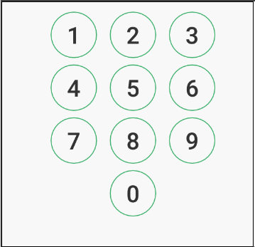
用 GradientDrawable 来实现一个自定义的数字输入键盘。此处仿 iphone的锁屏节目的圆形数字输入按钮。正常状态下,是一个有边框,中间透明圆环,按下时,中间填充颜色
创建正常键盘样式number_button_normal.xml
<?xml version="1.0" encoding="utf-8"?>
<shape xmlns:android="http://schemas.android.com/apk/res/android"android:shape="oval"><solid android:color="@android:color/transparent" /><strokeandroid:width="1dp"android:color="#df1ea353" />
</shape>
创建按下时的键盘样式number_button_pressed.xml
<?xml version="1.0" encoding="utf-8"?>
<shape xmlns:android="http://schemas.android.com/apk/res/android"android:shape="oval"><solid android:color="#1ea353" /><strokeandroid:width="1dp"android:color="#df1ea353" />
</shape>
正常和按下状态都有了,我们要通过创建一个selector来组合这两种状态,创建number_button_selector.xml
<?xml version="1.0" encoding="utf-8"?>
<selector xmlns:android="http://schemas.android.com/apk/res/android"><item android:drawable="@drawable/number_button_pressed" android:state_pressed="true" /><item android:drawable="@drawable/number_button_normal" />
</selector>
按钮布局
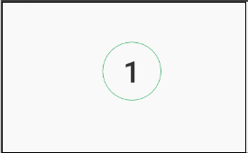
<LinearLayout xmlns:android="http://schemas.android.com/apk/res/android"android:layout_width="wrap_content"android:layout_height="wrap_content"android:orientation="vertical"android:layout_gravity="center_horizontal"android:gravity="center"><LinearLayoutandroid:layout_width="wrap_content"android:layout_height="wrap_content"android:layout_marginTop="30dp"><Buttonstyle="@style/number_button"android:id="@+id/nkb_1"android:text="1"/><Buttonstyle="@style/number_button"android:id="@+id/nkb_2"android:text="2"/><Buttonstyle="@style/number_button"android:id="@+id/nkb_3"android:text="3"/></LinearLayout><LinearLayoutandroid:layout_width="wrap_content"android:layout_height="wrap_content"><Buttonstyle="@style/number_button"android:id="@+id/nkb_4"android:text="4"/><Buttonstyle="@style/number_button"android:id="@+id/nkb_5"android:text="5"/><Buttonstyle="@style/number_button"android:id="@+id/nkb_6"android:text="6"/></LinearLayout><LinearLayoutandroid:layout_width="wrap_content"android:layout_height="wrap_content"><Buttonstyle="@style/number_button"android:id="@+id/nkb_7"android:text="7"/><Buttonstyle="@style/number_button"android:id="@+id/nkb_8"android:text="8"/><Buttonstyle="@style/number_button"android:id="@+id/nkb_9"android:text="9"/></LinearLayout><Buttonstyle="@style/number_button"android:id="@+id/nkb_0"android:text="0"/>
</LinearLayout>
因为此处有10个按钮,每个按钮的样式都是一样的,所以,给按钮建一个样式,在要应用的地方直接使用style="@style/number_button"制定样式。在styles.xml中
<style name="wrap_wrap"><item name="android:layout_width">wrap_content</item><item name="android:layout_height">wrap_content</item></style><style name="number_button" parent="wrap_wrap"><item name="android:background">@drawable/number_button_selector</item><item name="android:textColor">#333333</item><item name="android:textSize">30sp</item><item name="android:minHeight">60dp</item><item name="android:minWidth">60dp</item><item name="android:layout_marginLeft">8dp</item><item name="android:layout_marginRight">8dp</item><item name="android:layout_marginBottom">8dp</item></style>
效果图
动态创建GradientDrawable并使用
用shape标签定义的xml,最终都是转化为GradientDrawable对象,而不是ShapeDrawable, 也不是起类型对应的 OvalShape,RoundRectShape等
我们这里换用代码实现和上边相同的效果,这里用一个按钮举例子
<Buttonandroid:id="@+id/number_button"android:layout_width="60dp"android:layout_height="60dp"android:text="1"android:textColor="#333"android:textSize="30sp"/>
关键代码
if(android.os.Build.VERSION.SDK_INT >= Build.VERSION_CODES.JELLY_BEAN){btn.setBackground(initStateListDrawable());
}else{btn.setBackgroundDrawable(initStateListDrawable());
}private StateListDrawable initStateListDrawable(){//创建drawableGradientDrawable normalGb = new GradientDrawable();//设置类型normalGb.setShape(GradientDrawable.OVAL);//内部填充颜色normalGb.setColor(Color.TRANSPARENT);//边框 参数分别为i:边框宽度、边框颜色normalGb.setStroke(1,Color.parseColor("#df1ea353"));GradientDrawable pressedGb = new GradientDrawable();pressedGb.setShape(GradientDrawable.OVAL);pressedGb.setColor(Color.parseColor("#1ea353"));pressedGb.setStroke(1,Color.parseColor("#df1ea353"));StateListDrawable stalistDrawable = new StateListDrawable();int pressed = android.R.attr.state_pressed;stalistDrawable.addState(new int []{-pressed}, normalGb);stalistDrawable.addState(new int []{pressed}, pressedGb);stalistDrawable.addState(new int []{}, normalGb);return stalistDrawable;}
效果
另外,还有一个常用到的方法是
setCornerRadius(int px)
用来设置圆角,传入的是px,需要用方法转换成dp
Android Drawable之GradientDrawable
Android GradientDrawable(shape标签定义) 静态使用和动态使用(圆角,渐变实现)
Android XML shape 标签使用详解(apk瘦身,减少内存好帮手)
LayerDrawable
LayerDrawable对应的XML的根元素是<layer-list>,它表示一种层次化显示的Drawable集合。通过将不同的Drawable放置在不同的层上面从而达到一种叠加后的效果
官网语法
<?xml version="1.0" encoding="utf-8"?>
<layer-listxmlns:android="http://schemas.android.com/apk/res/android" ><itemandroid:drawable="@[package:]drawable/drawable_resource"//我们可以通过drawable属性来直接引用一个已有的drawable资源android:id="@[+][package:]id/resource_name"//id资源名 (少用)android:top="dimension"//比较常用的属性有bottom,left,right,top,它们分别表示Drawable相对于view的偏移量,单位为像素android:right="dimension"android:bottom="dimension"android:left="dimension" />
</layer-list>
特点
1、一个layer-list可包含多个item,每一个item表示一个Drawable
2、Layer-list有层次的概念,下面的item会覆盖上面的item,通过合理的分层,可以实现一些特殊的叠加效果
3、item里面常见放的是bitmap,当然也可以是shape,不管是什么肯定是Drawable
4、默认情况下,layer-list中所有的drawable都被放至View的大小,对于bitmap来说,需要使用gravity才能控制图片的显示效果。
效果一

创建一个layer_list.xml
<?xml version="1.0" encoding="utf-8"?>
<layer-list xmlns:android="http://schemas.android.com/apk/res/android"><item><shape><!-- 实心 --><solid android:color="@android:color/black" /></shape></item><!--模拟背景的padding的size 6dp--><itemandroid:bottom="10dp"android:left="10dp"android:right="10dp"android:top="10dp"><!--原来的需求区域--><shape><!-- 实心 --><solid android:color="@android:color/holo_red_dark" /><!-- 边框 --><strokeandroid:width="2dp"android:color="@android:color/holo_green_dark" /><!-- 圆角 --><corners android:radius="2dp" /></shape></item></layer-list>
代码中使用
<TextViewandroid:layout_width="300dp"android:layout_height="200dp"android:text="Text"android:textColor="@android:color/white"android:gravity="center"android:background="@drawable/layer_list"/>
效果二

<?xml version="1.0" encoding="utf-8"?>
<layer-list xmlns:android="http://schemas.android.com/apk/res/android"><item><bitmapandroid:gravity="left"android:src="@mipmap/heart0" /></item><itemandroid:left="10dp"android:top="10dp"><bitmapandroid:gravity="left"android:src="@mipmap/heart0" /></item><itemandroid:left="20dp"android:top="20dp"><bitmapandroid:gravity="left"android:src="@mipmap/heart0" /></item>
</layer-list>
<ImageViewandroid:layout_width="wrap_content"android:layout_height="wrap_content"android:background="@drawable/layer_list" />
效果三

<?xml version="1.0" encoding="utf-8"?>
<layer-list xmlns:android="http://schemas.android.com/apk/res/android"><item android:drawable="@mipmap/heart0" /><itemandroid:drawable="@mipmap/heart0"android:left="10dp"android:top="10dp" /><itemandroid:drawable="@mipmap/heart0"android:left="20dp"android:top="20dp" />
</layer-list>
旋转

创建一个layer_list.xml
<?xml version="1.0" encoding="utf-8"?>
<layer-list xmlns:android="http://schemas.android.com/apk/res/android"><item><!-- 最底层的图片,以x,y轴坐标为中心进行旋转,负数逆时针旋转--><rotateandroid:fromDegrees="-10"android:pivotX="0"android:pivotY="0"android:toDegrees="-10"><bitmap android:src="@mipmap/heart0" /></rotate></item><item><rotateandroid:fromDegrees="10"android:pivotX="0"android:pivotY="0"android:toDegrees="10"><bitmap android:src="@mipmap/heart1" /></rotate></item><item><rotateandroid:fromDegrees="35"android:pivotX="0"android:pivotY="0"android:toDegrees="55"><bitmap android:src="@mipmap/heart2" /></rotate></item>
</layer-list>
输入框效果
创建一个layer_list.xml
<?xml version="1.0" encoding="utf-8"?>
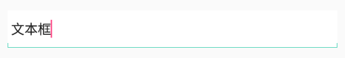
<layer-list xmlns:android="http://schemas.android.com/apk/res/android"><!-- 前景层--><item><shape android:shape="rectangle"><solid android:color="#0ac39e" /></shape></item><!-- 第二层,当前drawable为一个纯白色,相对view底部6dp外间距。--><item android:bottom="6dp"><shape android:shape="rectangle"><solid android:color="#ffffff" /></shape></item><!-- 第三层,当前drawable为一个纯白色,相对view下,左,右各1dp的外间距。--><itemandroid:bottom="1dp"android:left="1dp"android:right="1dp"><shape android:shape="rectangle"><solid android:color="#ffffff" /></shape></item></layer-list>
布局中使用
<EditTextandroid:layout_width="match_parent"android:layout_height="50dp"android:background="@drawable/layer_list"android:paddingLeft="5dp"android:paddingRight="5dp"android:text="文本框" />
按钮阴影
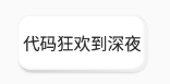
创建layer_list.xml
<?xml version="1.0" encoding="utf-8"?>
<layer-list xmlns:android="http://schemas.android.com/apk/res/android"><!-- item前景层--><itemandroid:left="2dp"android:top="2dp"><shape><gradientandroid:angle="45"android:endColor="#F5F5F5"android:startColor="#D3D3D3"android:type="linear" /><corners android:radius="10dp" /></shape></item><!-- item预览层--><!-- 这层item会覆盖在之前上一层的item之上,会产生叠加的效果。--><itemandroid:bottom="2dp"android:right="2dp"><shape><strokeandroid:width="1dp"android:color="#F5F5F5"/><solid android:color="@android:color/white" /><corners android:radius="10dp" /></shape></item>
</layer-list>
代码中使用
<Buttonandroid:layout_width="wrap_content"android:layout_height="wrap_content"android:background="@drawable/layer_list"android:text="代码狂欢到深夜"android:padding="5dp"/>
搜索框

<?xml version="1.0" encoding="utf-8"?>
<layer-list xmlns:android="http://schemas.android.com/apk/res/android"><item><shape android:shape="rectangle"><corners android:radius="50dip" /><solid android:color="@android:color/white" /></shape></item><itemandroid:drawable="@mipmap/ic_search"android:gravity="left"android:left="10dp"android:top="5dp"android:right="10dp"android:bottom="5dp"/>
</layer-list>
<?xml version="1.0" encoding="utf-8"?>
<LinearLayout xmlns:android="http://schemas.android.com/apk/res/android"android:layout_width="match_parent"android:layout_height="match_parent"android:background="#DCDCDC"android:orientation="vertical"><EditTextandroid:layout_width="match_parent"android:layout_height="48dip"android:layout_marginLeft="10dip"android:layout_marginTop="8dip"android:layout_marginRight="10dip"android:layout_marginBottom="8dip"android:background="@drawable/layer_list2"android:hint="搜索"android:paddingLeft="55dp" />
</LinearLayout>
代码实现最后一个搜索效果
学了这么多,实践一下,用代码实现最后一个搜索效果
public class MainActivity extends AppCompatActivity {private EditText editText;@Overrideprotected void onCreate(Bundle savedInstanceState) {super.onCreate(savedInstanceState);setContentView(R.layout.activity_main);editText = findViewById(R.id.et);GradientDrawable gd = new GradientDrawable();gd.setColor(Color.WHITE);gd.setCornerRadius(dpToPx(50));Drawable[] layers = {gd, getResources().getDrawable(R.mipmap.ic_search)};LayerDrawable layerDrawable = new LayerDrawable(layers);layerDrawable.setLayerGravity(1, Gravity.LEFT);layerDrawable.setLayerInset(1, dpToPx(10), dpToPx(5), dpToPx(10), dpToPx(5));editText.setBackground(layerDrawable);}public int dpToPx(float dpValue) {if (dpValue <= 0) {return 0;}final float scale = this.getResources().getDisplayMetrics().density;return (int) (dpValue * scale + 0.5f);}}布局文件
<?xml version="1.0" encoding="utf-8"?>
<LinearLayout xmlns:android="http://schemas.android.com/apk/res/android"android:layout_width="match_parent"android:layout_height="match_parent"android:background="#DCDCDC"android:orientation="vertical"><EditTextandroid:id="@+id/et"android:layout_width="match_parent"android:layout_height="48dip"android:layout_marginLeft="10dip"android:layout_marginTop="8dip"android:layout_marginRight="10dip"android:layout_marginBottom="8dip"android:hint="搜索"android:paddingLeft="55dp" /></LinearLayout>
新建LayerDrawable对象时,要传入一个 Drawable 数组,就是把所以的图层放在 Drawable 数组里面传进去
也对外提供了一系列操作 Drawable 的方法,通过 id 或 index 对 Layer 进行设置:
public int addLayer(Drawable dr)
public Drawable findDrawableByLayerId(int id)
public void setId(int index, int id)
public int getId(int index)
public int getNumberOfLayers()
public boolean setDrawableByLayerId(int id, Drawable drawable)
public int findIndexByLayerId(int id)
public void setDrawable(int index, Drawable drawable)
public Drawable getDrawable(int index)
public void setLayerSize(int index, int w, int h)
public void setLayerWidth(int index, int w)
public void setLayerHeight(int index, int h)
public void setLayerGravity(int index, int gravity)
public void setLayerInset(int index, int l, int t, int r, int b)
public void setLayerInsetRelative(int index, int s, int t, int e, int b)
public void setLayerInsetLeft(int index, int l)
public void setLayerInsetRight(int index, int r)
public void setLayerInsetTop(int index, int t)
public void setLayerInsetBottom(int index, int b)
public void setLayerInsetStart(int index, int s)
public void setLayerInsetEnd(int index, int e)
public void setPaddingMode(int mode)
public void setPadding(int left, int top, int right, int bottom)
其中setLayerInset()函数的作用就是将某层(层数从0开始计数)相对于上一层进行向里偏移。当然如果传入的数值为负数,就是向外偏移了,不过这时上层就遮挡住下层了,失去了使用layer的意义了
值得注意:的是这里所有的int值,单位都是px,在传入时需要进行px单位的转换,所以我调用了一个dpToPx()方法
能动态改变图片颜色的Tint使用
tint 可以帮助我们一张图实现各种变色,也就是说可以非常容易改变某个icon的颜色,同样的也能减少我们apk的体积(原本需要多张图片的,现在可能一张就够了)
tint效果图:
xml实现:
<ImageViewandroid:id="@+id/enable_cart"android:layout_width="wrap_content"android:layout_height="wrap_content"android:src="@mipmap/btn_cart_list"/><ImageViewandroid:id="@+id/disable_cart"android:layout_width="wrap_content"android:layout_height="wrap_content"android:src="@mipmap/btn_cart_list"android:tint="#cccccc"/>
代码实现:
ImageView imageView = findViewById(R.id.enable_cart);ImageView imageView1 = findViewById(R.id.disable_cart);Drawable drawable = ContextCompat.getDrawable(this,R.mipmap.btn_cart_list);imageView.setImageDrawable(drawable);Drawable.ConstantState state = drawable.getConstantState();Drawable drawable1 = DrawableCompat.wrap(state == null ? drawable : state.newDrawable()).mutate();drawable1.setBounds(0, 0, drawable.getIntrinsicWidth(), drawable.getIntrinsicHeight());DrawableCompat.setTint(drawable1,ContextCompat.getColor(this,R.color.gray));imageView1.setImageDrawable(drawable1);
DrawableCompat类:
是Drawable的向下兼容类,我们为了在6.0一下兼容tint属性而使用的,是很简单的一个兼容类
wrap方法:使用tint就必须调用该方法对Drawable进行一次包装
mutate方法:如果不调用该方法,我们进行操作的就是原drawable,着色之后原drawable也改变的,所有两个ImageView都会显示着色之后的drawable
使用selector

xml代码
<ImageViewandroid:layout_width="wrap_content"android:layout_height="wrap_content"android:id="@+id/image"android:clickable="true" />
java代码
ImageView imageView = (ImageView) findViewById(R.id.image);Drawable drawable = ContextCompat.getDrawable(this, R.mipmap.btn_cart_list);int[] colors = new int[]{ContextCompat.getColor(this, R.color.gray), ContextCompat.getColor(this, R.color.colorAccent)};int[][] states = new int[2][];states[0] = new int[]{android.R.attr.state_pressed};states[1] = new int[]{};ColorStateList colorList = new ColorStateList(states, colors);StateListDrawable stateListDrawable = new StateListDrawable();stateListDrawable.addState(states[0], drawable);//注意顺序stateListDrawable.addState(states[1], drawable);Drawable.ConstantState state = stateListDrawable.getConstantState();drawable = DrawableCompat.wrap(state == null ? stateListDrawable : state.newDrawable()).mutate();DrawableCompat.setTintList(drawable, colorList);imageView.setImageDrawable(drawable);
Android中View(视图)绘制不同状态背景图片原理深入分析以及StateListDrawable使用详解
属性按钮3种状态demo
属性选框一般会有三种状态:未选中,选中,不可用
可以用RadioButton实现,用enabled属性表示是否可用,用checked表示是否选中
textColor 和 background就可以分别设置三种状态的文字颜色和按钮背景色
源码传送门
getCompoundDrawables()
用于获取当下该控件的上下左右位置的Drawable引用,该方法返回的是Drawable[]数组,length为4,分别对应Left,Top,Right和Bottom的Drawable引用
例如 在 EditText中增加图片

<EditTextandroid:id="@+id/et"android:layout_width="match_parent"android:layout_height="40dp"android:background="@color/white"android:padding="5dp"android:layout_margin="5dp"android:drawableRight="@mipmap/ic_search"/>
Drawable[] drawables = et.getCompoundDrawables();for (int i = 0; i < drawables.length; i++) {Drawable drawable = drawables[i];if (drawable != null) {Log.d("TTT", "第" + i + "张图片 width=" + drawable.getBounds().width() +",height=" + drawable.getBounds().height());} else {Log.d("TTT", "该位置没有图片");}}
该位置没有图片
该位置没有图片
第2张图片 width=73,height=73
该位置没有图片
getIntrinsicWidth() 获取drawable图片的宽高(和设备有关)
不举例了
更多:
Android 图像绘制之 Drawable
注意
由于 Android 熊解析 XML 是从上到下的解析流程,且一旦解析到匹配的项则停止解析,而 selector 中,没有配置 state_??? 的 item 表示匹配所有状态,所以没有配置 state_??? 的 item 必须是 selector 中的最后一个 item 节点。
这篇关于Android中drawable使用总结的文章就介绍到这儿,希望我们推荐的文章对编程师们有所帮助!


