本文主要是介绍python 绘图库matplotlib-_Python图表绘制:matplotlib绘图库入门,希望对大家解决编程问题提供一定的参考价值,需要的开发者们随着小编来一起学习吧!
matplotlib 是python最著名的绘图库,它提供了一整套和matlab相似的命令API,十分适合交互式地行制图。而且也可以方便地将它作为绘图控件,嵌入GUI应用程序中。
它的文档相当完备,并且Gallery页面中有上百幅缩略图,打开之后都有源程序。因此如果你需要绘制某种类型的图,只需要在这个页面中浏览/复制/粘贴一下,基本上都能搞定。
在Linux下比较著名的数据图工具还有gnuplot,这个是免费的,Python有一个包可以调用gnuplot,但是语法比较不习惯,而且画图质量不高。
而 Matplotlib则比较强:Matlab的语法、python语言、latex的画图质量(还可以使用内嵌的latex引擎绘制的数学公式)。
本文目录
Matplotlib.pyplot快速绘图
matplotlib实际上是一套面向对象的绘图库,它所绘制的图表中的每个绘图元素,例如线条Line2D、文字Text、刻度等在内存中都有一个对象与之对应。
为了方便快速绘图matplotlib通过pyplot模块提供了一套和MATLAB类似的绘图API,将众多绘图对象所构成的复杂结构隐藏在这套API内部。我们只需要调用pyplot模块所提供的函数就可以实现快速绘图以及设置图表的各种细节。pyplot模块虽然用法简单,但不适合在较大的应用程序中使用。
为了将面向对象的绘图库包装成只使用函数的调用接口,pyplot模块的内部保存了当前图表以及当前子图等信息。当前的图表和子图可以使用plt.gcf()和plt.gca()获得,分别表示"Get Current Figure"和"Get Current Axes"。在pyplot模块中,许多函数都是对当前的Figure或Axes对象进行处理,比如说:
plt.plot()实际上会通过plt.gca()获得当前的Axes对象ax,然后再调用ax.plot()方法实现真正的绘图。
可以在Ipython中输入类似"plt.plot??"的命令查看pyplot模块的函数是如何对各种绘图对象进行包装的。
matplotlib所绘制的图表的每个组成部分都和一个对象对应,我们可以通过调用这些对象的属性设置方法set_*()或者pyplot模块的属性设置函数setp()设置它们的属性值。
因为matplotlib实际上是一套面向对象的绘图库,因此也可以直接获取对象的属性
绘制一幅图需要对许多对象的属性进行配置,例如颜色、字体、线型等等。我们在绘图时,并没有逐一对这些属性进行配置,许多都直接采用了matplotlib的缺省配置。
matplotlib将这些缺省配置保存在一个名为“matplotlibrc”的配置文件中,通过修改配置文件,我们可以修改图表的缺省样式。配置文件的读入可以使用rc_params(),它返回一个配置字典;在matplotlib模块载入时会调用rc_params(),并把得到的配置字典保存到rcParams变量中;matplotlib将使用rcParams字典中的配置进行绘图;用户可以直接修改此字典中的配置,所做的改变会反映到此后创建的绘图元素。
绘制多子图(快速绘图)
Matplotlib 里的常用类的包含关系为 Figure -> Axes -> (Line2D, Text, etc.)一个Figure对象可以包含多个子图(Axes),在matplotlib中用Axes对象表示一个绘图区域,可以理解为子图。
可以使用subplot()快速绘制包含多个子图的图表,它的调用形式如下:
subplot(numRows, numCols, plotNum)
subplot将整个绘图区域等分为numRows行* numCols列个子区域,然后按照从左到右,从上到下的顺序对每个子区域进行编号,左上的子区域的编号为1。如果numRows,numCols和plotNum这三个数都小于10的话,可以把它们缩写为一个整数,例如subplot(323)和subplot(3,2,3)是相同的。subplot在plotNum指定的区域中创建一个轴对象。如果新创建的轴和之前创建的轴重叠的话,之前的轴将被删除。
subplot()返回它所创建的Axes对象,我们可以将它用变量保存起来,然后用sca()交替让它们成为当前Axes对象,并调用plot()在其中绘图。
绘制多图表(快速绘图)
如果需要同时绘制多幅图表,可以给figure()传递一个整数参数指定Figure对象的序号,如果序号所指定的Figure对象已经存在,将不创建新的对象,而只是让它成为当前的Figure对象。
import numpy as np
import matplotlib.pyplot as plt
plt.figure(1) # 创建图表1
plt.figure(2) # 创建图表2
ax1 = plt.subplot(211) # 在图表2中创建子图1
ax2 = plt.subplot(212) # 在图表2中创建子图2
x = np.linspace(0, 3, 100)
for i in xrange(5):
plt.figure(1) #❶ # 选择图表1
plt.plot(x, np.exp(i*x/3))
plt.sca(ax1) #❷ # 选择图表2的子图1
plt.plot(x, np.sin(i*x))
plt.sca(ax2) # 选择图表2的子图2
plt.plot(x, np.cos(i*x))
plt.show()

matplotlib的缺省配置文件中所使用的字体无法正确显示中文。为了让图表能正确显示中文,可以有几种解决方案。
在程序中直接指定字体。
在程序开头修改配置字典rcParams。
修改配置文件。
上面那个link里的修改matplotlibrc方式,我试了好几次都没成功。能work的一个比较简便粗暴的方式(但不知道有没有副作用)是,1.找到字体目录YOURPYTHONHOME\Lib\site-packages\matplotlib\mpl-data\fonts\ttf下的Vera.ttf。这里我们用中文楷体(可以从windows/system32/fonts拷贝过来,对于win8字体文件不是ttf的可以从网上下一个微软雅黑),直接张贴到前面的ttf目录下,然后更名为Vera.ttf。2. 中文字符串用unicode格式,例如:u''测试中文显示'',代码文件编码使用utf-8 加上" # coding = utf-8 "一行。
面向对象画图
matplotlib API包含有三层,Artist层处理所有的高层结构,例如处理图表、文字和曲线等的绘制和布局。通常我们只和Artist打交道,而不需要关心底层的绘制细节。
直接使用Artists创建图表的标准流程如下:
创建Figure对象
用Figure对象创建一个或者多个Axes或者Subplot对象
调用Axies等对象的方法创建各种简单类型的Artists
importmatplotlib.pyplot as plt
X1 = range(0, 50)Y1 = [num**2 for num in X1] # y = x^2X2 = [0, 1]Y2 = [0, 1] # y = x
Fig = plt.figure(figsize=(8,4)) # Create a `figure' instanceAx = Fig.add_subplot(111) # Create a `axes' instance in the figureAx.plot(X1, Y1, X2, Y2) # Create a Line2D instance in the axes
Fig.show()Fig.savefig("test.pdf")
参考:
什么是 Matplotlib (主要讲面向对象绘图,对于新手可能有点乱)
Matplotlib.pylab快速绘图
matplotlib还提供了一个名为pylab的模块,其中包括了许多NumPy和pyplot模块中常用的函数,方便用户快速进行计算和绘图,十分适合在IPython交互式环境中使用。这里使用下面的方式载入pylab模块:
>>> import pylab as pl
1 安装numpy和matplotlib
>>> import numpy
>>> numpy.__version__
>>> import matplotlib
>>> matplotlib.__version__
2 两种常用图类型:Line and scatter plots(使用plot()命令), histogram(使用hist()命令)
2.1 折线图&散点图 Line and scatter plots
2.1.1 折线图 Line plots(关联一组x和y值的直线)
import numpy as np
import pylab as pl
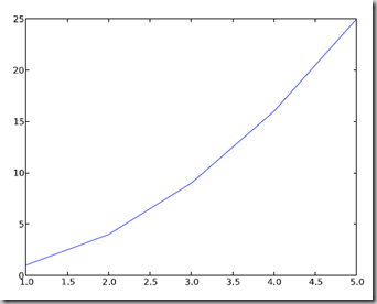
x = [1, 2, 3, 4, 5]# Make an array of x values
y = [1, 4, 9, 16, 25]# Make an array of y values for each x value
pl.plot(x, y)# use pylab to plot x and y
pl.show()# show the plot on the screen
2.1.2 散点图 Scatter plots
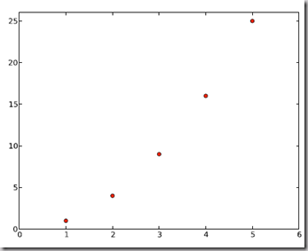
把pl.plot(x, y)改成pl.plot(x, y, 'o')即可,下图的蓝色版本
2.2 美化 Making things look pretty
2.2.1 线条颜色 Changing the line color
红色:把pl.plot(x, y, 'o')改成pl.plot(x, y, ’or’)

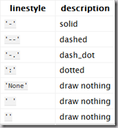
2.2.2 线条样式 Changing the line style
虚线:plot(x,y, '--')
2.2.3 marker样式 Changing the marker style
蓝色星型markers:plot(x,y, ’b*’)
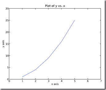
2.2.4 图和轴标题以及轴坐标限度 Plot and axis titles and limits
import numpy as np
import pylab as pl
x = [1, 2, 3, 4, 5]# Make an array of x values
y = [1, 4, 9, 16, 25]# Make an array of y values for each x value
pl.plot(x, y)# use pylab to plot x and y
pl.title(’Plot of y vs. x’)# give plot a title
pl.xlabel(’x axis’)# make axis labels
pl.ylabel(’y axis’)
pl.xlim(0.0, 7.0)# set axis limits
pl.ylim(0.0, 30.)
pl.show()# show the plot on the screen
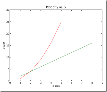
2.2.5 在一个坐标系上绘制多个图 Plotting more than one plot on the same set of axes
做法是很直接的,依次作图即可:
import numpy as np
import pylab as pl
x1 = [1, 2, 3, 4, 5]# Make x, y arrays for each graph
y1 = [1, 4, 9, 16, 25]
x2 = [1, 2, 4, 6, 8]
y2 = [2, 4, 8, 12, 16]
pl.plot(x1, y1, ’r’)# use pylab to plot x and y
pl.plot(x2, y2, ’g’)
pl.title(’Plot of y vs. x’)# give plot a title
pl.xlabel(’x axis’)# make axis labels
pl.ylabel(’y axis’)
pl.xlim(0.0, 9.0)# set axis limits
pl.ylim(0.0, 30.)
pl.show()# show the plot on the screen
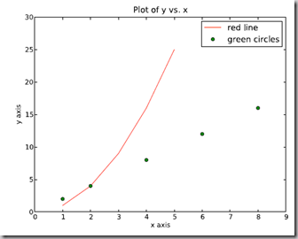
2.2.6 图例 Figure legends
pl.legend((plot1, plot2), (’label1, label2’), 'best’, numpoints=1)
其中第三个参数表示图例放置的位置:'best’‘upper right’, ‘upper left’, ‘center’, ‘lower left’, ‘lower right’.
如果在当前figure里plot的时候已经指定了label,如plt.plot(x,z,label="$cos(x^2)$"),直接调用plt.legend()就可以了哦。
import numpy as np
import pylab as pl
x1 = [1, 2, 3, 4, 5]# Make x, y arrays for each graph
y1 = [1, 4, 9, 16, 25]
x2 = [1, 2, 4, 6, 8]
y2 = [2, 4, 8, 12, 16]
plot1 = pl.plot(x1, y1, ’r’)# use pylab to plot x and y : Give your plots names
plot2 = pl.plot(x2, y2, ’go’)
pl.title(’Plot of y vs. x’)# give plot a title
pl.xlabel(’x axis’)# make axis labels
pl.ylabel(’y axis’)
pl.xlim(0.0, 9.0)# set axis limits
pl.ylim(0.0, 30.)
pl.legend([plot1, plot2], (’red line’, ’green circles’), ’best’, numpoints=1)# make legend
pl.show()# show the plot on the screen
2.3 直方图 Histograms
import numpy as np
import pylab as pl
# make an array of random numbers with a gaussian distribution with
# mean = 5.0
# rms = 3.0
# number of points = 1000
data = np.random.normal(5.0, 3.0, 1000)
# make a histogram of the data array
pl.hist(data)
# make plot labels
pl.xlabel(’data’)
pl.show()
如果不想要黑色轮廓可以改为pl.hist(data, histtype=’stepfilled’)
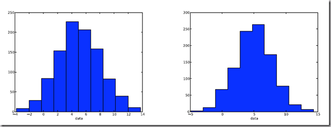
2.3.1 自定义直方图bin宽度 Setting the width of the histogram bins manually
增加这两行
bins = np.arange(-5., 16., 1.) #浮点数版本的range
pl.hist(data, bins, histtype=’stepfilled’)
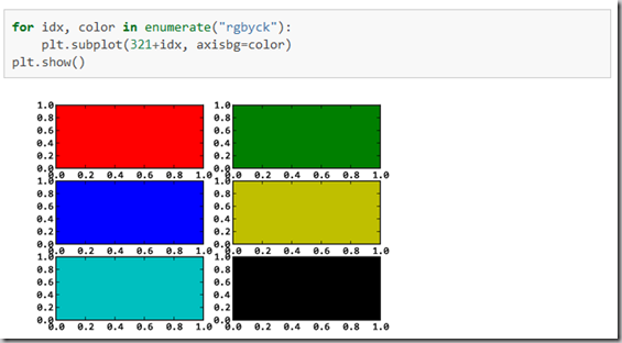
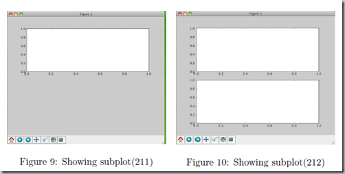
3 同一画板上绘制多幅子图 Plotting more than one axis per canvas
如果需要同时绘制多幅图表的话,可以是给figure传递一个整数参数指定图标的序号,如果所指定
序号的绘图对象已经存在的话,将不创建新的对象,而只是让它成为当前绘图对象。
fig1 = pl.figure(1)
pl.subplot(211)
subplot(211)把绘图区域等分为2行*1列共两个区域, 然后在区域1(上区域)中创建一个轴对象. pl.subplot(212)在区域2(下区域)创建一个轴对象。
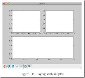
You can play around with plotting a variety of layouts. For example, Fig. 11 is created using the following commands:
f1 = pl.figure(1)
pl.subplot(221)
pl.subplot(222)
pl.subplot(212)
当绘图对象中有多个轴的时候,可以通过工具栏中的Configure Subplots按钮,交互式地调节轴之间的间距和轴与边框之间的距离。如果希望在程序中调节的话,可以调用subplots_adjust函数,它有left, right, bottom, top, wspace, hspace等几个关键字参数,这些参数的值都是0到1之间的小数,它们是以绘图区域的宽高为1进行正规化之后的坐标或者长度。
pl.subplots_adjust(left=0.08, right=0.95, wspace=0.25, hspace=0.45)
4 绘制文件中的数据Plotting data contained in files
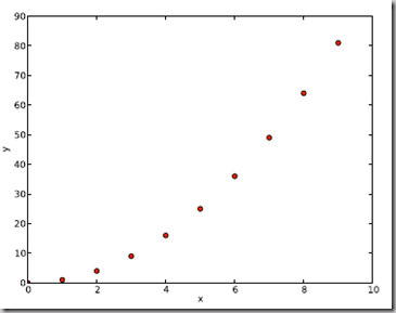
4.1 从Ascii文件中读取数据 Reading data from ascii files
读取文件的方法很多,这里只介绍一种简单的方法,更多的可以参考官方文档和NumPy快速处理数据(文件存取)。
numpy的loadtxt方法可以直接读取如下文本数据到numpy二维数组
**********************************************
# fakedata.txt
0 0
1 1
2 4
3 9
4 16
5 25
6 36
7 49
8 64
9 81
0 0
1 1
2 4
3 9
4 16
5 25
6 36
7 49
8 64
9 81
**********************************************
import numpy as np
import pylab as pl
# Use numpy to load the data contained in the file
# ’fakedata.txt’ into a 2-D array called data
data = np.loadtxt(’fakedata.txt’)
# plot the first column as x, and second column as y
pl.plot(data[:,0], data[:,1], ’ro’)
pl.xlabel(’x’)
pl.ylabel(’y’)
pl.xlim(0.0, 10.)
pl.show()
4.2 写入数据到文件 Writing data to a text file
写文件的方法也很多,这里只介绍一种可用的写入文本文件的方法,更多的可以参考官方文档。
import numpy as np
# Let’s make 2 arrays (x, y) which we will write to a file
# x is an array containing numbers 0 to 10, with intervals of 1
x = np.arange(0.0, 10., 1.)
# y is an array containing the values in x, squared
y = x*x
print ’x = ’, x
print ’y = ’, y
# Now open a file to write the data to
# ’w’ means open for ’writing’
file = open(’testdata.txt’, ’w’)
# loop over each line you want to write to file
for i in range(len(x)):
# make a string for each line you want to write
# ’\t’ means ’tab’
# ’\n’ means ’newline’
# ’str()’ means you are converting the quantity in brackets to a string type
txt = str(x[i]) + ’\t’ + str(y[i]) + ’ \n’
# write the txt to the file
file.write(txt)
# Close your file
file.close()
对LaTeX数学公式的支持
Matlplotlib对LaTeX有一定的支持,如果记得使用raw字符串语法会很自然:
xlabel(r"$\frac{x^2}{y^4}$")
在matplotlib里面,可以使用LaTex的命令来编辑公式,只需要在字符串前面加一个“r”即可
Here is a simple example:
# plain text
plt.title('alpha > beta')
produces “alpha > beta”.
Whereas this:

produces "
 ".
".
这里给大家看一个简单的例子。
import matplotlib.pyplot as plt
x = arange(1,1000,1)
r = -2
c = 5
y = [5*(a**r) for a in x]
fig = plt.figure()
ax = fig.add_subplot(111)
ax.loglog(x,y,label = r"$y = \frac{1}{2\sigma_1^2}, c=5,\sigma_1=-2$")
ax.legend()
ax.set_xlabel(r"x")
ax.set_ylabel(r"y")
程序执行结果如图3所示,这实际上是一个power-law的例子,有兴趣的朋友可以继续google之。
再看一个《用Python做科学计算》中的简单例子,下面的两行程序通过调用plot函数在当前的绘图对象中进行绘图:
plt.plot(x,y,label="$sin(x)$",color="red",linewidth=2)
plt.plot(x,z,"b--",label="$cos(x^2)$")
plot函数的调用方式很灵活,第一句将x,y数组传递给plot之后,用关键字参数指定各种属性:
label : 给所绘制的曲线一个名字,此名字在图示(legend)中显示。只要在字符串前后添加"$"符号,matplotlib就会使用其内嵌的latex引擎绘制的数学公式。
color : 指定曲线的颜色
linewidth : 指定曲线的宽度
详细的可以参考matplotlib官方教程:
有几个问题:
matplotlib.rcParams属性字典
想要它正常工作,在matplotlibrc配置文件中需要设置text.markup = "tex"。
如果你希望图表中所有的文字(包括坐标轴刻度标记)都是LaTeX'd,需要在matplotlibrc中设置text.usetex = True。如果你使用LaTeX撰写论文,那么这一点对于使图表和论文中其余部分保持一致是很有用的。
对数坐标轴
在实际中,我们可能经常会用到对数坐标轴,这时可以用下面的三个函数来实现
ax.semilogx(x,y) #x轴为对数坐标轴
ax.semilogy(x,y) #y轴为对数坐标轴
ax.loglog(x,y) #双对数坐标轴
学习资源
Gnuplot的介绍
官方英文资料:
matplotlib技巧集(绘制不连续函数的不连续点;参数曲线上绘制方向箭头;修改缺省刻度数目;Y轴不同区间使用不同颜色填充的曲线区域。)
这篇关于python 绘图库matplotlib-_Python图表绘制:matplotlib绘图库入门的文章就介绍到这儿,希望我们推荐的文章对编程师们有所帮助!