本文主要是介绍css3d六面体,希望对大家解决编程问题提供一定的参考价值,需要的开发者们随着小编来一起学习吧!
用到的css知识:
flex布局、transition动画、transform3d
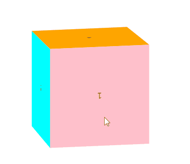
效果:
代码:
<!DOCTYPE html>
<html xmlns="http://www.w3.org/1999/xhtml">
<head><meta http-equiv="Content-Type" content="text/html; charset=utf-8" /><title></title><style type="text/css">* {margin: 0;padding: 0;}html, body {width: 100%;height: 100%;}body {display: flex;justify-content: center;align-items: center;}#box {position: relative;width: 200px;height: 200px;border: 0px solid red;perspective: 5000px;transform-style: preserve-3d;transform: rotateX(30deg) rotateY(30deg);transition: all 6s;}#box:hover {transform: rotateX(390deg) rotateY(390deg);}#box div {display: flex;justify-content: center;align-items: center;position: absolute;width: 200px;height: 200px;backface-visibility: hidden;}#box div:nth-child(1) {background-color: pink;transform: translateZ(100px);}#box div:nth-child(2) {background-color: #2196F3;transform: rotateX(90deg) translateZ(100px);}#box div:nth-child(3) {background-color: azure;transform: rotateX(180deg) translateZ(100px);}#box div:nth-child(4) {background-color: orange;transform: rotateX(270deg) translateZ(100px);}#box div:nth-child(5) {background-color: cyan;transform: rotateY(90deg) translateZ(100px);}#box div:nth-child(6) {background-color: green;transform: rotateY(270deg) translateZ(100px);}</style>
</head>
<body><div id="box"><div>1</div><div>2</div><div>3</div><div>4</div><div>5</div><div>6</div></div>
</body>
</html>
这篇关于css3d六面体的文章就介绍到这儿,希望我们推荐的文章对编程师们有所帮助!


