本文主要是介绍前端三剑客 —— CSS (第三节),希望对大家解决编程问题提供一定的参考价值,需要的开发者们随着小编来一起学习吧!
目录
上节回顾:
1.CSS使用有以下几种样式;
2.选择器
1.基本选择器
2.包含选择器
3.属性选择器 []
4.伪类选择器 :
5.伪元素选择器 ::before :after
3.常见样式的使用
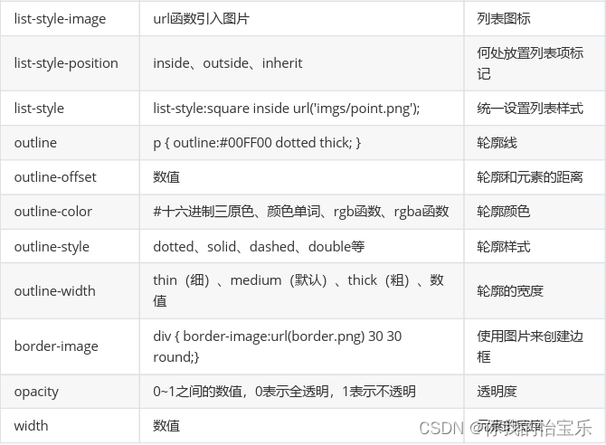
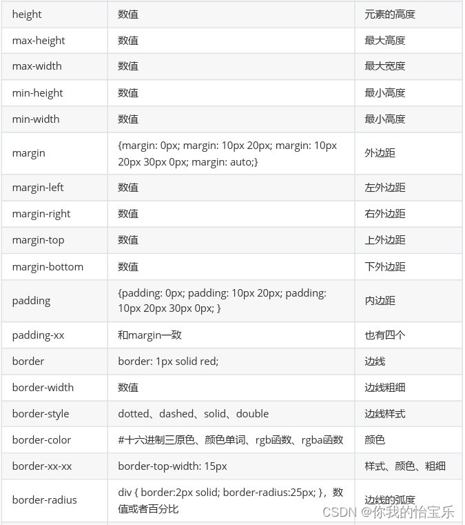
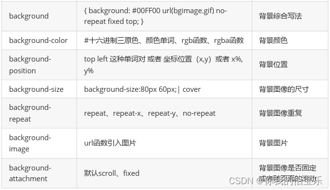
常见样式参考表
一些特殊样式
媒体查询
自定义字体
变换效果
translate()方法
rotate()方法
scale()方法
skew()方法
matrix()方法
上节回顾:
1.CSS使用有以下几种样式;
1.行内样式
2.页面样式
3.外部样式(link标签,@import)
2.选择器
1.基本选择器
1.ID选择器
2.标签选择器
3.类选择器
4.通用选择器
2.包含选择器
1.子选择器 >
2.后代选择器 空格
3.并列选择器 ,
4.交集选择器 选择器.选择器
3.属性选择器 []
1.完全匹配 =
2.包含匹配 *=
3.以什么开头 ^=
4.以什么结尾 $=
4.伪类选择器 :
5.伪元素选择器 ::before :after
3.常见样式的使用
常见样式参考表

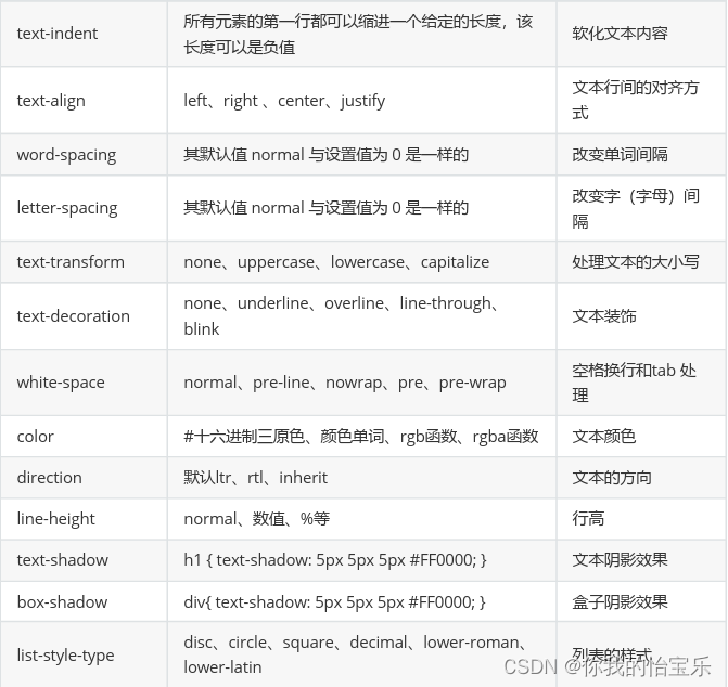
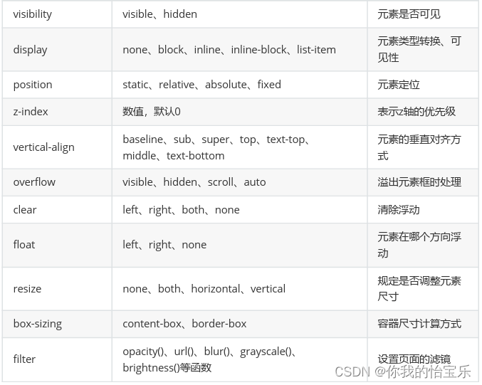
text-shadow x轴 y轴 阴影的模糊程度 阴影的颜色
box-shadow
border-radio 实现圆角
margin 内边距
padding 外边距
background
样式(CSS):
body {
/*background-color: #666666;*/
}
.content {
width: 600px;
font-family: "微软雅黑","宋体";
font-size: 16px;
line-height: 35px;
/*font-weight: bold;*/
text-shadow: -5px -5px 2px #317FE5; /* offset-x | offset-y | blur
radius | color */
position: fixed;
top: 0;
left: 0;
}
.box {
margin: 30px auto;
width: 700px;
height: 100px;
background-color: grey;
color: white;
/*text-align: justify;*/
word-spacing: 10px;
letter-spacing: 5px;
text-transform: lowercase;
text-decoration: underline;
direction: inherit;
box-shadow: 5px 5px 5px #ff0000; /* offset-x | offset-y | blur-radius |
color */
/*border: 2px solid green;*/
border-width: 2px;
border-style: solid;
border-color: green;
/*border-radius: 5px;*/
border-bottom-left-radius: 5px;
border-top-right-radius: 15px;
/*visibility: hidden;*/
/*display: none;*/
}
input {
outline: blue 1px solid;
}
.box1 {
margin-top: 30px;
width: 300px;
height: 300px;
/*background-color: #317FE5;*/
border-radius: 50%;
background: #317FE5 url("../image/5.jpeg") left top;
}
.box2 {
margin: 30px;
width: 700px;
height: 300px;
border: 1px solid red;
background: url("../image/mybatis-logo.png") no-repeat 50px 5px;
}
页面(HTML):
<!DOCTYPE html>
<html lang="en">
<head>
<meta charset="UTF-8">
<title>常见样式的使用</title>
<link rel="stylesheet" href="css/index.css">
</head>
<body>
<div class="content">
中新网2月20日电 据香港《明报》报道,澳门赌王何鸿燊与三太陈婉珍的27岁儿子何猷启,被视为“城中
钻石笋盘”,家底丰厚兼遗传了赌王的帅气。2018年农历新年,他公布向内地女友GiGi求婚成功,随后传
媒追问他有关婚礼的安排却低调避谈。
</div>
<div class="box">澳门赌王何鸿燊与三太陈婉珍的27岁儿子何猷启,hello HTML css</div>
<input type="text" name="username" placeholder="姓名">
<div class="box1"></div>
<div class="box2"></div>
</body>
</html>
一些特殊样式
媒体查询
有时,我们需要显示的区域根据不同设备显示不一样的效果,这时就可以使用媒体查询。而使用媒体查询我们就需要使用到@media来实现。
<!DOCTYPE html>
<html lang="en">
<head>
<meta charset="UTF-8">
<title>媒体查询</title>
<style>
.box{
width: 100%;
height: 500px;
background-color: #317FE5;
}
@media screen and (max-width: 500px) {
.box {
background-color: red;
}
}
@media screen and (min-width: 768px){
.box {
background-color: blue;
}
}
@media screen and (min-width: 1200px){
.box {
background-color: #C44F00;
}
}
</style>
</head>
<body>
<div class="box"></div>
</body>
</html>
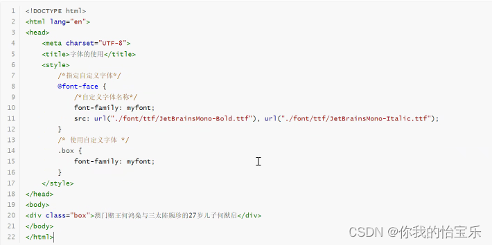
自定义字体
由于浏览器默认的使用的字体是微软雅黑,但有时候我们希望使用我们自己指定的字体,这时就需要使用@font-face来实现
变换效果
在CSS中有以下几种变换效果:translate()移动、rotate()转换、scale()缩放、shew()、mareix()
translate()方法
它是一种平移效果,从元素某个位置移动到另一个位置。在使用过程中,需要通过X轴和Y轴来实现。
<!DOCTYPE html>
<html lang="en">
<head>
<meta charset="UTF-8">
<title>translate</title>
<style>
div {
width: 200px;
height: 200px;
}
div.box1 {
background-color: #317FE5;
z-index: 900000;
}
div.box2 {
background-color: orange;
/*transform: translate(200px, 30px);*/
/*transform: translate(100px, -100px);*/
/*transform: translate(50px);*/
/*transform: translateX(100px);*/
transform: translateY(100px);
z-index: 0;
}
</style>
</head>
<body>
<div class="box1"></div>
<div class="box2"></div>
</body>
</html>
rotate()方法
这个效果是·让某个元素进行旋转,需要指定旋转的角度。负数为逆时针旋转,正数为顺时针旋转,旋转单位是deg。
<!DOCTYPE html>
<html lang="en">
<head>
<meta charset="UTF-8">
<title>rotate</title>
<style>
div {
width: 200px;
height: 200px;
}
div.box1 {
background-color: #317FE5;
transform: rotate(-20deg);
}
div.box2 {
background-color: orange;
transform: rotate(45deg);
}
</style>
</head>
<body>
<div class="box1"></div>
<div class="box2"></div>
</body>
</html>
scale()方法
这个方法的作用是让某个元素的尺寸增加或者减少,会根据给定的宽度(x轴)和高度(y轴)
<!DOCTYPE html>
<html lang="en">
<head>
<meta charset="UTF-8">
<title>scale</title>
<style>
div {
width: 200px;
height: 200px;
}
div.box1 {
background-color: #317FE5;
transform: scale(0.5, 0.5);
}
div.box2 {
background-color: orange;
/*transform: scale(1.5, 1.5);*/
/*transform: scale(2);*/
transform: scaleX(2);
}
.container {
position: absolute;
left: 200px;
top: 0;
}
</style>
</head>
<body>
<div class="container">
<div class="box1"></div>
<div class="box2"></div>
</div>
</body>
</html>
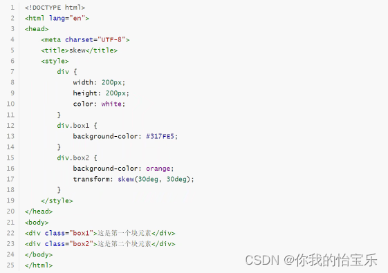
skew()方法
这个方法的作用是让元素翻转给定的角度,根据给定的水平线(x轴)和垂直线(y轴)来进行变换。
matrix()方法
这个方法可以实现前面几个效果。
<!DOCTYPE html>
<html lang="en">
<head>
<meta charset="UTF-8">
<title>matrix</title>
<style>
div {
width: 200px;
height: 200px;
color: white;
text-align: center;
}
div.box1 {
background-color: #317FE5;
}
div.box2 {
background-color: orange;
transform: matrix(0.86, 0.5, -0.5, 0.86, 0, 0); /* matrix(a, b, c, d, tx, ty) */
}
</style>
</head>
<body>
<div class="box1">这是第一个块元素</div>
<div class="box2">这是第二个块元素</div>
</body>
</html>
这篇关于前端三剑客 —— CSS (第三节)的文章就介绍到这儿,希望我们推荐的文章对编程师们有所帮助!


