本文主要是介绍MATLAB 的 plot 绘图,希望对大家解决编程问题提供一定的参考价值,需要的开发者们随着小编来一起学习吧!
文章目录
- Syntax
- Description
- 1. plot(X, Y)
- 2. plot(X, Y, LineSpec)
- 3. plot(X1, Y1, … , Xn, Yn)
- 4. plot(X1, Y1, LineSpec1, ... , Xn, Yn, LineSpecn)
- 5. plot(Y)
- 6. plot(Y, LineSpec)
- 7. plot(tbl, xvar, yvar)
- 8. plot(tbl, yvar)
- 9. plot(ax, ___)
- 10. plot(___, Name, Value)
- 11. p = plot(___)
- Examples
- Input Arguments
- x coordinates
- y coordinates
- LineSpec — Line style, marker, and color
- Name-Value Arguments
- Color — Line color
- LineStyle — Line style
- LineWidth — Line width
- Marker — Marker symbol
- MarkerIndices — Indices of data points at which to display markers
- MarkerEdgeColor — Marker outline color
- MarkerSize — Marker size
- DatetimeTickFormat — Format for datetime tick labels
- DurationTickFormat — Format for duration tick labels
- Tips
plot的作用: 2-D line plot
Syntax
- plot(X,Y)
- plot(X,Y,LineSpec)
- plot(X1,Y1,…,Xn,Yn)
- plot(X1,Y1,LineSpec1,…,Xn,Yn,LineSpecn)
- plot(Y)
- plot(Y,LineSpec)
- plot(tbl,xvar,yvar)
- plot(tbl,yvar)
- plot(ax,___)
- plot(___,Name,Value)
- p = plot(___)
Description
1. plot(X, Y)
plot(X, Y) creates a 2-D line plot of the data in Y versus the corresponding values in X.
- To plot a set of coordinates connected by line segments, specify X and Y as vectors of the same length. (要绘制由线段连接的一组坐标,指定 X 和 Y 为相同长度的向量。)
- To plot multiple sets of coordinates on the same set of axes, specify at least one of X or Y as a matrix. (若要在同一组轴上绘制多组坐标,请将 X 或 Y 中的至少一个指定为矩阵。)(这里指的是用一条 plot 语句绘制出多条曲线。)(X 的维度要等于 Y 的第 1 维或第 2 维,X 的维数决定了横坐标,Y 的和 X 不相等的那个维数决定了可以绘制出的曲线的条数。)
2. plot(X, Y, LineSpec)
plot(X, Y, LineSpec) creates the plot using the specified line style, marker, and color.
曲线的三个属性:style, marker, color.
3. plot(X1, Y1, … , Xn, Yn)
plot(X1, Y1, ... , Xn, Yn) plots multiple pairs of x- and y-coordinates on the same set of axes. Use this syntax as an alternative to specifying coordinates as matrices. (使用此语法作为将坐标指定为矩阵的替代方法。)(使用此方法可以不必将坐标指定为矩阵,将多组坐标都指定为等长度的向量,使用此语法即可用一条 plot 语句绘制出多条语句。)
4. plot(X1, Y1, LineSpec1, … , Xn, Yn, LineSpecn)
plot(X1, Y1, LineSpec1, ... ,Xn, Yn, LineSpecn) assigns specific line styles, markers, and colors to each x-y pair. You can specify LineSpec for some x-y pairs and omit it for others. For example, plot(X1, Y1, “o”, X2, Y2) specifies markers for the first x-y pair but not for the second pair.
5. plot(Y)
plot(Y) plots Y against an implicit set of x-coordinates. (plot(Y) 根据一组隐式的 X 坐标绘制 Y。)
- If Y is a vector, the x-coordinates range from 1 to length(Y).
- If Y is a matrix, the plot contains one line for each column in Y. The x-coordinates range from 1 to the number of rows in Y. (如果 Y 是一个矩阵, 那么 Y 的每一列都会绘制出一条线, X 坐标从 1 递增至 Y 的行数。)(注意,这里一定是以矩阵的每一列作为一个向量来绘制曲线,横坐标采用默认值。)
If Y contains complex numbers, MATLAB® plots the imaginary part of Y versus the real part of Y. If you specify both X and Y, the imaginary part is ignored. (如果 Y 包含复数,MATLAB® 绘制 Y 的虚部与 Y 的实部。如果同时指定 X 和 Y,则忽略虚部。)
6. plot(Y, LineSpec)
plot(Y, LineSpec) plots Y using implicit x-coordinates, and specifies the line style, marker, and color. (使用默认的 x 坐标,但是指定了曲线的属性。)
7. plot(tbl, xvar, yvar)
plot(tbl, xvar, yvar) plots the variables xvar and yvar from the table tbl. To plot one data set, specify one variable for xvar and one variable for yvar. To plot multiple data sets, specify multiple variables for xvar, yvar, or both. If both arguments specify multiple variables, they must specify the same number of variables. (since R2022a). (Plot (tbl, xvar, yvar) 绘制表 tbl 中的变量 xvar 和 yvar。要绘制一个数据集,请分别为 xvar 和 yvar 指定一个变量。若要绘制多个数据集,请为 xvar、yvar 或两者指定多个变量。如果两个参数都指定了多个变量,它们必须指定相同数量的变量。(自从 R2022a))
8. plot(tbl, yvar)
plot(tbl, yvar) plots the specified variable from the table against the row indices of the table. If the table is a timetable, the specified variable is plotted against the row times of the timetable. (since R2022a). (Plot (tbl, yvar) 根据表的行索引绘制表中的指定变量。如果表是时间表,则根据时间表的行时间绘制指定变量。(自从R2022a))
9. plot(ax, ___)
plot(ax, ___) displays the plot in the target axes. Specify the axes as the first argument in any of the previous syntaxes. (Plot (ax,___) 在指定的坐标轴上绘图。将坐标轴指定为第一个参数。)
10. plot(___, Name, Value)
plot(___, Name, Value) specifies Line properties using one or more name-value arguments. The properties apply to all the plotted lines. Specify the name-value arguments after all the arguments in any of the previous syntaxes. For a list of properties, see Line Properties. (plot(___,Name, Value) 使用一个或多个名称-值参数指定线条属性。这些属性适用于所有绘制的线条。在所有参数之后指定名称-值参数。有关属性列表,请参见 Line Properties (线条属性) )
11. p = plot(___)
p = plot(___) returns a Line object or an array of Line objects. Use p to modify properties of the plot after creating it. For a list of properties, see Line Properties. (p = plot(___) 返回一个 Line 对象或一个 Line 对象数组。使用 p 在创建绘图后修改其属性。)
11 种语法可以分为以下三类:
| Vector and Matrix Data | Table Data | Additional Options |
|---|---|---|
| plot(X, Y) | plot(tbl, xvar, yvar) | plot(ax, ___) |
| plot(X, Y, LineSpec) | plot(tbl, yvar) | plot(___, Name, Value) |
| plot(X1, Y1, … , Xn, Yn) | p = plot(___) | |
| plot(X1, Y1, LineSpec1, … , Xn, Yn, LineSpecn) | ||
| plot(Y) | ||
| plot(Y, LineSpec) |
Examples
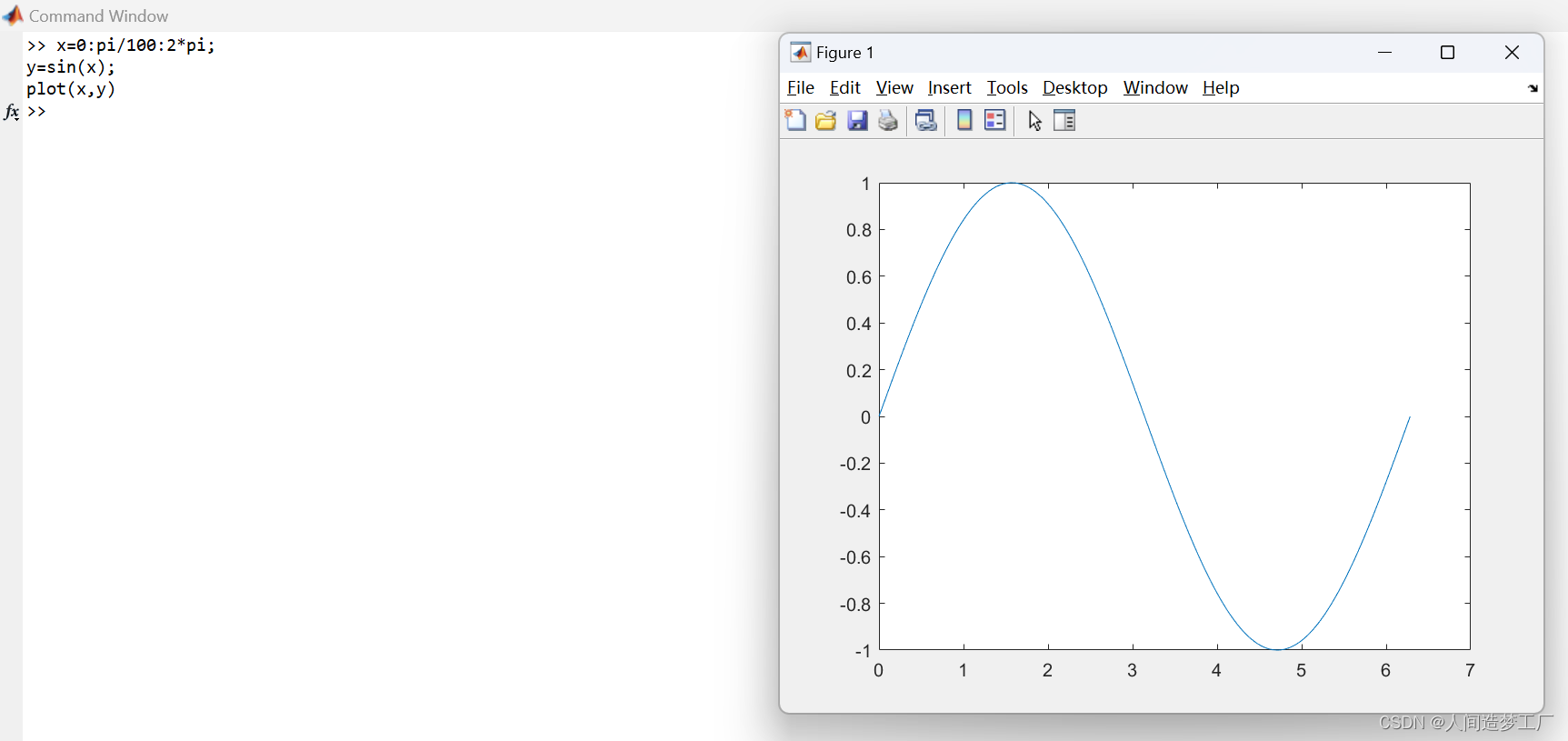
1.Create x as a vector of linearly spaced values between 0 and 2π. Use an increment of π/100 between the values. Create y as sine values of x. Create a line plot of the data.
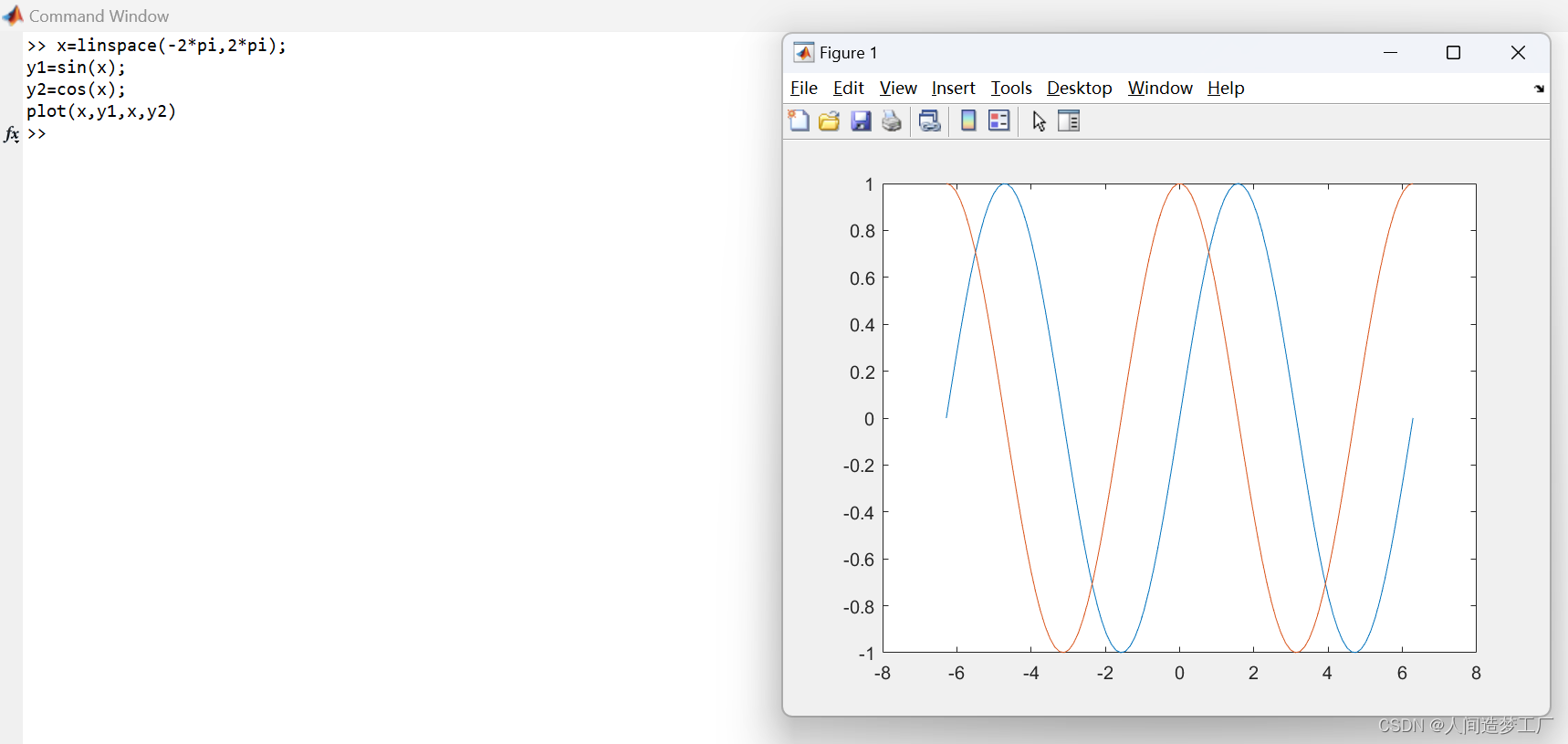
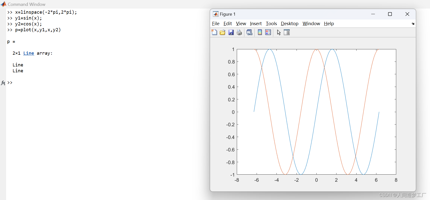
2.Define x as 100 linearly spaced values between −2π and 2π. Define y1 and y2 as sine and cosine values of x. Create a line plot of both sets of data. (创建两组数据的线形图。)
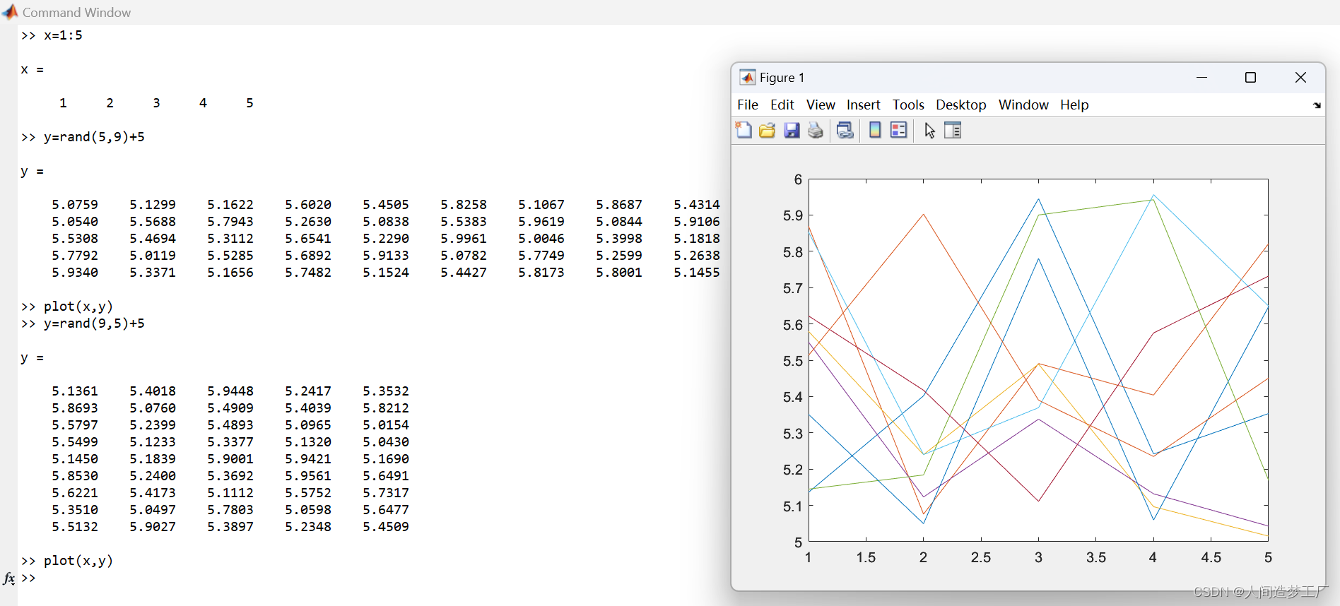
3.Create a 2-D line plot of a matrix. MATLAB® plots each matrix column as a separate line.
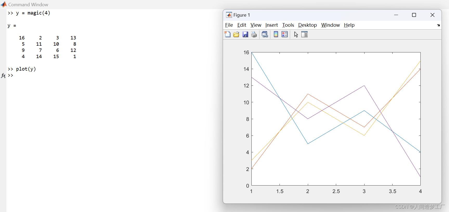
当 plot(X, Y) 中 X 为向量,而 Y 为矩阵时,X 的维度要等于 Y 的第 1 维或第 2 维,X 的维数决定了横坐标,Y 的和 X 不相等的那个维数决定了可以绘制出的曲线的条数。
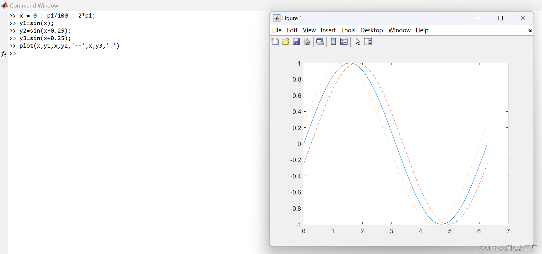
4.Plot three sine curves with a small phase shift between each line. Use the default line style for the first line. Specify a dashed line style for the second line and a dotted line style for the third line. (绘制三条正弦曲线,每条线之间有一个小的相移。第一行使用默认的行样式。为第二行指定虚线样式,为第三行指定点虚线样式。)
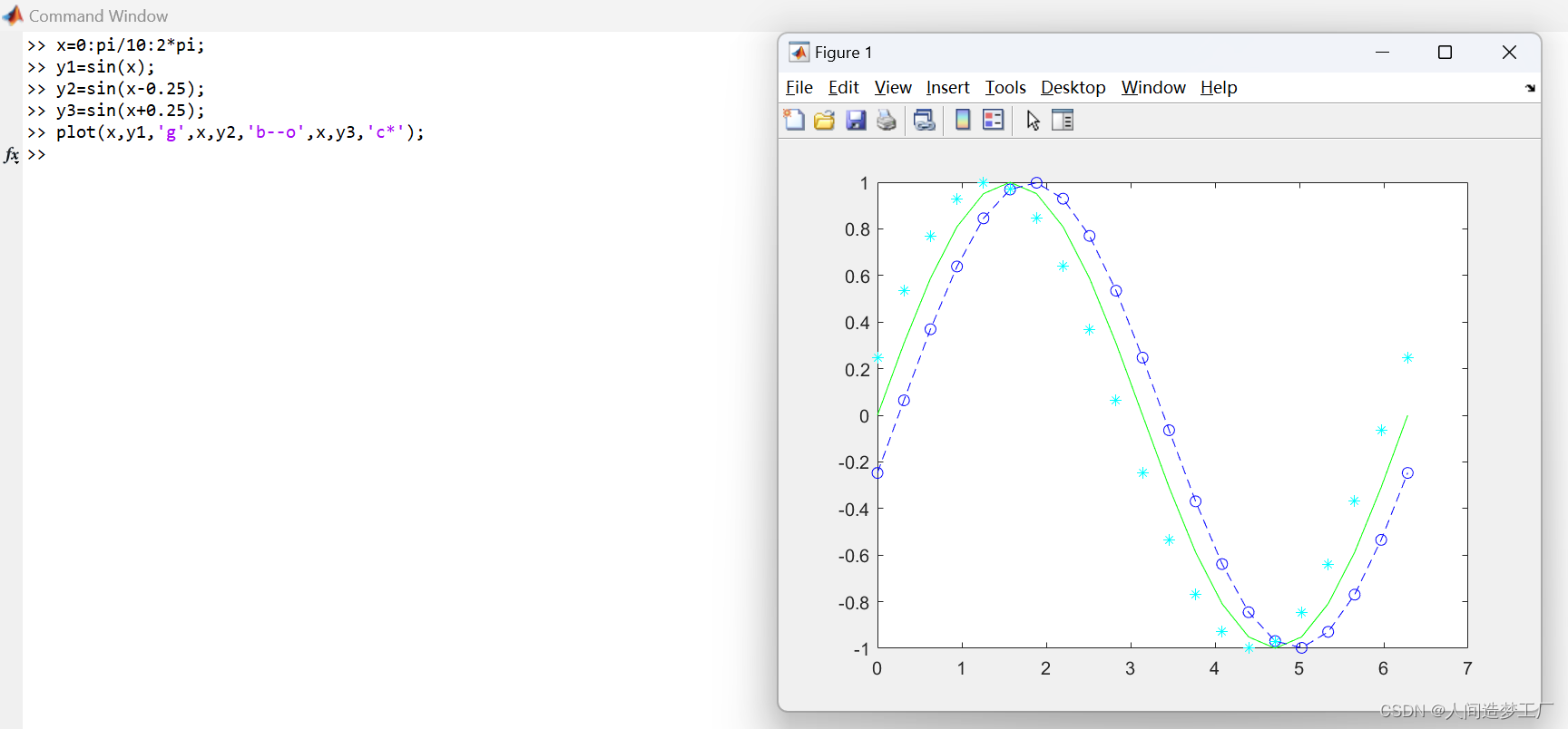
5.Plot three sine curves with a small phase shift between each line. Use a green line with no markers for the first sine curve. Use a blue dashed line with circle markers for the second sine curve. Use only cyan star markers for the third sine curve.
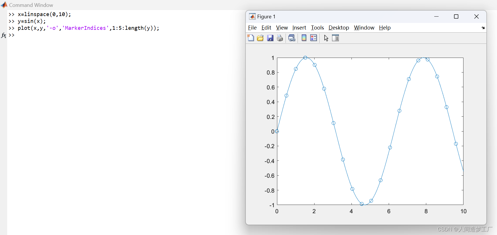
6.Display Markers at Specific Data Points. Create a line plot and display markers at every fifth data point by specifying a marker symbol and setting the MarkerIndices property as a name-value pair.
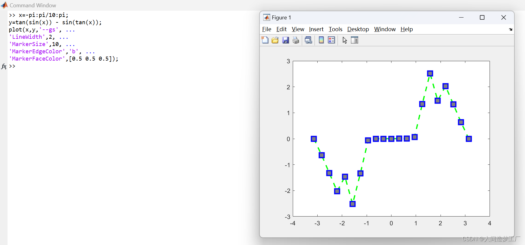
7.Create a line plot and use the LineSpec option to specify a dashed green line with square markers. Use Name,Value pairs to specify the line width, marker size, and marker colors. Set the marker edge color to blue and set the marker face color using an RGB color value.
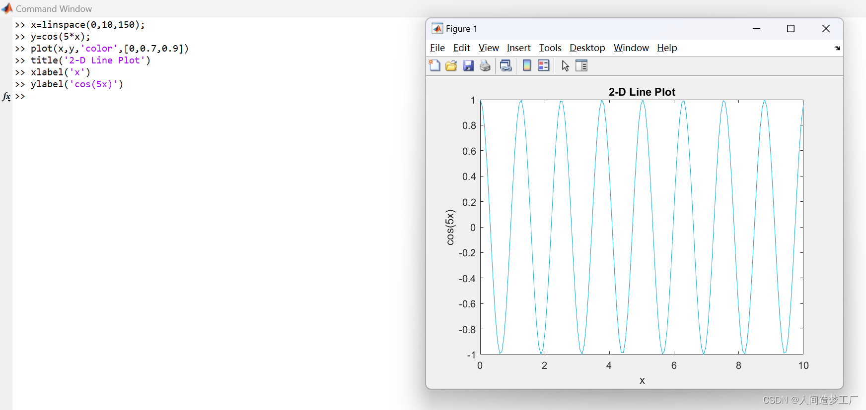
8.Use the linspace function to define x as a vector of 150 values between 0 and 10. Define y as cosine values of x. Create a 2-D line plot of the cosine curve. Change the line color to a shade of blue-green using an RGB color value. (使用RGB颜色值将线条颜色更改为蓝绿阴影。)Add a title and axis labels to the graph using the title, xlabel, and ylabel functions.
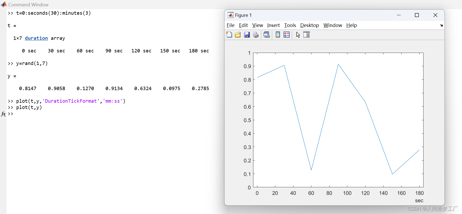
9.Plot Durations and Specify Tick Format. Define t as seven linearly spaced duration values between 0 and 3 minutes. Plot random data and specify the format of the duration tick marks using the ‘DurationTickFormat’ name-value pair argument.
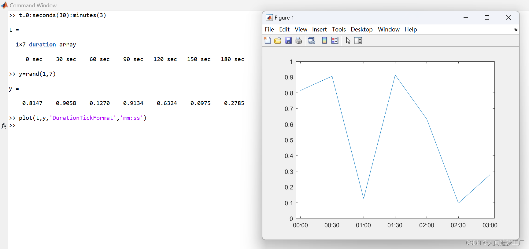
默认的情况:
10.Plot Coordinates from a Table
(Since R2022a)
A convenient way to plot data from a table is to pass the table to the plot function and specify the variables to plot. Read weather.csv as a timetable tbl. Then display the first three rows of the table.
tbl = readtimetable("weather.csv");
tbl = sortrows(tbl);
head(tbl,3)

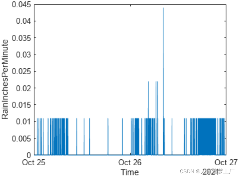
Plot the row times on the x-axis and the RainInchesPerMinute variable on the y-axis. When you plot data from a timetable, the row times are plotted on the x-axis by default. Thus, you do not need to specify the Time variable. Return the Line object as p. Notice that the axis labels match the variable names.
在x轴上绘制行时间,在y轴上绘制RainInchesPerMinute变量。在绘制时间表中的数据时,默认情况下会将行时间绘制在x轴上。因此,您不需要指定Time变量。将Line对象返回为p。注意,轴标签与变量名匹配。
p = plot(tbl,"RainInchesPerMinute");
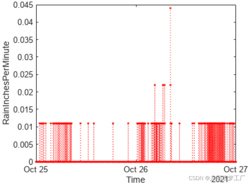
To modify aspects of the line, set the LineStyle, Color, and Marker properties on the Line object. For example, change the line to a red dotted line with point markers.
p.LineStyle = ":";
p.Color = "red";
p.Marker = ".";
11.Plot Multiple Table Variables on One Axis
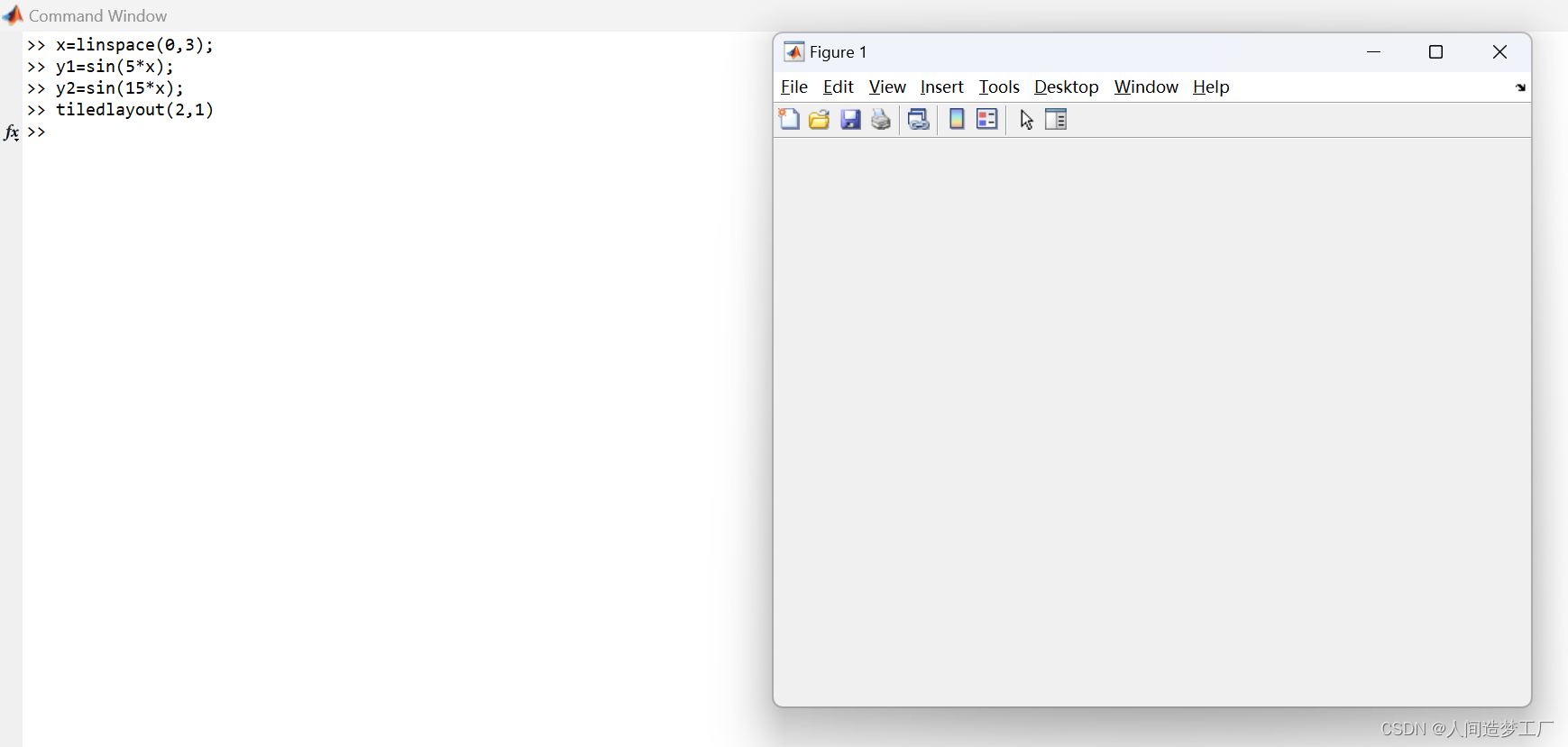
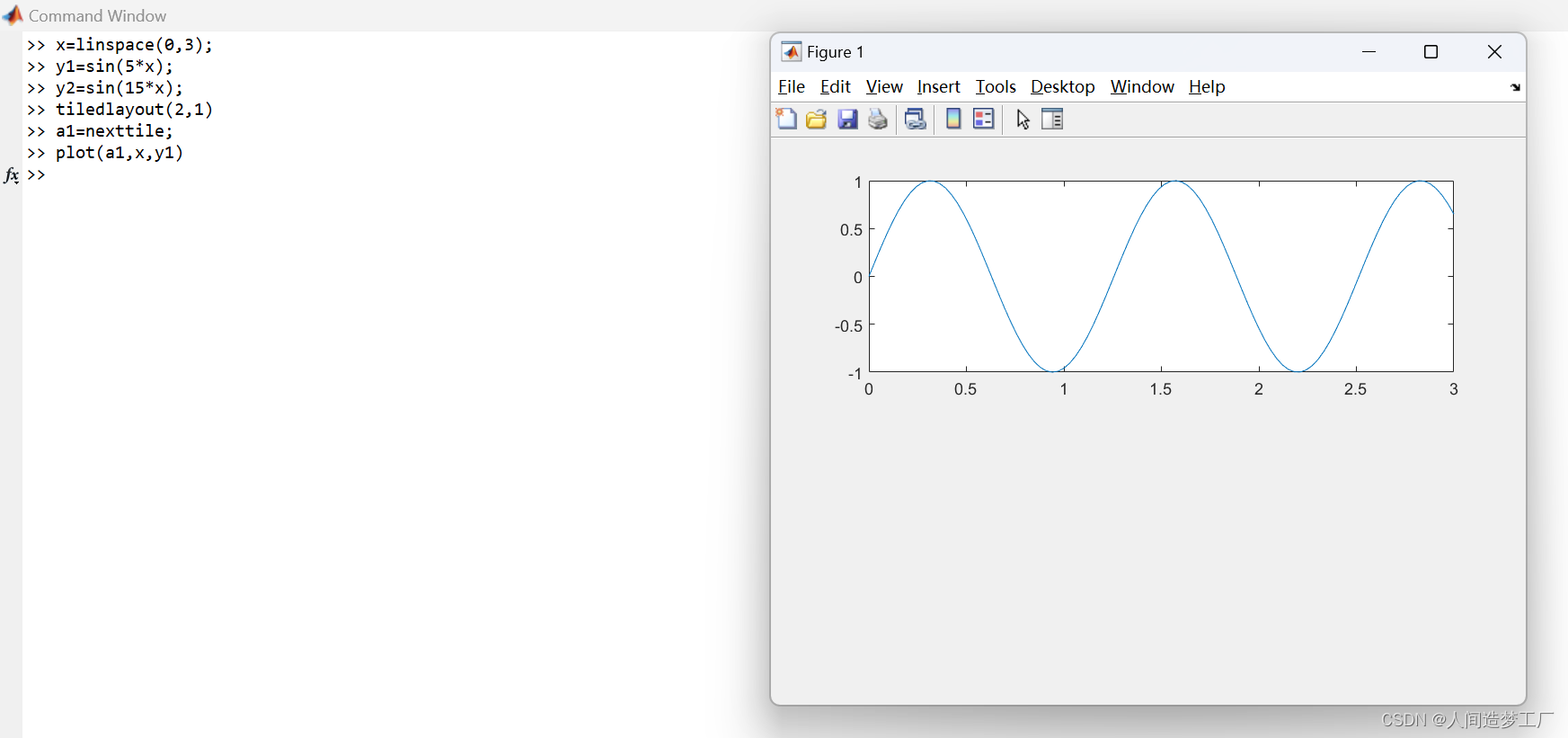
12.Specify Axes for Line Plot
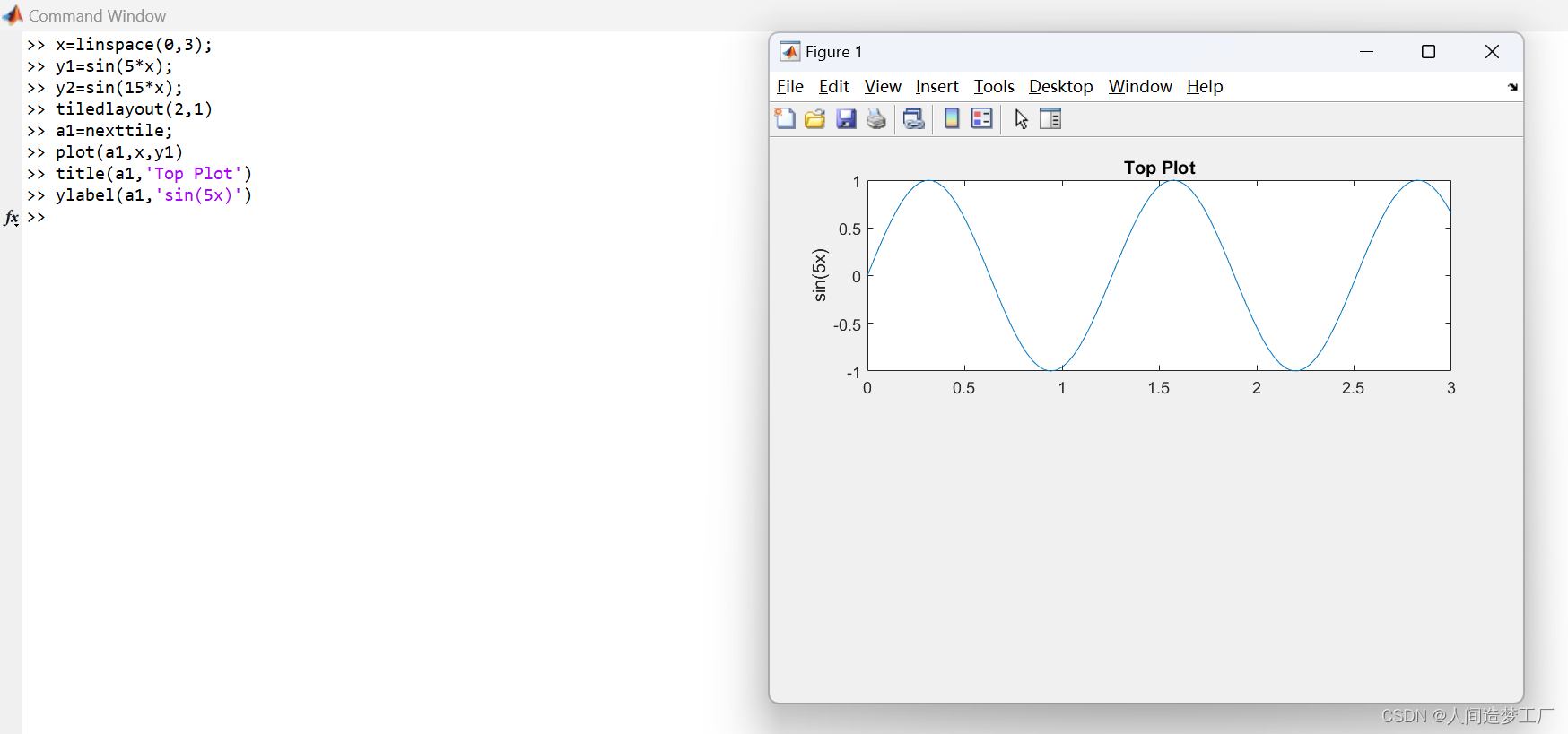
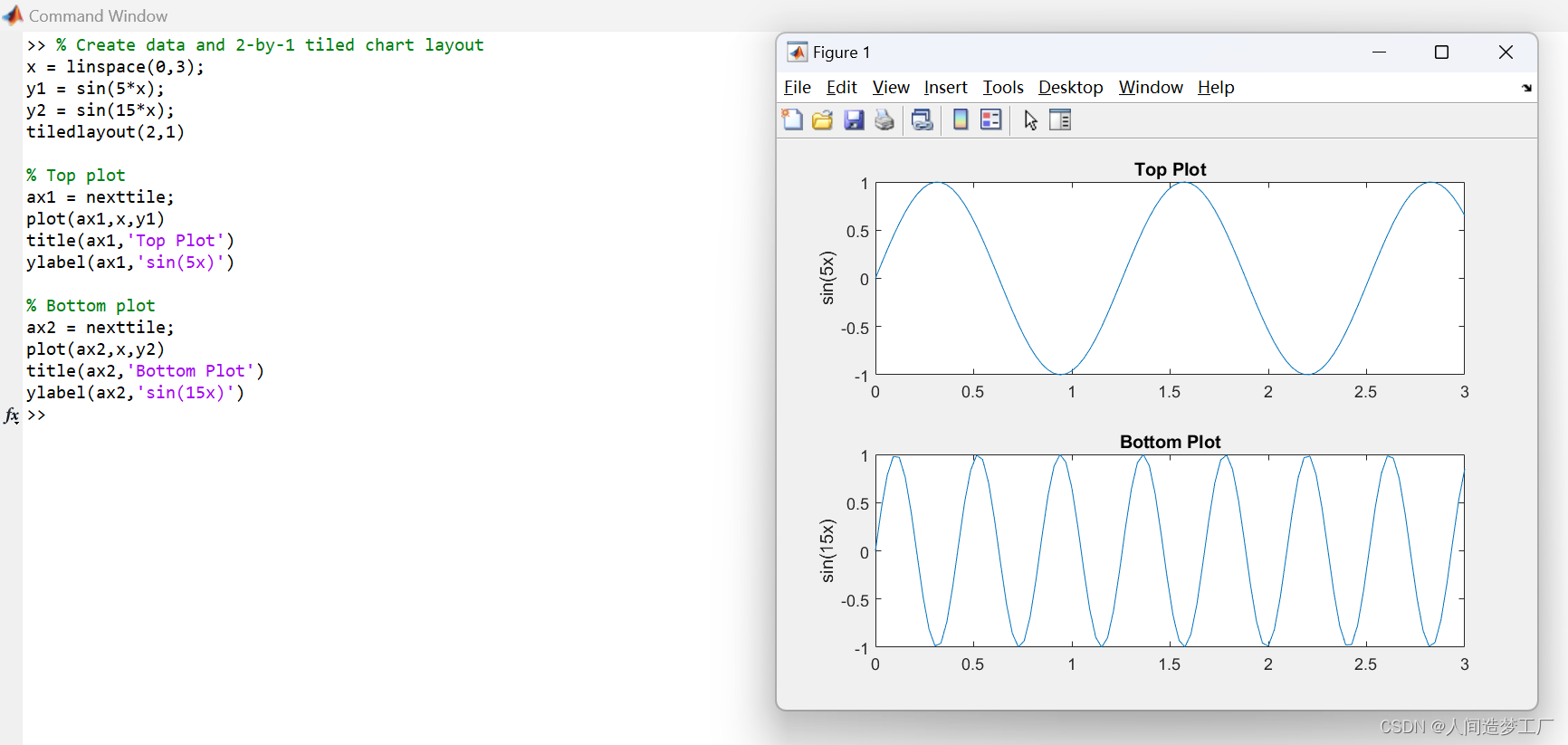
Starting in R2019b, you can display a tiling of plots using the tiledlayout and nexttile functions. Call the tiledlayout function to create a 2-by-1 tiled chart layout. Call the nexttile function to create an axes object and return the object as ax1. Create the top plot by passing ax1 to the plot function. Add a title and y-axis label to the plot by passing the axes to the title and ylabel functions. Repeat the process to create the bottom plot. (从R2019b开始,您可以使用tiledlayout和nexttile函数显示绘图的平铺。调用tiledlayout函数创建一个2 × 1的平铺图表布局。调用nexttile函数来创建一个坐标轴对象,并将该对象作为ax1返回。通过将ax1传递给plot函数来创建顶部的plot。通过将坐标轴传递给title和ylabel函数,向绘图添加标题和y轴标签。重复这个过程来创建底部的图。)
13.Modify Lines After Creation
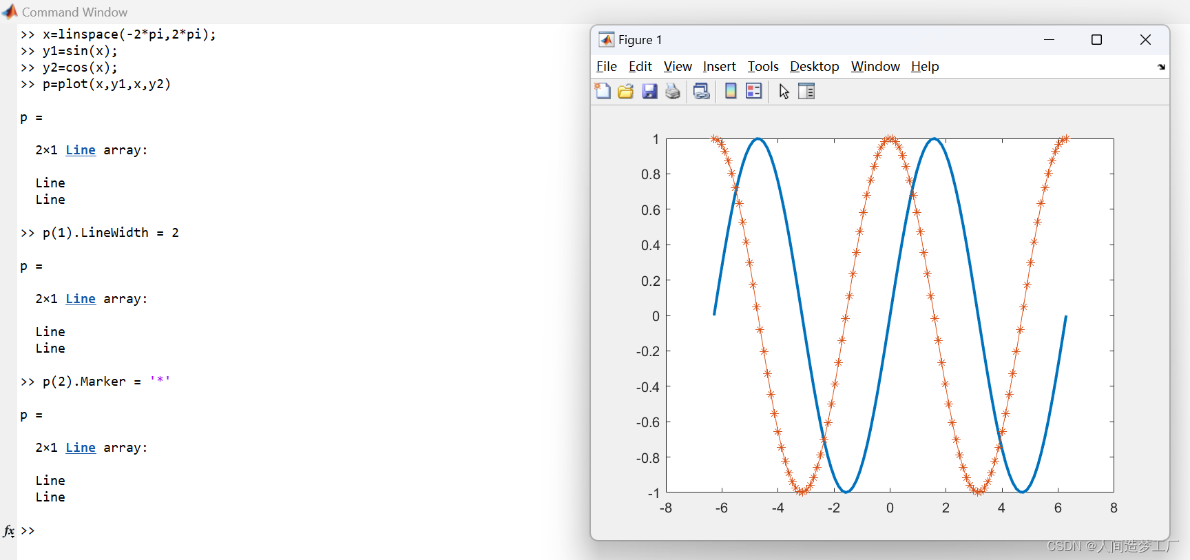
Define x as 100 linearly spaced values between −2π and 2π. Define y1 and y2 as sine and cosine values of x. Create a line plot of both sets of data and return the two chart lines in p.
Change the line width of the first line to 2. Add star markers to the second line. Use dot notation to set properties.
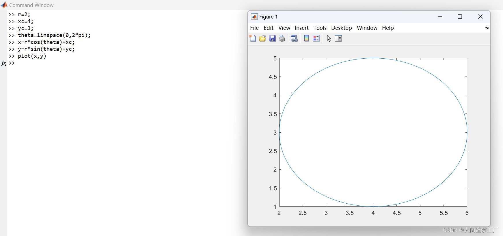
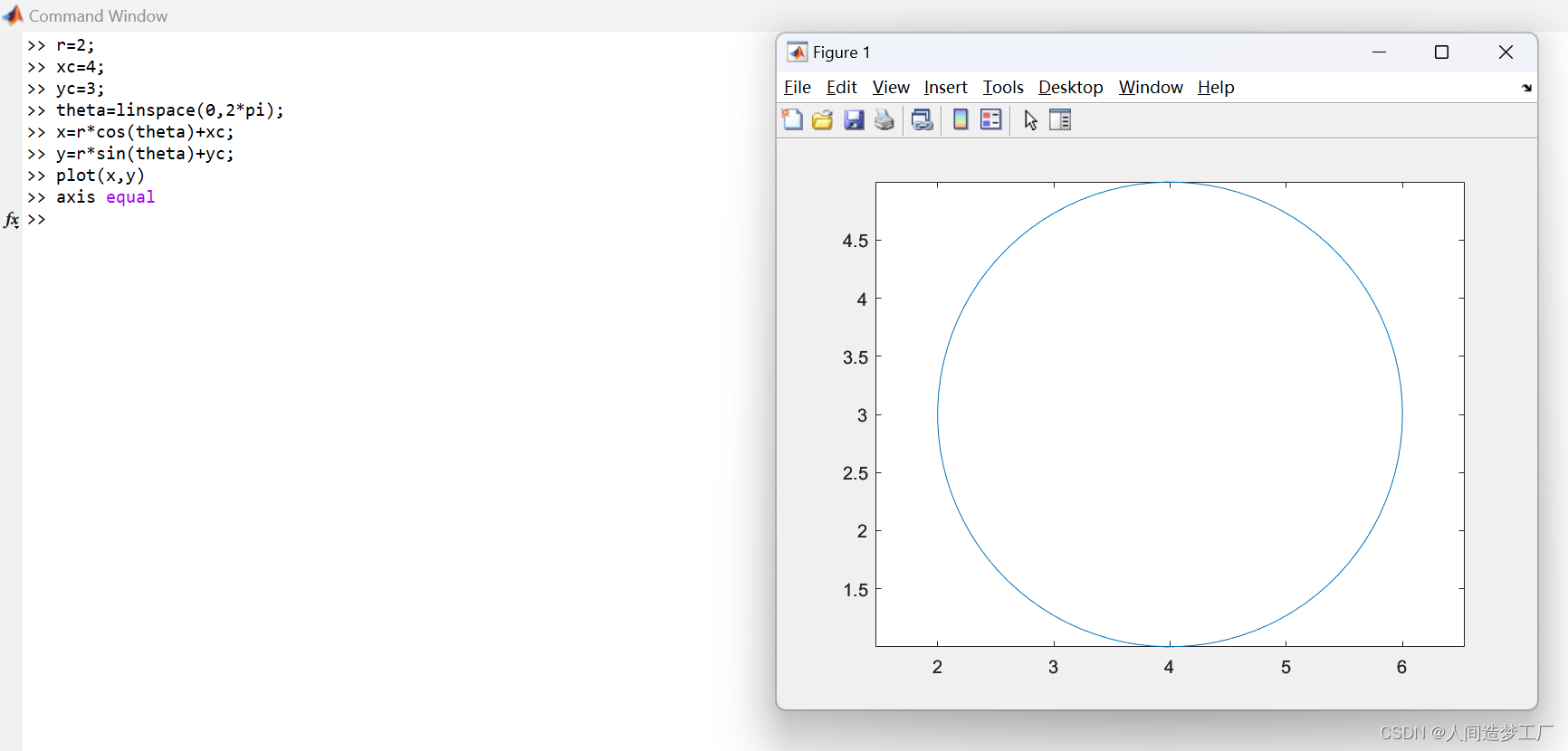
14.Plot Circle
Plot a circle centered at the point (4,3) with a radius equal to 2. Use axis equal to use equal data units along each coordinate direction.
Input Arguments
x coordinates
y coordinates
LineSpec — Line style, marker, and color
string | character vector
Line style, marker, and color, specified as a string or character vector containing symbols. (线条样式、标记和颜色,指定为包含符号的字符串或字符向量。) The symbols can appear in any order. You do not need to specify all three characteristics (line style, marker, and color). For example, if you omit the line style and specify the marker, then the plot shows only the marker and no line.
Example: “–or” is a red dashed line with circle markers
Name-Value Arguments
Specify optional pairs of arguments as Name1=Value1,…,NameN=ValueN, where Name is the argument name and Value is the corresponding value. Name-value arguments must appear after other arguments, but the order of the pairs does not matter.
Example: plot([0 1],[2 3],LineWidth=2)
Before R2021a, use commas to separate each name and value, and enclose Name in quotes.
Example: plot([0 1],[2 3],“LineWidth”,2)
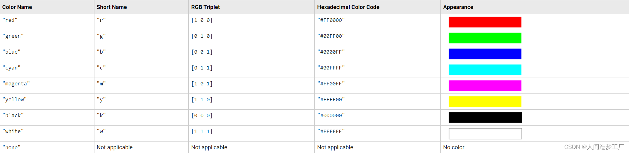
Color — Line color
[0 0.4470 0.7410] (default) | RGB triplet | hexadecimal color code | “r” | “g” | “b” | …
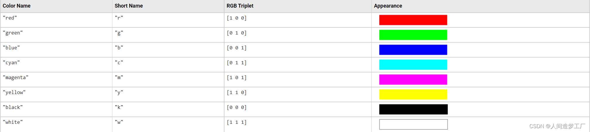
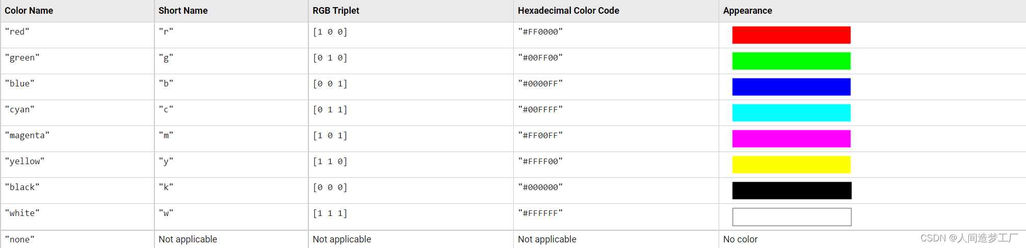
Line color, specified as an RGB triplet, a hexadecimal color code, a color name, or a short name.
For a custom color, specify an RGB triplet or a hexadecimal color code.
An RGB triplet is a three-element row vector whose elements specify the intensities of the red, green, and blue components of the color. The intensities must be in the range [0,1], for example, [0.4 0.6 0.7].
A hexadecimal color code is a character vector or a string scalar that starts with a hash symbol (#) followed by three or six hexadecimal digits, which can range from 0 to F. The values are not case sensitive. Therefore, the color codes “#FF8800”, “#ff8800”, “#F80”, and “#f80” are equivalent.
Alternatively, you can specify some common colors by name. This table lists the named color options, the equivalent RGB triplets, and hexadecimal color codes.
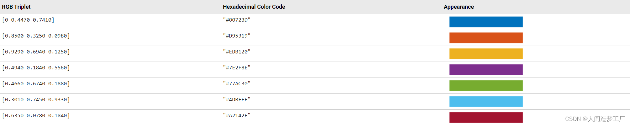
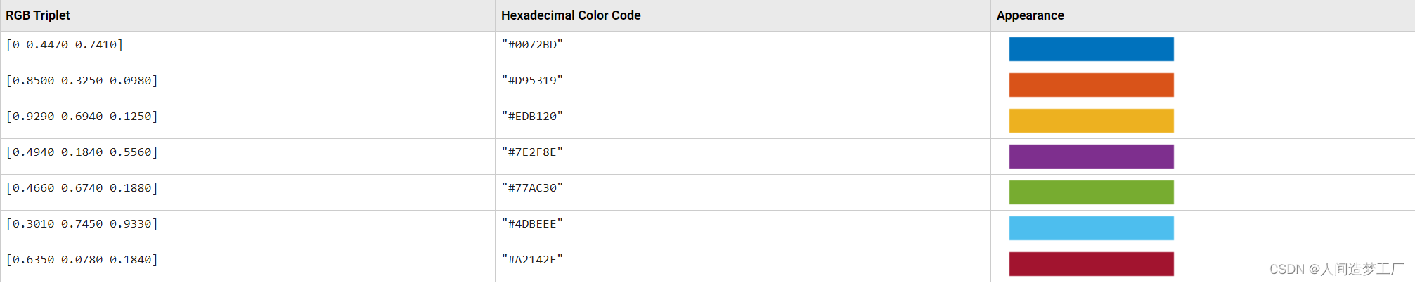
Here are the RGB triplets and hexadecimal color codes for the default colors MATLAB uses in many types of plots.
Example: “blue”
Example: [0 0 1]
Example: “#0000FF”
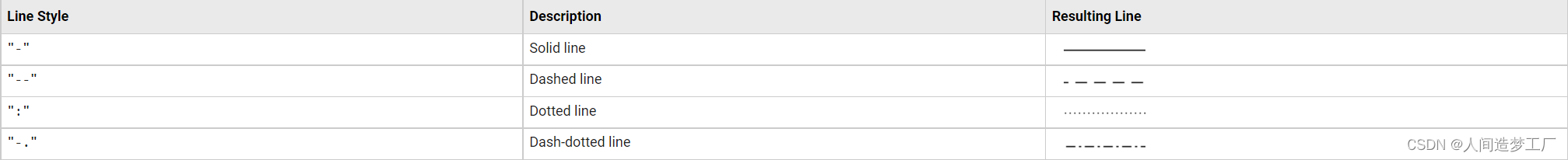
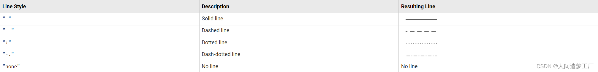
LineStyle — Line style
“-” (default) | “–” | “:” | “-.” | “none”
Line style, specified as one of the options listed in this table.
LineWidth — Line width
0.5 (default) | positive value
Line width, specified as a positive value in points, where 1 point = 1/72 of an inch. If the line has markers, then the line width also affects the marker edges.
The line width cannot be thinner than the width of a pixel. If you set the line width to a value that is less than the width of a pixel on your system, the line displays as one pixel wide.
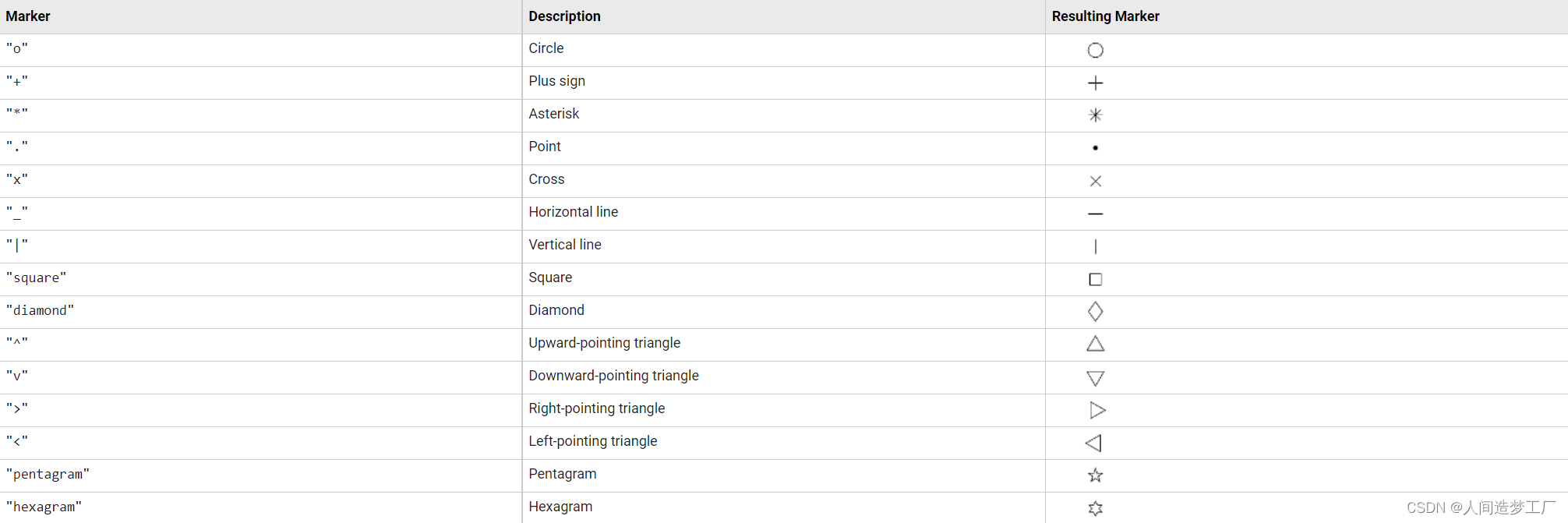
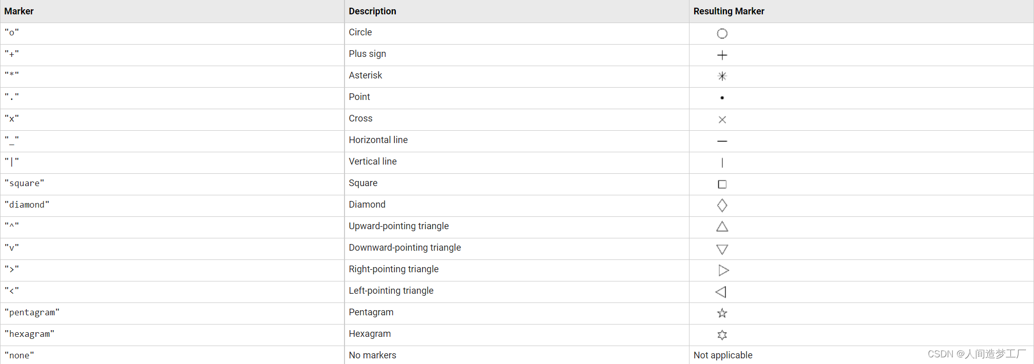
Marker — Marker symbol
“none” (default) | “o” | “+” | “*” | “.” | …
Marker symbol, specified as one of the values listed in this table. By default, the object does not display markers. Specifying a marker symbol adds markers at each data point or vertex.
MarkerIndices — Indices of data points at which to display markers
1:length(YData) (default) | vector of positive integers | scalar positive integer
Indices of data points at which to display markers, specified as a vector of positive integers. If you do not specify the indices, then MATLAB displays a marker at every data point.
Note
To see the markers, you must also specify a marker symbol.
Example: plot(x,y,“-o”,“MarkerIndices”,[1 5 10]) displays a circle marker at the first, fifth, and tenth data points.
Example: plot(x,y,“-x”,“MarkerIndices”,1:3:length(y)) displays a cross marker every three data points.
Example: plot(x,y,“Marker”,“square”,“MarkerIndices”,5) displays one square marker at the fifth data point.
MarkerEdgeColor — Marker outline color
“auto” (default) | RGB triplet | hexadecimal color code | “r” | “g” | “b” | …
Marker outline color, specified as “auto”, an RGB triplet, a hexadecimal color code, a color name, or a short name. The default value of “auto” uses the same color as the Color property.
For a custom color, specify an RGB triplet or a hexadecimal color code.
- An RGB triplet is a three-element row vector whose elements specify the intensities of the red, green, and blue components of the color. The intensities must be in the range [0,1], for example, [0.4 0.6 0.7].
- A hexadecimal color code is a character vector or a string scalar that starts with a hash symbol (#) followed by three or six hexadecimal digits, which can range from 0 to F. The values are not case sensitive. Therefore, the color codes “#FF8800”, “#ff8800”, “#F80”, and “#f80” are equivalent.
Alternatively, you can specify some common colors by name. This table lists the named color options, the equivalent RGB triplets, and hexadecimal color codes.
Here are the RGB triplets and hexadecimal color codes for the default colors MATLAB uses in many types of plots.

MarkerFaceColor — Marker fill color
“none” (default) | “auto” | RGB triplet | hexadecimal color code | “r” | “g” | “b” | …
Marker fill color, specified as “auto”, an RGB triplet, a hexadecimal color code, a color name, or a short name. The “auto” option uses the same color as the Color property of the parent axes. If you specify “auto” and the axes plot box is invisible, the marker fill color is the color of the figure.
For a custom color, specify an RGB triplet or a hexadecimal color code.
- An RGB triplet is a three-element row vector whose elements specify the intensities of the red, green, and blue components of the color. The intensities must be in the range [0,1], for example, [0.4 0.6 0.7].
- A hexadecimal color code is a character vector or a string scalar that starts with a hash symbol (#) followed by three or six hexadecimal digits, which can range from 0 to F. The values are not case sensitive. Therefore, the color codes “#FF8800”, “#ff8800”, “#F80”, and “#f80” are equivalent.
Alternatively, you can specify some common colors by name. This table lists the named color options, the equivalent RGB triplets, and hexadecimal color codes.
Here are the RGB triplets and hexadecimal color codes for the default colors MATLAB uses in many types of plots.
MarkerSize — Marker size
6 (default) | positive value
Marker size, specified as a positive value in points, where 1 point = 1/72 of an inch.
DatetimeTickFormat — Format for datetime tick labels
character vector | string
Format for datetime tick labels, specified as the comma-separated pair consisting of “DatetimeTickFormat” and a character vector or string containing a date format. Use the letters A-Z and a-z to construct a custom format. These letters correspond to the Unicode® Locale Data Markup Language (LDML) standard for dates. You can include non-ASCII letter characters such as a hyphen, space, or colon to separate the fields.
If you do not specify a value for “DatetimeTickFormat”, then plot automatically optimizes and updates the tick labels based on the axis limits.
Example: “DatetimeTickFormat”,“eeee, MMMM d, yyyy HH:mm:ss” displays a date and time such as Saturday, April 19, 2014 21:41:06.
The following table shows several common display formats and examples of the formatted output for the date, Saturday, April 19, 2014 at 9:41:06 PM in New York City.
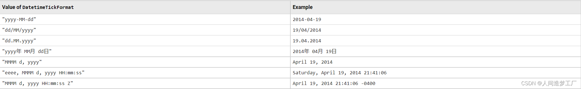
For a complete list of valid letter identifiers, see the Format property for datetime arrays.
DatetimeTickFormat is not a chart line property. You must set the tick format using the name-value pair argument when creating a plot. Alternatively, set the format using the xtickformat and ytickformat functions.
The TickLabelFormat property of the datetime ruler stores the format.
DurationTickFormat — Format for duration tick labels
character vector | string
Format for duration tick labels, specified as the comma-separated pair consisting of “DurationTickFormat” and a character vector or string containing a duration format.
If you do not specify a value for “DurationTickFormat”, then plot automatically optimizes and updates the tick labels based on the axis limits.
To display a duration as a single number that includes a fractional part, for example, 1.234 hours, specify one of the values in this table.

Example: “DurationTickFormat”,“d” displays duration values in terms of fixed-length days.
To display a duration in the form of a digital timer, specify one of these values.
- “dd:hh:mm:ss”
- “hh:mm:ss”
- “mm:ss”
- “hh:mm”
In addition, you can display up to nine fractional second digits by appending up to nine S characters.
Example: “DurationTickFormat”,“hh:mm:ss.SSS” displays the milliseconds of a duration value to three digits.
DurationTickFormat is not a chart line property. You must set the tick format using the name-value pair argument when creating a plot. Alternatively, set the format using the xtickformat and ytickformat functions.
The TickLabelFormat property of the duration ruler stores the format.
Tips
- Use NaN and Inf values to create breaks in the lines. For example, this code plots the first two elements, skips the third element, and draws another line using the last two elements:
plot([1,2,NaN,4,5])
- plot uses colors and line styles based on the ColorOrder and LineStyleOrder properties of the axes. plot cycles through the colors with the first line style. Then, it cycles through the colors again with each additional line style.
You can change the colors and the line styles after plotting by setting the ColorOrder or LineStyleOrder properties on the axes. You can also call the colororder function to change the color order for all the axes in the figure. (since R2019b)
这篇关于MATLAB 的 plot 绘图的文章就介绍到这儿,希望我们推荐的文章对编程师们有所帮助!


![C# double[] 和Matlab数组MWArray[]转换](/front/images/it_default2.jpg)


