本文主要是介绍QCustomPlot-绘制X轴为日期的折线图,希望对大家解决编程问题提供一定的参考价值,需要的开发者们随着小编来一起学习吧!
主要代码如下:
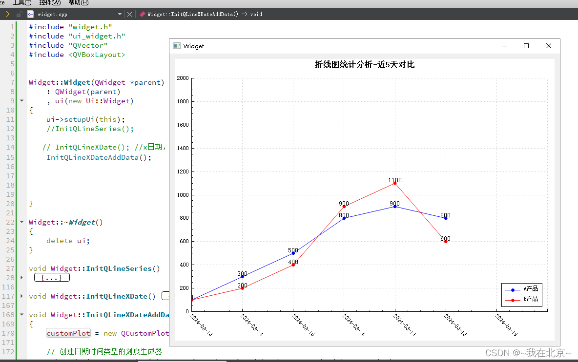
void Widget::InitQLineXDateAddData()
{customPlot = new QCustomPlot(this);// 创建日期时间类型的刻度生成器QSharedPointer<QCPAxisTickerDateTime> dateTimeTicker(new QCPAxisTickerDateTime);dateTimeTicker->setDateTimeFormat("yyyy-MM-dd"); // 设置日期时间格式//dateTimeTicker->setTickCount(8);// 将刻度生成器应用到 X 轴customPlot->xAxis->setTicker(dateTimeTicker);customPlot->xAxis->setTickLabelRotation(45); // 设置刻度标签旋转角度,以便更好地显示// 设置 X 轴的范围(使用 QDateTime 转换为键)QDateTime startDateTime = QDateTime(QDate(2024, 3, 13), QTime(0, 0, 0), Qt::UTC);QDateTime endDateTime = QDateTime(QDate(2024, 3, 20), QTime(0, 0, 0), Qt::UTC); // 计算日期范围内的天数,并设置为刻度数量int numDays = startDateTime.daysTo(endDateTime) + 1; // 包括开始和结束日期dateTimeTicker->setTickCount(numDays);// 将 QDateTime 转换为自 Unix 纪元以来的秒数double startKey = startDateTime.toMSecsSinceEpoch() / 1000.0;double endKey = endDateTime.toMSecsSinceEpoch() / 1000.0;customPlot->xAxis->setRange(QCPRange(startKey, endKey));// 添加并设置两个图形的penQCPGraph *graph1 = customPlot->addGraph();graph1->setPen(QPen(Qt::blue));QCPGraph *graph2 = customPlot->addGraph();graph2->setPen(QPen(Qt::red));// 设置图例customPlot->legend->setVisible(true);graph1->setName("A产品");graph2->setName("B产品");customPlot->axisRect()->insetLayout()->setInsetAlignment(0,Qt::AlignBottom|Qt::AlignRight);graph1->setLineStyle(QCPGraph::lsLine); // 实线graph1->setScatterStyle(QCPScatterStyle(QCPScatterStyle::ssDisc, QColor(Qt::blue), 6)); // 圆形散点graph2->setLineStyle(QCPGraph::lsLine); // 实线graph2->setScatterStyle(QCPScatterStyle(QCPScatterStyle::ssDisc, 6)); // 圆形散点QVector<double> keys1;int numValues = 6; // 要生成的值的数量for (int i = 0; i < numValues; ++i ) {keys1.push_back(startKey + i * 86400);}QVector<double> values1 = {100, 300, 500, 800, 900, 800};QVector<double> keys2 = {startKey, startKey + 86400, startKey + 2 * 86400, startKey + 3 * 86400, startKey + 4 * 86400, startKey + 5 * 86400};QVector<double> values2 = {100, 200, 400, 900, 1100, 600};// 设置数据并显示图表graph1->setData(keys1, values1);graph2->setData(keys2, values2);// 设置数据点标签显示for (int i = 0; i < keys1.size(); ++i) {QCPItemText *textItem = new QCPItemText(customPlot);//textItem->setPositionAlignment(Qt::AlignTop | Qt::AlignHCenter);textItem->setPositionAlignment( Qt::AlignBottom | Qt::AlignHCenter);textItem->position->setType(QCPItemPosition::ptPlotCoords);textItem->position->setCoords(keys1[i], values1[i]);textItem->setText(QString::number(values1[i]));textItem->setFont(QFont(font().family(), 10)); // Set font size as needed//textItem->setPen(QPen(Qt::blue)); // Set text colortextItem->setPen(Qt::NoPen); // Set no pen (remove border)textItem->setBrush(QBrush(Qt::transparent)); // Set transparent brush to hide the background}// 设置数据点标签显示for (int i = 0; i < keys1.size(); ++i) {QCPItemText *textItem = new QCPItemText(customPlot);//textItem->setPositionAlignment(Qt::AlignTop | Qt::AlignHCenter);textItem->setPositionAlignment( Qt::AlignBottom | Qt::AlignHCenter);textItem->position->setType(QCPItemPosition::ptPlotCoords);textItem->position->setCoords(keys1[i], values2[i]);textItem->setText(QString::number(values2[i]));textItem->setFont(QFont(font().family(), 10)); // Set font size as needed//textItem->setPen(QPen(Qt::blue)); // Set text colortextItem->setPen(Qt::NoPen); // Set no pen (remove border)textItem->setBrush(QBrush(Qt::transparent)); // Set transparent brush to hide the background}// 整个折线图标题QCPTextElement* PlotTitle = new QCPTextElement(customPlot, "折线图统计分析-近5天对比");//PlotTitle->setPositionAlignment(Qt::AlignCenter);PlotTitle->setFont(QFont("宋体", 12, QFont::Bold)); // 设置标题的字体customPlot->plotLayout()->insertRow(0); // 在图表布局中插入一行customPlot->plotLayout()->addElement(0, 0, PlotTitle); // 将标题添加到插入的行// 设置Y轴范围为0-2000customPlot->yAxis->setRange(0, 2000);customPlot->yAxis->ticker()->setTickCount(10);customPlot->setGeometry(QRect(10,20,700,600));// 自动调整坐标轴范围以适应数据,并重新绘制图表//customPlot->rescaleAxes();customPlot->replot();QVBoxLayout* pVBoxLayout = new QVBoxLayout(this);pVBoxLayout->addWidget(customPlot);}
这篇关于QCustomPlot-绘制X轴为日期的折线图的文章就介绍到这儿,希望我们推荐的文章对编程师们有所帮助!