本文主要是介绍PullScrollView详解(一)——自定义控件属性,希望对大家解决编程问题提供一定的参考价值,需要的开发者们随着小编来一起学习吧!
这里又将介绍另一个控件了——PullScrollView,同样是利用几篇来详细讲述它的实现方法,先看看最终的效果吧:
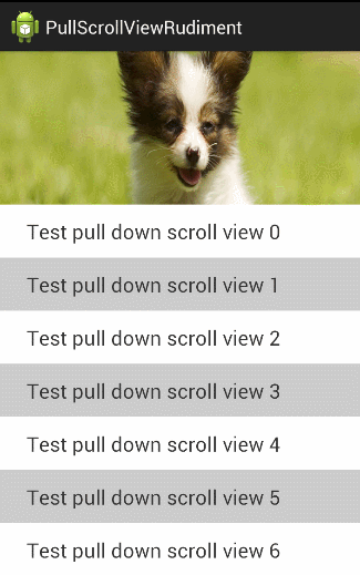
其实效果也挺简单,下拉回弹,然后在下拉的时候顶部的图片伸展。
看似简单的效果,用到的知识可不少,今天就先给大家做个铺垫,讲讲如何给自定义控件添加上自定义的控件属性。
一、概述
平时大家在看别人写的代码时,可能在一个自定义控件的XML中也发现过类似的代码:

大家看最后三个属性:
attrstest:headerHeight="300dp"
attrstest:headerVisibleHeight="100dp"
attrstest:age ="young"
明显这三个属性不是系统自带的,这是自己添加上去的。那怎么添加自定义的属性呢?利用XML中的declare-styleable标签来做。
二、declare-styleable使用方法
下面我们先看如何自定义控件属性,然后再讲讲它的具体用途。
1、自定义一个类MyTextView
public class MyTextView extends TextView {
public MyTextView(Context context) {
super(context);
}
}
2、新建attrs.xml文件(res/values下)
复制下面这段代码到attrs.xml文件中:
<?xml version="1.0" encoding="utf-8"?>
<resources>
<declare-styleable name="MyTextView">
<attr name="header" format="reference" />
<attr name="headerHeight" format="dimension" />
<attr name="headerVisibleHeight" format="dimension" />
<attr name="age">
<flag name="child" value="10"/>
<flag name="young" value="18"/>
<flag name="old" value="60"/>
</attr>
</declare-styleable>
</resources>
注意:
1、最重要的一点是declare-styleable旁边有一个name属性,这个name的取值就是对应所定义的类名。即要为哪个类添加自定义的属性,那这个name属性的值就是哪个。当然我们这里要为自定义的MyTextView来添加XML属性,所以name = "MyTextView";
2、自定义属性值可以组合使用比如:<attr name="border_color" format="color|reference"/ >;即表示即可以自定义color值比如#ff00ff,也可以利用@color/XXX来引用color.xml中已有的值
有关<declare-styleable / >标签下各个标签的用法,我们后面会逐一讲解。
这里就先讲讲上面的几个:
reference指的是从string.xml、drawable.xml、color.xml等引用过来的值
flag是自己定义的,类似于 android:gravity="top"
dimension 指的是是从dimension.xml里引用过来的内容.注意,这里如果是dp那就会做像素转换
他们在使用的时候是这样的:
<com.harvic.com.trydeclarestyle.MyTextView
android:layout_width="fill_parent"
android:layout_height="match_parent"
attrstest:header="@drawable/pic1"
attrstest:headerHeight="300dp"
attrstest:headerVisibleHeight="100dp"
attrstest:age="young"/>
可以看到header的取值是从其它XML引用过来的;dimension就表示尺寸,直接输入数字;flag就相当于代码里的常量,比如这里的young就表示数字18
理解这些代码难度不大,下面看看在XML中要怎么添加这些自定义的属性
3、XML中使用自定义的属性
(1)、添加自定义控件
我们在一个XML布局中,比如下面这个activity_main.xml
<RelativeLayout xmlns:android="http://schemas.android.com/apk/res/android"
android:layout_width="match_parent"
android:layout_height="match_parent">
<com.harvic.com.trydeclarestyle.MyTextView
android:layout_width="fill_parent"
android:layout_height="match_parent"
attrstest:header="@drawable/pic1"
attrstest:headerHeight="300dp"
attrstest:headerVisibleHeight="100dp"
attrstest:age="young"/>
</RelativeLayout>
如果我们像上面这样,直接添加自定义的控件及属性,你会发现,所有的自定义属性都会标红!这是因为这个XML根本识别不了这些标记
(2)、导入自定义的属性集(方法一)
要让它识别我们自定义的属性也非常简单,在根布局上添加
xmlns:attrstest ="http://schemas.android.com/apk/res/com.harvic.com.trydeclarestyle"
这里有两点注意:
1、xmlns:attrstest,这里的attrstest是自定义的,你想定义成什么就可以定义成什么。但要注意的是,下面访问你定义的XML控件属性时,就是通过这个标识符访问的。比如我们这里定义成attrstest;那我们下面对应的访问自定义控件的方式就是:attrstest:headerHeight="300dp";
2、最后的:com.harvic.com.trydeclarestyle,是AndroidManifest.xml中的包名。即AndroidManifest.xml中package字段对应的值,如下所示:
<?xml version="1.0" encoding="utf-8"?>
<manifest xmlns:android="http://schemas.android.com/apk/res/android"
package="com.harvic.com.trydeclarestyle" >
所以,在这种方式下,完整的activity_main..xml代码应该是:
<RelativeLayout xmlns:android="http://schemas.android.com/apk/res/android"
xmlns:attrstest ="http://schemas.android.com/apk/res/com.harvic.com.trydeclarestyle"
android:layout_width="match_parent"
android:layout_height="match_parent">
<com.harvic.com.trydeclarestyle.MyTextView
android:layout_width="fill_parent"
android:layout_height="match_parent"
attrstest:headerHeight="300dp"
attrstest:headerVisibleHeight="100dp"
attrstest:age="young"/>
</RelativeLayout>
(3)、导入自定义的属性集(方法二)
另一种自动导入自定义属性集的方式要相对简单,要根布局控件上添加:
xmlns:attrstest="http://schemas.android.com/apk/res-auto"
其中xmlns:attrstest,这里的attrstest是自定义的,你想定义成什么就可以定义成什么。但要注意的是,下面访问你定义的XML控件属性时,就是通过这个标识符访问的。比如我们这里定义成attrstest;那我们下面对应的访问自定义控件的方式就是:attrstest:headerHeight="300dp";
所以,在这种方式下,完整的activity_main.xml的代码如下:
<RelativeLayout xmlns:android="http://schemas.android.com/apk/res/android"
xmlns:attrstest="http://schemas.android.com/apk/res-auto"
android:layout_width="match_parent"
android:layout_height="match_parent">
<com.harvic.com.trydeclarestyle.MyTextView
android:layout_width="fill_parent"
android:layout_height="match_parent"
attrstest:headerHeight="300dp"
attrstest:headerVisibleHeight="100dp"
attrstest:age="young"/>
</RelativeLayout>
4、代码中获取自定义属性的值
大家可能会有疑问:我在XML中添加上自定义的属性有什么用呢?它不是系统原有的属性,那就不能指望系统能对它做什么操作。那我加它有什么用呢?
我们自定义的控件属性,系统当然不知道是用来干嘛的,所以当然也不可能对它有任何操作。如果我们不在代码中自己操作这些值,那这些自己添加的代码就毫无意义!所以,我们添加它们的主要目的,就是可以在代码中获取用户所设置的值。然后利用这些值完成我们想完成的功能。
使用代码获取某个属性用户所定义的值,主要是使用TypedArray类,这个类担供了所有的获取某个属性值的方法,如下所示,但需要注意的是,在使用完以后必须调用TypedArray的recycle()方法,用来释放资源
typedArray.getInt(int index, float defValue);
typedArray.getDimension(int index, float defValue);
typedArray.getBoolean(int index, float defValue);
typedArray.getColor(int index, float defValue);
typedArray.getString(int index)
typedArray.getDrawable(int index);
typedArray.getResources();
我们就看看在MyTextView中获取我们在XML中定义的那些属性的值,然后将它设置到成显示的文字:
public class MyTextView extends TextView {
public MyTextView(Context context, AttributeSet attrs) {
super(context, attrs);
TypedArray typedArray = context.obtainStyledAttributes(attrs,R.styleable.MyTextView);
float headerHeight = typedArray.getDimension(R.styleable.MyTextView_headerHeight,-1);
int age = typedArray.getInt(R.styleable.MyTextView_age,-1);
typedArray.recycle();
this.setText("headerHeight:"+headerHeight + " age:"+age);
}
}
整个工程的效果图如下:

好了,到这里基本上就结束了,下面就讲讲declare-styleable标签下其它属性的用法。
三、declare-styleable标签其它属性用法
1、 reference:参考某一资源ID。
(1)属性定义:
<declare-styleable name = "名称">
<attr name = "background" format = "reference" />
</declare-styleable>
(2)属性使用:
<ImageView
android:layout_width = "42dip"
android:layout_height = "42dip"
android:background = "@drawable/图片ID"/>
2. color:颜色值。
(1)属性定义:
<declare-styleable name = "名称">
<attr name = "textColor" format = "color" />
</declare-styleable>
(2)属性使用:
<TextView
android:layout_width = "42dip"
android:layout_height = "42dip"
android:textColor = "#00FF00"/>
3. boolean:布尔值。
(1)属性定义:
<declare-styleable name = "名称">
<attr name = "focusable" format = "boolean" />
</declare-styleable>
(2)属性使用:
<Button
android:layout_width = "42dip"
android:layout_height = "42dip"
android:focusable = "true"/>
4. dimension:尺寸值。
(1)属性定义:
<declare-styleable name = "名称">
<attr name = "layout_width" format = "dimension" />
</declare-styleable>
(2)属性使用:
<Button
android:layout_width = "42dip"
android:layout_height = "42dip"/>
5. float:浮点值。
(1)属性定义:
<declare-styleable name = "AlphaAnimation">
<attr name = "fromAlpha" format = "float" />
<attr name = "toAlpha" format = "float" />
</declare-styleable>
(2)属性使用:
<alpha
android:fromAlpha = "1.0"
android:toAlpha = "0.7"/>
6. integer:整型值。
(1)属性定义:
<declare-styleable name = "AnimatedRotateDrawable">
<attr name = "visible" />
<attr name = "frameDuration" format="integer" />
<attr name = "framesCount" format="integer" />
<attr name = "pivotX" />
<attr name = "pivotY" />
<attr name = "drawable" />
</declare-styleable>
(2)属性使用:
<animated-rotate
xmlns:android = "http://schemas.android.com/apk/res/android"
android:drawable = "@drawable/图片ID"
android:pivotX = "50%"
android:pivotY = "50%"
android:framesCount = "12"
android:frameDuration = "100"/>
7. string:字符串。
(1)属性定义:
<declare-styleable name = "MapView">
<attr name = "apiKey" format = "string" />
</declare-styleable>
(2)属性使用:
<com.google.android.maps.MapView
android:layout_width = "fill_parent"
android:layout_height = "fill_parent"
android:apiKey = "0jOkQ80oD1JL9C6HAja99uGXCRiS2CGjKO_bc_g" />
8. fraction:百分数。
(1)属性定义:
<declare-styleable name="RotateDrawable">
<attr name = "visible" />
<attr name = "fromDegrees" format = "float" />
<attr name = "toDegrees" format = "float" />
<attr name = "pivotX" format = "fraction" />
<attr name = "pivotY" format = "fraction" />
<attr name = "drawable" />
</declare-styleable>
(2)属性使用:
<rotate
xmlns:android = "http://schemas.android.com/apk/res/android"
android:interpolator = "@anim/动画ID"
android:fromDegrees = "0"
android:toDegrees = "360"
android:pivotX = "200%"
android:pivotY = "300%"
android:duration = "5000"
android:repeatMode = "restart"
android:repeatCount = "infinite"/>
9. enum:枚举值。
(1)属性定义:
<declare-styleable name="名称">
<attr name="orientation">
<enum name="horizontal" value="0" />
<enum name="vertical" value="1" />
</attr>
</declare-styleable>
(2)属性使用:
<LinearLayout
xmlns:android = "http://schemas.android.com/apk/res/android"
android:orientation = "vertical"
android:layout_width = "fill_parent"
android:layout_height = "fill_parent">
</LinearLayout>
10. flag:位或运算。
(1)属性定义:
<declare-styleable name="名称">
<attr name="windowSoftInputMode">
<flag name = "stateUnspecified" value = "0" />
<flag name = "stateUnchanged" value = "1" />
<flag name = "stateHidden" value = "2" />
<flag name = "stateAlwaysHidden" value = "3" />
<flag name = "stateVisible" value = "4" />
<flag name = "stateAlwaysVisible" value = "5" />
<flag name = "adjustUnspecified" value = "0x00" />
<flag name = "adjustResize" value = "0x10" />
<flag name = "adjustPan" value = "0x20" />
<flag name = "adjustNothing" value = "0x30" />
</attr>
</declare-styleable>
(2)属性使用:
<activity
android:name = ".StyleAndThemeActivity"
android:label = "@string/app_name"
android:windowSoftInputMode = "stateUnspecified | stateUnchanged | stateHidden">
<intent-filter>
<action android:name = "android.intent.action.MAIN" />
<category android:name = "android.intent.category.LAUNCHER" />
</intent-filter>
</activity>
特别要注意:
属性定义时可以指定多种类型值。
(1)属性定义:
<declare-styleable name = "名称">
<attr name = "background" format = "reference|color" />
</declare-styleable>
(2)属性使用:
<ImageView
android:layout_width = "42dip"
android:layout_height = "42dip"
android:background = "@drawable/图片ID|#00FF00"/>
这篇关于PullScrollView详解(一)——自定义控件属性的文章就介绍到这儿,希望我们推荐的文章对编程师们有所帮助!


