本文主要是介绍一语道破CSS3(二),希望对大家解决编程问题提供一定的参考价值,需要的开发者们随着小编来一起学习吧!
- CSS背景:CSS允许使用纯色作为背景,也允许使用背景图创建相当复杂的效果
| 属性 | 描述 |
|---|---|
| background-color | 设置背景颜色 |
| background-image | 以图片做背景 |
| background-repeat | 设置的背景图片是否及如何重复 |
| background-position | 设置背景图片的起始位置 |
| background-attachment | 背景图像是否固定或随页面其余部分滚动 |
| background-size | 规定背景图片的尺寸 |
| background-origin | 规定背景图片的定位区域 |
| background-clip | 规定背景的绘制区域 |
(1)padding:设置内边框,如:padding: 10px;
(2)background-position属性:如果设置属性值right,就默认从右上角,而且从照片的中间开始显示。我们可以这样改变:right top;。这个属性也可以直接使用坐标,如:0px 0px。
(3)background-attachment属性:默认随页面动。fixed属性值随页面动,
- CSS文本:可以改变文本颜色、字符间距、对齐文本、装饰文本、文本缩进
| 属性 | 描述 |
|---|---|
| color * | 文本颜色 |
| direction | 文本方向 |
| line-height | 行高 |
| letter-spacing | 字符间距 |
| text- align * | 文本的对齐方式 |
| text-decoration | 向文本添加修饰 |
| text-indent | 缩进元素中文本的首行 |
| text-transform | 处理元素中的字母 |
| unicode-bidi | 设置文本方向 |
| white-space | 元素中空白的处理方式 |
| word-spacing | 字间距 |
(1)text-indent属性:属性值可以是:2em。em是字符。
- CSS字体:定义文本的字体的大小,类型等
| 属性 | 描述 |
|---|---|
| font-family | 设置字体系列 |
| font-size | 设置字体的尺寸 |
| font-style | 设置分风格 |
| font-weight | 设置字体粗细 |
- 链接:使用text-decoration:none;去掉链接的下划线。
- CSS轮廓:主要是突出元素的作用。就是给内容加一个框框。
| 属性 | 描述 |
|---|---|
| outline | 设置轮廓属性 |
| outline-color | 轮廓颜色 |
| outline-style | 设置轮廓样式 |
| outline-width | 设置轮廓宽度 |
- CSS定位:改变元素在页面上的位置。
(1)CSS定位机制:- 普通流:元素按照其在HTML中的位置顺序决定排布的过程。
- 浮动:
- 绝对布局:
| 属性 | 描述 |
|---|---|
| position | 把元素故在一一个静态的、相对的、绝对的、或固定的位置中 |
| top | 元素向上的偏移量 |
| left | 元素向左的偏移量 |
| right | 元素向右的偏移量 |
| bottom | 元素向下的偏移量 |
| overflow | 设置元素溢出其区域发生的事情 |
| clip | 设置元素显示的形状 |
| vertical-align | 设置元素垂直对齐方式 |
| z-index | 设置元素的堆叠顺序 |
-
CSS定位属性:
(1)position属性有四个值:- static:静态布局。没有偏移量。即使设置了。
- relative:相对布局。可以设置top,right,left等的偏移量。
- absolute:绝对布局。相当于它在页面内不再占有位置。也有偏移量。
- fixed:将设置为fixed的元素固定在页面上,不随页面滚动而动。
(2)z-index:控制那个元素在页面的前面显示(当覆盖时)值大的在前面。相对和绝对布局有可用。
-
CSS浮动:
(1)float属性:浮动会随容器大小来适应屏幕。-
left:元素向左浮动。
-
right:元素向右浮动
-
none:不浮动
-
inherit:从父级继承浮动属性。
(2)clear属性:清除浮动属性。 -
left、right:去掉向左向右的浮动
-
both:左右两侧均去掉
-
inherit:从父级继承来的clear属性。
-
-
CSS盒子模型:
(1)盒子模型概述:- margin:外边距
- border:边框
- padding:内边距
- content:内容
(2)CSS内边距:内容外部,边框外部。padding-*设置某一边的内边距(left,right,top)。
(3)CSS边框:- border-style:定义了10中不同的非继承样式。包括none。border-left-style改变左边的样式。
- CSS3提供的是三个边框属性:border-radius(圆角边框)、border-shadow(边框阴影)、border-image(边框图片)。
(4)CSS外边框:围绕在内容边框的区域就是外边距,默认为透明区域。margin。
(5)CSS外边距合并:两个内容之间的外边距会自动叠加,遵循大的内边距。 -
CSS常用操作:
(1)对齐操作:- margin:进行水平对齐。如:margin-left auto;。如:margin 0px auto;,前一个是上下,后一个是左右。
- position、float:左右对齐。
(2)尺寸操作:width,height等。
(3)分类操作:如:clear、display(如何显示,做导航栏)、float、position、cursor(鼠标指针的显示形式)等
(4)导航栏:使用列表来创建,(text-decoration none;去掉链接的下划线)
(5)图片操作:opacity,透明效果。取值[0,1]
-
类选择器和id选择器的区别:
(1)id是唯一的,class不唯一。
(2)id选择器不能结合使用
(3)当使用js时,要使用到id。
2D,3D的转换
过渡
动画
多列
-
2D、3D转换:通过CSS,我们能够对元素进行移动、缩放、移动、拉长或拉伸,转换是是元素改变形状、尺寸和位置的一种效果。
(1)2D转换方法:-
translate():移动。是transform的属性值。例:
-webkit-transform: translate(100px);/*支持Chrome浏览器 */,向x,y轴移动的像素。 -
rotate():旋转。例:
-webkit-transform: rotate(90deg);,旋转度数 -
scale():缩放。
-webkit-transform: scale(1,2);,宽和高 -
skew():倾斜度数。向x,y轴倾斜的度数。
-
matrix():矩阵的效果。
(2)3D转换方法:
- rotateX():
- rotateY():
-
-
CSS动画过度:CSS3过度是元素从一种样式转化成另外一种样式。
CSS3样式:
img{-webkit-transition: width 2s,height 2s,-webkit-transform 2s;/*执行时间*/transition: width 2s,height 2s,transform 2s;transition-delay: 2s;/*延时显示动画*/}
img:hover{width:20%;height: 20%;transform: rotate(350deg);-webkit-transform: rotate(360deg);
}
- 动画:通过CSS3考验创建动画。
(1)遵循@keyframes规则:规定动画时长和名称。
div{width: 100px;height: 100px;background-color: aqua;position: relative;/*相对定位*/animation: anim 5s infinite alternate;/*动画执行时间为5秒,并且重复执行*/-webkit-animation: anim 5s infinite alternate;/* 按反方向执行*/}
@keyframes anim {0%{ background-color: darkgray;left: 0px;top: 0px}/*颜色和移动*/25%{background-color: blue;left: 200px;top: 0px}50%{background-color: blueviolet;left: 200px;top: 200px}75%{background-color: red;left: 200px;top: 0px}100%{background-color: black;left: 200px;top: 0px}
}
@-webkit-keyframes anim {/*适配Chrome浏览器*/0%{ background-color: darkgray;left: 0px;top: 0px}25%{background-color: blue;left: 200px;top: 0px}50%{background-color: blueviolet;left: 200px;top: 200px}75%{background-color: red;left: 200px;top: 0px}100%{background-color: black;left: 200px;top: 0px}
}
- 多列:可以创建多列来对文本或区域进行布局。加线来分裂。也需要适配浏览器。
(1)属性:- column-count:
- column-gap:间距
- column-rule:
开发:
<!DOCTYPE html>
<html lang="en">
<head><meta charset="UTF-8"><meta name="viewport" content="width=device-width, initial-scale=1.0"><meta http-equiv="X-UA-Compatible" content="ie=edge"><link rel="stylesheet" type="text/css" href="mycss.css">
</head>
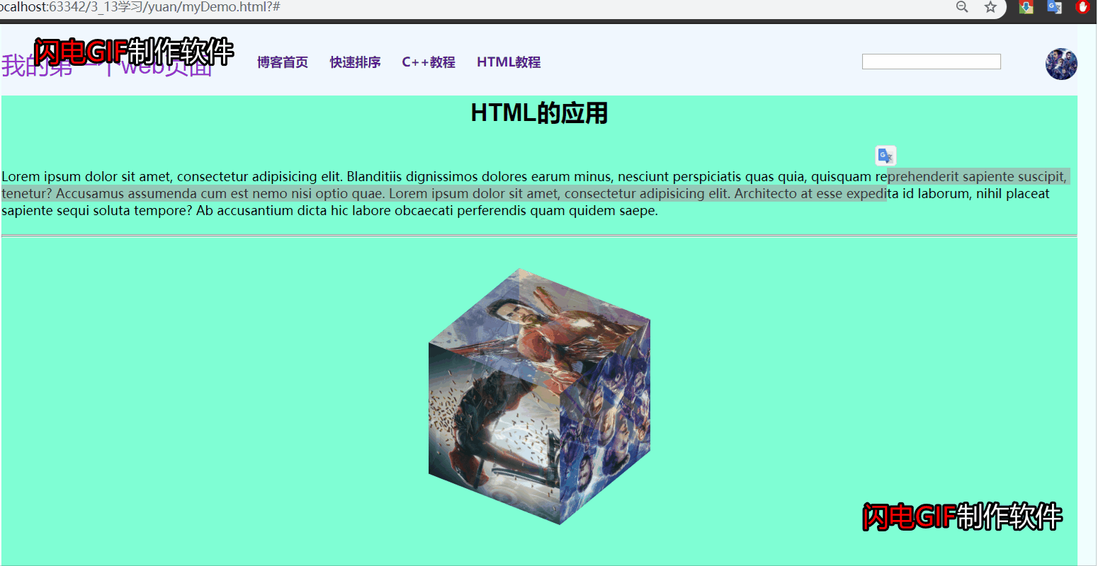
<body><div class="container"><div class="wrapper"><div class="heading"><div class="heading_nav"><div class="heading_title">我的第一个web页面</div><div class="heading_navbar"><ul><li><a href="https://blog.csdn.net/qq_44755403">博客首页</a></li><li><a href="https://blog.csdn.net/qq_44755403/article/details/104837072">快速排序</a></li><li><a href="https://blog.csdn.net/qq_44755403/article/details/104383192">C++教程</a></li><li><a href="https://blog.csdn.net/qq_44755403/article/details/104589115">HTML教程</a></li></ul></div><div class="heading_image"><img src="../images/4.jpg" width="3%" height="3%"></div><div class="heading_sopt"><form><input type="text"></form></div></div></div><div class="body"><div class="body_title"><h3>HTML的应用</h3><p>Lorem ipsum dolor sit amet, consectetur adipisicing elit.Blanditiis dignissimos dolores earum minus, nesciunt perspiciatisquas quia, quisquam reprehenderit sapiente suscipit, tenetur?Accusamus assumenda cum est nemo nisi optio quae.Lorem ipsum dolor sit amet, consectetur adipisicing elit. Architectoat esse expedita id laborum, nihil placeat sapiente sequi solutatempore? Ab accusantium dicta hic labore obcaecati perferendisquam quidem saepe.</p></div><hr/><hr/><div class="cube"><div class="box1"><img src="http://129.211.56.163/images/1.jpg" alt="蚁人" class="img3"></div><div class="box2"><img src="http://129.211.56.163/images/2.jpg" alt="女侠" class="img3"></div><div class="box3"><img src="http://129.211.56.163/images/3.jpg" alt="美国队长" class="img3"></div><div class="box4"><img src="http://129.211.56.163/images/4.jpg" alt="全体漫威" class="img3"></div><div class="box5"><img src="http://129.211.56.163/images/5.jpg" alt="雷神" class="img3"></div><div class="box6"><img src="http://129.211.56.163/images/6.jpg" alt="钢铁侠" class="img3"></div></div>
<!-- <div>-->
<!-- <img src="../images/4.jpg" width="10%" height="10%" align="center" class="img2">-->
<!-- </div>--></div></div><div class="footing">@1139049948</div></div>
</body>
</html>*{margin: 0px;padding: 0px;
}
body{background-color: azure;
}
.wrapper{width: 80%;height: 1000px;background-color: aquamarine;margin: 0px auto;}
.heading{margin: 0px auto;width: 100%;height: 90px;background-color: aliceblue;
}
.heading_title{float: left;font-family: Arial;font-size: 30px;color: darkorchid;}
.heading_nav{padding-bottom: 30px;padding-top: 30px;width: 100%;height: 30px;position: relative;
}
li{padding-left: 10px;display: inline;/*一行显示*/
}
ul{margin-left: 40px;float: left;list-style: none;padding-top: 6px;padding-bottom: 6px;
}
a:link{font-weight: bold;color: darkgray;text-align: center;padding: 6px;text-decoration: none;/*去掉下化线*/
}
a:hover,a:active{color: black;}
.heading_image img{border-radius: 30px;display: inline;float: right;
}
.heading_sopt form{display: inline;float: right;width: 80px;height: 35px;position: relative;margin-right: 150px;margin-top: 5px;
}
button{float: right;margin-right: 10px;
}
from input{height: 35px;border-radius: 30px;
}
.body_title p{margin-top: 50px;margin-bottom: 20px;}
.body_title h3{font-size: 30px;font-family: Arial;width: auto;color: black;text-align: center;
}/*.img2{*/
/* position: relative;!*相对定位*!*/
/* animation: anim 5s infinite alternate;!*动画执行时间为5秒,并且重复执行*!*/
/* -webkit-animation: anim 5s infinite alternate;!* 按反方向执行*!*//*}*/
/*@keyframes anim {*/
/* 0%{ background-color: darkgray;left: 0px;top: 0px}!*颜色和移动*!*/
/* 25%{background-color: blue;left: 200px;top: 0px}*/
/* 50%{background-color: blueviolet;left: 200px;top: 200px}*/
/* 75%{background-color: red;left: 0px;top: 200px}*/
/* 100%{background-color: black;left: 0px;top: 0px}*/
/*}*/
/*@-webkit-keyframes anim {!*适配Chrome浏览器*!*/
/* 0%{ background-color: darkgray;left: 0px;top: 0px}*/
/* 25%{background-color: blue;left: 200px;top: 0px}*/
/* 50%{background-color: blueviolet;left: 200px;top: 200px}*/
/* 75%{background-color: red;left: 0px;top: 200px}*/
/* 100%{background-color: black;left: 0px;top: 0px}*/
/*}*/.cube{width: 200px;height: 200px;margin: 100px auto;transform-style: preserve-3d;transform: rotateX(45deg) rotateZ(45deg);animation: rotate 20s infinite linear;}.cube>div{width: 200px;height: 200px;opacity: 0.7;position: absolute;}
.img3{width: 200px;height: 200px;vertical-align: top;}
.box1{transform: rotateY(90deg) translateZ(100px);}
.box2{transform: rotateY(-90deg) translateZ(100px);
}
.box3{transform: rotateX(90deg) translateZ(100px);;
}
.box4{transform: rotateX(-90deg) translateZ(100px);;
}
.box5{transform: translateZ(100px);
}
.box6{transform: rotateY(-180deg) translateZ(100px);
}
@keyframes rotate {form{transform: rotateX(0) rotateZ(0);}to{transform: rotateX(1turn) rotateZ(1turn);}
}
.footing{width: 80%;height: 30px;margin: 0px auto;background-color: darkgray;padding-top: 20px;text-align: center;color: black;font-size: 15px;
}成品展示:
这篇关于一语道破CSS3(二)的文章就介绍到这儿,希望我们推荐的文章对编程师们有所帮助!


