本文主要是介绍TextInputLayout+TextInputEditText 打造精美的登录界面,希望对大家解决编程问题提供一定的参考价值,需要的开发者们随着小编来一起学习吧!
博主声明:
转载请在开头附加本文链接及作者信息,并标记为转载。本文由博主 威威喵 原创,请多支持与指教。
本文首发于此 博主:威威喵 | 博客主页:https://blog.csdn.net/smile_running
感受 Material Design UI 魅力,你不能错过的 Material Design 全系列文章:
Material Design 之一 BottomNavigationView + ViewPager + Fragment 仿微信底部导航效果
Material Design 之二 Toolbar + DrawerLayout + NavigationView 实现QQ侧拉抽屉效果
Material Design 之三 TabLayout + ViewPager + Fragment 今日头条标题切换效果
Material Design 之四 SwipeRefreshLayout + CardView + RecyclerView 精美瀑布流效果
Material Design 之五 CoordinatorLayout + AppBarLayout 提供最佳浏览体验
Material Design 之六 CollapsingToolbarLayout + FloatingActionButton 打造精美详情界面
Material Design 之七 TextInputLayout+TextInputEditText 打造精美的登录界面
前面写的那几篇呢,都是关于 Material Design 库下提供的几种漂亮的 view 的使用,这么一连学习下来的话, Material Design 库下几个 nice 又常用的都学完了,这一篇是 Material Design 库剩下的最后两个控件了,把这些综合起来用,绝大部分的界面都足够满足需求了,如果再不够的话,就只能自定义 View,自定义 sytle 去更改了。
好了,多的就说到这里。我们来看看这篇要使用的两个控件 TextInputLayout 与 TextInputEditText,光从名字看,就能知道它是用于文本输入的,至于有什么新的效果,我们使用过后才知道。
我们要用这两个控件写一个精美的登录界面,我们之前使用的 EditText 输入框基本都是这样样子的:
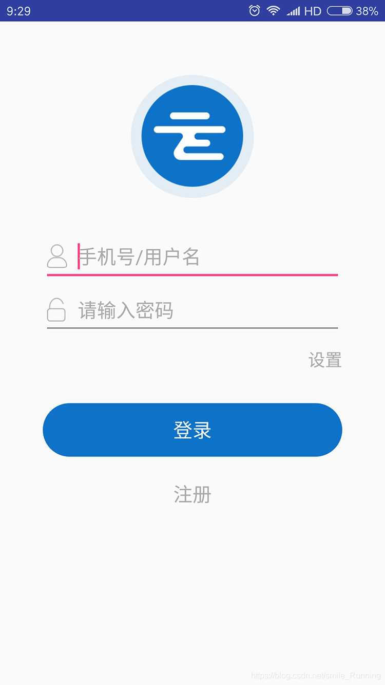
虽然 EditText 的样式能够自定义,但是总缺了点什么味道。而我们今天要写的一个登录界面是这样的:

这只是一个比较简约的登录界面,做为例子已经足够了。下面我们来看如何实现吧。
首先,登录外围是一个 CardView 包裹起来,顶部是一个 CircleImageView 圆形图片,说到这个 CircleImageView 是真的好用,而且非常简单,与 ImageView 的使用没有什么区别,不过需要引入一下库依赖:
implementation 'de.hdodenhof:circleimageview:3.0.0'然后接下来就是 TextInputLayout 了,它是一个 ViewGroup,所以与它配合的就是 TextInputEditText 了。TextInputLayout 内部包裹着 TextInputEditText,就能够形成联动效果。
那么,整个布局代码如下:
<?xml version="1.0" encoding="utf-8"?>
<RelativeLayout xmlns:android="http://schemas.android.com/apk/res/android"xmlns:app="http://schemas.android.com/apk/res-auto"android:layout_width="match_parent"android:layout_height="match_parent"android:background="#ffffff"><android.support.v7.widget.CardViewandroid:layout_width="match_parent"android:layout_height="match_parent"android:layout_marginLeft="32dp"android:layout_marginTop="64dp"android:layout_marginRight="32dp"android:layout_marginBottom="64dp"app:cardCornerRadius="4dp"app:cardElevation="8dp"><LinearLayoutandroid:layout_width="match_parent"android:layout_height="match_parent"android:orientation="vertical"><de.hdodenhof.circleimageview.CircleImageViewandroid:layout_width="100dp"android:layout_height="100dp"android:layout_gravity="center_horizontal"android:layout_marginTop="16dp"android:src="@drawable/cat" /><android.support.design.widget.TextInputLayoutandroid:layout_width="match_parent"android:layout_height="wrap_content"android:layout_marginLeft="16dp"android:layout_marginTop="16dp"android:layout_marginRight="16dp"android:hint="用户名"android:textColorHint="#a2c699"><android.support.design.widget.TextInputEditTextandroid:id="@+id/edt_user"android:layout_width="match_parent"android:layout_height="wrap_content"android:textColor="#9966cc" /></android.support.design.widget.TextInputLayout><android.support.design.widget.TextInputLayoutandroid:layout_width="match_parent"android:layout_height="wrap_content"android:layout_marginLeft="16dp"android:layout_marginTop="16dp"android:layout_marginRight="16dp"android:hint="密码"android:textColorHint="#a2c699"><android.support.design.widget.TextInputEditTextandroid:id="@+id/edt_pwd"android:layout_width="match_parent"android:layout_height="wrap_content"android:textColor="#9966cc" /></android.support.design.widget.TextInputLayout><LinearLayoutandroid:layout_width="wrap_content"android:layout_height="wrap_content"android:layout_gravity="center_horizontal"android:layout_marginTop="48dp"><Buttonandroid:id="@+id/btn_login"android:layout_width="0dp"android:layout_height="32dp"android:layout_marginRight="16dp"android:layout_weight="1"android:background="@drawable/style_btn_login"android:text="登录"android:textColor="#fcfcfc" /><Buttonandroid:id="@+id/btn_reg"android:layout_width="0dp"android:layout_height="32dp"android:layout_marginLeft="16dp"android:layout_weight="1"android:background="@drawable/style_btn_login"android:text="注册"android:textColor="#fcfcfc" /></LinearLayout></LinearLayout></android.support.v7.widget.CardView></RelativeLayout>
TextInputLayout 有几个比较常用的属性:
- android:hint="用户名"
- android:textColorHint="#a2c699"
hint 和以往的 EditText 一样,是一个提示文本,但是必须写在 TextInputLayout 下面,才能形成如上图那个提示文本效果。还有一个 color 属性就是设置提示文本的样式了,非常容易懂。TextInputEditText 的话,就与 EditText 没什么区别,都是基本属性的使用。
接下来就是 Button 的一个样式设置了,代码如下:
<?xml version="1.0" encoding="utf-8"?>
<selector xmlns:android="http://schemas.android.com/apk/res/android"><item android:state_pressed="false"><shape android:shape="rectangle"><stroke android:color="#9966cc" /><solid android:color="#9966cc" /><corners android:radius="8dp" /></shape></item><item android:state_pressed="true"><shape android:shape="rectangle"><stroke android:color="#a2c699" /><solid android:color="#a2c699" /><corners android:radius="8dp" /></shape></item>
</selector>
两个 item 表示的是被按下和抬起的样式,stroke 表示描边,solid 表示填充的颜色,corners 表示四周弧度,也就是将 button 设置为圆角矩形,值越大,就越明显。
最后是我们 Fragment 中的代码,也就是登录逻辑的判断,这里我就随便写了一下:
package nd.no.xww.bottomnavigationlayout;import android.os.Bundle;
import android.support.annotation.NonNull;
import android.support.annotation.Nullable;
import android.support.design.widget.TextInputEditText;
import android.support.v4.app.Fragment;
import android.text.TextUtils;
import android.view.LayoutInflater;
import android.view.View;
import android.view.ViewGroup;
import android.widget.Button;
import android.widget.Toast;/*** @author xww* @desciption :* @date 2019/7/22* @time 23:40*/
public class TwoFragment extends Fragment {TextInputEditText edt_user;TextInputEditText edt_pwd;Button btn_login;@Nullable@Overridepublic View onCreateView(@NonNull LayoutInflater inflater, @Nullable ViewGroup container, @Nullable Bundle savedInstanceState) {View view = inflater.inflate(R.layout.fragment_two, container, false);return view;}@Overridepublic void onViewCreated(@NonNull View view, @Nullable Bundle savedInstanceState) {super.onViewCreated(view, savedInstanceState);edt_user = view.findViewById(R.id.edt_user);edt_pwd = view.findViewById(R.id.edt_pwd);btn_login = view.findViewById(R.id.btn_login);btn_login.setOnClickListener(new View.OnClickListener() {@Overridepublic void onClick(View v) {String user = edt_user.getText().toString().trim();String pwd = edt_pwd.getText().toString().trim();if (TextUtils.isEmpty(user) && TextUtils.isEmpty(pwd)) {Toast.makeText(getContext(), "user or pwd not null", Toast.LENGTH_SHORT).show();return;}if ("威威喵".equals(user) && "123456".equals(pwd)) {Toast.makeText(getContext(), "登录成功", Toast.LENGTH_SHORT).show();} else if (!"威威喵".equals(user)) {edt_user.setError("用户名错误");} else if (!"123456".equals(pwd)) {edt_pwd.setError("密码错误");}}});}
}
还有一个比较好看的效果,就是那个用户名或密码错误时,弹出的框框效果,是这样的:
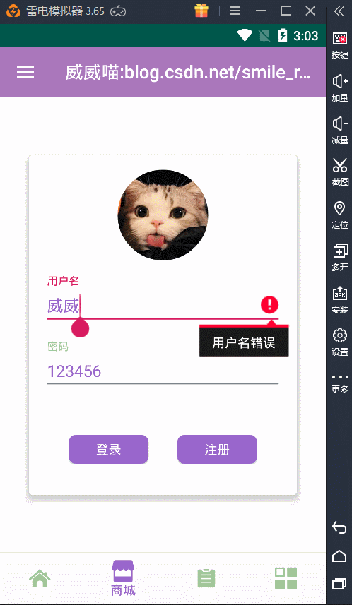
看起来挺不错的效果,就一行代码搞定:
edt_user.setError("用户名错误");
edt_pwd.setError("密码错误");
好了,最后经过这几篇下来的学习,Material Design 库已经被我们使用的差不多了,如果还没使用过的话,感觉学起来吧,让你的界面更加炫酷和美观。
这篇关于TextInputLayout+TextInputEditText 打造精美的登录界面的文章就介绍到这儿,希望我们推荐的文章对编程师们有所帮助!


