本文主要是介绍SwipeRefreshLayout+CardView+RecyclerView 精美瀑布流效果,希望对大家解决编程问题提供一定的参考价值,需要的开发者们随着小编来一起学习吧!
博主声明:
转载请在开头附加本文链接及作者信息,并标记为转载。本文由博主 威威喵 原创,请多支持与指教。
本文首发于此 博主:威威喵 | 博客主页:https://blog.csdn.net/smile_running
感受 Material Design UI 魅力,你不能错过的 Material Design 全系列文章:
Material Design 之一 BottomNavigationView + ViewPager + Fragment 仿微信底部导航效果
Material Design 之二 Toolbar + DrawerLayout + NavigationView 实现QQ侧拉抽屉效果
Material Design 之三 TabLayout + ViewPager + Fragment 今日头条标题切换效果
Material Design 之四 SwipeRefreshLayout + CardView + RecyclerView 精美瀑布流效果
Material Design 之五 CoordinatorLayout + AppBarLayout 提供最佳浏览体验
Material Design 之六 CollapsingToolbarLayout + FloatingActionButton 打造精美详情界面
Material Design 之七 TextInputLayout+TextInputEditText 打造精美的登录界面
RecyclerView 是我们 Android 开发中必备的控件之一,可以说基本每一个复杂一点的界面都需要 RecyclerView 来帮助处理,因为 RecyclerView 的可定制性非常高,我们可以玩出各种花样来。
不仅如此,RecyclerView 自带的三种布局形式,比如线性、网格、瀑布流都非常容易就能用上的,我们可以根据需要,自行的设置页面样式,接下来,我们使用 RecyclerView 来使用一下这三种布局,并且配合 design 库下的 CardView 控件,制作一个精美的动物信息浏览的界面。
先看看效果图吧:

在此之前呢,我们把准备工作给做好,第一个是我的代码是沿用上篇文章:TabLayout+ViewPager 快速实现标题切换效果
第二个是由于本次图片的量比较大,因为我们在 RecyclerView 中要引入大量的图片来浏览,所以不得不使用第三方开源的图片加载库,这也是为了方便。
首先,在 app 项目中引入 Glide 图片加载库,sync 一下会自动下载:
implementation 'com.github.bumptech.glide:glide:4.9.0'然后它的用法非常简单,比如这样:
Glide.with(context).load(data.get(i).get("pic")).into(holder.img);RecyclerView 线性布局
好了,基于这个代码上, 我们添加一个线性布局的 RecyclerView
<?xml version="1.0" encoding="utf-8"?>
<RelativeLayout xmlns:android="http://schemas.android.com/apk/res/android"android:layout_width="match_parent"android:layout_height="match_parent"><android.support.v7.widget.RecyclerViewandroid:id="@+id/line_recy_view"android:layout_width="match_parent"android:layout_height="match_parent" />
</RelativeLayout>
然后,它的 Item 布局文件如下:
<?xml version="1.0" encoding="utf-8"?>
<RelativeLayout xmlns:android="http://schemas.android.com/apk/res/android"android:layout_width="match_parent"android:padding="8dp"android:layout_height="140dp"><ImageViewandroid:id="@+id/img_recy_item_1_pic"android:layout_width="140dp"android:layout_height="match_parent"android:scaleType="centerCrop" /><TextViewandroid:id="@+id/tv_recy_item_1_name"android:layout_width="wrap_content"android:layout_height="wrap_content"android:layout_marginLeft="16dp"android:layout_marginTop="8dp"android:layout_toRightOf="@id/img_recy_item_1_pic"android:textSize="23sp" /><TextViewandroid:id="@+id/tv_recy_item_1_desc"android:layout_width="wrap_content"android:layout_height="wrap_content"android:layout_alignParentBottom="true"android:layout_marginLeft="16dp"android:layout_marginBottom="8dp"android:layout_toRightOf="@id/img_recy_item_1_pic"android:textSize="18sp" />
</RelativeLayout>
接下来是它的适配器,在适配器中设置 item 布局和加载每一个 item 的数据:
package nd.no.xww.bottomnavigationlayout;import android.content.Context;
import android.media.Image;
import android.support.annotation.NonNull;
import android.support.v7.widget.RecyclerView;
import android.view.LayoutInflater;
import android.view.View;
import android.view.ViewGroup;
import android.widget.ImageView;
import android.widget.TextView;import com.bumptech.glide.Glide;import java.util.List;
import java.util.Map;/*** @author xww* @desciption :* @date 2019/7/24* @time 12:06*/
public class RecyclerLineAdapter extends RecyclerView.Adapter<RecyclerLineAdapter.ViewHolder> {Context context;List<Map<String, Object>> data;public RecyclerLineAdapter(Context context, List<Map<String, Object>> data) {this.data = data;this.context = context;}@NonNull@Overridepublic ViewHolder onCreateViewHolder(@NonNull ViewGroup viewGroup, int i) {View view = LayoutInflater.from(viewGroup.getContext()).inflate(R.layout.recycler_one_view_1_item, viewGroup, false);return new ViewHolder(view);}@Overridepublic void onBindViewHolder(@NonNull ViewHolder holder, int i) {Glide.with(context).load(data.get(i).get("pic")).into(holder.img);holder.name.setText(data.get(i).get("name").toString());holder.desc.setText(data.get(i).get("desc").toString());}@Overridepublic int getItemCount() {return data.size();}public class ViewHolder extends RecyclerView.ViewHolder {ImageView img;TextView name;TextView desc;public ViewHolder(@NonNull View itemView) {super(itemView);img = itemView.findViewById(R.id.img_recy_item_1_pic);name = itemView.findViewById(R.id.tv_recy_item_1_name);desc = itemView.findViewById(R.id.tv_recy_item_1_desc);}}
}
添加数据源和设置适配器
int[] pics = {R.drawable.a1,R.drawable.a2,R.drawable.a3,R.drawable.a4,R.drawable.a5,R.drawable.a6,R.drawable.a7,R.drawable.a8,R.drawable.a9,R.drawable.a10,R.drawable.a11,R.drawable.a12,};String[] names = {"北极熊","犀牛","花豹","白马","小鹦鹉","袋鼠","狐狸","小猫咪","哈巴狗","蜥蜴","大熊猫","蚂蚁",};List<Map<String, Object>> lineData = new ArrayList<>();private void addData() {Map<String, Object> map = null;Random random = new Random();for (int i = 0; i < 30; i++) {int n = random.nextInt(pics.length);map = new HashMap<>();map.put("pic", pics[n]);map.put("name", names[n]);map.put("desc", "我是一只" + names[n]);lineData.add(map);}}// 设置为线性布局lineRecycler.setLayoutManager(new LinearLayoutManager(getContext()));// 设置适配器lineRecycler.setAdapter(new RecyclerLineAdapter(getContext(), lineData));然后,我们运行一下是这样的效果:

不过这样的界面并不是特别好看,于是,我们就给它的 item 添加一个 CardView,使得我们的每一个 Item 都像一张张卡片那样呈现出来,修改 recyclerview item 布局如下:
<?xml version="1.0" encoding="utf-8"?>
<android.support.v7.widget.CardView xmlns:android="http://schemas.android.com/apk/res/android"xmlns:app="http://schemas.android.com/apk/res-auto"android:layout_width="match_parent"android:layout_height="140dp"android:layout_margin="8dp"app:cardCornerRadius="8dp"app:cardElevation="4dp"><RelativeLayoutandroid:layout_width="match_parent"android:layout_height="match_parent"android:padding="8dp"><ImageViewandroid:id="@+id/img_recy_item_1_pic"android:layout_width="140dp"android:layout_height="match_parent"android:scaleType="centerCrop" /><TextViewandroid:id="@+id/tv_recy_item_1_name"android:layout_width="wrap_content"android:layout_height="wrap_content"android:layout_marginLeft="16dp"android:layout_marginTop="8dp"android:layout_toRightOf="@id/img_recy_item_1_pic"android:textSize="23sp" /><TextViewandroid:id="@+id/tv_recy_item_1_desc"android:layout_width="wrap_content"android:layout_height="wrap_content"android:layout_alignParentBottom="true"android:layout_marginLeft="16dp"android:layout_marginBottom="8dp"android:layout_toRightOf="@id/img_recy_item_1_pic"android:textSize="18sp" /></RelativeLayout>
</android.support.v7.widget.CardView>
我们在原先基础的最外层包裹了一个 CardView,并且设置了两个 CardView 经常使用的属性。一个是 cardElevation 指的是 CardView 的一个高度,可以这样想象,RecyclerView 是一个平面,而 CardView 就在它的上面,我们可以通过设置 cardElevation 来控制这个高度,也就是 CardView 在这样的高度时的一个阴影效果,高度越高,阴影越明显。
还有一个属性是 cardCornerRadius 指的是 CardView 四周的弧度,值越大,圆弧就越明显。那么,我们修改完之后的效果如下:
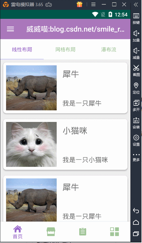
嗯,这样看起来就有点舒服了哦,我是比较喜欢这样的效果,看上去像一张一张小卡片一样,浏览起来也舒服。
RecyclerView 网格布局
上面我们介绍的就是 RecyclerView 线性布局的使用,效果还是不错的,一般可以用于浏览个人信息列表操作。接着,我们来看第二种布局形式:网格布局。
网格布局也是非常常用的,一般用于图片相册的浏览,接下来的工作就是复制粘贴一下原先的代码就可以了,因为适配器里面的代码几乎一个样,我们可以考虑把它封装起来用,不过现在还是怎么方便怎么来。
对于线性布局来说,网格布局是需要做一定量的修改的,也就是布局文件的修改,我们把旁边的 “我是一只...” 文本给去掉,保留了图片和动物名称,所以布局文件代码修改为:
<?xml version="1.0" encoding="utf-8"?>
<android.support.v7.widget.CardView xmlns:android="http://schemas.android.com/apk/res/android"xmlns:app="http://schemas.android.com/apk/res-auto"android:layout_width="match_parent"android:layout_height="180dp"android:layout_margin="8dp"app:cardCornerRadius="8dp"app:cardElevation="4dp"><RelativeLayoutandroid:layout_width="match_parent"android:layout_height="match_parent"android:padding="8dp"><ImageViewandroid:id="@+id/img_recy_item_2_pic"android:layout_width="match_parent"android:layout_height="120dp"android:scaleType="centerCrop" /><TextViewandroid:id="@+id/tv_recy_item_2_name"android:layout_width="wrap_content"android:layout_height="wrap_content"android:layout_below="@id/img_recy_item_2_pic"android:layout_centerInParent="true"android:layout_marginTop="8dp"android:layout_marginBottom="8dp"android:textSize="18sp" /></RelativeLayout>
</android.support.v7.widget.CardView>
没了这个,我们适配器中也相应的把 textview 给删除,这个应该很简单,就是把 desc 给删了就好了,还是贴一下代码吧:
package nd.no.xww.bottomnavigationlayout;import android.content.Context;
import android.support.annotation.NonNull;
import android.support.v7.widget.RecyclerView;
import android.view.LayoutInflater;
import android.view.View;
import android.view.ViewGroup;
import android.widget.ImageView;
import android.widget.TextView;import com.bumptech.glide.Glide;import java.util.List;
import java.util.Map;/*** @author xww* @desciption :* @date 2019/7/24* @time 12:06*/
public class RecyclerGridAdapter extends RecyclerView.Adapter<RecyclerGridAdapter.ViewHolder> {Context context;List<Map<String, Object>> data;public RecyclerGridAdapter(Context context, List<Map<String, Object>> data) {this.data = data;this.context = context;}@NonNull@Overridepublic ViewHolder onCreateViewHolder(@NonNull ViewGroup viewGroup, int i) {View view = LayoutInflater.from(viewGroup.getContext()).inflate(R.layout.recycler_one_view_2_item, viewGroup, false);return new ViewHolder(view);}@Overridepublic void onBindViewHolder(@NonNull ViewHolder holder, int i) {Glide.with(context).load(data.get(i).get("pic")).into(holder.img);holder.name.setText(data.get(i).get("name").toString());}@Overridepublic int getItemCount() {return data.size();}public class ViewHolder extends RecyclerView.ViewHolder {ImageView img;TextView name;public ViewHolder(@NonNull View itemView) {super(itemView);img = itemView.findViewById(R.id.img_recy_item_2_pic);name = itemView.findViewById(R.id.tv_recy_item_2_name);}}
}
然后,是数据做一下简单的修改,把对应的 desc 数据给删除:
private void addGridData() {Map<String, Object> map = null;Random random = new Random();for (int i = 0; i < 30; i++) {int n = random.nextInt(pics.length);map = new HashMap<>();map.put("pic", pics[n]);map.put("name", names[n]);gridData.add(map);}}最重要的一步,为 RecyclerView 设置布局管理样式:
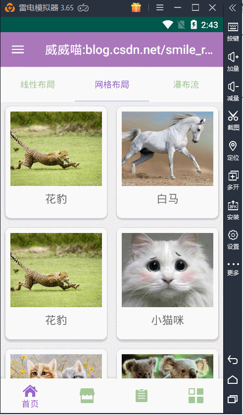
//设置网格布局样式,2为列数gridRecycler.setLayoutManager(new GridLayoutManager(getContext(), 2));gridRecycler.setAdapter(new RecyclerGridAdapter(getContext(), gridData));好了,这样我们再运行一下,效果如下:

这样就完成了网格布局的设置,效果看起来还可以。
RecyclerView 瀑布流布局
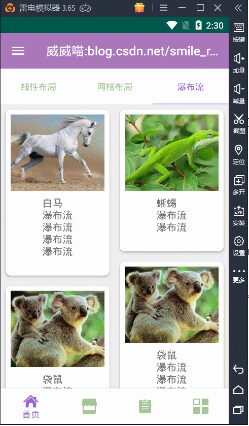
最后一个布局样式是瀑布流的布局,其实和网格布局几乎一样的,网格布局是规规矩矩的,而瀑布流就是有长有短的那种,有错位和落差感,有时候太规矩的不好看,有一点错位显得更加美观。
瀑布流的 RecyclerView Item 布局文件要注意了,不能写固定的一个高度,否则就没有效果了。比如,我们得这样改:
<?xml version="1.0" encoding="utf-8"?>
<android.support.v7.widget.CardView xmlns:android="http://schemas.android.com/apk/res/android"xmlns:app="http://schemas.android.com/apk/res-auto"android:layout_width="match_parent"android:layout_height="wrap_content"android:layout_margin="8dp"app:cardCornerRadius="8dp"app:cardElevation="4dp"><RelativeLayoutandroid:layout_width="match_parent"android:layout_height="match_parent"android:padding="8dp"><ImageViewandroid:id="@+id/img_recy_item_3_pic"android:layout_width="match_parent"android:layout_height="120dp"android:scaleType="centerCrop" /><TextViewandroid:id="@+id/tv_recy_item_3_name"android:layout_width="wrap_content"android:layout_height="wrap_content"android:layout_below="@id/img_recy_item_3_pic"android:layout_centerInParent="true"android:layout_marginTop="8dp"android:textSize="16sp" /></RelativeLayout>
</android.support.v7.widget.CardView>
注意上面的代码,cardview 的高度不能固定,以及下面的 textview 高度也都不能固定值,都要写为 wrap_content,适配器就不需要修改了,要改的地方就是数据格式还有 RecyclerView 的布局管理样式。
我们添加数据要改为这样,名称有长的有短的,才能形成长短不一的瀑布流的形式。
private void addStaggeredData() {Map<String, Object> map = null;Random random = new Random();String[] str = {"瀑布流\n","瀑布流\n瀑布流\n","瀑布流\n瀑布流\n瀑布流\n","瀑布流\n瀑布流\n瀑布流\n瀑布流\n",};for (int i = 0; i < 30; i++) {int n = random.nextInt(pics.length);map = new HashMap<>();map.put("pic", pics[n]);map.put("name", names[n] + "\n" + str[random.nextInt(str.length)]);staggeredData.add(map);}}最关键的还是 RecyclerView 的设置:
// 设置瀑布流形式,2为两列staggerRecycler.setLayoutManager(new StaggeredGridLayoutManager(2, StaggeredGridLayoutManager.VERTICAL));// 设置适配器staggerRecycler.setAdapter(new RecyclerStaggeredAdapter(getContext(), staggeredData));好了,我们运行一下,就会产生错落的瀑布流效果了:
那么,到此为止呢,几种 RecyclerView 常用的布局形式都给试了一遍,总体来说都非常不错的,特别是配合 CardView 以后,显示效果更佳。不过 design 库里面还有一个比较漂亮的控件,与 RecyclerView 也是天生绝配的存在,那就是下拉刷新的控件:SwipeRefreshLayout,最后呢,我们继续把 SwipeRefreshLayout 添加到 RecyclerView 上,看看效果如何吧。
下拉刷新 SwipeRefreshLayout
我们就那网格布局例子为基础, 在它的 RecyclerView 上面加上一个 SwipeRefreshLayout 控件,这样要注意一下,SwipeRefreshLayout 必须是 RecyclerView 的父容器,也就是 SwipeRefreshLayout 包裹 RecyclerView,看下面的代码你就非常清楚了:
<?xml version="1.0" encoding="utf-8"?>
<RelativeLayout xmlns:android="http://schemas.android.com/apk/res/android"android:layout_width="match_parent"android:layout_height="match_parent"><android.support.v4.widget.SwipeRefreshLayoutandroid:id="@+id/swipe_refresh"android:layout_width="match_parent"android:layout_height="match_parent"><android.support.v7.widget.RecyclerViewandroid:id="@+id/grid_recy_view"android:layout_width="match_parent"android:layout_height="match_parent" /></android.support.v4.widget.SwipeRefreshLayout></RelativeLayout>
SwipeRefreshLayout 要刷新的话,需要添加一个监听事件,又因为适配器在刷新后需要把数据也刷新一下,然后再绑定到 RecyclerView 上,代码如下所示。
swipeRefreshLayout.setOnRefreshListener(new SwipeRefreshLayout.OnRefreshListener() {@Overridepublic void onRefresh() {gridData.clear();addGridData();gridAdapter.notifyDataSetChanged();new Handler().postDelayed(new Runnable() {@Overridepublic void run() {if (swipeRefreshLayout.isRefreshing()) {swipeRefreshLayout.setRefreshing(false);}}}, 1500);}});首先,要把集合给清空,然后为集合添加新的数据,最后调用适配器通知一下重新绑定数据就搞定了。那么效果如下:
这里有个与 SwipeRefreshLayout 相关的比较常用的属性,直接看下面的代码就知道了:
//为下拉刷新,设置一组颜色swipeRefreshLayout.setColorSchemeColors(Color.BLUE, Color.RED, Color.GREEN);//设置触发刷新的距离swipeRefreshLayout.setDistanceToTriggerSync(200);//设置滑动的距离swipeRefreshLayout.setSlingshotDistance(400);刷新时就会不停的变化进度的颜色效果,显得花里胡哨的,当然了,你也可以只添加一种颜色。

还有两个用于设置刷新的监听与取消情况:
//开始刷新,false 取消刷新swipeRefreshLayout.setRefreshing(true);//判断是否正在刷新swipeRefreshLayout.isRefreshing();好了,结合上面的几个控件,我们可以随意的写出好看的界面。
这篇关于SwipeRefreshLayout+CardView+RecyclerView 精美瀑布流效果的文章就介绍到这儿,希望我们推荐的文章对编程师们有所帮助!


