本文主要是介绍纯css实现三等分饼图,希望对大家解决编程问题提供一定的参考价值,需要的开发者们随着小编来一起学习吧!
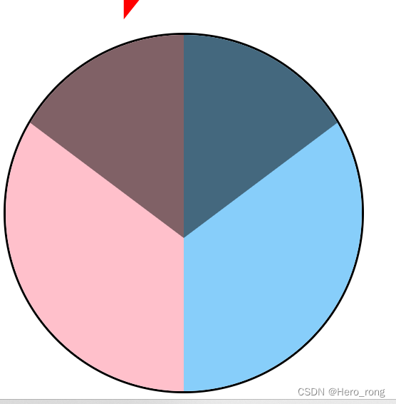
实现原理,先绘制一个圆,然后把圆分成两份,在绘制一个菱形,最下面的角是120°,这样就可以实现三等分啦
关键代码是一个css很少见的属性clip-path
clip-path: polygon(24rem 36rem, 48rem 18rem, 24rem 0, 0 18rem);
(polygon值是根据勾股定理算出来)
<!DOCTYPE html>
<html><head><meta charset="utf-8"><title>纯css实现三等分饼图</title><style>.border {display: flex;border: solid;width: 50rem;height: 50rem;overflow: hidden;border-radius: 50%;position: relative;flex-wrap: wrap;}.box1 {display: inline-block;width: 100%;height: 100%;background-color: rgba(1, 1, 1, .5);margin-top: -15%;margin-left: 2%;clip-path: polygon(24rem 36rem, 48rem 18rem, 24rem 0, 0 18rem);z-index: 1;}.box2 {display: inline-block;width: 50%;height: 100%;background-color: pink;position: absolute;}.box3 {display: inline-block;width: 50%;height: 100%;background-color: lightskyblue;position: absolute;right: 0;}</style></head><body><div class="border"><div class="box1"></div><div class="box2"></div><div class="box3"></div></div><script type="text/javascript" src="js/jquery-2.1.4.min.js"></script><script>$('.box1').click(() => {alert(1)})$('.box2').click(() => {alert(2)})$('.box3').click(() => {alert(3)})</script></body></html>
以上代码引入一下jquery后可以直接使用噢
这篇关于纯css实现三等分饼图的文章就介绍到这儿,希望我们推荐的文章对编程师们有所帮助!


