本文主要是介绍storybook vue@3.0,希望对大家解决编程问题提供一定的参考价值,需要的开发者们随着小编来一起学习吧!
Storybook是一个开源工具,用于独立开发React、Vue和Angular的UI组件。它能有组织和高效地构建UI组件。
这里介绍vue@3.0
1、初始化项目
npx sb@next init
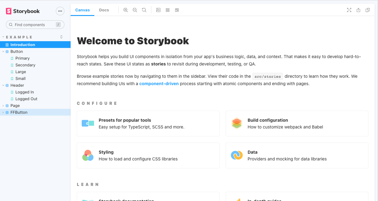
2、直接运行
npm run storybook
运行结果
3、配置scss
需要安装sass-loader和node-sass,这里是自己写的FFButton,icon用的是elementUI的 所以样式需要配置scss
npm install sass-loader@8.0.2 node-sass@4.12.0
在.storybook/main.js 下需要配置
const path = require('path');webpackFinal: async (config, { configType }) => {config.module.rules.push({test: /\.scss$/,use: ['style-loader', 'css-loader', 'sass-loader'],include: path.resolve(__dirname, '../'),});return config;}
4、手写ff-button组件,放在src/components/ff-button目录下
variables.scss 是配置全局颜色的文件,这个组件的样式没有单独拎出来,写文档图方便,就放在组件里面了
<template><div class="button"><button:class="['ff-button', type ? 'ff-button--' + type : '',{'is-disabled': buttonDisabled,}]":disabled="buttonDisabled"@click="handleClick"><i v-if="loading" class="el-icon-loading"></I><i v-if="icon && !loading" :class="icon"></I><span v-if="$slots.default"><slot></slot></span></button></div></template><script>
import { computed, defineComponent } from 'vue'
export default defineComponent({name: 'FFButton',props: {type: {type: String ,default: 'default',validator: (val) => {return ['default','primary','success','warning','info','danger','text',].includes(val)},},disabled: Boolean,icon: {type: String,default: '',},loading: Boolean,},emits: ['click'],setup(props, ctx) {const buttonDisabled = computed(() => {return props.disabled})//methodsconst handleClick = (evt) => {ctx.emit('click', evt)}return{buttonDisabled,handleClick,}}
})
</script><style lang="scss" scoped>
@import "../../styles/variables.scss";.button{width: 80px;height: 40px;margin:0px 5px;
}.ff-button{width: 100%;height: 100%;border-radius: 5px;font-size: 14px;color: #FFFFFF;border: none;cursor: pointer;
}
.ff-button:focus {outline: none;
}
.ff-button:hover{opacity: 0.5;
}.ff-button:active::before {opacity: 0.1;
}
.ff-button--default{background-color: $default;color: #333333;border: 1px #e1e1e1 solid;
}
.ff-button--primary{background-color: $primary;
}
.ff-button--success{background-color: $success;
}
.ff-button--warning{background-color: $warning;
}
.ff-button--info{border: none;background-color: $info;
}
.ff-button--danger{background-color: $danger;
}
.ff-button--text{background-color: $text;
}
.is-disabled{background-color: #f5f7fa;border-color: #e4e7ed;color: #c0c4cc;cursor: not-allowed;
}
</style>
icon 图标配置,是借用elementUI的字体图标
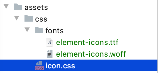
在src/main.js中引入
import ‘…/src/assets/css/icon.css’
这样icon图标就可以使用了
5、写storybook生成文档
在stories下面新建ffButton.stories.js,需要引入组件,引入icon.scss
import FFButton from '../components/ff-button/ff-button.vue';
import '../../src/assets/css/icon.css'
配置组件的事件或动态数据
import { action } from '@storybook/addon-actions';export const actionsData = {onHandlClick: action('click'),
};const Template = (args) => ({// Components used in your story `template` are defined in the `components` objectcomponents: { FFButton },// The story's `args` need to be mapped into the template through the `setup()` methodsetup() {return { args };},methods: actionsData,// 新增配置template: '<FFButton v-bind="args" type="default"  :icon="`el-icon-edit`" :disabled="false" @click="onHandlClick($event)">default</FFButton>',
});
由于事件的点击回调的方法是动态配置的所以还要需要加上excludeStories: /.*Data$/,不然会报错
export default {title: 'Example/FFButton',component: FFButton,excludeStories: /.*Data$/,
};
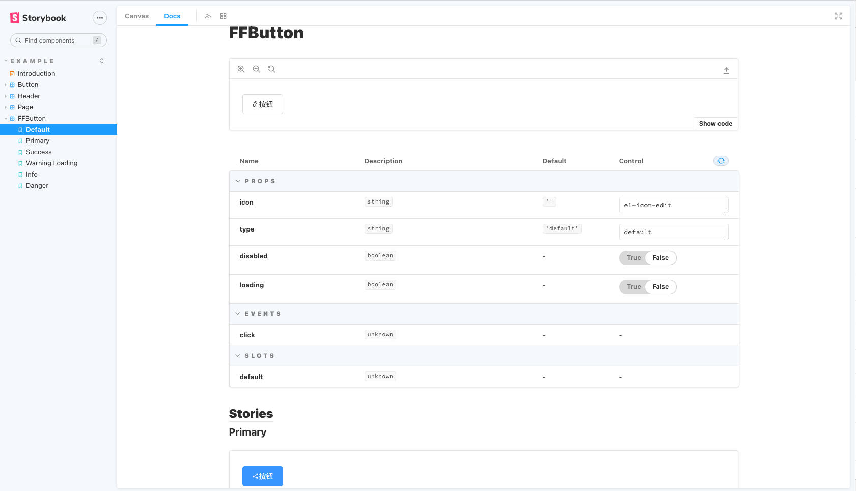
说明:
title是左侧目录结构
component是组件本身
argTypes提供有关未明确设置的args的信息,还可以用来args信息备注
template.bind({})是一个标准javascript复制功能技术
ffButton.stories.js完整代码
import FFButton from '../components/ff-button/ff-button.vue';
import '../../src/assets/css/icon.css'
import { action } from '@storybook/addon-actions';export default {title: 'Example/FFButton',component: FFButton,argTypes: {},excludeStories: /.*Data$/,};
export const actionsData = {onHandlClick: action('click'),
};const Template = (args) => ({// Components used in your story `template` are defined in the `components` objectcomponents: { FFButton },// The story's `args` need to be mapped into the template through the `setup()` methodsetup() {return { args };},methods: actionsData,// And then the `args` are bound to your component with `v-bind="args"`template: '<FFButton v-bind="args" type="default" :icon="`el-icon-edit`" :disabled="false" @click="onHandlClick($event)">按钮</FFButton>',
});export const Default = Template.bind({});
Default.args = {icon:'el-icon-edit',type:'default'
};export const Primary = Template.bind({template: '<FFButton type="Primary" :icon="`el-icon-share`" @click="onHandlClick($event)">按钮</FFButton>'});
Primary.args = {icon:'el-icon-share',type:'primary'
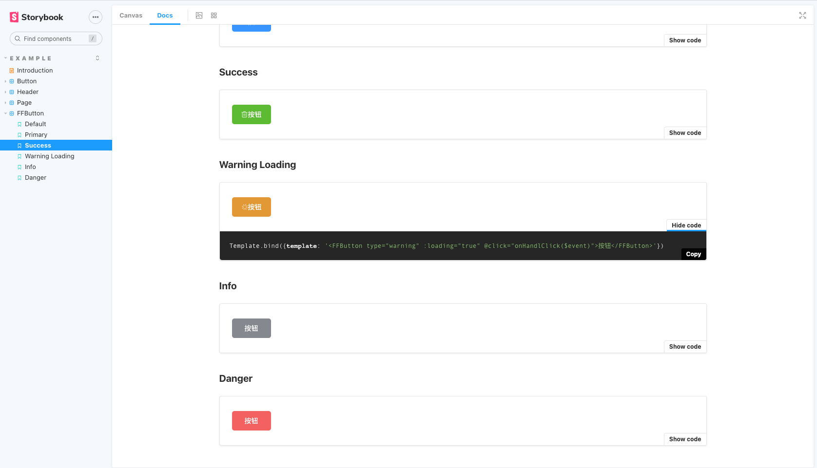
};export const success = Template.bind({template: '<FFButton type="success" :icon="`el-icon-delete`" @click="onHandlClick($event)">按钮</FFButton>'});
success.args = {icon:'el-icon-delete',type:'success'
};export const warning_loading = Template.bind({template: '<FFButton type="warning" :loading="true" @click="onHandlClick($event)">按钮</FFButton>'});
warning_loading.args = {loading:true,type:'warning'
};export const info = Template.bind({template: '<FFButton type="info" @click="onHandlClick($event)">按钮</FFButton>'});
info.args = {type:'info'
};export const danger = Template.bind({template: '<FFButton type="danger" @click="onHandlClick($event)">按钮</FFButton>'});
danger.args = {type:'danger'
};效果如下
6、安装插件
Storybook有 数百个可重复使用的插件打包为NPM模块。
npm下载包,在.storybook/main.js下addons配置就可以。
"addons": ["@storybook/addon-links","@storybook/addon-essentials","@storybook/addon-actions","@storybook/addon-storysource"],
具体配置查看storybook官网/Install addons
这篇关于storybook vue@3.0的文章就介绍到这儿,希望我们推荐的文章对编程师们有所帮助!


