本文主要是介绍【Matplotlib作图-3.Ranking】50 Matplotlib Visualizations, Python实现,源码可复现,希望对大家解决编程问题提供一定的参考价值,需要的开发者们随着小编来一起学习吧!
目录
- 03 Ranking
- 3.0 Prerequisite
- 3.1 有序条形图(Ordered Bar Chart)
- 3.2 棒棒糖图(Lollipop Chart)
- 3.3 点图(Dot Plot)
- 3.4 斜率图(Slope Chart)
- 3.5 杠铃图(Dumbbell Plot)
- References

03 Ranking
3.0 Prerequisite
-
Setup.py
# !pip install brewer2mpl
import numpy as np
import pandas as pd
import matplotlib as mpl
import matplotlib.pyplot as plt
import seaborn as sns
import warnings; warnings.filterwarnings(action='once')large = 22; med = 16; small = 12
params = {'axes.titlesize': large,'legend.fontsize': med,'figure.figsize': (16, 10),'axes.labelsize': med,'axes.titlesize': med,'xtick.labelsize': med,'ytick.labelsize': med,'figure.titlesize': large}
plt.rcParams.update(params)
# plt.style.use('seaborn-whitegrid')
plt.style.use("seaborn-v0_8")
sns.set_style("white")
# %matplotlib inline# Version
print(mpl.__version__)  #> 3.7.1
print(sns.__version__)  #> 0.12.2
3.1 有序条形图(Ordered Bar Chart)
-
Ordered bar chart conveys the rank order of the items effectively. But adding the value of the metric above the chart, the user gets the precise information from the chart itself. It is a classic way of visualizing items based on counts or any given metric. Check this free video tutorial on implementing and interpreting ordered bar charts.
-
有序条形图(Ordered Bar Chart)是一种有效传达项目排名顺序的图表。通过在图表上方添加指标的数值,用户可以从图表本身获取准确的信息。这是一种经典的根据计数或任何给定指标来可视化项目的方式。
-
mpg_ggplot2.csv展示不同汽车制造商的城市燃油效率(每加仑行驶的英里数):
"manufacturer","model","displ","year","cyl","trans","drv","cty","hwy","fl","class"
"audi","a4",1.8,1999,4,"auto(l5)","f",18,29,"p","compact"
"audi","a4",1.8,1999,4,"manual(m5)","f",21,29,"p","compact"
"audi","a4",2,2008,4,"manual(m6)","f",20,31,"p","compact"
"audi","a4",2,2008,4,"auto(av)","f",21,30,"p","compact"
"audi","a4",2.8,1999,6,"auto(l5)","f",16,26,"p","compact"
"chevrolet","c1500 suburban 2wd",5.3,2008,8,"auto(l4)","r",14,20,"r","suv"
"chevrolet","c1500 suburban 2wd",5.3,2008,8,"auto(l4)","r",11,15,"e","suv"
"chevrolet","c1500 suburban 2wd",5.3,2008,8,"auto(l4)","r",14,20,"r","suv"
"chevrolet","c1500 suburban 2wd",5.7,1999,8,"auto(l4)","r",13,17,"r","suv"
- 程序代码为:
# Prepare Data
df_raw = pd.read_csv("https://github.com/selva86/datasets/raw/master/mpg_ggplot2.csv")
# 从原始数据集df_raw中选择'cty'(城市里程)和'manufacturer'(制造商)两列数据,使用groupby按制造商进行分组,并计算每个制造商的城市里程平均值。
df = df_raw[['cty', 'manufacturer']].groupby('manufacturer').apply(lambda x: x.mean())
df.sort_values('cty', inplace=True)
df.reset_index(inplace=True)# Draw plot
import matplotlib.patches as patches# 创建一个图形和坐标轴对象,设置图形的大小、背景颜色和dpi。
fig, ax = plt.subplots(figsize=(16,10), facecolor='white', dpi= 80)
# 使用ax.vlines绘制垂直线条,表示每个制造商的城市里程。df.index表示制造商的索引,0表示线条的起始位置,df.cty表示线条的终止位置。线条的颜色为'firebrick',透明度为0.7,线条宽度为20。
ax.vlines(x=df.index, ymin=0, ymax=df.cty, color='firebrick', alpha=0.7, linewidth=20)# Annotate Text
# 使用循环遍历每个制造商的城市里程,在相应的位置添加文本标注。标注的位置为(i, cty+0.5),文本内容为城市里程的值(保留一位小数),水平对齐方式为居中。
for i, cty in enumerate(df.cty):ax.text(i, cty+0.5, round(cty, 1), horizontalalignment='center')# Title, Label, Ticks and Ylim
ax.set_title('Bar Chart for Highway Mileage', fontdict={'size':22})
ax.set(ylabel='Miles Per Gallon', ylim=(0, 30))
# 使用plt.xticks设置X轴刻度位置为df.index,标签内容为df.manufacturer中的制造商名称(转换为大写字母),标签旋转角度为60度,水平对齐方式为右对齐,字体大小为12。
plt.xticks(df.index, df.manufacturer.str.upper(), rotation=60, horizontalalignment='right', fontsize=12)# Add patches to color the X axis labels
# 创建两个矩形补丁对象,分别表示X轴标签的颜色区域。
p1 = patches.Rectangle((.57, -0.005), width=.33, height=.13, alpha=.1, facecolor='green', transform=fig.transFigure)
p2 = patches.Rectangle((.124, -0.005), width=.446, height=.13, alpha=.1, facecolor='red', transform=fig.transFigure)
# 使用fig.add_artist将矩形补丁添加到图形中。
fig.add_artist(p1)
fig.add_artist(p2)
plt.show()
- 运行结果为:

3.2 棒棒糖图(Lollipop Chart)
-
Lollipop chart serves a similar purpose as a ordered bar chart in a visually pleasing way.
-
Lollipop图表是一种以视觉上令人愉悦的方式呈现有序条形图的图表形式。
在Lollipop图表中,数据点通过垂直的线段与水平轴连接,类似于有序条形图中的条形。这种图表形式可以有效地传达数据的排序和比较,同时提供了一种更加吸引人的可视化方式。
与传统的有序条形图相比,Lollipop图表通过使用线段而不是实心条形来表示数据点,使图表更加简洁、优雅。线段的长度可以表示数据的大小或数值,而水平轴上的顺序可以表示数据的排序。
Lollipop图表通常用于可视化具有排序特征的数据集,例如排名、得分、评级等。它提供了一种直观的方式来比较不同数据点之间的差异,并突出显示顶部或底部的极端值。
总之,Lollipop图表以一种视觉上令人愉悦的方式呈现有序条形图,通过使用线段连接数据点和水平轴,提供了一种简洁、优雅的可视化方法,用于比较和突出显示排序特征的数据。 -
程序代码为:
# Prepare Data
df_raw = pd.read_csv("https://github.com/selva86/datasets/raw/master/mpg_ggplot2.csv")
# 从原始数据集中选择"cty"(城市里程)和"manufacturer"(制造商)这两列,并使用groupby函数按制造商进行分组。然后,使用lambda函数计算每个制造商的城市燃油效率的平均值,将结果存储在名为df的新DataFrame中。
df = df_raw[['cty', 'manufacturer']].groupby('manufacturer').apply(lambda x: x.mean())
# 对df按城市燃油效率进行排序,并重置索引
df.sort_values('cty', inplace=True)
df.reset_index(inplace=True)# Draw plot
fig, ax = plt.subplots(figsize=(16,10), dpi= 80)
# 使用垂直线表示每个制造商的城市燃油效率,垂直线的高度由平均值确定。
ax.vlines(x=df.index, ymin=0, ymax=df.cty, color='firebrick', alpha=0.7, linewidth=2)
# 使用散点图在垂直线的顶部显示城市燃油效率的数值。
ax.scatter(x=df.index, y=df.cty, s=75, color='firebrick', alpha=0.7)# Title, Label, Ticks and Ylim
ax.set_title('Lollipop Chart for Highway Mileage', fontdict={'size':22})
ax.set_ylabel('Miles Per Gallon')
ax.set_xticks(df.index)
ax.set_xticklabels(df.manufacturer.str.upper(), rotation=60, fontdict={'horizontalalignment': 'right', 'size':12})
ax.set_ylim(0, 30)# Annotate
# 使用循环遍历DataFrame中的每一行,将城市燃油效率的数值以文本形式标注在相应的位置上。
for row in df.itertuples():ax.text(row.Index, row.cty+.5, s=round(row.cty, 2), horizontalalignment= 'center', verticalalignment='bottom', fontsize=14)plt.show()
- 运行结果为:

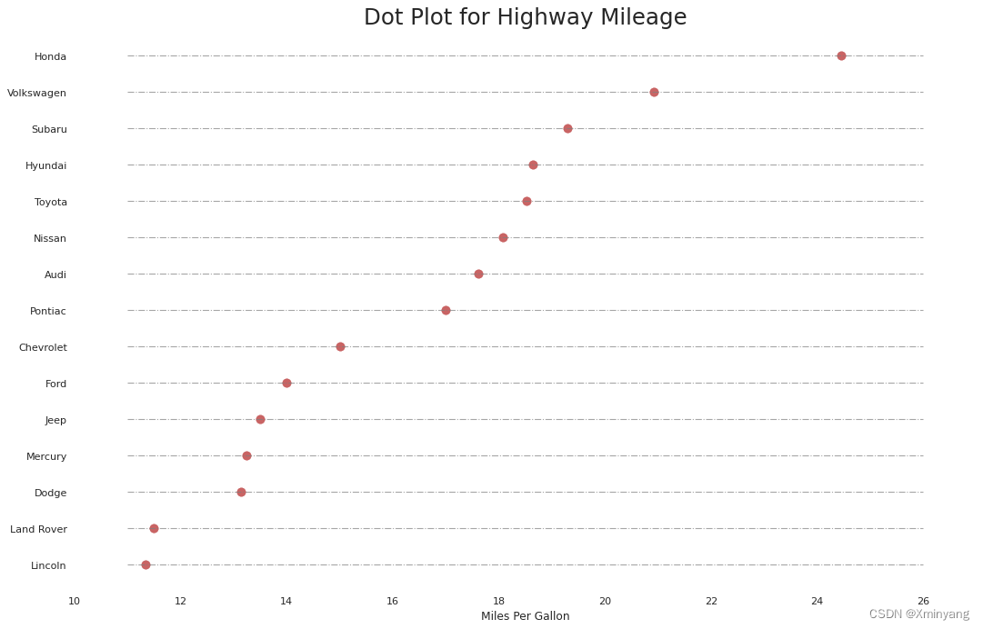
3.3 点图(Dot Plot)
-
The dot plot conveys the rank order of the items. And since it is aligned along the horizontal axis, you can visualize how far the points are from each other more easily.
-
点图传达了项目的排名顺序。由于它沿水平轴对齐,您可以更容易地可视化点之间的距离。
-
程序代码为:
# Prepare Data
df_raw = pd.read_csv("https://github.com/selva86/datasets/raw/master/mpg_ggplot2.csv")
df = df_raw[['cty', 'manufacturer']].groupby('manufacturer').apply(lambda x: x.mean())
df.sort_values('cty', inplace=True)
df.reset_index(inplace=True)# Draw plot
fig, ax = plt.subplots(figsize=(16,10), dpi= 80)
# 在图形窗口中,代码使用ax.hlines函数绘制水平虚线,表示城市里程的范围。虚线的y坐标取自df.index,x坐标范围为11到26,颜色为灰色,透明度为0.7,线宽为1,线型为点划线。
ax.hlines(y=df.index, xmin=11, xmax=26, color='gray', alpha=0.7, linewidth=1, linestyles='dashdot')
# 使用ax.scatter函数绘制散点图,表示每个制造商的城市里程。散点图的y坐标取自df.index,x坐标取自df.cty,散点的大小为75,颜色为火砖红色,透明度为0.7。
ax.scatter(y=df.index, x=df.cty, s=75, color='firebrick', alpha=0.7)# Title, Label, Ticks and Ylim 对坐标轴进行标题、标签、刻度和限制范围的设置
# 使用ax.set_title设置图形的标题为"Dot Plot for Highway Mileage",字体大小为22。
ax.set_title('Dot Plot for Highway Mileage', fontdict={'size':22})
# 使用ax.set_xlabel设置x轴标签为"Miles Per Gallon"。
ax.set_xlabel('Miles Per Gallon')
# 使用ax.set_yticks和ax.set_yticklabels设置y轴刻度和刻度标签,刻度取自df.index,标签取自df.manufacturer,并将制造商名称的首字母大写。
ax.set_yticks(df.index)
ax.set_yticklabels(df.manufacturer.str.title(), fontdict={'horizontalalignment': 'right'})
# 使用ax.set_xlim设置x轴的范围为10到27。
ax.set_xlim(10, 27)
plt.show()
- 运行结果为:
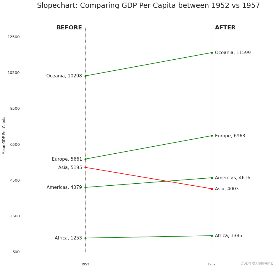
3.4 斜率图(Slope Chart)
-
Slope chart is most suitable for comparing the ‘Before’ and ‘After’ positions of a given person/item.
(Slope Chart) -
斜率图最适合用于比较给定个体/项目的“之前”和“之后”位置。
斜率图是一种可视化工具,用于展示个体/项目在不同时间或条件下的变化情况。它通过连接两个时间点或条件的数据点,以直观地显示个体/项目的变化趋势。
通常,斜率图的横轴表示时间或条件,纵轴表示某种度量指标(例如,数量、得分等)。每个个体/项目在图中用线段表示,线段的起点表示“之前”位置,终点表示“之后”位置。线段的斜率(即线段的倾斜程度)反映了个体/项目的变化幅度。
斜率图特别适合用于比较个体/项目在某种干预、政策或改变发生前后的状态。通过观察斜率图,可以直观地看出个体/项目在不同时间点或条件下的变化趋势,从而评估干预的效果或政策的影响。 -
gdppercap.csv:
"continent","1952","1957"
"Africa",1252.57246582115,1385.23606225577
"Americas",4079.0625522,4616.04373316
"Asia",5195.48400403939,4003.13293994242
"Europe",5661.05743476,6963.01281593333
"Oceania",10298.08565,11598.522455
- 程序代码为:
import matplotlib.lines as mlines
# Import Data
df = pd.read_csv("https://raw.githubusercontent.com/selva86/datasets/master/gdppercap.csv")# 通过遍历DataFrame的'continent'列和'1952'、'1957'列,创建左侧标签和右侧标签。klass列表根据'1952'和'1957'的值的差异确定线段的颜色。
left_label = [str(c) + ', '+ str(round(y)) for c, y in zip(df.continent, df['1952'])]
right_label = [str(c) + ', '+ str(round(y)) for c, y in zip(df.continent, df['1957'])]
klass = ['red' if (y1-y2) < 0 else 'green' for y1, y2 in zip(df['1952'], df['1957'])]# draw line
# https://stackoverflow.com/questions/36470343/how-to-draw-a-line-with-matplotlib/36479941
# 这个函数用于绘制线段。它接受两个点的坐标p1和p2,以及线段的颜色。函数内部创建一个Line2D对象,并将其添加到当前的坐标轴对象ax中。
def newline(p1, p2, color='black'):ax = plt.gca()l = mlines.Line2D([p1[0],p2[0]], [p1[1],p2[1]], color='red' if p1[1]-p2[1] > 0 else 'green', marker='o', markersize=6)ax.add_line(l)return lfig, ax = plt.subplots(1,1,figsize=(14,14), dpi= 80)# Vertical Lines
# 使用vlines函数在x轴上绘制两条垂直线。
ax.vlines(x=1, ymin=500, ymax=13000, color='black', alpha=0.7, linewidth=1, linestyles='dotted')
ax.vlines(x=3, ymin=500, ymax=13000, color='black', alpha=0.7, linewidth=1, linestyles='dotted')# Points
# 使用scatter函数在指定的位置上绘制散点图。
ax.scatter(y=df['1952'], x=np.repeat(1, df.shape[0]), s=10, color='black', alpha=0.7)
ax.scatter(y=df['1957'], x=np.repeat(3, df.shape[0]), s=10, color='black', alpha=0.7)# Line Segmentsand Annotation
# 使用循环遍历'1952'、'1957'和'continent'列,调用newline函数绘制线段,并使用text函数添加标签。
for p1, p2, c in zip(df['1952'], df['1957'], df['continent']):newline([1,p1], [3,p2])ax.text(1-0.05, p1, c + ', ' + str(round(p1)), horizontalalignment='right', verticalalignment='center', fontdict={'size':14})ax.text(3+0.05, p2, c + ', ' + str(round(p2)), horizontalalignment='left', verticalalignment='center', fontdict={'size':14})# 'Before' and 'After' Annotations
# 使用text函数在指定位置添加文字标签。
ax.text(1-0.05, 13000, 'BEFORE', horizontalalignment='right', verticalalignment='center', fontdict={'size':18, 'weight':700})
ax.text(3+0.05, 13000, 'AFTER', horizontalalignment='left', verticalalignment='center', fontdict={'size':18, 'weight':700})# Decoration
ax.set_title("Slopechart: Comparing GDP Per Capita between 1952 vs 1957", fontdict={'size':22})
ax.set(xlim=(0,4), ylim=(0,14000), ylabel='Mean GDP Per Capita')
ax.set_xticks([1,3])
ax.set_xticklabels(["1952", "1957"])
plt.yticks(np.arange(500, 13000, 2000), fontsize=12)# Lighten borders
plt.gca().spines["top"].set_alpha(.0)
plt.gca().spines["bottom"].set_alpha(.0)
plt.gca().spines["right"].set_alpha(.0)
plt.gca().spines["left"].set_alpha(.0)
plt.show()
- 运行结果为:
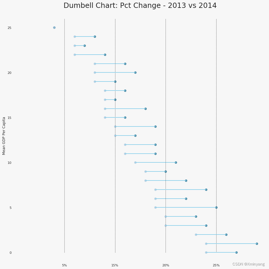
3.5 杠铃图(Dumbbell Plot)
-
Dumbbell plot conveys the ‘before’ and ‘after’ positions of various items along with the rank ordering of the items. Its very useful if you want to visualize the effect of a particular project / initiative on different objects.
-
杠铃图展示了不同项目在“之前”和“之后”的位置,并显示了项目的排名顺序。如果您想要可视化特定项目/计划对不同对象的影响,杠铃图非常有用。
-
health.csv:
"Area","pct_2014","pct_2013"
"Houston",0.19,0.22
"Miami",0.19,0.24
"Dallas",0.18,0.21
"San Antonio",0.15,0.19
"Atlanta",0.15,0.18
"Los Angeles",0.14,0.2
"Tampa",0.14,0.17
"Riverside, Calif.",0.14,0.19
"Phoenix",0.13,0.17
"Charlotte",0.13,0.15
"San Diego",0.12,0.16
"All Metro Areas",0.11,0.14
"Chicago",0.11,0.14
"New York",0.1,0.12
"Denver",0.1,0.14
"Washington, D.C.",0.09,0.11
"Portland",0.09,0.13
"St. Louis",0.09,0.1
"Detroit",0.09,0.11
"Philadelphia",0.08,0.1
"Seattle",0.08,0.12
"San Francisco",0.08,0.11
"Baltimore",0.06,0.09
"Pittsburgh",0.06,0.07
"Minneapolis",0.06,0.08
"Boston",0.04,0.04
- 程序代码为:
import matplotlib.lines as mlines# Import Data
df = pd.read_csv("https://raw.githubusercontent.com/selva86/datasets/master/health.csv")
df.sort_values('pct_2014', inplace=True)
df.reset_index(inplace=True)# Func to draw line segment
# 定义了一个名为newline的函数,用于在图中绘制线段。该函数接受两个点p1和p2的坐标,并可选地指定线段的颜色。
def newline(p1, p2, color='black'):ax = plt.gca()l = mlines.Line2D([p1[0],p2[0]], [p1[1],p2[1]], color='skyblue')ax.add_line(l)return l# Figure and Axes
# 创建一个图形窗口和一个坐标轴对象。figsize参数指定了图形窗口的大小,facecolor参数设置了图形窗口的背景颜色,dpi参数设置了图形的分辨率。
fig, ax = plt.subplots(1,1,figsize=(14,14), facecolor='#f7f7f7', dpi= 80)# Vertical Lines
# 使用ax.vlines函数在图中绘制垂直线段。这些线段的x坐标分别为0.05、0.10、0.15和0.20,y坐标范围从0到26。这些线段的颜色为黑色,透明度为1,线宽为1,线型为虚线。
ax.vlines(x=.05, ymin=0, ymax=26, color='black', alpha=1, linewidth=1, linestyles='dotted')
ax.vlines(x=.10, ymin=0, ymax=26, color='black', alpha=1, linewidth=1, linestyles='dotted')
ax.vlines(x=.15, ymin=0, ymax=26, color='black', alpha=1, linewidth=1, linestyles='dotted')
ax.vlines(x=.20, ymin=0, ymax=26, color='black', alpha=1, linewidth=1, linestyles='dotted')# Points
# 使用ax.scatter函数在图中绘制散点图。其中,df['index']表示y坐标,df['pct_2013']和df['pct_2014']分别表示x坐标。散点的大小为50,颜色分别为'#0e668b'和'#a3c4dc',透明度为0.7。
ax.scatter(y=df['index'], x=df['pct_2013'], s=50, color='#0e668b', alpha=0.7)
ax.scatter(y=df['index'], x=df['pct_2014'], s=50, color='#a3c4dc', alpha=0.7)# Line Segments
for i, p1, p2 in zip(df['index'], df['pct_2013'], df['pct_2014']):newline([p1, i], [p2, i])# Decoration
ax.set_facecolor('#f7f7f7')
ax.set_title("Dumbell Chart: Pct Change - 2013 vs 2014", fontdict={'size':22})
ax.set(xlim=(0,.25), ylim=(-1, 27), ylabel='Mean GDP Per Capita')
ax.set_xticks([.05, .1, .15, .20])
ax.set_xticklabels(['5%', '15%', '20%', '25%'])
ax.set_xticklabels(['5%', '15%', '20%', '25%'])
plt.show()
- 运行结果为:
References
- Top 50 matplotlib Visualizations
- 【Matplotlib作图-1.Correlation】50 Matplotlib Visualizations, Python实现,源码可复现
- 【Matplotlib作图-2.Deviation】50 Matplotlib Visualizations, Python实现,源码可复现

这篇关于【Matplotlib作图-3.Ranking】50 Matplotlib Visualizations, Python实现,源码可复现的文章就介绍到这儿,希望我们推荐的文章对编程师们有所帮助!