本文主要是介绍比较(一)利用python绘制条形图,希望对大家解决编程问题提供一定的参考价值,需要的开发者们随着小编来一起学习吧!
比较(一)利用python绘制条形图
条形图(Barplot)简介
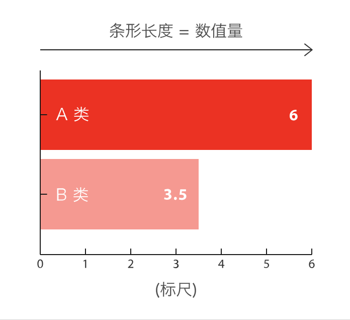
条形图主要用来比较不同类别间的数据差异,一条轴表示类别,另一条则表示对应的数值度量。
快速绘制
-
基于seaborn
import seaborn as sns
import matplotlib.pyplot as plt# 导入数据
tips = sns.load_dataset("tips")# 利用barplot函数快速绘制
sns.barplot(x="total_bill", y="day", data=tips, estimator=sum, errorbar=None, color='#69b3a2')plt.show()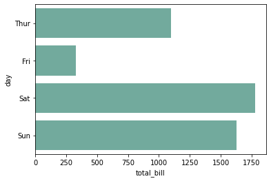
-
基于matplotlib
import matplotlib.pyplot as plt# 导入数据
tips = sns.load_dataset("tips")
grouped_tips = tips.groupby('day')['total_bill'].sum().reset_index()# 利用bar函数快速绘制
plt.bar(grouped_tips.day, grouped_tips.total_bill)plt.show()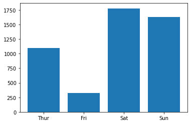
-
基于pandas
import matplotlib.pyplot as plt
import pandas as pd# 导入数据
tips = sns.load_dataset("tips")
grouped_tips = tips.groupby('day')['total_bill'].sum().reset_index()# 利用plot.bar函数快速绘制
grouped_tips.plot.bar(x='day', y='total_bill', rot=0)plt.show()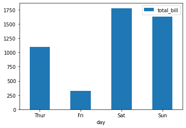
定制多样化的条形图
自定义条形图一般是结合使用场景对相关参数进行修改,并辅以其他的绘图知识。参数信息可以通过官网进行查看,其他的绘图知识则更多来源于实战经验,大家不妨将接下来的绘图作为一种学习经验,以便于日后总结。
通过seaborn绘制多样化的条形图
seaborn主要利用barplot绘制条形图,可以通过seaborn.barplot了解更多用法
-
修改参数
import seaborn as sns
import matplotlib.pyplot as plt
import numpy as npsns.set(font='SimHei', font_scale=0.8, style="darkgrid") # 解决Seaborn中文显示问题# 导入数据
tips = sns.load_dataset("tips")# 构造子图
fig, ax = plt.subplots(2,2,constrained_layout=True, figsize=(8, 8))# 修改方向-垂直
ax_sub = sns.barplot(y="total_bill", x="day", data=tips, estimator=sum, errorbar=None, color='#69b3a2',ax=ax[0][0])
ax_sub.set_title('垂直条形图')# 自定义排序
ax_sub = sns.barplot(y="total_bill", x="day", data=tips, estimator=sum, errorbar=None, color='#69b3a2',order=["Fri","Thur","Sat","Sun"],ax=ax[0][1])
ax_sub.set_title('自定义排序')# 数值排序
df = tips.groupby('day')['total_bill'].sum().sort_values(ascending=False).reset_index()
ax_sub = sns.barplot(y="day", x="total_bill", data=df, errorbar=None, color='#69b3a2',order=df['day'],ax=ax[1][0])
ax_sub.set_title('数值排序')# 添加误差线
ax_sub = sns.barplot(x="day", y="total_bill", data=tips, estimator=np.mean, errorbar=('ci', 85), capsize=.2, color='lightblue',ax=ax[1][1])
ax_sub.set_title('添加误差线')plt.show()
-
分组条形图
import seaborn as sns
import matplotlib.pyplot as plt
import numpy as npsns.set(style="darkgrid")# 导入数据
tips = sns.load_dataset("tips")fig, ax = plt.subplots(figsize=(4, 4))# 分组条形图
colors = ["#69b3a2", "#4374B3"]
sns.barplot(x="day", y="total_bill", hue="smoker", data=tips, errorbar=None, palette=colors)plt.show()# 分组/子分组条形图
sns.catplot(x="sex", y="total_bill", hue="smoker", col="day", data=tips, kind="bar", height=4, aspect=.7)plt.show()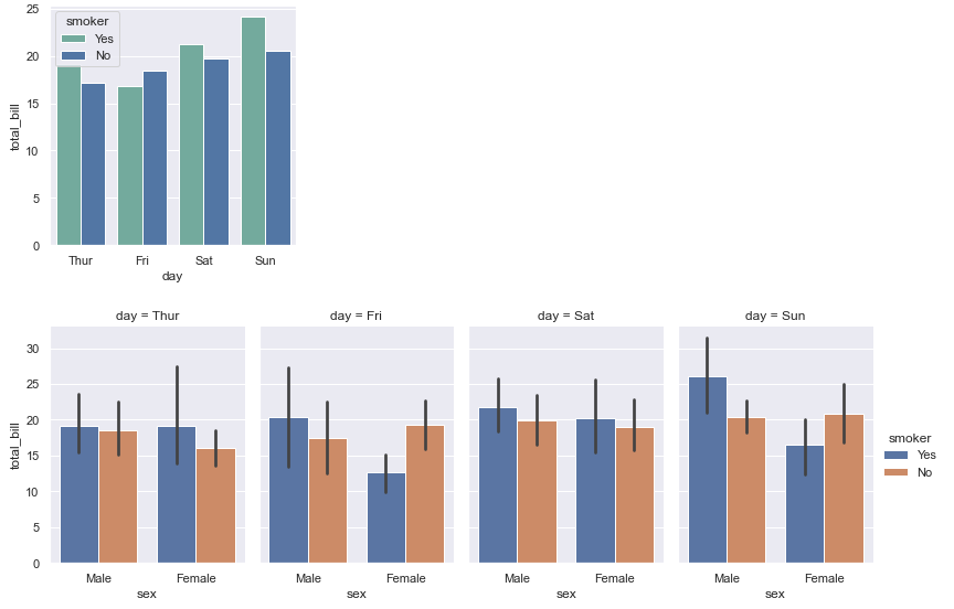
-
引申-数量堆积条形图
import seaborn as sns
import numpy as np
import matplotlib.pyplot as plt
import matplotlib.patches as mpatchessns.set(style="darkgrid")# 导入数据
tips = sns.load_dataset("tips")
df = tips.groupby(['day', 'smoker'])['total_bill'].sum().reset_index()
smoker_df = df[df['smoker']=='Yes']
non_smoker_df = df[df['smoker']=='No']# 布局
plt.figure(figsize=(6, 4))# 非吸烟者的条形图
bar1 = sns.barplot(x='day', y='total_bill', data=non_smoker_df, color='lightblue')
# 吸烟者的条形图,底部开始位置设置为非吸烟者的total_bill值(即吸烟者条形图在上面)
bar2 = sns.barplot(x='day', y='total_bill', bottom=non_smoker_df['total_bill'], data=smoker_df, color='darkblue')# 图例
top_bar = mpatches.Patch(color='darkblue', label='smoker = Yes')
bottom_bar = mpatches.Patch(color='lightblue', label='smoker = No')
plt.legend(handles=[top_bar, bottom_bar])plt.show()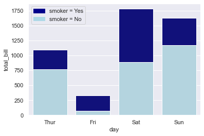
-
引申-百分比堆积条形图
import seaborn as sns
import matplotlib.pyplot as plt
import pandas as pd# 导入数据
tips = sns.load_dataset("tips")# 计算百分比
day_total_bill = tips.groupby('day')['total_bill'].sum() # 每日数据
group_total_bill = tips.groupby(['day', 'smoker'])['total_bill'].sum().reset_index() # 每日每组数据
group_total_bill['percent'] = group_total_bill.apply(lambda row: row['total_bill'] / day_total_bill[row['day']] * 100, axis=1)# 将数据分成smoker和non-smoker两份,方便我们绘制两个条形图
smoker_df = group_total_bill[group_total_bill['smoker'] == 'Yes']
non_smoker_df = group_total_bill[group_total_bill['smoker'] == 'No']# 布局
plt.figure(figsize=(6, 4))# 非吸烟者的条形图
bar1 = sns.barplot(x='day', y='percent', data=non_smoker_df, color='lightblue')
# 吸烟者的条形图,底部开始位置设置为非吸烟者的total_bill值(即吸烟者条形图在上面)
bar2 = sns.barplot(x='day', y='percent', bottom=non_smoker_df['percent'], data=smoker_df, color='darkblue')# 图例
top_bar = mpatches.Patch(color='darkblue', label='smoker = Yes')
bottom_bar = mpatches.Patch(color='lightblue', label='smoker = No')
plt.legend(handles=[top_bar, bottom_bar])plt.show()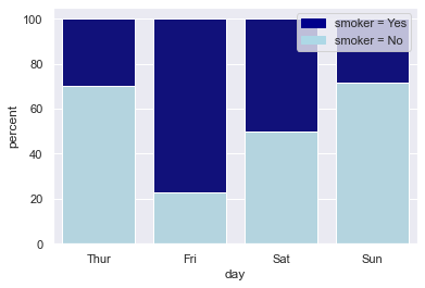
通过seaborn绘制多样化的条形图
seaborn主要利用barh绘制条形图,可以通过matplotlib.pyplot.barh了解更多用法
-
修改参数
import matplotlib as mpl
import matplotlib.pyplot as plt
import numpy as np
import pandas as pdmpl.rcParams.update(mpl.rcParamsDefault) # 恢复默认的matplotlib样式
plt.rcParams['font.sans-serif'] = ['SimHei'] # 用来正常显示中文标签# 自定义数据
height = [3, 12, 5, 18, 45]
bars = ('A', 'B', 'C', 'D', 'E')
y_pos = np.arange(len(bars))
x_pos = np.arange(len(bars))# 初始化布局
fig = plt.figure(figsize=(8,8))# 水平方向-水平条形图
plt.subplot(3, 3, 1)
plt.barh(y_pos, height)
plt.yticks(y_pos, bars)
plt.title('水平条形图')# 指定顺序
height_order, bars_order = zip(*sorted(zip(height, bars), reverse=False)) # 自定义顺序plt.subplot(3, 3, 2)
plt.barh(y_pos, height_order)
plt.yticks(y_pos, bars_order)
plt.title('指定顺序')# 自定义颜色
plt.subplot(3, 3, 3)
plt.bar(x_pos, height, color=['black', 'red', 'green', 'blue', 'cyan'])
plt.xticks(x_pos, bars)
plt.title('自定义颜色')# 自定义颜色-边框颜色
plt.subplot(3, 3, 4)
plt.bar(x_pos, height, color=(0.1, 0.1, 0.1, 0.1),  edgecolor='blue')
plt.xticks(x_pos, bars)
plt.title('自定义边框颜色')# 控制距离
width = [0.1,0.2,3,1.5,0.3]
x_pos_width = [0,0.3,2,4.5,5.5]plt.subplot(3, 3, 5)
plt.bar(x_pos_width, height, width=width)
plt.xticks(x_pos_width, bars)
plt.title('控制距离')# 控制宽度
x_pos_space = [0,1,5,8,9]plt.subplot(3, 3, 6)
plt.bar(x_pos_space, height)
plt.xticks(x_pos_space, bars)
plt.title('控制宽度')# 自定义布局
plt.subplot(3, 3, 7)
plt.bar(x_pos, height)
plt.xticks(x_pos, bars, color='orange', rotation=90) # 自定义x刻度名称颜色,自定义旋转
plt.xlabel('category', fontweight='bold', color = 'orange', fontsize='18') # 自定义x标签
plt.yticks(color='orange') # 自定义y刻度名称颜色plt.title('自定义布局')# 添加误差线
err = [val * 0.1 for val in height] # 计算误差(这里假设误差为height的10%)plt.subplot(3, 3, 8)
plt.bar(x_pos, height, yerr=err, alpha=0.5, ecolor='black', capsize=10)
plt.xticks(x_pos, bars)
plt.title('添加误差线')# 增加数值文本信息
plt.subplot(3, 3, 9)
ax = plt.bar(x_pos, height)
for bar in ax:yval = bar.get_height()plt.text(bar.get_x() + bar.get_width()/2.0, yval, int(yval), va='bottom') # va参数代表垂直对齐方式
plt.xticks(x_pos, bars)
plt.title('增加数值文本信息')fig.tight_layout() # 自动调整间距
plt.show()
-
分组条形图
import numpy as np
import matplotlib.pyplot as plt# 宽度设置
barWidth = 0.25# 自定义数据
bars1 = [12, 30, 1, 8, 22]
bars2 = [28, 6, 16, 5, 10]
bars3 = [29, 3, 24, 25, 17]# x位置
r1 = np.arange(len(bars1))
r2 = [x + barWidth for x in r1]
r3 = [x + barWidth for x in r2]# 绘制分组条形图
plt.bar(r1, bars1, color='#7f6d5f', width=barWidth, edgecolor='white', label='g1')
plt.bar(r2, bars2, color='#557f2d', width=barWidth, edgecolor='white', label='g2')
plt.bar(r3, bars3, color='#2d7f5e', width=barWidth, edgecolor='white', label='g3')# 轴标签、图例
plt.xlabel('group', fontweight='bold')
plt.xticks([r + barWidth for r in range(len(bars1))], ['A', 'B', 'C', 'D', 'E'])
plt.legend()plt.show()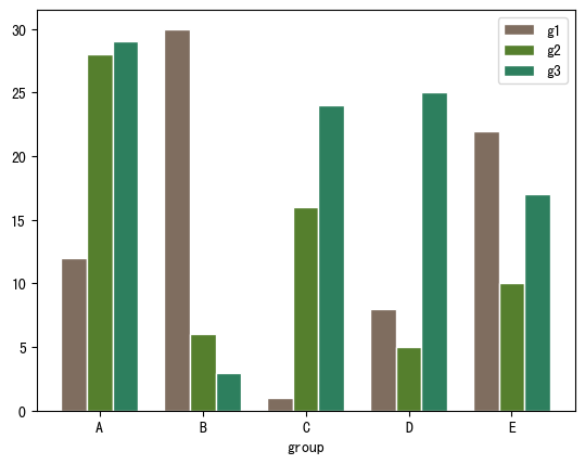
-
数量堆积条形图
import numpy as np
import matplotlib.pyplot as plt
import pandas as pd# 自定义数据
bars1 = [12, 28, 1, 8, 22]
bars2 = [28, 7, 16, 4, 10]
bars3 = [25, 3, 23, 25, 17]# bars1 + bars2的高度
bars = np.add(bars1, bars2).tolist()# x位置
r = [0,1,2,3,4]# bar名称、宽度
names = ['A','B','C','D','E']
barWidth = 1# 底部bar
plt.bar(r, bars1, color='#7f6d5f', edgecolor='white', width=barWidth, label="g1")
# 中间bar
plt.bar(r, bars2, bottom=bars1, color='#557f2d', edgecolor='white', width=barWidth, label="g2")
# 顶部bar
plt.bar(r, bars3, bottom=bars, color='#2d7f5e', edgecolor='white', width=barWidth, label="g3")# x轴设置、图例
plt.xticks(r, names, fontweight='bold')
plt.xlabel("group")
plt.legend()plt.show()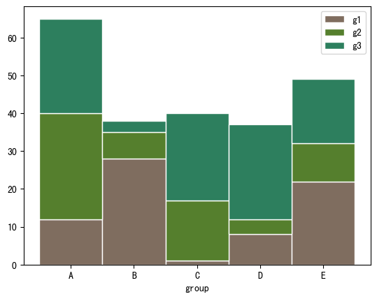
-
百分比堆积条形图
import numpy as np
import matplotlib.pyplot as plt
import pandas as pd# 自定义数据
r = [0,1,2,3,4] # x位置
raw_data = {'greenBars': [20, 1.5, 7, 10, 5], 'orangeBars': [5, 15, 5, 10, 15],'blueBars': [2, 15, 18, 5, 10]}
df = pd.DataFrame(raw_data)# 转为百分比
totals = [i+j+k for i,j,k in zip(df['greenBars'], df['orangeBars'], df['blueBars'])]
greenBars = [i / j * 100 for i,j in zip(df['greenBars'], totals)]
orangeBars = [i / j * 100 for i,j in zip(df['orangeBars'], totals)]
blueBars = [i / j * 100 for i,j in zip(df['blueBars'], totals)]# bar名称、宽度
barWidth = 0.85
names = ('A','B','C','D','E')# 底部bar
plt.bar(r, greenBars, color='#b5ffb9', edgecolor='white', width=barWidth, label="g1")
# 中间bar
plt.bar(r, orangeBars, bottom=greenBars, color='#f9bc86', edgecolor='white', width=barWidth, label="g2")
# 顶部bar
plt.bar(r, blueBars, bottom=[i+j for i,j in zip(greenBars, orangeBars)], color='#a3acff', edgecolor='white', width=barWidth, label="g3")# x轴、图例
plt.xticks(r, names)
plt.xlabel("group")
plt.legend()plt.show()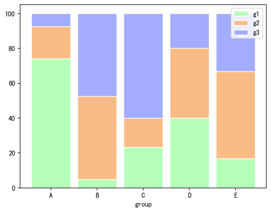
通过pandas绘制多样化的条形图
pandas主要利用barh绘制条形图,可以通过pandas.DataFrame.plot.barh了解更多用法
-
修改参数
import matplotlib as mpl
import matplotlib.pyplot as plt
import numpy as np
import pandas as pdplt.rcParams['font.sans-serif'] = ['SimHei'] # 用来正常显示中文标签# 自定义数据
category = ['Group1']*30 + ['Group2']*50 + ['Group3']*20
df = pd.DataFrame({'category': category})
values = df['category'].value_counts()# 初始化布局
fig = plt.figure(figsize=(8,4))# 水平方向-水平条形图
plt.subplot(1, 2, 1)
values.plot.barh(grid=True)
plt.title('水平条形图')# 自定义顺序、颜色
# 指定顺序
desired_order = ['Group1', 'Group2', 'Group3']
values_order = values.reindex(desired_order)
# 指定颜色
colors = ['#69b3a2', '#cb1dd1', 'palegreen']plt.subplot(1, 2, 2)
values.plot.bar(color=colors,grid=True, )
plt.title('自定义顺序、颜色')fig.tight_layout() # 自动调整间距
plt.show()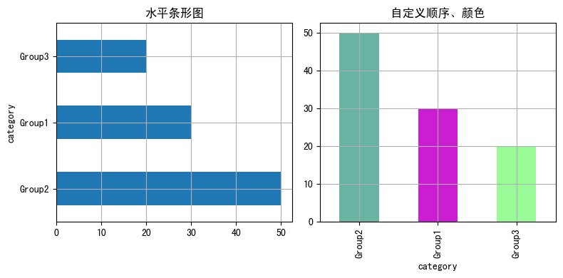
-
分组条形图
import pandas as pd
import matplotlib.pyplot as plt# 自定义数据
data = {"Product": ["Product A", "Product A", "Product A", "Product B", "Product B", "Product B"],"Segment": ["Segment 1", "Segment 2", "Segment 3", "Segment 1", "Segment 2", "Segment 3"],"Amount_sold": [100, 120, 120, 80, 160, 150]
}df = pd.DataFrame(data)
pivot_df = df.pivot(index='Segment',columns='Product',values='Amount_sold')# 分组条形图
pivot_df.plot.bar(grid=True)plt.show()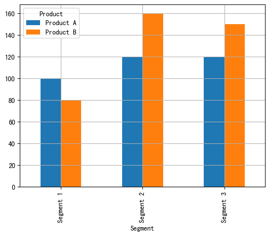
-
数量堆积条形图
import pandas as pd
import matplotlib.pyplot as plt# 自定义数据
data = {"Product": ["Product A", "Product A", "Product A", "Product B", "Product B", "Product B"],"Segment": ["Segment 1", "Segment 2", "Segment 3", "Segment 1", "Segment 2", "Segment 3"],"Amount_sold": [100, 120, 120, 80, 160, 150]
}df = pd.DataFrame(data)
pivot_df = df.pivot(index='Segment',columns='Product',values='Amount_sold')# 堆积条形图
pivot_df.plot.bar(stacked=True,grid=True)plt.show()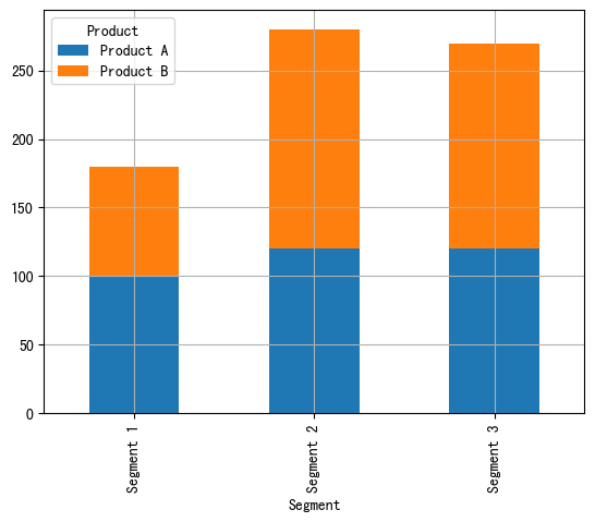
-
百分比堆积条形图
import pandas as pd
import matplotlib.pyplot as plt# 自定义数据
data = {"Product": ["Product A", "Product A", "Product A", "Product B", "Product B", "Product B"],"Segment": ["Segment 1", "Segment 2", "Segment 3", "Segment 1", "Segment 2", "Segment 3"],"Amount_sold": [100, 120, 120, 80, 160, 150]
}df = pd.DataFrame(data)
pivot_df = df.pivot(index='Segment',columns='Product',values='Amount_sold')
pivot_df_percentage = pivot_df.div(pivot_df.sum(axis=1), axis=0) * 100# 百分比堆积条形图
pivot_df_percentage.plot.bar(stacked=True,grid=True)# 图例
plt.legend(bbox_to_anchor=(1.04, 1),loc='upper left')
plt.show()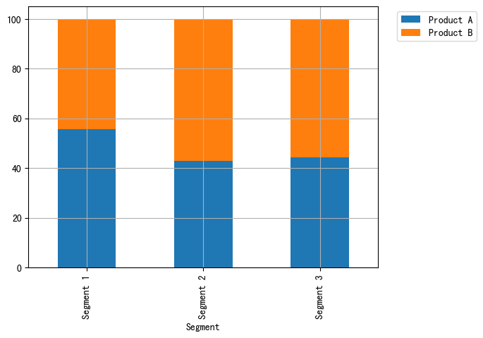
总结
以上通过seaborn的barplot、matplotlib的bar和pandas的bar快速绘制条形图,并通过修改参数或者辅以其他绘图知识自定义各种各样的条形图来适应相关使用场景。
共勉~
这篇关于比较(一)利用python绘制条形图的文章就介绍到这儿,希望我们推荐的文章对编程师们有所帮助!